- 投稿日:2019-11-28T21:10:13+09:00
初心者によるプログラミング学習ログ 171日目
100日チャレンジの171日目
twitterの100日チャレンジ#タグ、#100DaysOfCode実施中です。
すでに100日超えましたが、継続。100日チャレンジは、ぱぺまぺの中ではプログラミングに限らず継続学習のために使っています。
171日目は
おはようございます
— ぱぺまぺ@webエンジニアを目指したい社畜 (@yudapinokio) November 27, 2019
webサイトコーディング課題
オブジェクトの位置とか修正#100DaysOfCode #早起きチャレンジ#駆け出しエンジニアと繋がりたい
- 投稿日:2019-11-28T20:50:23+09:00
<input> 使い方 属性
<input>の使い方とtype属性に関して書いていきます。
使い方
基本的な書き方
<input type="属性名" name="任意の名前">ポイント
1.type属性でフォームの見た目が変わる
2.name属性で各inputを管理する
3.閉じタグはなし
4.何も指定しない場合はtextがデフォルトで入る属性
text
number
tel
url
password
search
reset
submit
image
date
datetime-local
month
week
time
radio
checkbox
hidden
button
file
color
range
minlength・maxlength
placeholder
list
pattern
step
multiple
accept
readonly
disable
- 投稿日:2019-11-28T07:38:05+09:00
stress
Depression, which develops due to stress at work and school, and has become a social problem as the number of patients has increased in recent years. Even now, the author who is associated with depression asks nine former patients about the chance of getting sick, the path to recovery and rehabilitation, and communicates the actual condition of the disease in the immediate vicinity of everyday life as if he were wearing it everyday.
A variety of backgrounds appear in this book, from overworked office workers in their 30s to housewives in their 50s who are taking care of their families with dementia, students who are triggered by the stress of job hunting and studying for exams. . “To date, most books on depression are the celebrity experience of celebrities or academics written by intellectuals. Why did ordinary people become depressed and how did they get cured? I wanted to introduce a familiar case. ''
〈What kind of symptoms did you see when depression was severe? > . Under what circumstances did you become depressed and follow the path of recovery? Realistic experiences are developed through interaction between the interviewer's authors and those with experience in depression.
“At the time of depression, a woman who was 19 years old and was a black tanned gal” <I don't know what everyone is talking about, I don't know (omitted). Everyone said, “Kyahahaha! I recall that when I started developing, I mean, I'm cooling in inverse proportion.
Careful moody feeling with aroma on a day when you feel unwell
○ When irritation does not stop
If you get frustrated and accumulate stress, your body may be overpowered and your life energy cycle will be worse. Choose a bergamot to relieve stress or an orange sweet that supplements life energy to encourage your visit.
うつ体験談
○ When you think too much
If you have trouble or think too hard, lavender or black pepper aroma oil is recommended. Because it has a gastrointestinal regulating action, try using it even if it affects your "eating" such as loss of appetite and hunger.
- 投稿日:2019-11-28T01:01:40+09:00
CSSでスライドショーを作る
animationを初めて使って感動した
ページ↓ GitHub
https://kngy0306.github.io/SlideSample/
<body> <div class="slider"></div> </body>*{ padding: 0; margin: 0; background: #34495e; } .slider{ width: 800px; height: 550px; background: url(1.jpg); margin: 50px auto; animation: slide 15s infinite; } @keyframes slide{ 25%{ background: url(2.jpg); } 50%{ background: url(3.jpg); } 75%{ background: url(4.jpg); } 100%{ background: url(1.jpg); } }使用した画像 (Unsplashより)
1.jpg
https://images.unsplash.com/photo-1522383225653-ed111181a951?ixlib=rb-1.2.1&ixid=eyJhcHBfaWQiOjEyMDd9&auto=format&fit=crop&w=1355&q=80
Photo by AJ on Unsplash2.jpg
https://images.unsplash.com/photo-1570896168675-7338d1e857cb?ixlib=rb-1.2.1&ixid=eyJhcHBfaWQiOjEyMDd9&auto=format&fit=crop&w=1050&q=80
Photo by Mateus Elias Reis on Unsplash3.jpg
https://images.unsplash.com/photo-1506202687253-52e1b29d3527?ixlib=rb-1.2.1&ixid=eyJhcHBfaWQiOjEyMDd9&auto=format&fit=crop&w=1050&q=80
Photo by Timothy Eberly on Unsplash4.jpg
https://images.unsplash.com/photo-1543802700-8a647cc92bd4?ixlib=rb-1.2.1&ixid=eyJhcHBfaWQiOjEyMDd9&auto=format&fit=crop&w=1267&q=80
Photo by Aleksandra Rupar on Unsplash
CSSだけでもできることたくさんあってまだまだ驚くばかり
- 投稿日:2019-11-28T00:41:49+09:00
UIをきちんと考えた実装 - モーダルダイアログ (モーダルウィンドウ)
Webサイトやアプリなどのソフトウェア開発において、ユーザーのアクション・操作に対して何らかのレスポンスを返す、という相互的なUIを実装する機会があります。
こうしたUIに対し見た目先行で仕組み・機能への理解が足りないのか、疑問符のつく使われ方を見ることが割とあります。デザイナーであっても開発実装者であっても、そのUIの原型がどういった目的や仕様で生み出されたものなのかを調べるなどして、適用前に一度問い直してみることは大事かなと思います。
モーダルダイアログ (モーダルウィンドウ)とは?
なかでもよく誤用されるパーツの例として、今回は「モーダルダイアログ(モーダルウィンドウ)」を取り上げます。以下が大まかなモーダルダイアログの基本仕様です。
- アクションを実行すると画面最前面にウィンドウが現れ、選択肢を選ぶ、文字入力する、閉じるなど何かの操作をユーザーにさせる
- 別ウィンドウが表示され操作が終わるまでの間、操作の起点となった画面(背景または親画面)は操作を受け付けない
「モーダルウィンドウ」での検索ボリュームのほうが大きいのですが「モーダルダイアログ」名称のほうがこのUIの機能や役割がよりつかみやすいため、本記事ではモーダルダイアログとします。
モーダルダイアログUIのサンプル画像名称の定義
「モーダル」が正式名称かのような場面に多く出会います。モーダル(modal)とは英語で「形式上の~」、コンピューター用語としては「モードを持つ~」といった意味の形容詞で、モノ(名詞)のように呼ぶのは略称だとしても変です。
「ダイアログ」または「ダイアログボックス」とするのが適切でしょう。ダイアログ(dialog)は「対話」(名詞)を意味し、システムとユーザーによる対話形式のUIととらえるとしっくり来ます。
「ポップアップ(pop-up)」や「ライトボックス(Lightbox)」と呼ぶケースにも遭遇したことがあるのですが、それらよりもダイアログの名称がふさわしいでしょう。
OOUIにおけるモーダル、モードレス
せっかくモーダルという単語が出ているので、ソフトウェア開発において重要なOOUI(オブジェクト指向ユーザーインターフェース/オブジェクトベースUIとも)の考え方と併せて、このUIの定義を考えていきます。
コンピューターアプリケーションのインターフェース設計において、モードレス(modeless)とモーダル(modal)という2つの対比的な思想が存在します。以下、その意味についてソシオメディアの用語集から引用します。
モードレス
modeless
モードがない状態。ユーザーインターフェースをデザインする際に目指すべき状態。状況に依存した機能制限がなく、自由な手順でタスクを進行することができ、かつ特定の操作がシステムによって常に一定に解釈される状態。モーダル
modal
モードがある状態。つまり、システムが特定の機能の使用に制限された状態。ユーザーが自由に操作を行えなくなることと、モード別に機能の意味や振る舞いが変化することから、ユーザーインターフェースのデザインでは、できる限りモードを設けないほうがよいとされる。引用元:ソシオメディア | モードレス、ソシオメディア | モーダル
モードレスとは、コンピューターまたはWebサイト・アプリを操作する際に操作を限定されない自由な状態を指し、モーダルはその逆でシステム側から操作を限定された状態を指します。
まずユーザーが目的(オブジェクト)を選び、次に自由な操作・アクションが選択できることがGUI(グラフィカル・ユーザー・インターフェース)の基本思想であり、ソフトウェアデザインの出発点です。このオブジェクトベースなUIにおいて、モーダルは極力避けるべき状態とされています。
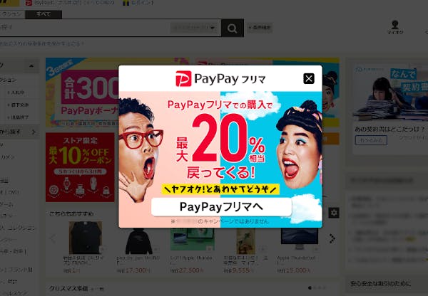
私たちはGUIユーザーとして、ときどき運営者都合で操作を制限された状態に遭遇します。それはビジネス側・売る側のロジックという強制力が働いた、不自由で押しつけがましいものになってはいないでしょうか。
画面を開いた際に即出現して「ぐぬぅ...」となるモーダルダイアログ例。ユーザーの行動の選択肢を狭めストレスを感じてしまう。disってないよモードレスダイアログという選択肢、あるいは...
モーダルダイアログがこの形態のUIの通名になっている感がありますが、モードレスダイアログも当然存在します。ダイアログがモーダル(モードが存在して制限されている)か、モードレス(モードが存在せず自由度が高い)かという状態の両軸を表しているだけです。
そして、よほどユーザーの操作を限定する必要がなければモーダルではなく、モードレスダイアログを検討・選択しても良いのかもしれません。ただでさえ不意に画面を遮って現れるのです。操作の自由はなるべくユーザーに委ねるほうがストレスにもつながらないでしょう。
モーダル(操作を絞る)がユーザーにとって有効なケース(必須の確認事項や限定されたプロセスなど)も確かに存在するので、使い分けやそもそもダイアログを利用しないことを慎重かつ適切に判断していきたいところです。
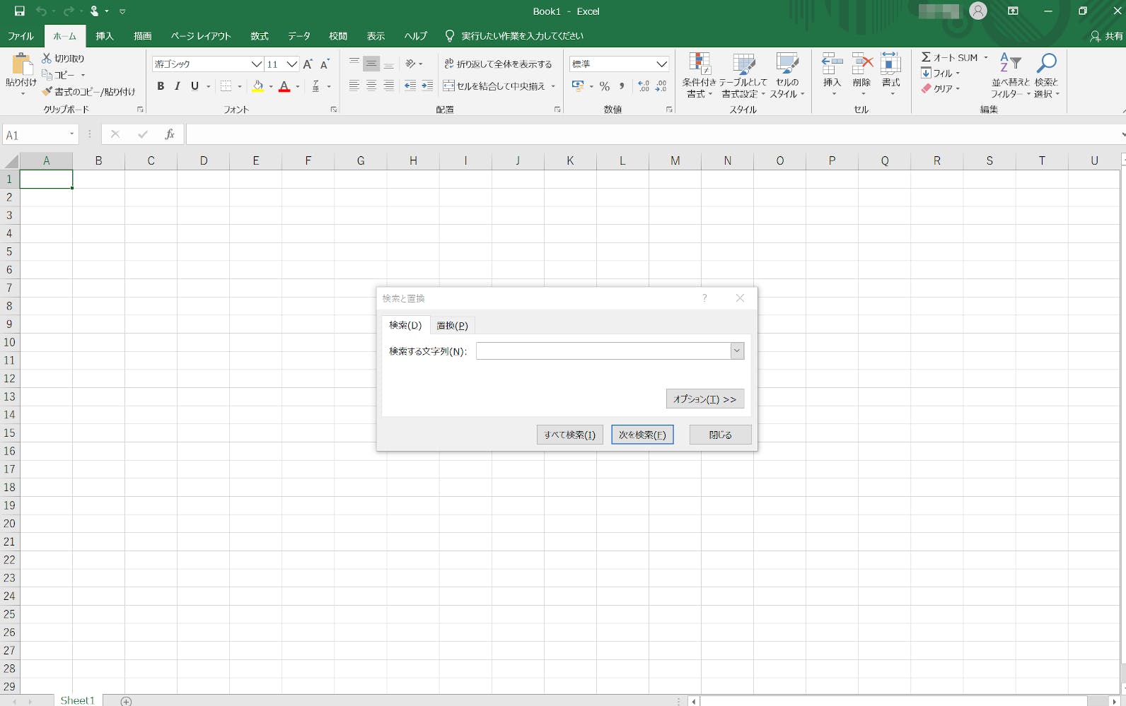
モードレスダイアログの例
Excelの「検索と置換」ダイアログは開いていても、背景画面の操作が可能。同様の機能はWebでも見ます機能定義と実装
それではここまでの流れを踏まえてモーダルダイアログの機能要件を定義し、Web UIとしての実装に入っていきたいと思います。
機能定義
- ボタンアクションで画面最前面にダイアログボックス(疑似的な別ウィンドウ)が現れる
- ダイアログが開いたら自身にフォーカスし、次のタブ操作でダイアログ内1番目のインタラクティブ要素にフォーカスする
- ダイアログ内では選択肢を選ばせるなどの限定的な操作にする
- ダイアログ表示中は、起点となる画面(背景または親画面)に対する操作やフォーカスを受け付けない ※
- ダイアログを閉じるボタンを設定する
- ダイアログ外をクリック・タッチした場合、ダイアログを閉じる ※
- [Esc](Escape)ボタン押下でダイアログを閉じる
- ユーザーが操作を終えたらダイアログを閉じ、何らかの値を返す
※マークのついた項目は、モードレスダイアログである場合は不要な機能を表します
実装方針
- HTMLの
dialog要素(open属性)とJavaScript APIのHTMLDialogElementを用いて実装する- 上記の技術は現状一部の主要ブラウザ(Chrome、Edge)しか実装対応していないため、Polyfill(dialog-polyfill)を組み込んで対応外ブラウザ(Firefox、Safari)にも対応する
- ダイアログが開いた際の背景または親画面は、明度を下げ操作不能を示す。暗い背景レイヤーはCSS
::backdrop疑似要素で実装※ サンプルコードでは、
role属性やaria-*属性を用い支援技術による適切な情報伝達を意識しています。キーボード操作などで必要なフォーカス管理をJSで補い、CSSに構造依存しないUI実装を心がけていますコード
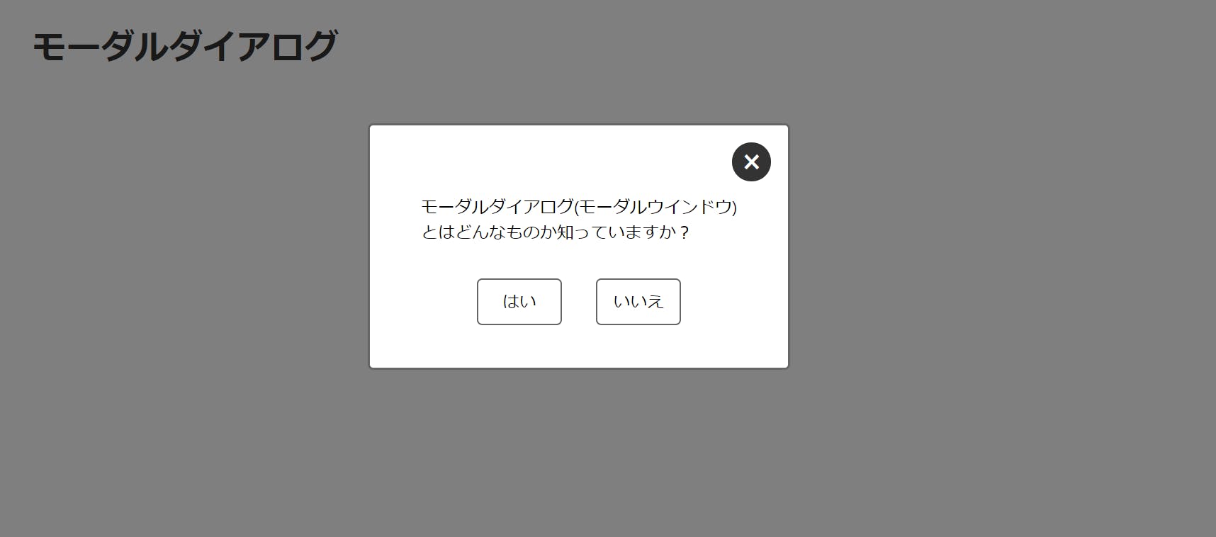
HTML・head内<script src="https://cdnjs.cloudflare.com/ajax/libs/dialog-polyfill/0.5.0/dialog-polyfill.min.js" defer></script> <script src="main.js" defer></script>HTML・body内<div id="modal-dialog" class="modal-dialog"> <h1>モーダルダイアログ</h1> <button type="button" id="dialog-open" class="dialog-open"> モーダルダイアログ<br> (モーダルウィンドウ)を開く </button> <dialog id="dialog-panel" class="dialog-panel" role="dialog" aria-describedby="d-message"> <p id="d-message" class="dialog-panel__message" role="document"> モーダルダイアログ(モーダルウィンドウ)<br> とはどんなものか知っていますか? </p> <div class="dialog-panel__buttons"> <button type="button" id="dialog-yes" class="dialog__button">はい</button> <button type="button" id="dialog-no" class="dialog__button">いいえ</button> </div> <button type="button" id="dialog-close" class="dialog__close" aria-label="このモーダルダイアログを閉じる"> × </button> </dialog> <p class="dialog-response"> ダイアログの返り値:<span id="return-value"></span> </p> </div>JavaScriptclass ModalDialog { constructor() { this.wrap = document.getElementById('modal-dialog'); this.open = document.getElementById('dialog-open'); this.dialog = document.querySelector("[role='dialog']"); this.yes = document.getElementById('dialog-yes'); this.no = document.getElementById('dialog-no'); this.close = document.getElementById('dialog-close'); this.returnSpan = document.getElementById('return-value'); // Polyfillを読み込む関数 dialogPolyfill.registerDialog(this.dialog); this.showDialog(); this.hideDialog(); this.respondValue(); } showDialog() { this.open.addEventListener('click', () => { this.dialog.showModal(); this.dialog.style.visibility = 'visible'; this.dialog.classList.remove('is-motioned'); this.dialog.setAttribute('tabindex', '0'); this.dialog.focus(); }); } hideDialog() { this.yes.addEventListener('click', () => { this.hideProcess('はい'); }); this.no.addEventListener('click', () => { this.hideProcess('いいえ'); }); this.close.addEventListener('click', () => { this.hideProcess('きみ、閉じるボタンを押したね...'); }); this.dialog.addEventListener('cancel', () => { this.hideProcess('Escapeボタン押しました?'); }); this.dialog.addEventListener('click', (event) => { if (event.target === this.dialog) { this.hideProcess('きみ、ウィンドウの外を押したね...'); } }); } hideProcess(resText) { this.dialog.close(resText); this.dialog.classList.add('is-motioned'); this.wrap.setAttribute('tabindex', '0'); this.wrap.focus(); setTimeout(() => { this.dialog.style.visibility = 'hidden'; }, 250); } respondValue() { this.dialog.addEventListener('close', () => { this.returnSpan.innerHTML = this.dialog.returnValue; }); } } const modalDialog = new ModalDialog();CSS/* 最低限のスタイル */ .modal-dialog { width: 100%; max-width: 64.25rem; margin: 2rem auto; } .dialog-open { display: block; width: 300px; margin: 4rem auto; padding: 1rem; border: 1px solid hsla(0, 0, 40%, 1); text-align: center; border-radius: 5px; } .dialog-panel { position: absolute; width: -moz-fit-content; width: -webkit-fit-content; width: fit-content; height: -moz-fit-content; height: -webkit-fit-content; height: fit-content; top: 15%; left: 0; right: 0; margin: auto; padding: 0; border: 2px solid hsla(0, 0, 40%, 1); background: hsla(0, 0, 100%, 1); border-radius: 5px; } /* native backdrop */ .dialog-panel::backdrop { background-color: rgba(0, 0, 0, .5); } /* polyfill backdrop */ .dialog-panel + .backdrop { position: fixed; top: 0; right: 0; bottom: 0; left: 0; background-color: rgba(0, 0, 0, .5); } .dialog-panel__message { margin: auto; padding: 4rem 3rem 0; } .dialog-panel__buttons { text-align: center; padding: 2rem 0 2.5rem; } .dialog__button { display: inline-block; min-width: 5rem; padding-top: .625rem; padding-bottom: .525rem; border: 1px solid hsla(0, 0, 40%, 1); border-radius: 5px; text-align: center; line-height: 1.5; } .dialog__button:not(:first-of-type) { margin-left: 1.75rem; } .dialog__close { position: absolute; top: 1rem; right: 1rem; width: 2.3rem; height: 2.3rem; background-color: hsla(0, 0, 20%, 1); font-size: 2rem; color: hsla(0, 0, 100%, 1); border-radius: 50%; }
HTMLDialogElementWeb APIのshow()showModal()close()メソッドやプロパティなどのコードや仕様についても細かく解説したかったのですが、それ以外の説明がやや長くなってしまい、力尽きたのでここで終わります。実装の詳細については上記コードと下記参考URLをご参照ください。
参考URL