- 投稿日:2019-05-03T18:55:45+09:00
ウィンドウサイズ別flexオーダーcss (uikit準拠)
uikitでflexのorderが無いので作りました。また、ウィンドウサイズ別でも対応しています。
普通のcssでも使えると思います。
_flex_order.scss$flex_order: -1, 0, 1, 2, 3, 4; $window_size_array: ( \@s: 640px, \@m: 960px, \@l: 1200px, \@xl: 1600px, ); @each $order in $flex_order { .uk-flex-order-#{$order} { order: $order; } } @each $window_size, $window_px in $window_size_array { @media (min-width: $window_px) { @each $order in $flex_order { .uk-flex-order-#{$order}#{$window_size} { order: $order; } } } }flex_order.css.uk-flex-order--1 { order: -1; } .uk-flex-order-0 { order: 0; } .uk-flex-order-1 { order: 1; } .uk-flex-order-2 { order: 2; } .uk-flex-order-3 { order: 3; } .uk-flex-order-4 { order: 4; } @media (min-width: 640px) { .uk-flex-order--1\@s { order: -1; } .uk-flex-order-0\@s { order: 0; } .uk-flex-order-1\@s { order: 1; } .uk-flex-order-2\@s { order: 2; } .uk-flex-order-3\@s { order: 3; } .uk-flex-order-4\@s { order: 4; } } @media (min-width: 960px) { .uk-flex-order--1\@m { order: -1; } .uk-flex-order-0\@m { order: 0; } .uk-flex-order-1\@m { order: 1; } .uk-flex-order-2\@m { order: 2; } .uk-flex-order-3\@m { order: 3; } .uk-flex-order-4\@m { order: 4; } } @media (min-width: 1200px) { .uk-flex-order--1\@l { order: -1; } .uk-flex-order-0\@l { order: 0; } .uk-flex-order-1\@l { order: 1; } .uk-flex-order-2\@l { order: 2; } .uk-flex-order-3\@l { order: 3; } .uk-flex-order-4\@l { order: 4; } } @media (min-width: 1600px) { .uk-flex-order--1\@xl { order: -1; } .uk-flex-order-0\@xl { order: 0; } .uk-flex-order-1\@xl { order: 1; } .uk-flex-order-2\@xl { order: 2; } .uk-flex-order-3\@xl { order: 3; } .uk-flex-order-4\@xl { order: 4; } }
- 投稿日:2019-05-03T16:35:07+09:00
カードをクリックで表裏切り替える方法
↓ 回転しながら裏面に切り替わる。↓
●html
<div class="main">
  <div class="card" (click)="cardClick()">
    <div class="front">
        {{ text.front }}
    </div>
    <div class="back">
      {{ text.back }}
    </div>
  </div>
</div>
●css
.main{
    position: relative;
    width:750px;
    height:750px;
}

.card {
    position: absolute;
    width: 350px;
    height:150px;
    background: #fff;
    border-radius: 5px;
    box-shadow: 0 2px 5px #ccc;
    transition:all 0.5% ease;
    transform-style: preserve-3d;
}

.flipped {
    transform: rotateY(180deg);
    transition: 1s;
}

.flippedReverse {
    transform: rotateY(0deg);
    transition: 1s;
}

.front {
    position: absolute;
    width: 350px;
    height:150px;
    backface-visibility: hidden; /* これで回転した後、表面が表示されなくなる */
    background: #fff;
    color: #333;
    transform:rotateY(0deg);
    transition: 1s;  /* これを入れないと回転した動きが見えない */
    display: -webkit-flex;
    display: flex;
    -webkit-align-items: center; /* 縦方向中央揃え(Safari用) */
    align-items: center; /* 縦方向中央揃え */
    -webkit-justify-content: center; /* 横方向中央揃え(Safari用) */
    justify-content: center; /* 横方向中央揃え */
}

.back {
    position: absolute;
    width: 350px;
    height:150px;
    backface-visibility: hidden;
    background: #fff;
    color: #333;
    transform:rotateY(180deg);
    transition: 1s;
    display: -webkit-flex;
    display: flex;
    -webkit-align-items: center; /* 縦方向中央揃え(Safari用) */
    align-items: center; /* 縦方向中央揃え */
    -webkit-justify-content: center; /* 横方向中央揃え(Safari用) */
    justify-content: center; /* 横方向中央揃え */
}
●ts
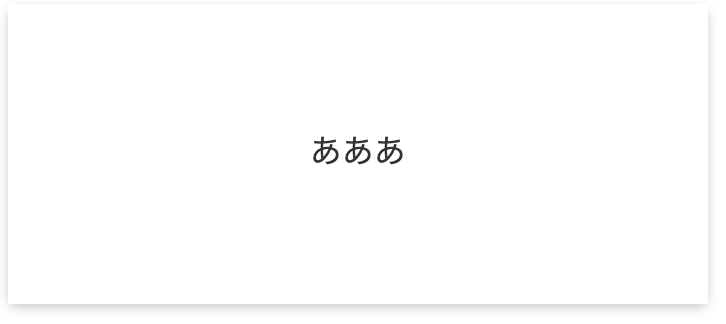
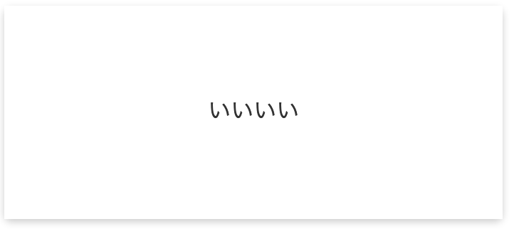
card;

ngOnInit() {
  this.card = document.getElementsByClassName('card');
}

text = {
  front:"ああああ",
  back:"いいいい"
}

frontFlag:Boolean = true;

cardClick(){
  if(this.frontFlag){
    this.frontFlag = false;
    this.card[0].classList.add('flipped');
    this.card[0].classList.remove('flippedReverse');
  }else{
    this.frontFlag = true;
    this.card[0].classList.add('flippedReverse');
    this.card[0].classList.remove('flipped');
  }
}
- 投稿日:2019-05-03T11:21:37+09:00
style="height: 50px"とかつい直書きしたくなるシーンに有効なcssライブラリー作ったので共有
CSSライブラリ作りました
Htmlのレイアウトを作成する時, paddingやwidthなどのpxを細かく指定したい時に以下のように記述したいと思いました。
<p class="p-45px height-100px max-width-300px"></p>なので、そういう記述ができるライブラリを作りました。
https://github.com/programmerkgit/dot-styleこれで名前空間を汚さず、styleへの直書きもせずにアトミックなクラスの組み合わせでスタイルを記述できるようになります。
z-index, height, width, min-max height, width, padding, margin, position(top, left, bottom, right)などに対応しています。
以下、使用例です (拙い英語で書いたReadmeそのまま載せます。)
Usage
Box Spacing
You can style padding, margin.
You can choose number from between 0 to 500, incremented step by 2.
Padding
<p class="pt-30px"></p>
<p class="pr-30px"></p>
<p class="pb-30px"></p>
<p class="pl-30px"></p>
<p class="px-30px"></p>
<p class="py-30px"></p>
<p class="p-30px"></p>
Margin
<p class="mt-30px"></p>
<p class="mr-30px"></p>
<p class="mb-30px"></p>
<p class="ml-30px"></p>
<p class="mx-30px"></p>
<p class="my-30px"></p>
<p class="m-30px"></p>
Dimension
You can set
width,max-width,min-width,height,max-height,min-height<p class="width-30px"></p> <p class="max-width-30px"></p> <p class="min-wdith-30px"></p> <p class="height-30px"></p> <p class="max-height-30px"></p> <p class="min-height-30px"></p>You can choose number from between 0 to 1000, incremented step by 5.
Line height
You can set
lien-height<p class="line-height-30px"></p>You can choose number from between 0 to 100, incremented by step 2.
Positioning
You can set
top,right,bottom,left.You can choose number from between 0 to 1000, incremented by step 5.
<p class="t-30px"></p>
<p class="r-35px"></p>
<p class="b-40px"></p>
<p class="l-45px"></p>
<p class="x-50px"></p>
<p class="y-55px"></p>
z-index
You can set
z-index.you can choose number from between 1-50 and from between 2000-2050.
<p class="z-index-1"></p>
<p class="z-index-2"></p>
<p class="z-index-2000"></p>
<p class="z-index-2001"></p>
Golden ratio of font-size, line-height and margins
Font size and line height and text block margin has a golden ratio.
You can set golden ratio by specifying fontsize.
<p class="gr-16px"></p> => font-size is set 16px, and correspoinding line-height, margin-top, margin-bottom are set.追加開発してきます
以下の点を満たすようなライブラリーにしようと考えています。
主要なPropertyを全てclassで指定できる。
class="p-30px flex-grow-3 pointer-cursor"などのように、classでほぼ全てのプロパティーを指定できるようにします。これによってついつい style="" の直書きをしたくなるようなシーンを無くします。component指向ではなくアトミックな機能群の提供。
CSSライブラリの多くが提供しているcomponentを使用すると素早くレイアウトができる代わりに、望まぬデフォルトのOutlineや色などが付与されてしまいます。
なので、class名を見るとどのプロパティーがどう内部で変化するかがすぐにわかるような機能群を作っていきます。
- 投稿日:2019-05-03T03:27:11+09:00
Sass基礎
Sassとは
Syntactically Awesome StyleSheet(文法的に格好良いスタイルシート)の略。
CSSを拡張した言語というか表記法。
変数や階層や関数を使えるように拡張されている。
CSSの肥大化が辛くて死にそうになった人が、プログラマブルにCSSを記載したくなり編み出したらしい。
実際使うときはコンパイラを通してCSSに変換して使う必要がある。
また、表記法としてもSASSとSCSSの2通りの書式がある。各々の所感は以下。SASS
最初に作られたのはこちらの記法らしい。流行ってない。ファイルの拡張子は.sass
括弧やセミコロンを省略、予約語も記号等で表現したりする。
記載量を削減させようと規約ベースで頑張ってるイメージ。
初めてJavaプログラマがPython見たときの感想に近い。慣れれば早く書けるんだと思う。多分。SCSS
後発で作られたのがこちら。主流はこちら。ファイルの拡張子は.scss
CSSの記法に寄せてあり、とっつきやすい。そして主流であるが故ネット上に情報も多い。
個人的に仕事で書くソースは誰もが読めるということが大事なので、こっちだけやればいいと思う。SCSSの記載方法
変数定義
頭に$をつけると変数として扱われる。
CSS同様上から順に読まれるので先頭とかで定義することになる。
あと、スコープも効くので注意。$aaaa: #ffffff; .prof { background-color: $aaaa; }階層化
入れ子ができる。視覚的にまとまるし、親のclass名変わった時とかに便利。
.prof {
  background-color: #ffffff;
    .info {
      color:#aaaaaa;
    }
    p {
      color:#2b546a;
    }
}
階層化(hoverやaction等の擬似クラス)
&が親を指す。以下みたいに書くと有効になる。
.prof {
  background-color: #ffffff;
    &:hover{
      color:#aaaaaa;
    }
}
関数化
@ mixinのように書くと関数として宣言できる。使うときは@ includeで展開される。
@mixin layout-image {
  padding: 40px 28px;
  margin: 16px 8px;
  background-color: #ffffff;
}

.prof {
  @include layout-image;
}
関数化(引数あり)
関数に引数も取れる。これ便利。
あと四則演算も使える。@mixin layout-image($padding, $color) { padding: $padding $padding / 2; margin: 16px 8px; background-color: $color; } .prof { @include layout-image(20px, #ffffff); }別SCSSファイルのインポート
読み込み対象のscssファイルは頭にアンダースコア、末尾に拡張子が必要。
_XXXXXX.scssというファイルを読み込む前提だと以下。@import XXXXXX;その他関数
SASSで定義されている関数がある模様。
全量はググってね。
関数名 概要 利用例 darken(色, パーセンテージ) 色を暗くする color: darken(#ffe400, 20%) lighten(色, パーセンテージ) 色を明るくする color: lighten(#ffe400, 20%) rgba(色, 透過値) 透過値変更 color: lighten(#ffe400, 0.5) SCSSをCSSにビルドする
せっかくなので動かしたい。
preprosというツールがよさそう。
Rubyも含めてインストールしてくれるので、インストーラたたくだけ。
prepros