- 投稿日:2020-11-23T17:28:35+09:00
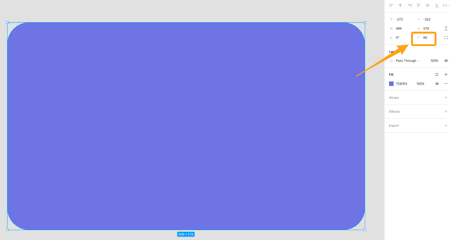
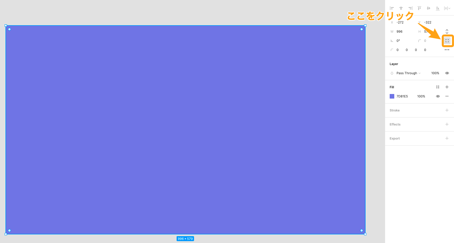
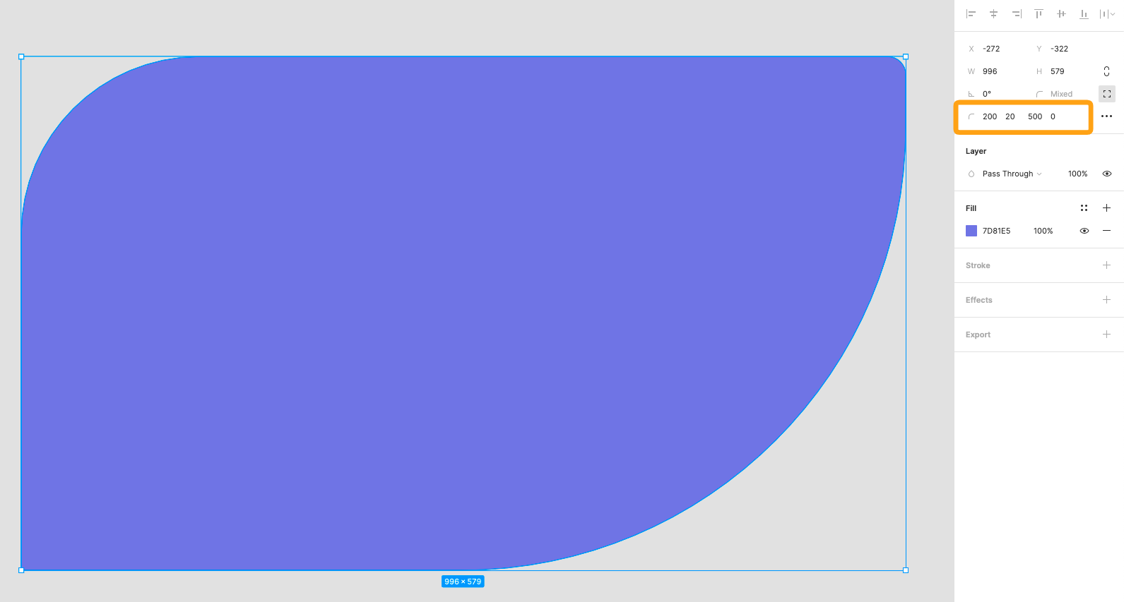
Figmaで角を丸くする方法(border-radius)
- 投稿日:2020-11-23T17:10:40+09:00
HTML/CSS初心者は必見! どんなデザインでも自由自在にできるFlexbox入門
はじめに
今回は要素を綺麗に配置するときに、大変役立つFlexboxの使い方について紹介します!
ここでは、要素 (アイテム) が入っている箱のことをコンテナと呼んで説明します。
YouTube動画
動画で学びたい方はこちらもどうぞ!
【YouTube動画】 HTML/CSSのFlexboxについて詳細解説! これでどんなデザインでも自由自在!【Flexbox入門】
GitHub
コードのサンプルをGitHubにアップロードしてます!
Pathや一部コードを修正する必要がありますが、ローカルで試してみたい方はこちらもどうぞ!
https://github.com/yassun-youtube/html-flexbox-samplesコンテナ内の全要素の配置
コンテナに入っている要素の並びを一括で指定したい場合は、flex-direction, justify-content, align-items, align-content, flex-wrapなどがあります。
flex-direction
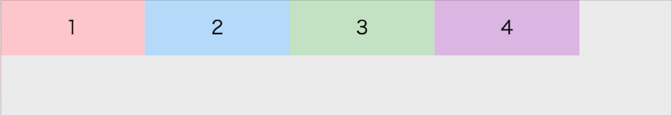
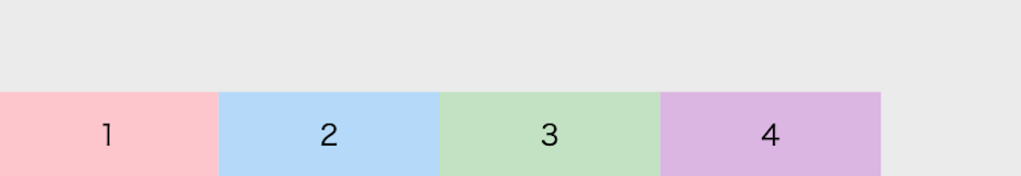
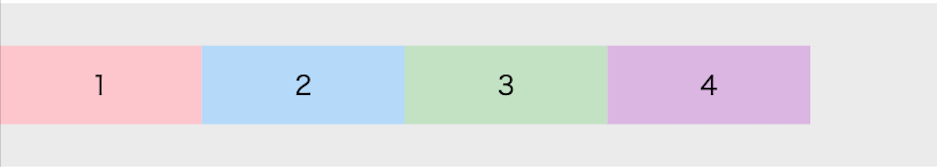
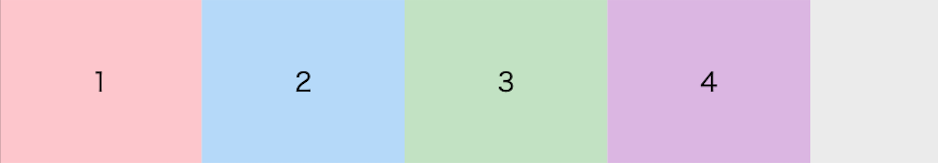
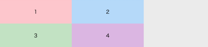
flex-directionは、コンテナ内の要素をどの軸方向で並べるかを決めるプロパティです。
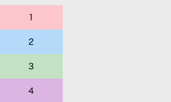
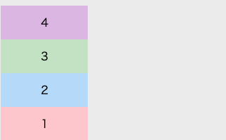
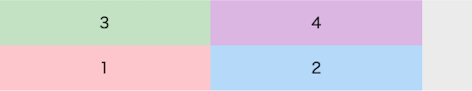
<div class="container" style="display: flex; flex-direction: <オプション>">
  <div class="red">1</div>
  <div class="blue">2</div>
  <div class="green">3</div>
  <div class="purple">4</div>
</div>
flex-direction: row;
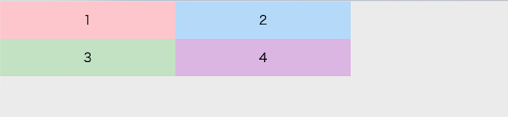
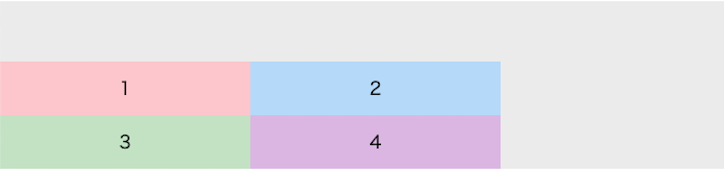
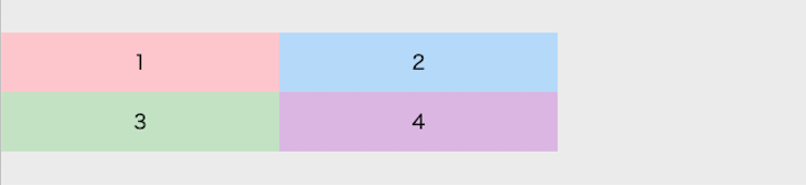
何も指定しない場合、デフォルトはこれになります。
flex-direction: row-reverse;
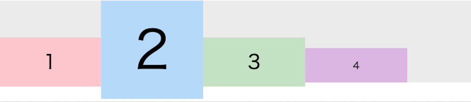
flex-direction: column;
flex-direction: column-reverse;
justify-content
justify-contentは、コンテナ内の要素をflex-directionの向きに従って、どのようにスペースを空けるかを決めるプロパティです。
<div class="container" style="display: flex; justify-content: <オプション>;">
  <div class="red">1</div>
  <div class="blue">2</div>
  <div class="green">3</div>
  <div class="purple">4</div>
</div>
justify-content: flex-start;
justify-content: flex-end;
justify-content: center;
justify-content: space-between;
justify-content: space-around;
justify-content: space-evenly;
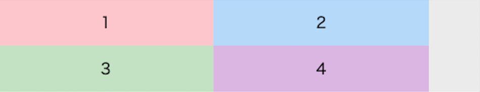
align-items
align-itemsは、コンテナ内の要素をflex-directionの向きに対してどの位置で配置するかを決めるプロパティです。
<div class="container" style="height: 100px; align-items: <オプション>;">
  <div class="red square">1</div>
  <div class="blue square">2</div>
  <div class="green square">3</div>
  <div class="purple square">4</div>
</div>
align-items: flex-start;
align-items: flex-end;
align-items: center;
align-items: stretch;
align-items: baseline;
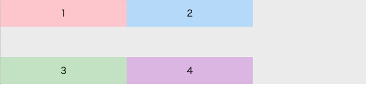
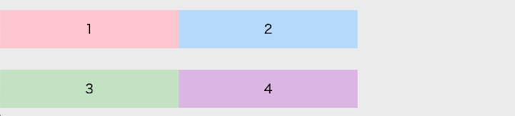
align-content
align-contentは、ウィンドウ幅が縮められたときに、コンテナ内の要素をどのように折り返すかを決めるプロパティです。
<div class="container" style="display: flex; flex-wrap: wrap; align-content: <オプション>;">
  <div class="red rectangle">1</div>
  <div class="blue rectangle">2</div>
  <div class="green rectangle">3</div>
  <div class="purple rectangle">4</div>
</div>
align-content: flex-start;
align-content: flex-end;
align-content: center;
align-content: stretch;
align-content: space-between;
align-content: space-around;
flex-wrap
flex-wrapはウィンドウ幅が縮められたときに、コンテナ内の要素を複数行にするかどうかを決めるプロパティです。
<div class="container" style="display: flex; flex-wrap: <オプション>;">
  <div class="red rectangle">1</div>
  <div class="blue rectangle">2</div>
  <div class="green rectangle">3</div>
  <div class="purple rectangle">4</div>
</div>
nowrap;
wrap;
wrap-reverse;
コンテナ内の一部の要素の配置
一部の要素だけ配置を変えたい場合のプロパティは、order, flex-grow, flex-shrink, align-selfなどがあります。
order
orderはHTML要素の記述する順番は変えずに、表示順を変えるプロパティです。
下のような書き方をすると、2番目の要素 (青い箱) が4番目に移ります。<div class="container" style='display: flex;'> <div class="red rectangle">1</div> <div class="blue rectangle" style="order: 4">2</div> <div class="green rectangle">3</div> <div class="purple rectangle">4</div> </div>
flex-glow
flex-glowはコンテナ内に隙間があったときに、その隙間を各要素がどの比率で占有するか設定するプロパティです。
<div class="container" style='display: flex;'>
  <p class="red" style="flex-grow: 0; padding: 12px; text-align: center;">1</p>
  <p class="blue" style="flex-grow: 0; padding: 12px; text-align: center;">2</p>
</div>
<div class="container" style='display: flex;'>
  <p class="red" style="flex-grow: 1; padding: 12px; text-align: center;">1</p>
  <p class="blue" style="flex-grow: 1; padding: 12px; text-align: center;">2</p>
</div>
<div class="container" style='display: flex;'>
  <p class="red" style="flex-grow: 1; padding: 12px; text-align: center;">1</p>
  <p class="blue" style="flex-grow: 1; padding: 12px; text-align: center;">2</p>
  <p class="green" style="flex-grow: 2; padding: 12px; text-align: center;">1</p>
</div>
flex-shrink
flex-shrinkはウィンドウを縮めるときに、どの比率で縮めるかを指定できるプロパティです。
<div class="container" style='display: flex;'>
  <p class="red rectangle" style="flex-shrink: 0;">0</p>
  <p class="blue rectangle" style="flex-shrink: 1;">1</p>
  <p class="green rectangle" style="flex-shrink: 2;">2</p>
  <p class="purple rectangle" style="flex-shrink: 1;">1</p>
</div>
align-self
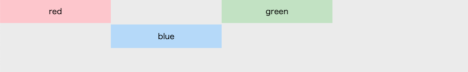
align-selfは任意の要素の位置を個別に設定できるプロパティです。
<div class="container" style="display: flex; align-items: flex-start;">
  <p class="red rectangle">red</p>
  <p class="blue rectangle" style="align-self: center;">blue</p>
  <p class="green rectangle">green</p>
</div>
具体例
上記で説明したFlexboxの具体例をみていきます。
例1. 中央とそのすぐ左への配置
緑をウィンドウの中心におき、そのすぐ左に赤を配置するレイアウトを考えます (上下の要素は目安で入れただけなので、無視してください)。
解答例 (他の解答例も募集中)
<div style="display: flex;">
  <div style="flex-grow: 1; width: 100%; display: flex; justify-content: flex-end;">
    <p class="red square">中心すぐ左</p>
  </div>
  <div class="green square" style="flex-grow: 0; width: 150px;">中心</div>
  <div style="flex-grow: 1; width: 100%;"></div>
</div>
例2. 右側にメニューとそれ以外の範囲
右側にメニューやアイコンなどがあって、左側はそれ以外のものを配置するレイアウトを考えてみます。
解答例 (他の解答例も募集中)
<div style="display: flex;">
  <div class="red" style="display: flex; flex-grow: 1; padding: 12px;">
    左の範囲すべて
  </div>

  <div style="display: flex;">
    <p class="green">右</p>
    <p class="purple">メニュー</p>
  </div>
</div>
例3. 両端にメニュー
両端に2組みずつ要素を配置するレイアウトを考えてみます。
解答例 (他の解答例も募集中)
<div style="display: flex; justify-content: space-between;">
  <div style="display: flex">
    <p class="red">左</p>
    <p class="blue">メニュー</p>
  </div>
  <div style="display: flex;">
    <p class="green">右</p>
    <p class="purple">メニュー</p>
  </div>
</div>
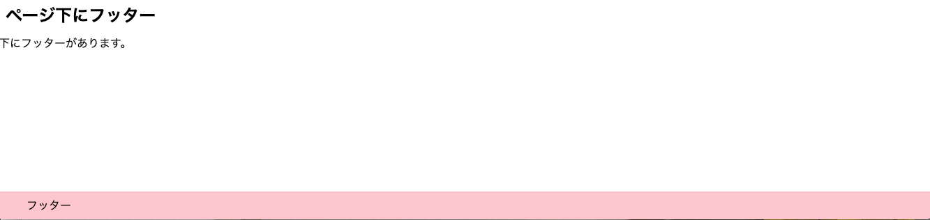
例4. フッター
ページの一番下にフッターを配置するレイアウトを考えます。
解答例 (他の解答例も募集中)
<div style="display: flex; flex-direction: column; justify-content: space-between; min-height: 100vh">
  <div>
    <h2 class="title">ページ下にフッター</h2>
    <div>
      下にフッターがあります。
    </div>
  </div>

  <div class="red" style="display: flex; align-items: center; padding: 0 40px; height: 40px; width: 100%;">
    フッター
  </div>
</div>
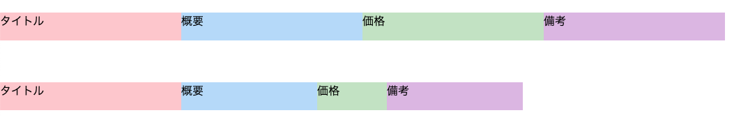
例5. 小さくなり方が項目ごとに違うテーブルのような要素
タイトルの長さを固定にし、ウィンドウを小さくすると、概要, 備考 < 価格の順で小さくなるようなレイアウトを考えます。
解答例 (他の解答例も募集中)
<div style="display: flex; height: 40px;">
  <div class="red" style="width: 260px; flex-shrink: 0;">タイトル</div>
  <div class="blue" style="width: 260px; flex-shrink: 1;">概要</div>
  <div class="green" style="width: 260px; flex-shrink: 4; min-width: 100px;">価格</div>
  <div class="purple" style="width: 260px; flex-shrink: 1;">備考</div>
</div>


- 投稿日:2020-11-23T17:10:40+09:00
どんなデザインでも自由自在! Flexbox入門
はじめに
今回は要素を綺麗に配置するときに、大変役立つFlexboxの使い方について紹介します!
ここでは、要素 (アイテム) が入っている箱のことをコンテナと呼んで説明します。
YouTube動画
動画で学びたい方はこちらもどうぞ!
【YouTube動画】 HTML/CSSのFlexboxについて詳細解説! これでどんなデザインでも自由自在!【Flexbox入門】
GitHub
コードのサンプルをGitHubにアップロードしてます!
Pathや一部コードを修正する必要がありますが、ローカルで試してみたい方はこちらもどうぞ!
https://github.com/yassun-youtube/html-flexbox-samplesコンテナ内の全要素の配置
コンテナに入っている要素の並びを一括で指定したい場合は、flex-direction, justify-content, align-items, align-content, flex-wrapなどがあります。
flex-direction
flex-directionは、コンテナ内の要素をどの軸方向で並べるかを決めるプロパティです。
<div class="container" style="display: flex; flex-direction: <オプション>">
  <div class="red">1</div>
  <div class="blue">2</div>
  <div class="green">3</div>
  <div class="purple">4</div>
</div>
flex-direction: row;
何も指定しない場合、デフォルトはこれになります。
flex-direction: row-reverse;
flex-direction: column;
flex-direction: column-reverse;
justify-content
justify-contentは、コンテナ内の要素をflex-directionの向きに従って、どのようにスペースを空けるかを決めるプロパティです。
<div class="container" style="display: flex; justify-content: <オプション>;">
  <div class="red">1</div>
  <div class="blue">2</div>
  <div class="green">3</div>
  <div class="purple">4</div>
</div>
justify-content: flex-start;
justify-content: flex-end;
justify-content: center;
justify-content: space-between;
justify-content: space-around;
justify-content: space-evenly;
align-items
align-itemsは、コンテナ内の要素をflex-directionの向きに対してどの位置で配置するかを決めるプロパティです。
<div class="container" style="height: 100px; align-items: <オプション>;">
  <div class="red square">1</div>
  <div class="blue square">2</div>
  <div class="green square">3</div>
  <div class="purple square">4</div>
</div>
align-items: flex-start;
align-items: flex-end;
align-items: center;
align-items: stretch;
align-items: baseline;
align-content
align-contentは、ウィンドウ幅が縮められたときに、コンテナ内の要素をどのように折り返すかを決めるプロパティです。
<div class="container" style="display: flex; flex-wrap: wrap; align-content: <オプション>;">
  <div class="red rectangle">1</div>
  <div class="blue rectangle">2</div>
  <div class="green rectangle">3</div>
  <div class="purple rectangle">4</div>
</div>
align-content: flex-start;
align-content: flex-end;
align-content: center;
align-content: stretch;
align-content: space-between;
align-content: space-around;
flex-wrap
flex-wrapはウィンドウ幅が縮められたときに、コンテナ内の要素を複数行にするかどうかを決めるプロパティです。
<div class="container" style="display: flex; flex-wrap: <オプション>;">
  <div class="red rectangle">1</div>
  <div class="blue rectangle">2</div>
  <div class="green rectangle">3</div>
  <div class="purple rectangle">4</div>
</div>
nowrap;
wrap;
wrap-reverse;
コンテナ内の一部の要素の配置
一部の要素だけ配置を変えたい場合のプロパティは、order, flex-grow, flex-shrink, align-selfなどがあります。
order
orderはHTML要素の記述する順番は変えずに、表示順を変えるプロパティです。
下のような書き方をすると、2番目の要素 (青い箱) が4番目に移ります。<div class="container" style='display: flex;'> <div class="red rectangle">1</div> <div class="blue rectangle" style="order: 4">2</div> <div class="green rectangle">3</div> <div class="purple rectangle">4</div> </div>
flex-glow
flex-glowはコンテナ内に隙間があったときに、その隙間を各要素がどの比率で占有するか設定するプロパティです。
<div class="container" style='display: flex;'>
  <p class="red" style="flex-grow: 0; padding: 12px; text-align: center;">1</p>
  <p class="blue" style="flex-grow: 0; padding: 12px; text-align: center;">2</p>
</div>
<div class="container" style='display: flex;'>
  <p class="red" style="flex-grow: 1; padding: 12px; text-align: center;">1</p>
  <p class="blue" style="flex-grow: 1; padding: 12px; text-align: center;">2</p>
</div>
<div class="container" style='display: flex;'>
  <p class="red" style="flex-grow: 1; padding: 12px; text-align: center;">1</p>
  <p class="blue" style="flex-grow: 1; padding: 12px; text-align: center;">2</p>
  <p class="green" style="flex-grow: 2; padding: 12px; text-align: center;">1</p>
</div>
flex-shrink
flex-shrinkはウィンドウを縮めるときに、どの比率で縮めるかを指定できるプロパティです。
<div class="container" style='display: flex;'>
  <p class="red rectangle" style="flex-shrink: 0;">0</p>
  <p class="blue rectangle" style="flex-shrink: 1;">1</p>
  <p class="green rectangle" style="flex-shrink: 2;">2</p>
  <p class="purple rectangle" style="flex-shrink: 1;">1</p>
</div>
align-self
align-selfは任意の要素の位置を個別に設定できるプロパティです。
<div class="container" style="display: flex; align-items: flex-start;">
  <p class="red rectangle">red</p>
  <p class="blue rectangle" style="align-self: center;">blue</p>
  <p class="green rectangle">green</p>
</div>
具体例
上記で説明したFlexboxの具体例をみていきます。
例1. 中央とそのすぐ左への配置
緑をウィンドウの中心におき、そのすぐ左に赤を配置するレイアウトを考えます (上下の要素は目安で入れただけなので、無視してください)。
解答例 (他の解答例も募集中)
<div style="display: flex;">
  <div style="flex-grow: 1; width: 100%; display: flex; justify-content: flex-end;">
    <p class="red square">中心すぐ左</p>
  </div>
  <div class="green square" style="flex-grow: 0; width: 150px;">中心</div>
  <div style="flex-grow: 1; width: 100%;"></div>
</div>
例2. 右側にメニューとそれ以外の範囲
右側にメニューやアイコンなどがあって、左側はそれ以外のものを配置するレイアウトを考えてみます。
解答例 (他の解答例も募集中)
<div style="display: flex;">
  <div class="red" style="display: flex; flex-grow: 1; padding: 12px;">
    左の範囲すべて
  </div>

  <div style="display: flex;">
    <p class="green">右</p>
    <p class="purple">メニュー</p>
  </div>
</div>
例3. 両端にメニュー
両端に2組みずつ要素を配置するレイアウトを考えてみます。
解答例 (他の解答例も募集中)
<div style="display: flex; justify-content: space-between;">
  <div style="display: flex">
    <p class="red">左</p>
    <p class="blue">メニュー</p>
  </div>
  <div style="display: flex;">
    <p class="green">右</p>
    <p class="purple">メニュー</p>
  </div>
</div>
例4. フッター
ページの一番下にフッターを配置するレイアウトを考えます。
解答例 (他の解答例も募集中)
<div style="display: flex; flex-direction: column; justify-content: space-between; min-height: 100vh">
  <div>
    <h2 class="title">ページ下にフッター</h2>
    <div>
      下にフッターがあります。
    </div>
  </div>

  <div class="red" style="display: flex; align-items: center; padding: 0 40px; height: 40px; width: 100%;">
    フッター
  </div>
</div>
例5. 小さくなり方が項目ごとに違うテーブルのような要素
タイトルの長さを固定にし、ウィンドウを小さくすると、概要, 備考 < 価格の順で小さくなるようなレイアウトを考えます。
解答例 (他の解答例も募集中)
<div style="display: flex; height: 40px;">
  <div class="red" style="width: 260px; flex-shrink: 0;">タイトル</div>
  <div class="blue" style="width: 260px; flex-shrink: 1;">概要</div>
  <div class="green" style="width: 260px; flex-shrink: 4; min-width: 100px;">価格</div>
  <div class="purple" style="width: 260px; flex-shrink: 1;">備考</div>
</div>
- 投稿日:2020-11-23T00:58:05+09:00
flexboxで要素の順番を入れ替える。
flexboxでbox内の順番を入れ替える、cssを紹介します。レスポンシブなサイトを使う時に結構使ったりするので覚えておくと便利です。
flexboxの入れ替え、orderプロパティ
以下を使います。
css.parent{ display: flex; } .child{ order: 1; }親クラスに通常通りflexを使い、子クラスにはorder:1;を使います。
このorderを使う事で子要素の並び順を変更する事が出来ます。order初期値は0です。html(使用例)<div class="parent"> <div class="child_1">1</div> <div class="child_2">2</div> <div class="child_3">3</div> </div>css(使用例).parent{ display: flex; } .child_1{ order: 1; } .child_3{ order: 2; }この場合、.child_nはどのような順になるでしょう?答えは2,1,3です。
0から始まる事に注意ましょう。縦並びの入れ替え、flex-directionプロパティ
縦並びの場合の順番の入れ替えはflex-directionを、display:flex;とセットで使います。flexboxが横並びでしか使わなそうなのでなんだか不思議な感じですが、flex-directionがflexのオプション的なイメージだと思います。
で実際の使い方ですが、display:flex;を使用すると、初期値として「flex-direction:row;」が付与されます。これで横並びになってます。そして縦の場合は「flex-direction:column;」を使用し、後から方向を縦に変えます。
試しに先程の使用例に追加してみます。
css(使用例).parent{ display: flex; flex-direction: column; } .child_1{ order: 1; } .child_3{ order: 2; }すると画面上は縦に2,1,3と並んだかと思います。
実践篇
初心者向けの解説に実践していきます。不要な方は見て頂かなくても結構です。
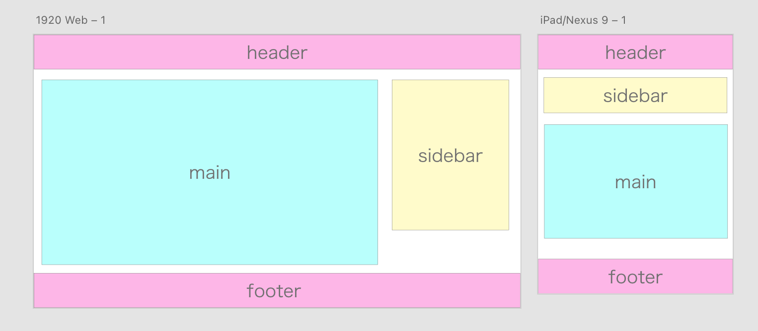
以下のようなワイヤーフレームをXDで作りました。【WF】
見てみると、mainとsidebarの配置がPCとモバイルで変わっている事が分かります。
上記で紹介した,flex,order,flex-directionを使用することで作る事が出来ます。
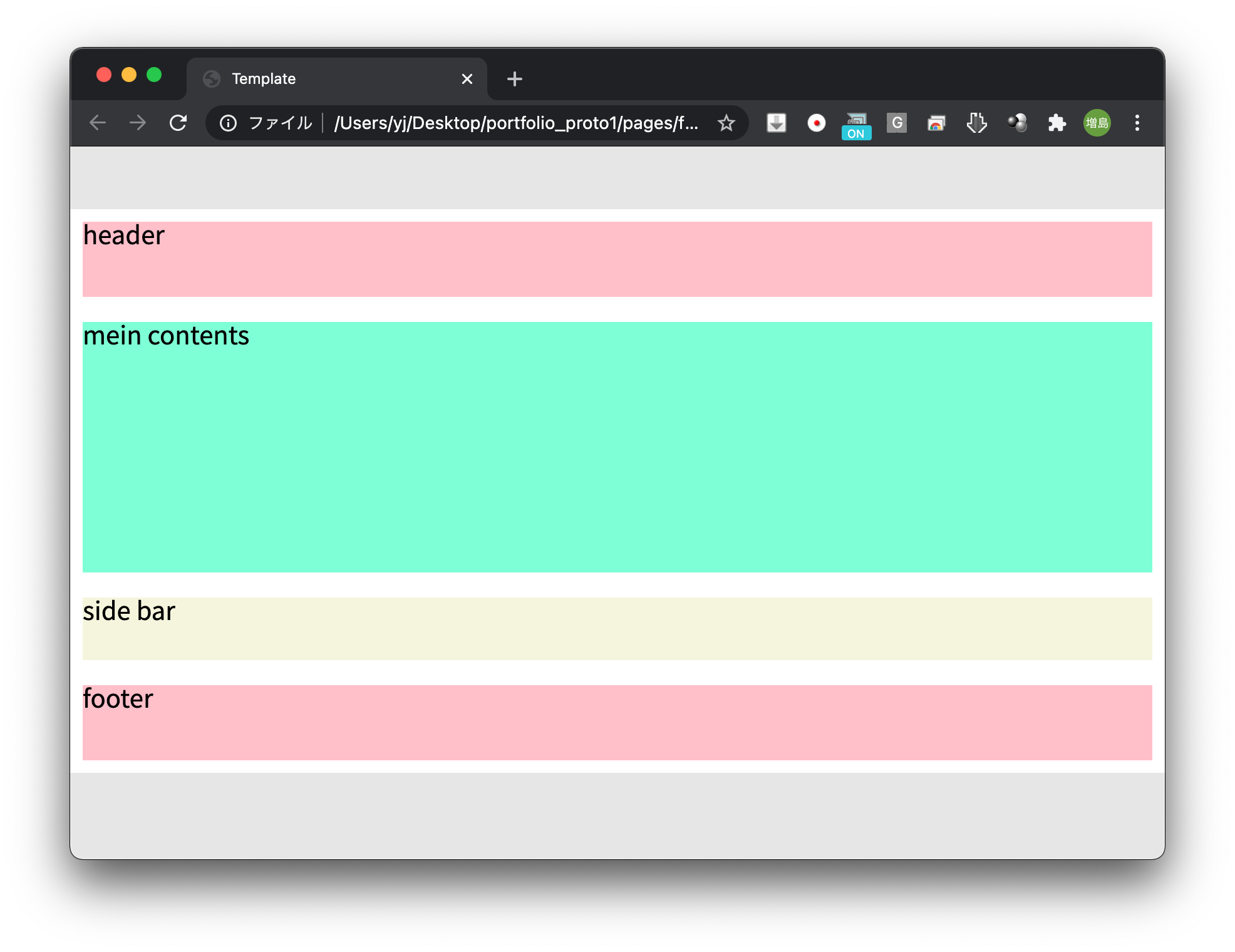
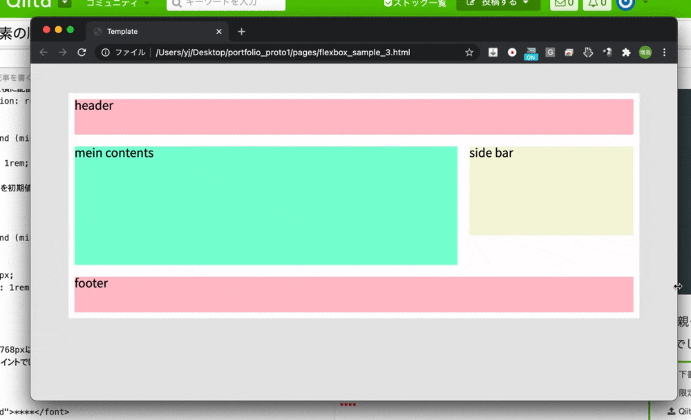
まずは以下のようなHTMLを用意します。html<div class="container"> <header>header</header> <div class="mainContents"> <main>mein contents</main> <aside>side bar</aside> </div> <footer>footer</footer> </div>今回は分かりやすくブロックと最低限のテキストだけにしています。
次にCSSです。モバイル版から作っていきます。css@charset "UTF-8"; /* reset */ *{ margin: 0; padding: 0; box-sizing: border-box; font-family: 'Noto Sans JP', sans-serif; line-height: 1; } ul{ list-style: none; } a{ text-decoration: none; } /* body */ body{ background: rgb(230, 230, 230); } .container{ max-width: 960px; margin: 50px auto; padding: 10px; background: white; } /* header */ header, footer{ width: 100%; height: 3rem; background: pink; } /* main contents */ main{ height: 200px; background: aquamarine; margin: 1rem 0; } /* main contents sidebar */ aside{ width: 100%; height: 50px; background: beige; margin: 1rem 0; }ブラウザを確認しましょう。
最初からhtmlをsidebar→mainの順にしても良いのですが、文章構造的におかしい気もしますし、今回は練習で書いているので気にしないで下さい。
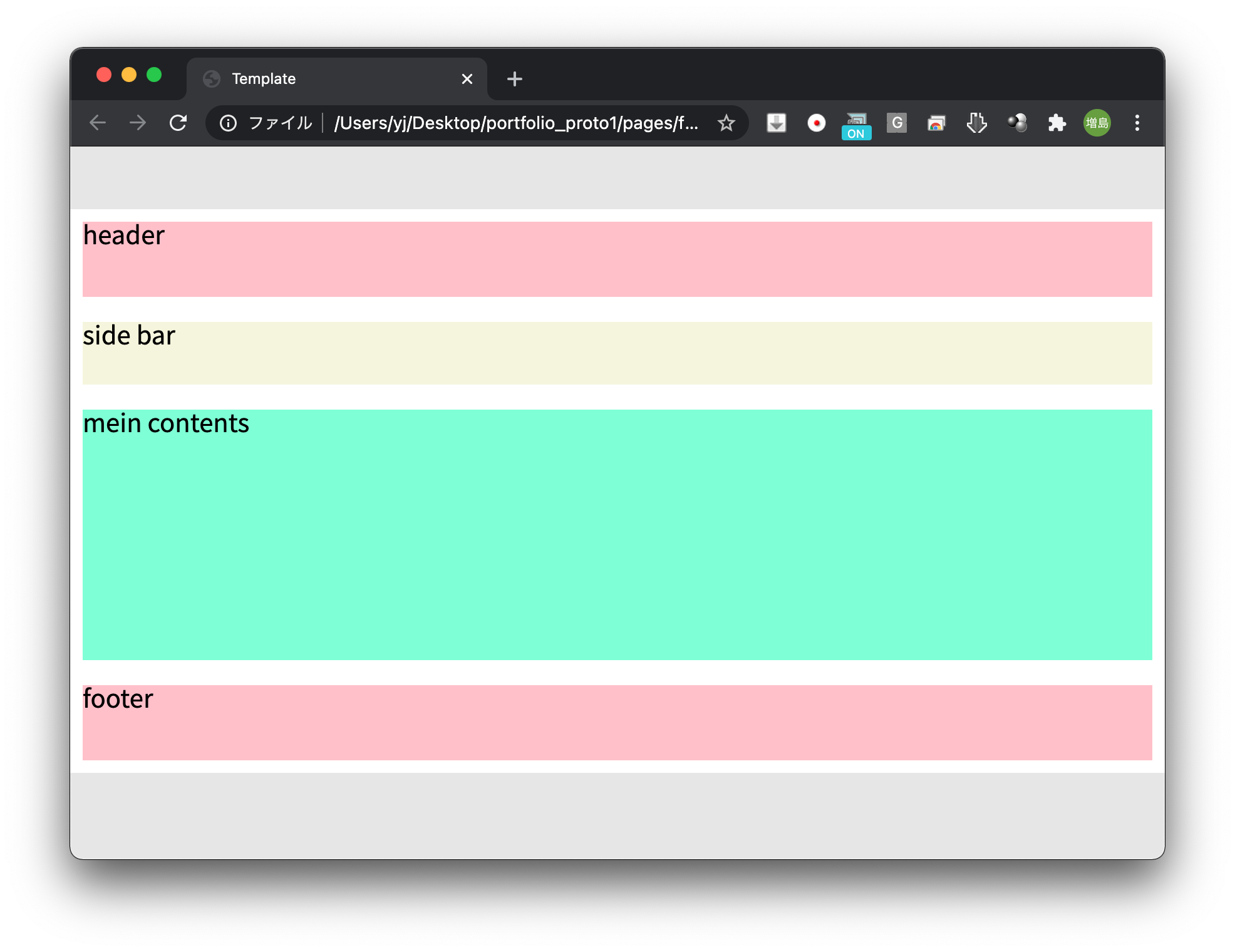
ではmainとsidebarの上下を入れ替えます。css.mainContents{ /* flexboxを縦に配置 */ display: flex; flex-direction: column; } main{ height: 200px; background: aquamarine; /* bottomのみに変更 */ margin-bottom: 1rem; /* 配置の順位を2番目に */ order: 1; }親クラス(.mainContents)に対し、flexで横並び、flex-directionで縦方向に変更してます。
子要素(main)には、配置の順を2番目にするためorder:1;を付与しました。
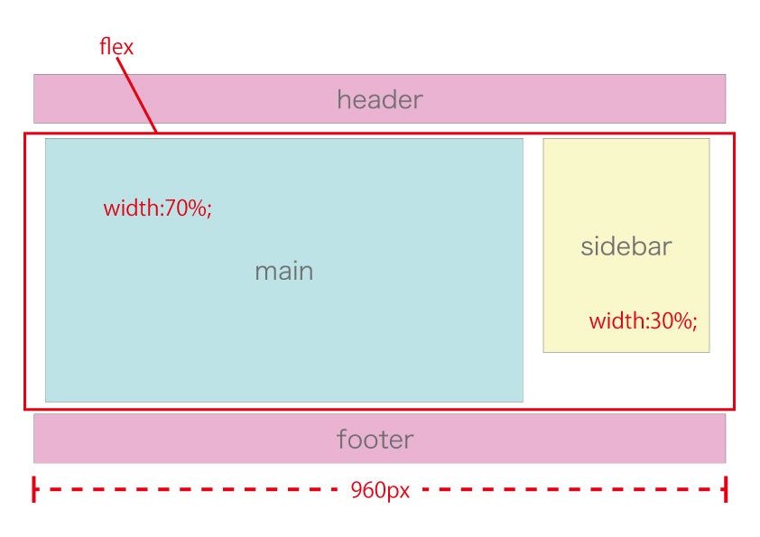
今度はPC版のサイズのコードを書き足していきます。
ブレイクポイントは768pxとします。
図解すると以下のような構成に。
横並びにし、mainとsidebarの割合を7:3にします。
css/* 768px以上のcss */ @media screen and (min-width: 768px){ .mainContents{ /* flexboxを横に配置(初期値に戻す) */ flex-direction: row; } } @media screen and (min-width: 768px){ main{ margin-top: 1rem; width: 70%; /* 配置の順位を初期値に戻す */ order: 0; } } @media screen and (min-width: 768px){ aside{ width: 30%; height: 150px; margin-left: 1rem; } }mediaクエリを使用し768px以上で切り替わるようにしてます。親クラスのflex-direction、子クラスorderを初期値に戻すところがポイントでしょうか?画面を確認します。
このように画面が切り替わればOKです。以下に完成形コードを載せておきます。marginの配置など少し調整しているので見比べておいて下さい。
html<!DOCTYPE html> <html lang="ja"> <head> <meta charset="UTF-8"> <meta name="viewport" content="width=device-width, initial-scale=1.0"> <title>flexbox_sample_3s</title> <!-- Google Font --> <link rel="preconnect" href="https://fonts.gstatic.com"> <link href="https://fonts.googleapis.com/css2?family=Noto+Sans+JP:wght@400;700&display=swap" rel="stylesheet"> <!-- CSS --> <link rel="stylesheet" href="../assets/css/flexbox_sample_3.css"> </head> <body> <div class="container"> <header>header</header> <div class="mainContents"> <main>mein contents</main> <aside>side bar</aside> </div> <footer>footer</footer> </div> </body> </html>css@charset "UTF-8"; /* reset */ *{ margin: 0; padding: 0; box-sizing: border-box; font-family: 'Noto Sans JP', sans-serif; line-height: 1; } ul{ list-style: none; } a{ text-decoration: none; } /* body */ body{ background: rgb(230, 230, 230); } .container{ max-width: 960px; margin: 50px auto; padding: 10px; background: white; } /* header */ header, footer{ width: 100%; height: 3rem; background: pink; } /* main contents */ .mainContents{ margin: 1rem 0; /* flexboxを縦に配置 */ display: flex; flex-direction: column; } /* 768px以上のcss */ @media screen and (min-width: 768px){ .mainContents{ /* flexboxを横に配置(初期値に戻す) */ flex-direction: row; } } main{ height: 200px; background: aquamarine; /* 配置の順位を2番目に */ order: 1; } @media screen and (min-width: 768px){ main{ width: 70%; /* 配置の順位を初期値に戻す */ order: 0; } } /* main contents sidebar */ aside{ width: 100%; height: 50px; background: beige; margin-bottom: 1rem; } @media screen and (min-width: 768px){ aside{ width: 30%; height: 150px; margin-left: 1rem; } }