- 投稿日:2020-09-28T23:17:10+09:00
[Xcode12.0.1]SpriteKitで全画面表示する
今回久々にSpriteKitに触れる機会があり、開始早々ハマりポイントがあったので備忘もかねて残しておきます。
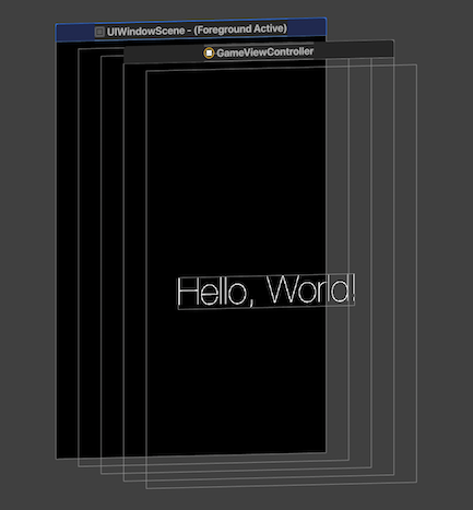
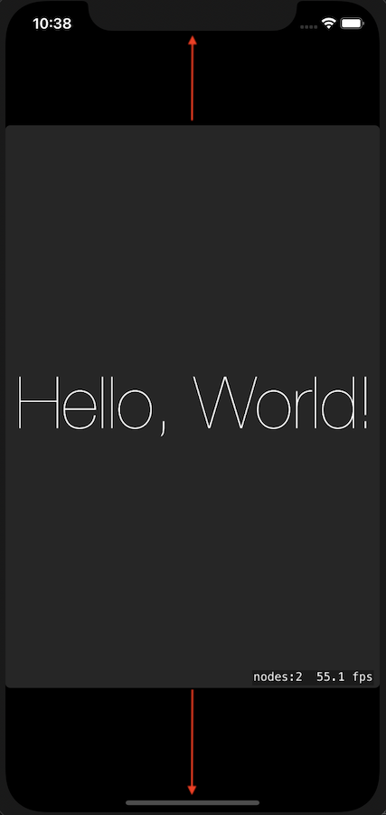
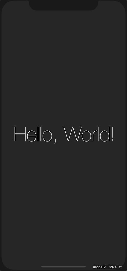
解決したかった課題
対応前 対応後 対応前のスクショの赤矢印のように、画面中央にあるSKViewの範囲を対応後のように画面全体に広げたかった。
解決方法
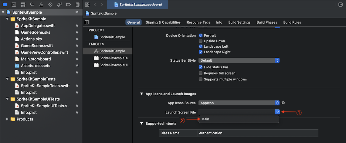
色々調べた割に、LaunchScreenFileを指定するだけという対応で呆気なく解決しました。。。
試行錯誤
折角なので、どんな感じで翻弄されていたかという恥ずかしい部分もさらけ出そうかと思います。
- AutoLayoutの問題では?と思ってGameViewControllerのルートビューをUIViewに変更し、そこにSKViewを制約つけて貼る → ?♀️
- サイズを指定しようと思い、SKViewのFrameサイズを上書きする → ?♀️
- ビューデバッガを使って確認したところ、ルートがUIWindowSceneとなっていたので、もしやSceneDelegateかな?と思いSceneDelegateを追加する → ?♀️
- 色々ググって、やっとLaunchScreenFileに気づく → ?♂️
これで1時間近く浪費してしまいました。。。
これからは己を過信せず、最初からググります。反省。。。
- 投稿日:2020-09-28T22:35:33+09:00
別画面に値を渡す方法について
画面遷移時に値を渡す
画面遷移時に遷移先の変数varに値を渡すことで、別の画面に値を渡すことができます。
ViewControllerlet secondViewController = self.storyboard?.instantiateViewController(withIdentifier: "second") as! secondViewController secondViewController. value = "value" self.present(secondViewController, animated: true, completion: nil)secondViewControllerclass secondViewController: UIViewController { var value = String() override func viewDidLoad() { super.viewDidLoad() } }画面遷移時以外で値を渡す
tabBarControllerは、最初にタブを切り替えた時に画面が生成され、削除されないため
画面遷移時以外に値を渡す方法が必要になります。プロトコルを使用して、特定の処理後に実行させることで、別の画面に値を渡したり処理を行うことができます。
ViewControllervar process: anotherScreenProcess! class ViewController: UIViewController { override func viewDidLoad() { super.viewDidLoad() self.process = secondViewController() as anotherScreenProcess self.process.sendValue() } }secondViewControllerprotocol anotherScreenProcess { func sendValue() } class secondViewController: UIViewController, anotherScreenProcess { override func viewDidLoad() { super.viewDidLoad() } // 別画面からの処理 func sendValue() { } }tabBarControllerについて
tabBarControllerは最初の画面遷移時のみ画面が作成され、削除されません。
そのため、プロトコルの使用以外に作成したtabBarControllerを削除することで、
画面自体の再作成を行うことができます。self.tabBarController!.viewControllers![1].dismiss(animated: true, completion: nil)
- 投稿日:2020-09-28T22:18:32+09:00
[Swift] UInt64型の整数を[UInt8]に変換する。
ググると二つの方法が出てきます。
extension UInt64{
    var uint8Array:[UInt8]{
        var x = self.bigEndian
        let data = Data(bytes: &x, count: MemoryLayout<UInt64>.size)
        return data.map{$0}
    }

    var uint8Array2:[UInt8]{
        var bigEndian:UInt64 = self.bigEndian
        let count = MemoryLayout<UInt64>.size
        let bytePtr = withUnsafePointer(to: &bigEndian) {
            $0.withMemoryRebound(to: UInt8.self, capacity: count) {
                UnsafeBufferPointer(start: $0, count: count)
            }
        }
        return Array(bytePtr)
    }
}
どっちでも同じ結果が得られます。折角なので速度も比較してみました。
func testPerformanceUInt64ToUInt8() throws{
    let data = (0..<1000000).map{_ in UInt64.random(in: 0..<UInt64.max)}
    self.measure {
        let uint8s = data.map{$0.uint8Array}
        print(uint8s.count)
    }
}

func testPerformanceUInt64ToUInt8_2() throws{
    let data = (0..<1000000).map{_ in UInt64.random(in: 0..<UInt64.max)}
    self.measure {
        let uint8s = data.map{$0.uint8Array2}
        print(uint8s.count)
    }
}
Test Case '[testPerformanceUInt64ToUInt8]' measured [Time, seconds] average: 0.176, relative standard deviation: 9.656%, values: [0.227525, 0.172769, 0.170525, 0.170571, 0.170574, 0.170578, 0.170615, 0.170248, 0.170302, 0.170817] Test Case '[testPerformanceUInt64ToUInt8_2]' measured [Time, seconds] average: 0.101, relative standard deviation: 8.491%, values: [0.126460, 0.098508, 0.098236, 0.097850, 0.097855, 0.097873, 0.097932, 0.097878, 0.097662, 0.097690]二つ目の方が速度は速そうです。一つ目の書き方の方が分かりやすいと感じますが、パフォーマンスが必要な場面では二つ目を使った方がいいでしょう。
参考
- 投稿日:2020-09-28T21:51:30+09:00
【Swift】UICollectionViewでInstagramのプロフィールっぽいUIをコードだけで実装してみた without storyboard
はじめに
今回はUICollectionViewでInstagramのプロフィールっぽいUIをコードだけで実装してみる。
という内容ですこの記事が誰かの役に立てば幸いです
ただただSwift初心者がUIを真似して作っただけなので、何かと至らない点があるかと思いますが、
コードの書き方、間違い等、お気づきのところあれば是非アドバイスくださると助かります!!書き始めたの3ヶ月前、、ピエンパオンが止まりません
完成形
[めっちゃ起業家に憧れるインスタグラマー]
対象読者
・ iOSアプリ開発初心者の方
・ UICollectionViewの使い方を知りたい方
・ StoryBoardを使用せずに開発してみたい方
・ InstagramのUIが好きな方開発環境
・ Version 11.3 (11C29)
・ Swift 5完成版 Github
以下にソースコードを載せておきます
https://github.com/Isseymiyamoto/FamousAppUI/tree/master/Instagram_profile/Instagram_profile
ファイル構成
今回、データの取得等の通信は行わないため
View、Controllerフォルダ内に新しいファイルを追加していきます
Utils>Extensions.swiftではLayout関連の処理を簡素化するための関数を入れていますが、
こちらの記事では詳細を記述しないので、Githubよりコピペしてくださると助かります
さて、実装に移りましょう
実装の手順
1、2に関しては、TabBarが必要なければスキップしてください
- 利用するcontrollerファイルの作成
- UITabBarControllerを用いて、TabBarと表示するControllerの決定
- SceneDelegate.swiftにて、起動時に表示するControllerの決定
- Viewフォルダにて、ProfileHeaderCellの作成
- Viewフォルダにて、FilterViewの作成
- Viewフォルダにて、投稿写真表示用のPostCellの作成
- 合体 and 完成!!
1.利用するControllerファイルの作成
ここでは、2で実装するTabBarと連携するためのControllerファイルを作成しましょう
Instagramでは表示するタブアイコンが5つありますので、5つのファイルをControllerフォルダ直下に作成しますProfileController.swiftimport UIKit class ProfileController: UICollectionViewController{ override func viewDidLoad() { super.viewDidLoad() } }その他の4ファイルについては以下で結構です
FeedController.swiftimport UIKit class FeedController: UIViewController{ override func viewDidLoad() { super.viewDidLoad() // navigationBarに表示したい文字列を入れましょう navigation.item = "投稿" } }2.UITabBarControllerを用いて、TabBarと表示するControllerの決定
1にて作成したファイルをTabBarと連携させるために、
controllerフォルダ直下にMainTabController.swiftを作成しますMainTabController.swiftimport UIKit class MainTabController: UITabBarController{ // MARK: - Lifecycle override func viewDidLoad() { super.viewDidLoad() configureUI() configureViewControllers() } // MARK: - Helpers func configureUI(){ view.backgroundColor = .white tabBar.tintColor = .black } func configureViewControllers(){ let feed = FeedController() let nav1 = templateNavigationController(image: UIImage(systemName: "house"), rootViewController: feed) let search = SearchController() let nav2 = templateNavigationController(image: UIImage(systemName: "magnifyingglass"), rootViewController: search) let upload = UploadPostController() let nav3 = templateNavigationController(image: UIImage(systemName: "plus.app"), rootViewController: upload) let notification = NotificationController() let nav4 = templateNavigationController(image: UIImage(systemName: "heart"), rootViewController: notification) // 2件通知きてるかのように表示 nav4.tabBarItem.selectedImage = UIImage(systemName: "heart.fill") nav4.tabBarItem.badgeValue = "2" let profile = ProfileController(collectionViewLayout: UICollectionViewFlowLayout()) let nav5 = templateNavigationController(image: UIImage(systemName: "person"), rootViewController: profile) // tabバーに配置するControllerを決定 viewControllers = [nav1, nav2, nav3, nav4, nav5] // profileControllerを初期表示 selectedIndex = 4 } // 任意のrootViewController、tabIconイメージを設定する関数, configureViewControllers内で使用 func templateNavigationController(image: UIImage?, rootViewController: UIViewController) -> UINavigationController{ let nav = UINavigationController(rootViewController: rootViewController) nav.tabBarItem.image = image nav.navigationBar.tintColor = .white return nav } }3.SceneDelegate.swiftにて、起動時に表示するControllerの決定
さて、
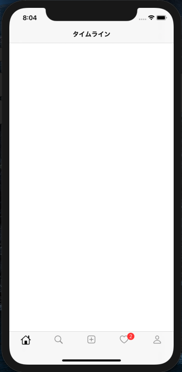
SceneDelegate.swiftを編集して、MainTabControllerを起動時に表示するように設定しましょうSceneDelegate.swiftclass SceneDelegate: UIResponder, UIWindowSceneDelegate { // 省略 func scene(_ scene: UIScene, willConnectTo session: UISceneSession, options connectionOptions: UIScene.ConnectionOptions) { guard let scene = scene as? UIWindowScene else { return } window = UIWindow(windowScene: scene) window?.rootViewController = MainTabController() window?.makeKeyAndVisible() } // 省略 }こちら設定後Simulatorを立ち上げると以下のように表示されれば完璧です
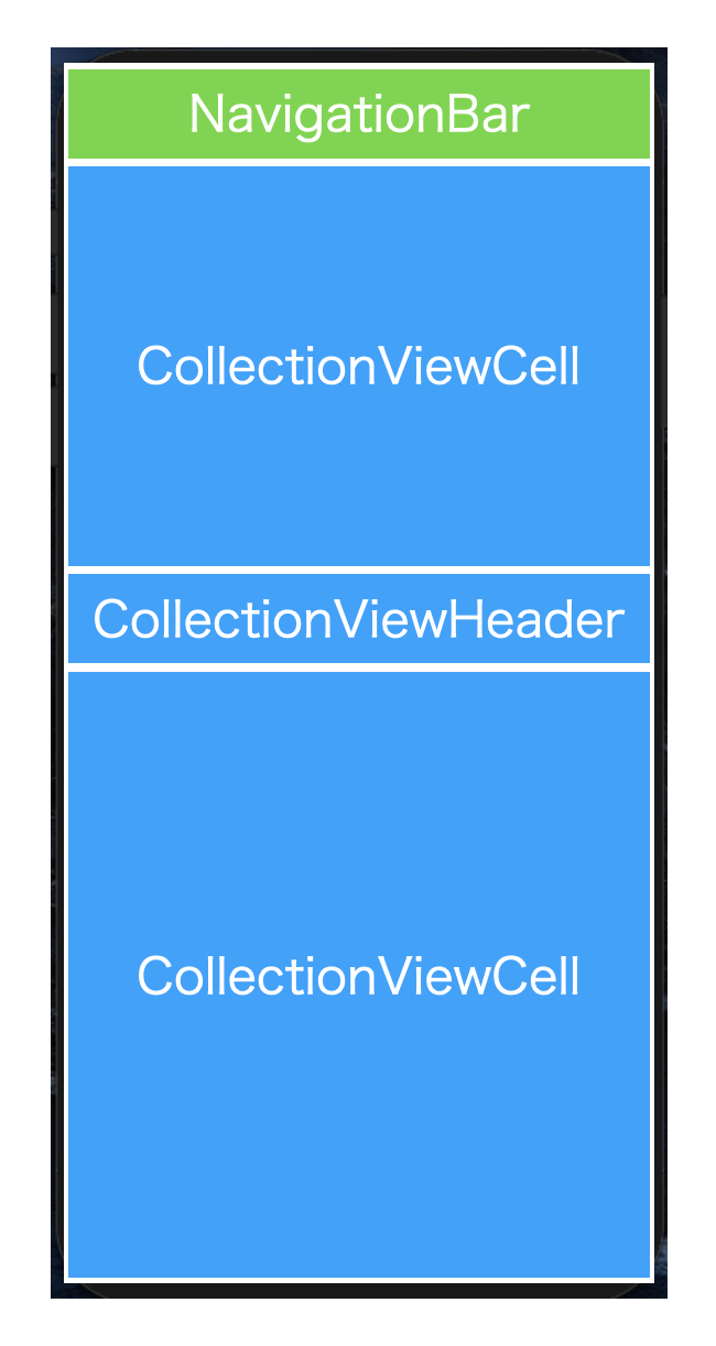
4.Viewフォルダにて、ProfileHeaderCellの作成
次に、ProfileControllerに適用するViewの作成に入ります
以下のような形式で作っていきますが、まずここでプロフィール概要部分のProfileHeaderCellを作りましょう
View直下にProfileHeader.swiftをファイルを作成しますProfileHeader.swiftimport UIKit // ハリボテなので無くても良い protocol ProfileHeaderDelegate: class { func handleEditProfile(_ header: ProfileHeader) } class ProfileHeader: UICollectionViewCell{ // MARK: - Properties // ハリボテなので無くても良い weak var delegate: ProfileHeaderDelegate? private let profileImageView: UIImageView = { let iv = UIImageView() iv.contentMode = .scaleAspectFit iv.clipsToBounds = true iv.image = UIImage(named: "適当に写真入れてみてください") iv.layer.borderColor = UIColor.black.cgColor return iv }() private lazy var postCountButton = makeStatsButton(withNumber: "12") private lazy var followingCountButton = makeStatsButton(withNumber: "320") private lazy var followerCountButton = makeStatsButton(withNumber: "1000") private lazy var postCountLabel = makeStatsTitle(withTitle: "投稿") private lazy var followingCountLabel = makeStatsTitle(withTitle: "フォロー中") private lazy var followerCountLabel = makeStatsTitle(withTitle: "フォロワー") private let fullnameLabel: UILabel = { let label = UILabel() label.text = "オナマエー" label.font = UIFont.boldSystemFont(ofSize: 14) return label }() private let bioLabel: UILabel = { let label = UILabel() label.text = "これはInstagramのプロフィールのUIをひたすらに真似する試みです。そうです。ただただ真似るだけです。" label.font = UIFont.systemFont(ofSize: 14) label.numberOfLines = 3 return label }() private let editProfileButton: UIButton = { let button = UIButton(type: .system) button.setTitle("プロフィールを編集", for: .normal) button.setTitleColor(.black, for: .normal) button.addTarget(self, action: #selector(handleEditProfileButtonTapped), for: .touchUpInside) button.titleLabel?.font = UIFont.boldSystemFont(ofSize: 14) button.layer.borderColor = UIColor.lightGray.cgColor button.layer.borderWidth = 1 button.layer.cornerRadius = 4 button.backgroundColor = .white return button }() private let storiesPlusButton: UIButton = { let button = UIButton(type: .system) button.setImage(UIImage(systemName: "plus"), for: .normal) button.tintColor = .black button.backgroundColor = .clear button.layer.borderColor = UIColor.lightGray.cgColor button.layer.borderWidth = 0.75 return button }() private let storiesPlusLabel: UILabel = { let label = UILabel() label.text = "新規" label.textAlignment = .center label.font = UIFont.systemFont(ofSize: 10) return label }() // MARK: - Lifecycle override init(frame: CGRect) { super.init(frame: frame) backgroundColor = .systemGroupedBackground let postCountStack = makeStatsStackView(button: postCountButton, label: postCountLabel) let followingCountStack = makeStatsStackView(button: followingCountButton, label: followingCountLabel) let followerCountStack = makeStatsStackView(button: followerCountButton, label: followerCountLabel) let infoStack = UIStackView(arrangedSubviews: [postCountStack, followingCountStack, followerCountStack]) infoStack.axis = .horizontal infoStack.alignment = .center infoStack.distribution = .fillEqually addSubview(profileImageView) profileImageView.anchor(top: safeAreaLayoutGuide.topAnchor, left: leftAnchor, paddingTop: 16, paddingLeft: 16) profileImageView.setDimensions(width: 96, height: 96) profileImageView.layer.cornerRadius = 96 / 2 addSubview(infoStack) infoStack.centerY(inView: profileImageView) infoStack.anchor(left: profileImageView.rightAnchor, right: rightAnchor, paddingLeft: 16, paddingRight: 32) addSubview(fullnameLabel) fullnameLabel.anchor(top: profileImageView.bottomAnchor, left: leftAnchor, right: rightAnchor, paddingTop: 16, paddingLeft: 16, paddingRight: 16) addSubview(bioLabel) bioLabel.anchor(top: fullnameLabel.bottomAnchor, left: leftAnchor, right: rightAnchor, paddingTop: 4, paddingLeft: 16, paddingRight: 16) addSubview(editProfileButton) editProfileButton.anchor(top: bioLabel.bottomAnchor, left: leftAnchor, right: rightAnchor, paddingTop: 16, paddingLeft: 16, paddingRight: 16 ) addSubview(storiesPlusButton) storiesPlusButton.anchor(top: editProfileButton.bottomAnchor, left: leftAnchor, paddingTop: 16, paddingLeft: 16) storiesPlusButton.setDimensions(width: 64, height: 64) storiesPlusButton.layer.cornerRadius = 64 / 2 addSubview(storiesPlusLabel) storiesPlusLabel.centerX(inView: storiesPlusButton) storiesPlusLabel.anchor(top: storiesPlusButton.bottomAnchor, paddingTop: 4) } required init?(coder: NSCoder) { fatalError("init(coder:) has not been implemented") } // MARK: - Selectors // ハリボテなので無くても良い @objc func handleEditProfileButtonTapped(){ delegate?.handleEditProfile(self) } // MARK: - Helpers // ボタンと詳細数を縦並びに揃えるStackView作成用 fileprivate func makeStatsStackView(button: UIButton, label: UILabel) -> UIStackView{ let stack = UIStackView(arrangedSubviews: [button, label]) stack.axis = .vertical stack.alignment = .center stack.setDimensions(width: 160, height: 40) return stack } // 投稿数やフォロワー等の表示ボタン作成用 private func makeStatsButton(withNumber number: String) -> UIButton{ let button = UIButton(type: .system) button.setTitle(number, for: .normal) button.setTitleColor(.black, for: .normal) button.titleLabel?.font = UIFont.boldSystemFont(ofSize: 16) return button } // 投稿数やフォロワー等の詳細数表示ラベル作成用 private func makeStatsTitle(withTitle title: String) -> UILabel{ let label = UILabel() label.text = title label.textAlignment = .center label.font = UIFont.systemFont(ofSize: 14) return label } }こちらをProfileControllerに適用してみましょう(5, 6では一旦すっ飛ばします)
ProfileController.swiftimport UIKit private let profileHeaderCell = "ProfileHeaderCell" class ProfileController: UICollectionViewController{ // MARK: - Lifecycle override func viewDidLoad() { super.viewDidLoad() configureUI() } // MARK: - Selectors // お飾り @objc func handleRightButtonTapped(){ print("DEBUG: you pressed the button..") } @objc func handleRefresh(){ // データがないので何もしません collectionView.refreshControl?.beginRefreshing() collectionView.refreshControl?.endRefreshing() } // MARK: - Helpers // 全体UIの設定 func configureUI(){ view.backgroundColor = .systemGroupedBackground configureNavigationBar() configureCollectionView() // 下にスワイプしてリロードしてる風設定 let refreshControl = UIRefreshControl() refreshControl.addTarget(self, action: #selector(handleRefresh), for: .valueChanged) collectionView.refreshControl = refreshControl } // navigationBarに関する諸設定 func configureNavigationBar(){ navigationController?.navigationBar.tintColor = .black navigationController?.navigationBar.barTintColor = .systemGroupedBackground navigationController?.navigationBar.isTranslucent = false navigationController?.navigationBar.shadowImage = UIImage() navigationItem.title = "user_id" navigationItem.rightBarButtonItem = UIBarButtonItem(image: UIImage(systemName: "line.horizontal.3"), style: .plain, target: self, action: #selector(handleRightButtonTapped)) } func configureCollectionView(){ collectionView.backgroundColor = .systemGroupedBackground // ProfileHeaderの登録 collectionView.register(ProfileHeader.self, forCellWithReuseIdentifier: profileHeaderCell) // collectionViewをtabBarにかからないように配置 guard let tabHeight = tabBarController?.tabBar.frame.height else { return } collectionView.contentInset.bottom = tabHeight } } // MARK: - UICollectionViewDataSource / UICollectionViewDelegate extension ProfileController{ // セクション数はひとまず1に設定 → PostCell設定後2に変更 override func numberOfSections(in collectionView: UICollectionView) -> Int { return 1 } // セクション内に表示するセルの数 → ProfileHeaderは1つで良いので一旦1 override func collectionView(_ collectionView: UICollectionView, numberOfItemsInSection section: Int) -> Int { return 1 } // 表示するcellの設定 override func collectionView(_ collectionView: UICollectionView, cellForItemAt indexPath: IndexPath) -> UICollectionViewCell { let cell = collectionView.dequeueReusableCell(withReuseIdentifier: profileHeaderCell, for: indexPath) as! ProfileHeader return cell } } // MARK: - UICollectionViewDelegateFlowLayout extension ProfileController: UICollectionViewDelegateFlowLayout{ // cellのサイズ設定 → 適当に高さは変えてください func collectionView(_ collectionView: UICollectionView, layout collectionViewLayout: UICollectionViewLayout, sizeForItemAt indexPath: IndexPath) -> CGSize { return CGSize(width: view.frame.width, height: 340) } }ここまででSimulatorを立ち上げるとProfileHeader箇所は表示されましたでしょう!多分!
ここからサクッと最後まで終わらせましょう5.Viewフォルダにて、FilterViewの作成
FilterViewは、自分の投稿一覧or友達がタグ付けした一覧を表示するためのフィルター部分です
ProfileController上では、indexPath.section = 1 のheaderとして表示しますさて、FilterViewですが、UICollectionReusableViewの中にUICollectionViewを設置する形で作成します
はい、つまりUICollectionViewCellのFilterViewCellも別ファイルで作ります。頑張りましょうProfileFilterView.swiftimport UIKit private let profileHeaderCellIdentifier = "profileHeaderCell" // ハリボテ protocol ProfileFilterViewDelegate: class { func filterView(_ view: ProfileFilterView, didSelect index: Int) } class ProfileFilterView: UICollectionReusableView { // MARK: - Properties // ハリボテ weak var delegate: ProfileFilterViewDelegate? // viewに載せていくcollectionView lazy var collectionView: UICollectionView = { let layout = UICollectionViewFlowLayout() let cv = UICollectionView(frame: .zero, collectionViewLayout: layout) cv.backgroundColor = .systemGroupedBackground cv.delegate = self cv.dataSource = self return cv }() // こいつをアニメーションさせていい感じに選択した感を演出 private let underlineView: UIView = { let view = UIView() view.backgroundColor = .black return view }() // profileHeaderCellとの境界線 private let abovelineView: UIView = { let view = UIView() view.backgroundColor = .lightGray return view }() // MARK: - Lifecycle override init(frame: CGRect) { super.init(frame: frame) collectionView.register(ProfileFilterCell.self, forCellWithReuseIdentifier: identifier) // 初期化時にisSelected = trueにするcellを決定する let selectedIndexPath = IndexPath(row: 0, section: 0) collectionView.selectItem(at: selectedIndexPath, animated: true, scrollPosition: .left) addSubview(collectionView) // 親viewいっぱいにcollectionViewを広げる collectionView.addConstraintsToFillView(self) } override func layoutSubviews() { addSubview(abovelineView) abovelineView.anchor(left: leftAnchor, bottom: topAnchor, width: frame.width, height: 0.5) addSubview(underlineView) underlineView.anchor(left: leftAnchor, bottom: bottomAnchor, width: frame.width / 2, height: 1) } required init?(coder: NSCoder) { fatalError("init(coder:) has not been implemented") } } // MARK: - UICollectionViewDataSource extension ProfileFilterView: UICollectionViewDataSource{ func collectionView(_ collectionView: UICollectionView, numberOfItemsInSection section: Int) -> Int { // tag or post の 2択なので return 2 でも ok return ProfileFilterOptions.allCases.count } func collectionView(_ collectionView: UICollectionView, cellForItemAt indexPath: IndexPath) -> UICollectionViewCell { let cell = collectionView.dequeueReusableCell(withReuseIdentifier: identifier, for: indexPath) as! ProfileFilterCell // cell側のoptionを更新 let option = ProfileFilterOptions(rawValue: indexPath.row) cell.option = option return cell } } // MARK: - UICollectionViewDelegate extension ProfileFilterView: UICollectionViewDelegate{ func collectionView(_ collectionView: UICollectionView, didSelectItemAt indexPath: IndexPath) { let cell = collectionView.cellForItem(at: indexPath) // underlineViewをtouchUpInsideされたcellのx座標に0.3秒で移動させる let xPosition = cell?.frame.origin.x ?? 0 UIView.animate(withDuration: 0.3) { self.underlineView.frame.origin.x = xPosition } // ハリボテ → 本来ProfileControllerにて表示画像変更できるように処理書く delegate?.filterView(self, didSelect: indexPath.row) } } // MARK: - UICollectionViewDelegateFlowLayout extension ProfileFilterView: UICollectionViewDelegateFlowLayout{ func collectionView(_ collectionView: UICollectionView, layout collectionViewLayout: UICollectionViewLayout, sizeForItemAt indexPath: IndexPath) -> CGSize { let count = CGFloat(ProfileFilterOptions.allCases.count) return CGSize(width: frame.width / count, height: frame.height) } // item同士の隙間がないよう設置 func collectionView(_ collectionView: UICollectionView, layout collectionViewLayout: UICollectionViewLayout, minimumInteritemSpacingForSectionAt section: Int) -> CGFloat { return 0 } }ProfileFilterViewCell.swiftimport UIKit // 投稿 or tag付け投稿一覧どっちやねんを見極めます enum ProfileFilterOptions: Int, CaseIterable{ case post case tag var systemImage: UIImage? { switch self { case .post: return UIImage(systemName: "rectangle.split.3x3") case .tag: return UIImage(systemName: "person.crop.rectangle") } } } class ProfileFilterViewCell: UICollectionViewCell{ // MARK: - Properties // 投稿 or tag付け投稿一覧どっちやねんが更新されたら、imageViewのimageを変更するように設定 var option: ProfileFilterOptions! { didSet{ imageView.image = option.systemImage } } private var imageView: UIImageView = { let iv = UIImageView() return iv }() // 選択された場合と否かでtintColor変更 override var isSelected: Bool { didSet{ imageView.tintColor = isSelected ? .black : .lightGray } } // MARK: - Lifecycle override init(frame: CGRect) { super.init(frame: frame) addSubview(imageView) imageView.tintColor = .lightGray imageView.setDimensions(width: 24, height: 24) imageView.center(inView: self) } required init?(coder: NSCoder) { fatalError("init(coder:) has not been implemented") } }さあ、そろそろ記事書くのに息切れしてきましたが、工程6に進みましょう
6.Viewフォルダにて、投稿写真表示用のPostCellの作成
さあ、最後にただただ写真を表示するだけのcellをサクッと作りましょう!!
PostCell.swiftimport UIKit class PostCell: UICollectionViewCell{ // MARK: - Properties let postImageView: UIImageView = { let iv = UIImageView() iv.contentMode = .scaleAspectFill iv.clipsToBounds = true return iv }() // MARK: - Lifecycle override init(frame: CGRect) { super.init(frame: frame) self.layer.borderColor = UIColor.white.cgColor self.layer.borderWidth = 0.5 addSubview(postImageView) postImageView.addConstraintsToFillView(self) postImageView.center(inView: self) } required init?(coder: NSCoder) { fatalError("init(coder:) has not been implemented") } }一気に人生イージーモードに突入したので、本当に最後にProfileControllerにて全部合致しましょう!!
7.合体 and 完成!!
ProfileController.swiftimport UIKit private let filterViewIdentifier = "filterView" private let profileHeaderCellIdentifier = "profileHeaderCell" private let postCellIdentifier = "postCell" class ProfileController: UICollectionViewController{ // MARK: - Properties // post cell箇所に適応したいハリボテUIIMage配列を作成 private var imageArray: [UIImage?] = [UIImage(named: "jeff"), UIImage(named: "zack"), UIImage(named: "elon"), UIImage(named: "steve"), UIImage(named: "jeff"), UIImage(named: "zack"), UIImage(named: "elon"), UIImage(named: "steve"), UIImage(named: "jeff"), UIImage(named: "zack"), UIImage(named: "elon"), UIImage(named: "steve"), UIImage(named: "jeff"), UIImage(named: "zack"), UIImage(named: "elon"), UIImage(named: "steve")] // MARK: - Lifecycle override func viewDidLoad() { super.viewDidLoad() configureUI() } // MARK: - Selectors @objc func handleRightButtonTapped(){ print("DEBUG: you pressed the button..") } @objc func handleRefresh(){ // データがないので何もしません collectionView.refreshControl?.beginRefreshing() collectionView.refreshControl?.endRefreshing() } // MARK: - Helpers func configureUI(){ view.backgroundColor = .systemGroupedBackground configureNavigationBar() configureCollectionView() let refreshControl = UIRefreshControl() refreshControl.addTarget(self, action: #selector(handleRefresh), for: .valueChanged) collectionView.refreshControl = refreshControl } func configureNavigationBar(){ navigationController?.navigationBar.tintColor = .black navigationController?.navigationBar.barTintColor = .systemGroupedBackground navigationController?.navigationBar.isTranslucent = false navigationController?.navigationBar.shadowImage = UIImage() navigationItem.title = "user_id" navigationItem.rightBarButtonItem = UIBarButtonItem(image: UIImage(systemName: "line.horizontal.3"), style: .plain, target: self, action: #selector(handleRightButtonTapped)) } func configureCollectionView(){ collectionView.backgroundColor = .systemGroupedBackground collectionView.register(ProfileHeader.self, forCellWithReuseIdentifier: profileHeaderCellIdentifier) collectionView.register(PostCell.self, forCellWithReuseIdentifier: postCellIdentifier) collectionView.register(ProfileFilterView.self, forSupplementaryViewOfKind: UICollectionView.elementKindSectionHeader, withReuseIdentifier: filterViewIdentifier) guard let tabHeight = tabBarController?.tabBar.frame.height else { return } collectionView.contentInset.bottom = tabHeight // スクロールした際にFilterViewをnavigationBarと同化させる guard let flowLayout = collectionView.collectionViewLayout as? UICollectionViewFlowLayout else { return } flowLayout.sectionHeadersPinToVisibleBounds = true } } // MARK: - UICollectionViewDataSource extension ProfileController{ override func numberOfSections(in collectionView: UICollectionView) -> Int { return 2 } override func collectionView(_ collectionView: UICollectionView, numberOfItemsInSection section: Int) -> Int { switch section { case 0: return 1 default: // 表示したいimage数だけcellを配置 return imageArray.count } } override func collectionView(_ collectionView: UICollectionView, cellForItemAt indexPath: IndexPath) -> UICollectionViewCell { switch indexPath.section { case 0: let cell = collectionView.dequeueReusableCell(withReuseIdentifier: profileHeaderCellIdentifier, for: indexPath) as! ProfileHeader return cell default: let cell = collectionView.dequeueReusableCell(withReuseIdentifier: postCellIdentifier, for: indexPath) as! PostCell // cellのimageに代入 cell.postImageView.image = imageArray[indexPath.row] return cell } } override func collectionView(_ collectionView: UICollectionView, viewForSupplementaryElementOfKind kind: String, at indexPath: IndexPath) -> UICollectionReusableView { // headerとしてProfileFilterView登録 let header = collectionView.dequeueReusableSupplementaryView(ofKind: kind, withReuseIdentifier: filterViewIdentifier, for: indexPath) as! ProfileFilterView return header } } // MARK: - UICollectionViewDelegate extension ProfileController{ override func collectionView(_ collectionView: UICollectionView, didSelectItemAt indexPath: IndexPath) { if(indexPath.section == 1){ print("DEBUG: this item is \(indexPath.row)") } } } // MARK: - UICollectionViewDelegateFlowLayout extension ProfileController: UICollectionViewDelegateFlowLayout{ func collectionView(_ collectionView: UICollectionView, layout collectionViewLayout: UICollectionViewLayout, referenceSizeForHeaderInSection section: Int) -> CGSize { switch section { case 0: return CGSize(width: 0, height: 0) default: let height: CGFloat = 50 return CGSize(width: view.frame.width, height: height) } } func collectionView(_ collectionView: UICollectionView, layout collectionViewLayout: UICollectionViewLayout, sizeForItemAt indexPath: IndexPath) -> CGSize { switch indexPath.section { case 0: let height: CGFloat = 340 return CGSize(width: view.frame.width, height: height) default: // 3列表示、正方形サイズに let size = view.frame.width / 3 return CGSize(width: size, height: size) } } func collectionView(_ collectionView: UICollectionView, layout collectionViewLayout: UICollectionViewLayout, minimumInteritemSpacingForSectionAt section: Int) -> CGFloat { return 0 } func collectionView(_ collectionView: UICollectionView, layout collectionViewLayout: UICollectionViewLayout, minimumLineSpacingForSectionAt section: Int) -> CGFloat { return 0 } }最後に
どうでしょうか?
いい感じに、InstagramのプロフィールっぽいハリボテUI完成しましたでしょうか?最後の方、段々疲れて来て口数減ってしまいました。
説明が足りない箇所等コメントにて教えてくださると追記したいと思います。というか、コピペしても動かんねんけどという苦情あったらすみません。すぐ直します。
それでは!

- 投稿日:2020-09-28T21:04:06+09:00
【iOS】iOS14でcanOpenURLがfalseになる
検証環境
Xcode: 12.0.1
iOS: 14.0
Swift: 5事象
下記のコードでブラウザを外部起動しようとしたら、canOpenURLメソッドがfalseになり、外部起動されなかった。
guard let url: URL = URL(string: "https://www.yahoo.co.jp/") else { return }
if UIApplication.shared.canOpenURL(url) {
    UIApplication.shared.open(url, options: [:], completionHandler: nil)
}
コンソールを見ると下記のようなエラーメッセージが表示された。
httpsのURLスキームは許可されていないとのこと。-canOpenURL: failed for URL: "https://www.yahoo.co.jp/" - error: "This app is not allowed to query for scheme https"対処法
エラーメッセージに書いてある通り、httpsは許可されていないので許可してあげれば良い。
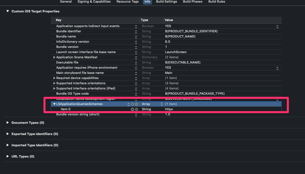
canOpenUrlの公式ドキュメントを確認すると、info.plistにLSApplicationQueriesSchemesを追加して、そこに許可するスキームを定義してあげれば良さそう。
(下記引用)If your app is linked on or after iOS 9.0, you must declare the URL schemes you pass to this method by adding the LSApplicationQueriesSchemes key to your app's Info.plist file. This method always returns false for undeclared schemes, whether or not an appropriate app is installed. To learn more about the key, see LSApplicationQueriesSchemes.
LSApplicationQueriesSchemesのドキュメントにもアプリがcanOpenURL:メソッドを使用してテストできるURLスキームを指定すると書いてある。
実装
下記のように、LSApplicationQueriesSchemesにhttpsのスキームを定義する。
この状態で実行すると、無事canOpenURLにtrueが返される。
以上。
- 投稿日:2020-09-28T19:13:30+09:00
[機械学習]Create MLでObject Detectionを試してみた[物体検知]
今回実装してみたもの
準備
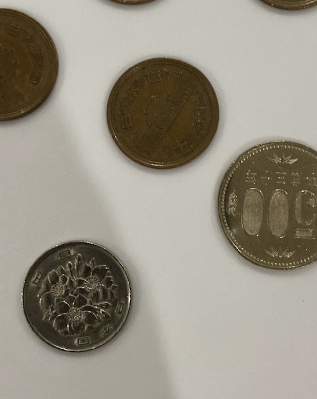
今回は冒頭のGifの通りCoinを検知して識別するものを試してみました。
準備するものは
- データ(Jpeg写真)100枚程度
- RecognizingObjectsInLiveCapture
- IBM Cloud Annotationsのアカウント(無料)
- 1円玉〜500円玉
以上です。※Create MLはXcodeを右クリックでOpen Developer Toolにあるのでそこからmodelを作って下さい。
機械学習の大まかな種類
機械学習には
・Image Classification(画像の分類)
・Sound Classification(音の分類)
・Action Classification(動作の分類)
・Object Detection(物体の検知)
などがありますが、今回はObject Detectionの実装、つまり物体の検知をしていきます。Objet Detectionとは
Object Detectionとは物体を検知をする事を指しますので”画像のどこになにが写っているか”と言うことを判定することになります。よって”写真”と”位置の情報”が必要となります。
写真はあらかじめ撮影し、フォルダ別に格納します。(フォルダ名=分類名)今回は硬貨を検知し、識別していきたいので500円〜1円のフォルダと、それぞれの画像の位置情報が必要となります。
→Object Detectionについてより深く知りたい方はこちらをご覧ください。
Create MLでのオブジェクト検出モデルのトレーニング手順
- データを集める。(検知したい写真をとる)
- IBM Cloud Annotations(以下IBMCAとする)を使って集めたデータを分類分け、位置情報を指定してデータセットを作る
- Create MLにIBMCAで作成したファイルを入れてModelを生成する
- Create ML上でTestをしてみる
- Appleのサンプルに入れて試してみる
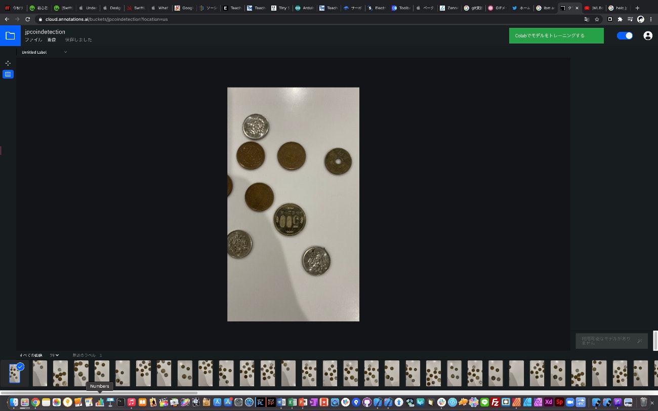
写真をとる(データを用意する)
写真は今回Coinが写った写真を100枚ほど用意しました。
写真は
・様々な角度の写真
・大きさも大・中・小の3パターンとしてそれぞれ30枚前後用意
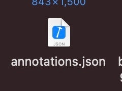
・背景は統一して白としたデータセットを作る(JSONファイル)
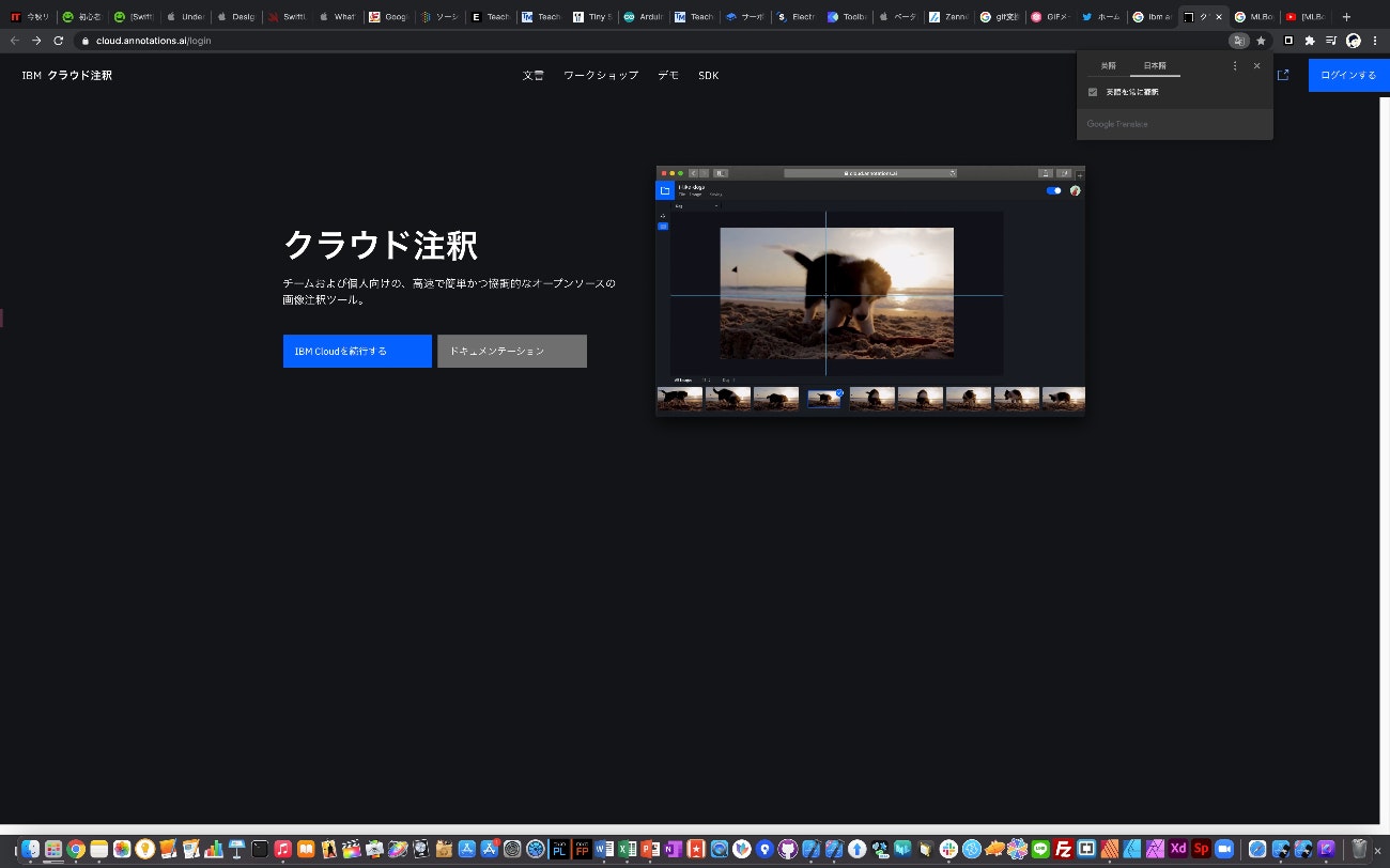
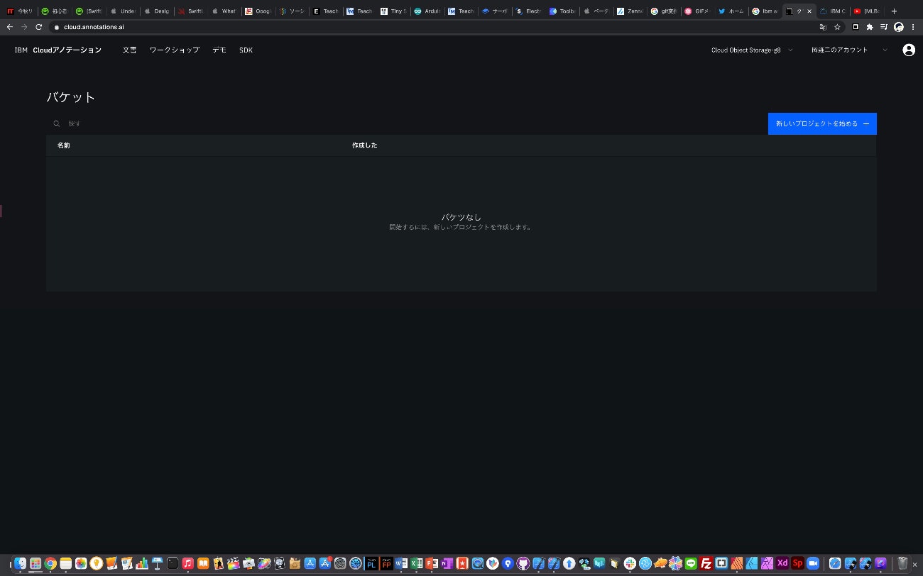
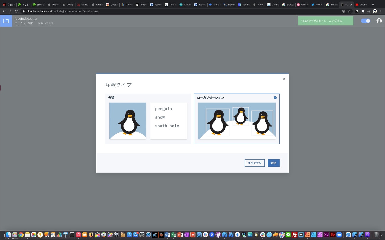
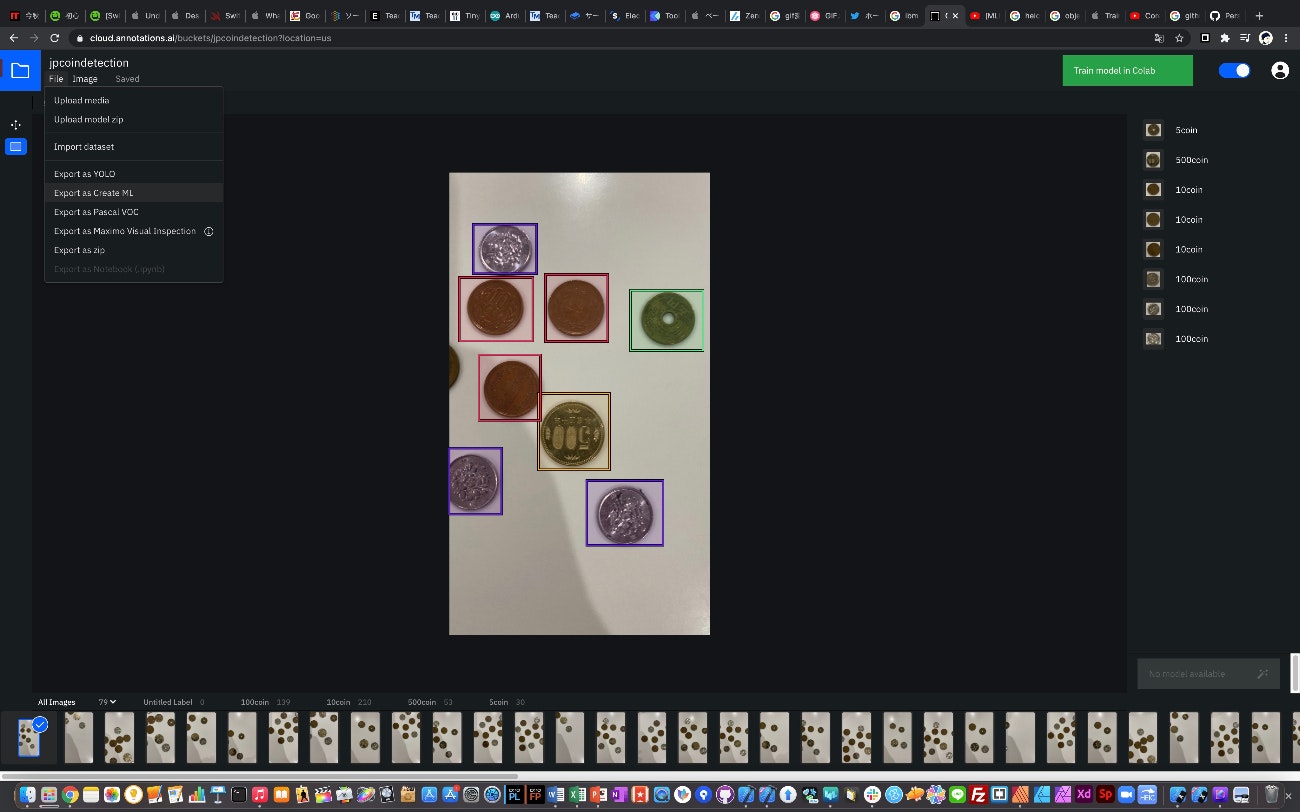
Object Detectionでは写真のみではなくJSONファイルも必要となる(位置情報が必要な為)ので今回はIBM Cloud Annotationsのアカウント(無料)を使って作成した。作り方は以下の通りである。
・IBM Cloudを続行するをクリック
・新しいプロジェクトをクリック
・ローカリゼーションをクリック
・ファイル名を記載し、プロジェクトが立ち上がると写真をD&Dできるようになるので入れる
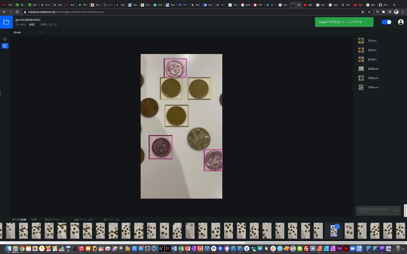
・Object(今回は硬貨)事にドラッグして囲んでいく
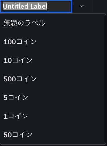
・右側にLabel名を記載できるので記載する
・一度記載したLabel名は左上のダウンリストより選択できるのでCoin事にLabel付すると効率がいい
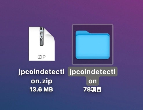
・全ての写真にLabel付し終えた後はFileよりCreate MLで使用できるようにexportする
・このファイルが生成されれば成功
・フォルダの中にJSONファイルがあるか確認Create MLでModel作成
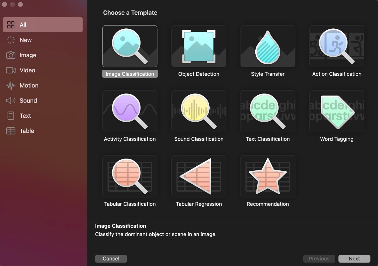
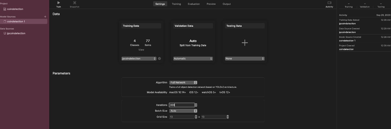
データセットができたらXcodeを右クリックし、Create MLを立ち上げる
object Detectionを選択し、先ほど作成したデータセットのファイルをフォルダ事D&D
Iterationは学習トレーニングを繰り返す回数(だと思います)で多ければ良いってわけではないみたいですが極度に少なくても精度が出ないので甘い場合は少し上げてみて調節してみて下さい。
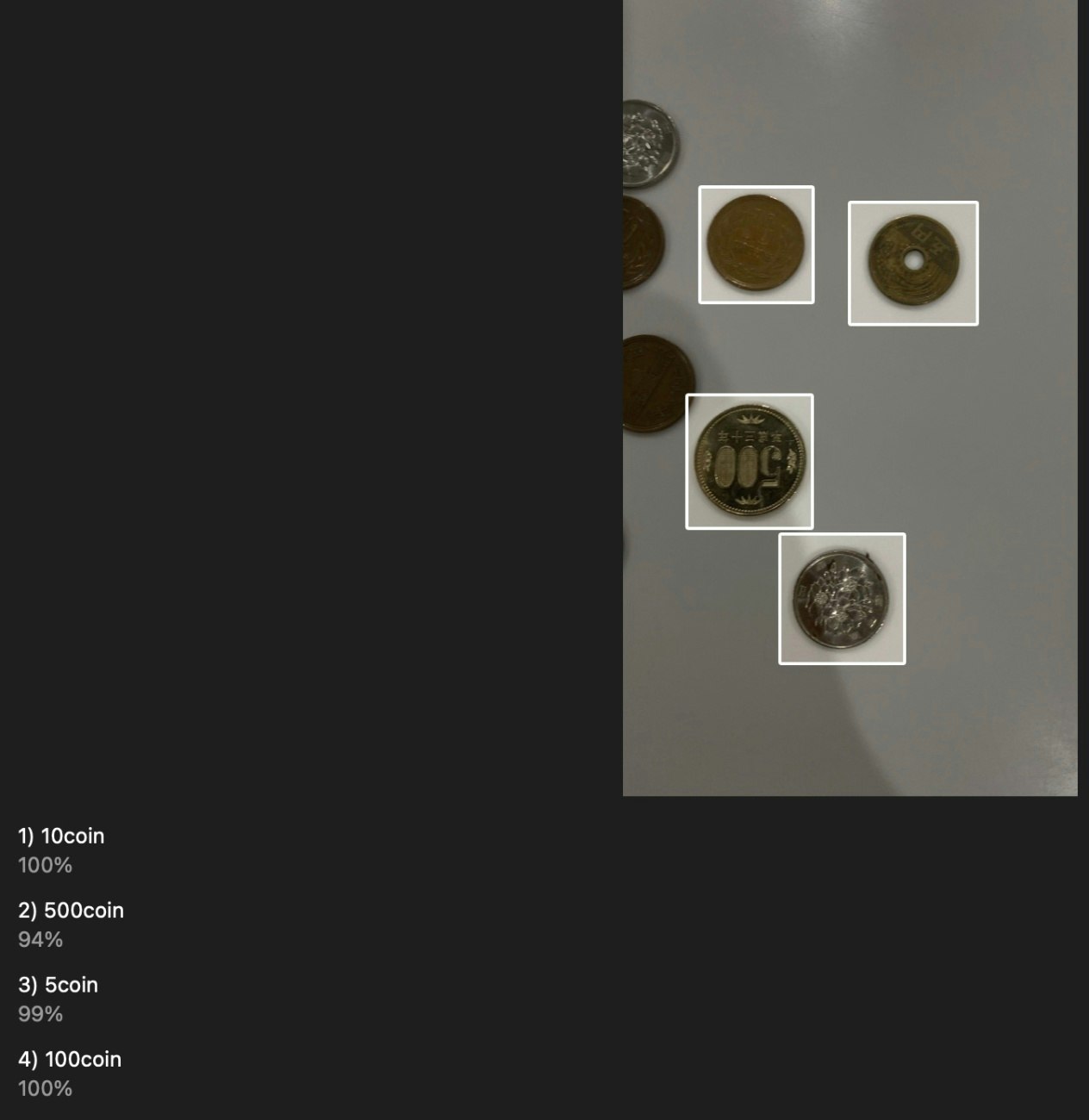
(今回300、600、1000と試したが変わらなかった。)学習を終えたらTestし、問題なければModelを取り出します。(D&Dで取り出せる)
Recognizing Objects in Live Captureを使って試してみる
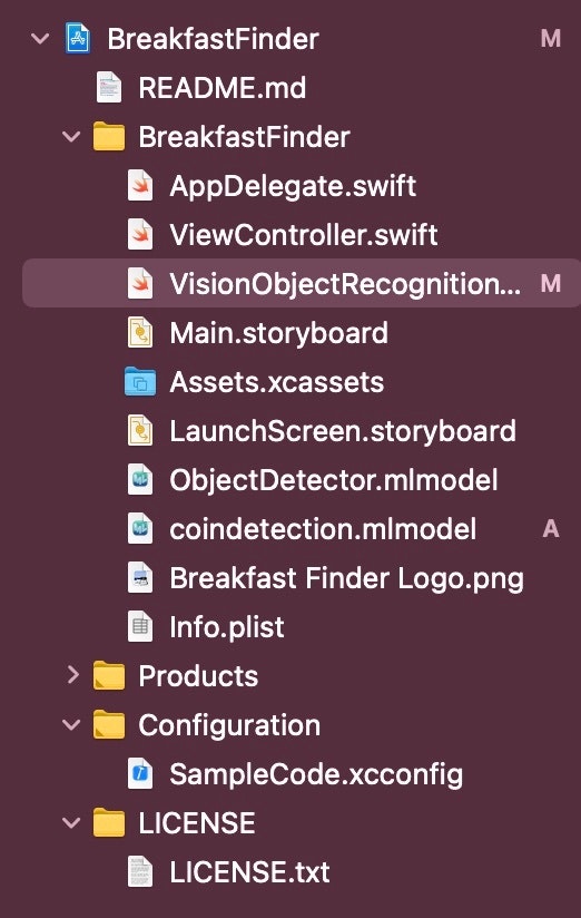
後はAppleが提供しているRecognizingObjectsInLiveCaptureをダウンロードして開く
ここにCreate MLで作ったModelをD&DcodeはもともとObjectDetectorと言うmodelを読み込んでクロワッサンやバナナ?などを検知して識別するものが入っているので
swift

guard let modelURL = Bundle.main.url(forResource: "ObjectDetector", withExtension: "mlmodelc")
を
swift

guard let modelURL = Bundle.main.url(forResource: "coindetection", withExtension: "mlmodelc")
今回生成したmodel名に書き換えて実装
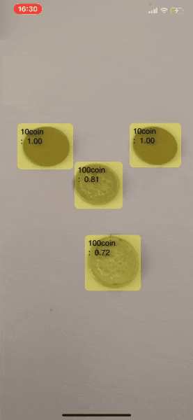
大体成功かな?
大体2時間ぐらいでデータセットから実装までできるので是非お試しあれ!最後に
今回はサンプルを使用しましたがせっかくなのでここもSwiftUIで今後作っていくことにチャレンジしていきたいと思います!またその他にも機械学習に関するデータセットの作り方から実装までチャレンジしていきたいと思いますので是非興味あるかたはこちらもチェックしてみて下さい!
https://twitter.com/oka_yuuji
note
https://note.com/oka_yuujiまた筆者高校の教職員ですが、技術の習得、研究が大好きです!もし技術的なご依頼や研究に関する事であれば下記にてDMでご連絡下さい。
https://twitter.com/oka_yuuji


- 投稿日:2020-09-28T15:04:18+09:00
【iOS14】PHPickerViewControllerからData型の画像データを取得するには?
AppleのPHPickerViewControllerのサンプルコード を見ると、UIImageを取得する例は書かれているのですが、Dataを取得する例はありません。
当然ながら、UIImageをDataに変換するのは微妙です。
百歩譲って、HEICやJPGやPNGなら良いかもしれませんが、UIImageをDataに変換するメソッドは、「pngData()」と「jpegData(compressionQuality:)」の2つしかありません。
GIFをこれらのメソッドで変換してしまうとアニメーションが止まってしまいます。やはり、直でData型を取得したい。
そんな人に向けて、 PHPickerViewControllerからDataを取得する方法 を書いておきます。NSItemProviderのloadDataRepresentation(forTypeIdentifier:completionHandler:)を使えば画像のDataを取得できる
NSItemProviderの
loadDataRepresentation(forTypeIdentifier:completionHandler:)を使えば取得できます。func picker(_ picker: PHPickerViewController, didFinishPicking results: [PHPickerResult]) { results.forEach { result in result.itemProvider.loadDataRepresentation(forTypeIdentifier: "public.image", completionHandler: { [weak self] data, _ in guard let data = data else { return } print(data) }) } }ミソとしては、forTypeIdentifier(Uniform Type Identifier)に
public.imageを指定することですね。
こうすることで、HEICやPNG、JPG、GIFなどのDataを取得できます。もっと、取得するDataを細かく指定したい場合は、Appleの Uniform Type Identifier Conceptsを参考にして指定してください。

- 投稿日:2020-09-28T15:04:18+09:00
【iOS14】PHPickerViewControllerから直にData型の画像データを取得するには?
AppleのPHPickerViewControllerのサンプルコード を見ると、UIImageを取得する例は書かれているのですが、Dataを取得する例はありません。
当然ながら、UIImageをDataに変換するのは微妙です。
百歩譲って、HEICやJPGやPNGなら良いかもしれませんが、UIImageをDataに変換するメソッドは「pngData()」と「jpegData(compressionQuality:)」の2つしかありません。
GIFをこれらのメソッドで変換してしまうとアニメーションが止まってしまいます。やはり、直でData型を取得したい。
そんな人に向けて、 PHPickerViewControllerからDataを取得する方法 を書いておきます。NSItemProviderのloadDataRepresentation(forTypeIdentifier:completionHandler:)を使えば画像のDataを取得できる
NSItemProviderの
loadDataRepresentation(forTypeIdentifier:completionHandler:)を使えば取得できます。func picker(_ picker: PHPickerViewController, didFinishPicking results: [PHPickerResult]) { results.forEach { result in result.itemProvider.loadDataRepresentation(forTypeIdentifier: "public.image", completionHandler: { [weak self] data, _ in guard let data = data else { return } print(data) }) } }ミソとしては、forTypeIdentifier(Uniform Type Identifier)に
public.imageを指定することですね。
こうすることで、HEICやPNG、JPG、GIFなどのDataを取得できます。もっと、取得するDataを細かく指定したい場合は、Appleの Uniform Type Identifier Conceptsを参考にして指定してください。
- 投稿日:2020-09-28T14:42:13+09:00
【Swift】タプルを用いたswitch文
1.はじめに
今回はSwitch文の条件分岐にタプルの値を使う、通常とは少し違った使い方を紹介しようと思います。場面によっては有効な使い方だと思うので、ぜひご覧ください。
2.タプルをcaseで使う
まず、タプルを定数のように考えてcaseラベルに置くようにすれば、次のように書くことができます。
ただし、タプルの型はすべて統一されている必要があり、この例では、変数dayが月と日からなる日付を表すタプルを持っていると考えます。
3つだけ書かれているいずれかの祝日に一致すれば表示されます。switch day { case (1,1): print("元旦") case (2,11): print("建国記念の日") case (5,3): print("憲法記念日") default: break }ある範囲の日付を表すために、範囲演算子が使えます。例えば次の例を確認してください。
switch day {
case (1,1...5): // 1/1 ~ 1/5
    print("正月休み")

case (5,3): print("憲法記念日")

case (4,29), (5,2...6):
    print("連休")

default: break
}
値を列挙するだけでなく、タプルの要素を取り出して処理に使うこともできます。
このために、caseラベル内にlet、またはvarを記述して、case節の内部でだけ有効な定数、変数を宣言できます。switch day { case (5,3): print("憲法記念日") case (8, let d): print("8/\(d)は夏休みです") default: break }この例では、8月の日付ならいつでも夏休みになります。変数dを使う必要がなければ、「_」を使い次のように記述することもできます。
case (8, _): print("夏休み")なお、キーワード付きのタプルをswitch文で使用することもできますが、値とcaseラベルで使っているキーワードが一致しない場合にはエラーになります。
タプルとcaseのラベルの対応付けのように、構造と値の一致を調べる処理一般を、Swiftではパターンマッチングといいます。3.switch文でwhere節を使う
switch文で、タプルの要素に対して条件を付けることもできます。ここで、日付から曜日を計算する関数dayOfWeekを利用します。この関数は日曜なら0、月曜なら1、というように曜日を整数値で返します。なお、変数yearが西暦年を持つとします。
caseラベルに条件を付ける場合、ラベルと「:」の間に、予約語whereと条件を記述します。以下の例を確認してください。switch day { case (1, let d) where d >= 8 && d <= 14 && dayOfWeek(year,1,d) == 1: print("成人の日") case (8, _): print("夏休み") case (let m, let d) where dayOfWeek(year,m,d) == 0: print("\(m)/\(d)は日曜日") default: break }ここでは、1月の第2月曜日が成人の日であることを条件にしています。
同様に、1年のいつでも日曜日であれば表示するようにしています。
このcaseラベルのように、タプルのすべての要素を定数に割り当てる場合、要素ごとにletを指定することもできますが、タプルの前に1つだけletを記述することもできます。case let (m, d) where dayOfWeek(year,m,d) == 0: print("\(m)/\(d)は日曜日")なお、caseラベルでletやvar、whereを使って条件を指定する方法は、タプルだけでなく、通常の整数などに対しても利用できます。
定数や変数を使うラベルは、別並べると「,」で区切って並べる際に制約があります。
これは、どのラベルの条件に一致したかによって、定数や変数が値を持たない可能性があるからです。
例えば以下のようにすることはできません。switch t { case (1, let y), (2, 2): print("\(y)") case (2, _): fallthrough case (let z, 2): print("\(z)") default: break }caseラベルで定数や変数を使っているcase節へは、すぐ上の選択肢からfallthrough文で遷移することはできません。
ラベルを「,」で区切って並べた時、それらが定数や変数を含んでよい条件は、すべてのラベルが同じ名前、同じ型の定数もしくは変数を含むことです。
つまり、どんな場合でも定数もしくは変数の値が定まる必要があります。その点だけ気を付けてください。4.オプショナル型をswitch文で使う
switch文で場合分けしたい式がオプショナル型の値を含む場合も、caseのラベルで書き分けることができます。
例として名前と年齢からなるタプル型を考えます。ただし、年齢は不明の場合があるのでオプショナル型になっています。typealias People = (String, Int?)このような型をSwitch文で扱うには、caseパターンで「?」という記号を使います。
switch m {
case let (name, age?) where age >= 18:
    print("\(name), 免許取得可")

case let (name, (15...18)?):
    print("\(name), 高校生")

case (let name, nil):
    print("\(name), 年齢不明")

default: break
}
このように、対応する定数もしくは変数に「?」を付けると、オプショナル型がnil以外の値を持つときにマッチし、その後のwhere節や実行分では開示演算子を使うことなく値を参照できます。
また、nilを記述しておけば、オプショナル型がnilの値を持つ場合にマッチします。範囲を示すパターンは()で囲みます。オプショナルであることを示す「?」は、タプルなどの他のパターンに利用することができます。
例えばPepole?型の変数opsをswitch文で使うとすれば、caseには次のように記述できます。switch ops { // opsはPeople?型 case let (name, 18?)? : // 開示した結果が(文字列, 18)ならマッチする5.おわりに
今回はタプルを用いたswitch文の利用法について書きました。次回は列挙型についての記事を書こうと思っているので、よろしければぜひご覧ください。
ここまで見てくださった方、ありがとうございました。
- 投稿日:2020-09-28T12:18:31+09:00
iOS Keyboard ExtensionでadjustTextPositionするときのお作法
iOS Keyboard Extensionでカーソルを移動させるには
adjustTextPosition(byCharacterOffset:Int)を使います。ドキュメントにはバッチリTo move the insertion point in the text input view, use the adjustTextPosition(byCharacterOffset:) method. For example, if you want to implement a forward delete action, move the insertion position forward by one character then delete backwards:
// Move the text insertion position forward 1 character (一文字分前に進める) textDocumentProxy.adjustTextPosition(byCharacterOffset: 1)と書いてありますが、罠です。なかなか気付きにくいところだと思うので共有しておきます。
この通りに実装するとこんな挙動になります。
「あいうえお」まではうまく動いていますが、漢字や絵文字に至ったあたりからどうも様子がおかしいですね。
解決方法
どうやらこのメソッドは
utf16とした時の文字数で「一文字分」を数えています。ということで、実行前に進行方向の文字をチェックして、それからadjustTextPositionしましょう。func getActualOffset(count: Int)->Int{ if count>0{ if let after = textDocumentProxy.documentContextAfterInput{ if after == ""{ return 1 //一文字前に改行がある場合、after==""となる。 } let left = after.prefix(count) return left.utf16.count }else{ return 1 } }else if count<0{ if let before = textDocumentProxy.documentContextBeforeInput{ let right = before.suffix(-count) return -right.utf16.count }else{ return -1 } }else{ return 0 } } let offset = getActualOffset(count: 1) //正確なoffsetを取得する textDocumentProxy.adjustTextPosition(byCharacterOffset: offset) //実行するこれで意図した通り動作します。
気付きづらいところに潜んでいる落とし穴なので、くれぐれもお気をつけください。


- 投稿日:2020-09-28T12:03:29+09:00
Xcode12でStoryboardの小窓(Minimap)を消す
Xcode12からStoryboardでもMinimapが出てきました。
99%の人にとっては邪魔なので消しましょう(偏見)。
ctrl+shift+command+M
or
Editor→Minimap
or
右上のPopupMenu→Minimap(下画像)
で消えます。


- 投稿日:2020-09-28T08:41:45+09:00
Swift Combine初めの1歩
概要
Swift初心者でCombineを少し触れたい人へ。
簡単なコードを説明します。今日の例
今日はこれがわかるようになるのが目標!
わからなくてもOK。後で説明します。
わかった人は読まなくて良いです。import Combine let a = CurrentValueSubject<Int, Never>(3) let b = Just(1) let publisher = b.combineLatest(a).map{b,a in a + b} publisher.sink{ added in print(added) } a.send(10)まじ意味不明だと思いますが、標準出力(print)には何が表示されそうでしょうか?
答えは
4 112行表示されます。
最初の4は3 + 1
次の11は10 + 1です。とりあえずimport
Combineのimportは
import Combineでできます。iOS 13以上で使用可能。
Playgroundなどで簡単に試せます。
Combineの用語
Combineでとりあえず覚えるべき用語にPublisherとSubscriberがある。
名前 日本読み 何してる Publisher パブリッシャー データを発行 Subscriber サブスクライバー データを購読 わからなくてもいいからとりあえず2単語暗記!
Publisher, SubscriberとりあえずJust
Justは(多分)一番簡単なPublisherです。
とりあえず定義を見にいってみます。(一部抜粋)
@available(macOS 10.15, iOS 13.0, tvOS 13.0, watchOS 6.0, *) public struct Just<Output> : Publisher { // ... (省略) }とりあえずPublisherを継承しているしPublisherですね。
iOS 13.0以上でしか使えないのも事実らしい。このJustの説明には何が書かれているかというと、
A publisher that emits an output to each subscriber just once, and then finishes.
1つのアウトプットを各々のSubscriberに対して、ただ(just)1回出力するPublisherで、その後finishします。
この文章からは以下がわかります。
- Justは一回だけ何かを出力する。
- JustはPublisher
- Subscriberは複数いる可能性がある
- 1回出したら終了(finish)する
値を1つ出すpublisherだと無理やり覚えてみる。sinkについて
例に出したコードで
publisher.sink{ added in print(added) }というのがありました。
このsinkの説明を見てみると、
Attaches a subscriber with closure-based behavior to a publisher that never fails.
クロージャベースの振る舞いを持つSubscriberを失敗しないpublisherにアタッチします。
意味は不明ですが、subscriberをアタッチしてくれそうなので使ってみましょう。
例1
先ほどのJustでsinkを呼び出すとどうなるでしょうか?
Just(1).sink { r in print(r) }これは
1が表示されます。publisher(Just)は1を一回だけ出力して、sinkすることでrにそれが入ってくるので
1が表示されたようです。例2
まだ説明していない
CurrentValueSubject<Int, Never>(3)についても試してみましょう。CurrentValueSubject<Int, Never>(3).sink { r in print(r) }これは
3が出力されます!一体Justと何が違うのか、、、
CurrentValueSubjectについて
CurrentValueSubjectとは何でしょうか?
定義をみてみます。@available(macOS 10.15, iOS 13.0, tvOS 13.0, watchOS 6.0, *) final public class CurrentValueSubject<Output, Failure> : SubjectこいつはSubjectらしい。Publisherじゃなかった!
それとiOS 13.0以上でしか使えないのはJustと一緒ですね。説明には、
A subject that wraps a single value and publishes a new element whenever the value changes.
1つの値をラップして、値が変わった時の新しい値をPublishするSubject。とあります。
PublishができるのはPublisherだけなのでは?
Subjectの定義も見に行きます。public protocol Subject : AnyObject, PublisherどうやらSubjectはPublisherの1種みたいですね。
Justと比べてみると、
Just 1つのアウトプットをただ(just)1回出力するPublisher CurrentValueSubject 1つの値をラップして、値が変わった時の新しい値をPublishするSubject Justとの違いは値が変わった時にその新しい値をpublishしてくれるということ!
試してみましょう。import Combine let a = CurrentValueSubject<Int, Never>(3) a.sink{ added in print(added) } a.value = 100 a.value = 10000 a.send(9999)何が出力されそうでしょうか?
答えは3 100 10000 9999a.valueの変更のたびにprintしています。
またa.send()でも、値の変更を表現できるようです。ラスト1行!
最初の例の大部分が説明できてきました。
import Combine let a = CurrentValueSubject<Int, Never>(3) let b = Just(1) let publisher = b.combineLatest(a).map{b,a in a + b} publisher.sink{ added in print(added) } a.send(10)後、
let publisher = b.combineLatest(a).map{b,a in a + b}が分かれば、なんとなくコードの意味がわかりそうです。combineLatest
まず
b.combineLatest(a)に注目しましょう。これはどういう意味でしょうか?
let a = CurrentValueSubject<Int, Never>(3) let b = Just(1)だったので、aもbもどちらもPublisherですね。
combineLatestの説明をみてみましょう。
Subscribes to an additional publisher and publishes a tuple upon receiving output from either publisher.
追加されたPublisherを購読(Subscribe)して、各々のPublisherから受け取った出力のタプルをPublishする。
こいつはSubscribeもPublishもしているようです。
実際に使う
動かしてみる。
import Combine let a = CurrentValueSubject<Int, Never>(3) let b = Just(1) let publisher = b.combineLatest(a).sink{r in print(r) }これだと何が出そうですか?
正解は
(1, 3)そういえばcombineLatestはタプルを返すと先ほどいっていました。
aの値を変えてみましょう。3行コードを追加します。
import Combine let a = CurrentValueSubject<Int, Never>(3) let b = Just(1) let publisher = b.combineLatest(a).sink{r in print(r) } a.value = 4 a.value = 5 a.send(6)どうなりそうですか?
正解は
(1, 3) (1, 4) (1, 5) (1, 6)bの値は変わらないままaの値の変更によってprintされています。
動きはわかりましたでしょうか?
SubscribeもPublishもしているcombineLatestとは何者か?
定義をみてみると、
public func combineLatest<P>(_ other: P) -> Publishers.CombineLatest<Self, P> where P : Publisher, Self.Failure == P.Failure長くて意味は不明ですが、返しているのは、
Publishers.CombineLatest<Self, P>。
Publishers.CombineLatestはpublic struct CombineLatest<A, B> : PublisherでPublisherです。
なので、
b.combineLatest(a)は2つのPublisherを1つのPublisherにするような関数です。map
mapは
Transforms all elements from the upstream publisher with a provided closure.
上流のPublisherから来る全ての要素を与えられたクロージャーを使って変形する。
全部変形するらしい。
定義をみてみると
public func map<T>(_ transform: @escaping (Self.Output) -> T) -> Publishers.Map<Self, T>結局こいつもPublisherを返す!
例1
先ほど
combineLatestで出した例。import Combine let a = CurrentValueSubject<Int, Never>(3) let b = Just(1) let publisher = b.combineLatest(a).sink{r in print(r) } a.value = 4 a.value = 5 a.send(6)結果は、
(1, 3) (1, 4) (1, 5) (1, 6)でしたね。
このコードのcombineLatestの後ろにmapをつけてみます。
import Combine let a = CurrentValueSubject<Int, Never>(3) let b = Just(1) let publisher = b.combineLatest(a) .map{(b,a) in a+b} .sink{r in print(r)} a.value = 4 a.value = 5 a.send(6)何が返りそうでしょうか?
正解は、
4 5 6 7これは
(1, 3) (1, 4) (1, 5) (1, 6)この結果の各々2つの値を足していることがわかります。
例2
.map{(b,a) in a+b}を.map{(b,a) in a}に変えてみました。
出力は何になりますか?import Combine let a = CurrentValueSubject<Int, Never>(3) let b = Just(1) let publisher = b.combineLatest(a) .map{(b,a) in a} .sink{r in print(r)} a.value = 4 a.value = 5 a.send(6)正解は
3 4 5 6まとめ
Combineを使うには iOS 13.0以上で import CombineJustとは 値を1回だけ出力するPublisher sinkとは Publisherの出力した値を購読(Subscribe)して処理できる CurrentValueSubject 値を変化でき、変化した値を出力するPublisher(Subject) CurrentValueSubjectの値を変更するには? CurrentValueSubject.valueに代入するか、CurrentValueSubject.send(value)に値を入力 combineLatestとは 2つのpublisherを1つのpublisherにして、値をタプルで返す。 mapとは publisherからきた値を全部変形する 目標の以下のコードの動きは理解できましたか?
import Combine

let a = CurrentValueSubject<Int, Never>(3)
let b = Just(1)

let publisher = b.combineLatest(a).map{b,a in a + b}

publisher.sink{ added in
    print(added)
}
a.send(10)
- 投稿日:2020-09-28T08:02:02+09:00
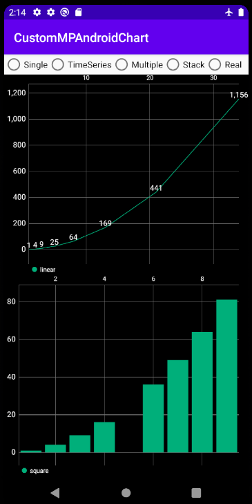
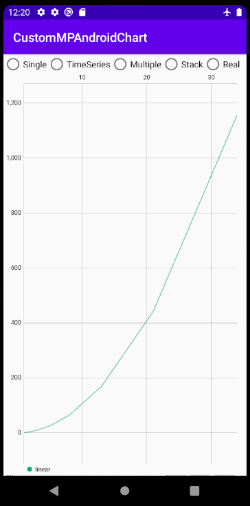
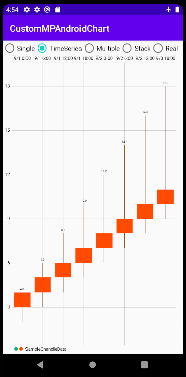
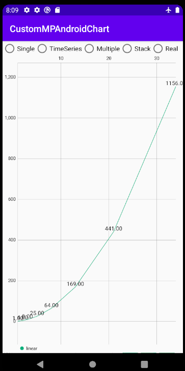
スマホアプリ向けお手軽グラフライブラリを作ってみた【MPAndroidChart改】
スマホアプリとグラフ
Androidアプリでグラフを表示させたい場合、
MPAndroidChart
というライブラリがよく使われます。 (iOS版のChartsライブラリも存在)多機能かつUIも優れた素晴らしいライブラリですが、
日本語情報の不足もあり、実装難度は結構高いと感じます。
そこで、簡易にグラフを作成するための追加パッケージを作成してみました!
Github下のようなグラフを簡単に作る事ができます
(題材が重い!(笑))
なお、本パッケージはKotlinでの実装を前提としておりますが、
希望があればJava・Swift(iOS)バージョンも作ろうと思います。
その他質問、メソッド追加要望等あれば、気軽にコメント頂けますとありがたいです!MPAndroidChartをより使いやすくするには?
MPAndroidChartでグラフを含んだアプリを作成して、私が苦戦したのは以下の部分です。
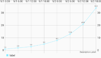
1. 時系列グラフの作成
2. フォーマット指定(特に色)
3. ツールヒントの作成
4. 日本語ドキュメントが少ない1. 時系列グラフの作成
詳しくは補足に書きますが、時系列グラフの作成にはデータの格納や軸のフォーマット等、相当な手間が掛かります。
本パッケージでの対応
時系列グラフ専用のメソッドを作成し、簡単な操作で作成できるようにしました。
また、下記のように時間が等間隔でない場合、
        val x = listOf<Date>(
            sdf.parse("2020/09/01 00:00:00"),
            sdf.parse("2020/09/01 06:00:00"),
            sdf.parse("2020/09/01 12:00:00"),
            sdf.parse("2020/09/01 18:00:00"),
            sdf.parse("2020/09/02 00:00:00"),
            sdf.parse("2020/09/02 06:00:00"),
            sdf.parse("2020/09/02 12:00:00"),
            sdf.parse("2020/09/03 18:00:00"),//ここのみ時間間隔が飛んでいる
        )
上記の方法ではインデックス情報のみに基づいて等間隔にプロットされてしまい、
時間の間隔が横軸上で正確に表現されません。
本パッケージでは、横軸が等間隔でない場合も正確にプロットされるような表示モードも準備しました
(ラベルは最初と最後のみ表示されます)2. UIフォーマット指定
MPAndroidChartでは、グラフ表示のためにおおざっぱに
①データを入力する処理
②UIフォーマットを指定する処理
の2種類が必要となります。
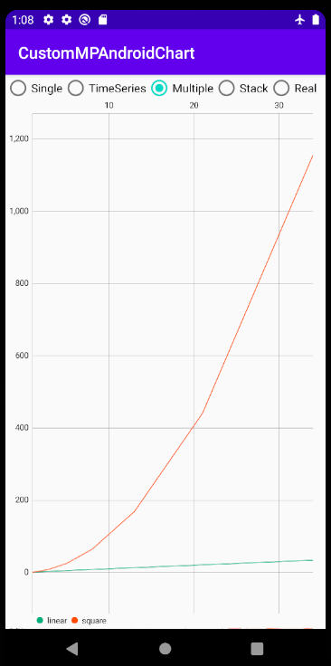
コード上でもこの2種類の処理をまとめて別個に指定できることが、独立性の観点から望ましいです。しかし折れ線グラフのように複数のY軸の値を指定する場合、
下のように①と②に処理が入り組んだ指定方法となってしまいます。//Entryにデータ格納 → ①データ入力処理 var entryList1 = mutableListOf<Entry>()//1本目の線 var entryList2 = mutableListOf<Entry>()//2本目の線 for(i in x.indices){ entryList1.add( Entry(x[i], y1[i]) ) entryList2.add( Entry(x[i], y2[i]) ) } //X軸の設定 → ②UIフォーマット指定処理 lineChart.xAxis.apply { isEnabled = true textColor = Color.BLACK } //左Y軸の設定 → ②UIフォーマット指定処理 lineChart.axisLeft.apply { isEnabled = true textColor = Color.BLACK } //右Y軸の設定 → ②UIフォーマット指定処理 lineChart.axisLeft.apply { isEnabled = false } //LineDataSet(線1本ごとの)のリストを作成 → ①データ入力処理 val lineDataSets = mutableListOf<ILineDataSet>() //線1本目のデータ格納 → ①データ入力処理 val lineDataSet1 = LineDataSet(entryList1, "linear") //線1本目の色 → ②UIフォーマット指定処理 lineDataSet1.color = Color.BLUE //リストに格納 → ①データ入力処理 lineDataSets.add(lineDataSet1) //線2本目のデータ格納 → ①データ入力処理 val lineDataSet2 = LineDataSet(entryList2, "square") //線2本目の色 → ②UIフォーマット指定処理 lineDataSet2.color = Color.RED //LineDataにLineDataSetのリスト格納 → ①データ入力処理 lineDataSets.add(lineDataSet2) //LineChartにData格納 → ①データ入力処理 lineChart.data = LineData(lineDataSets)本パッケージでの対応
上記のような指定法は独立性やコードの可読性の観点から好ましい状態ではないので、
・UIフォーマット指定用クラス(ChartとDataSetの2種類。両者の違いはこちら参照)
・データ入力用メソッド
・上記UI指定&データを基にグラフ描画するメソッド
の順で、独立して指定できるような構成としました。また、フォーマット指定ようわからん!という方のために、
フォーマット指定をしなかった(コンストラクタに引数を入れない)場合も、
私の主観でいい感じ(抽象的な表現ですが‥笑)に設定してくれるような機能を加えています。特に色設定は設定箇所が多く、手動設定が面倒なので、
・カラーユニバーサルデザインに基づき、線や棒の色を自動指定
・背景が黒(輝度が0.5以下)のときは、文字を白に自動変更
という機能を追加しました
3. ツールヒント作成
データ点をタップした際にデータの詳細を表示してくれる「ツールヒント」
があると、UIの見やすさが格段に向上します。
しかし公式ドキュメントにも実装法がまともに記載されておらず。
サンプルコードを見ながら手探りでの実装が求められます。本パッケージでの対応
簡単にツールヒントを表示できるよう、フォーマット指定用クラスで下記の指定を可能としました
A. ツールヒント表示の有無
ツールヒントの表示有無を指定しますB. 表示するデータの軸方向(X、Y、XY両方)
下の図のように表示するデータの軸方向を選択します(左から表示なし、Xのみ、Yのみ、XY両方)
C. 時系列グラフの場合、時刻表示のフォーマット(例:"M/d HH:mm")
X軸が時系列のとき、時刻表示のフォーマットを指定できるようにしました。
下の図では、"d日H時"というフォーマットを指定しています
D. データに付与する単位(例:℃、%、Paなど)
X軸、Y軸ともに、表示するデータに単位を付加できます。
下の図では、Y軸に"円"という単位を付加しています
4. 日本語ドキュメントが少ない
日本語で網羅的に解説した記事は皆無といっても良い状況です。
特にUIフォーマット指定系は公式英語ドキュメントに説明が記載されていないメソッド・プロパティも多いです。本パッケージでの対応
本記事に、UIフォーマット指定プロパティの一覧と、指定による変化を図示したリンクを記載しました
(DataSetのUIフォーマット指定プロパティ一覧はこちら)どのプロパティを設定すれば、どのようにグラフ形状が変わるかを、
日本語+画像で簡便に追えるかと思います必要なもの
下記の開発環境を構築してください
・開発用のPC(今回はWindows10を使用)
・Android Studio(今回は4.0.1を使用、AndroidバージョンはAPI26以降推奨)
・動作させるAndroidスマホ(今回はPixel 3aを使用)導入方法
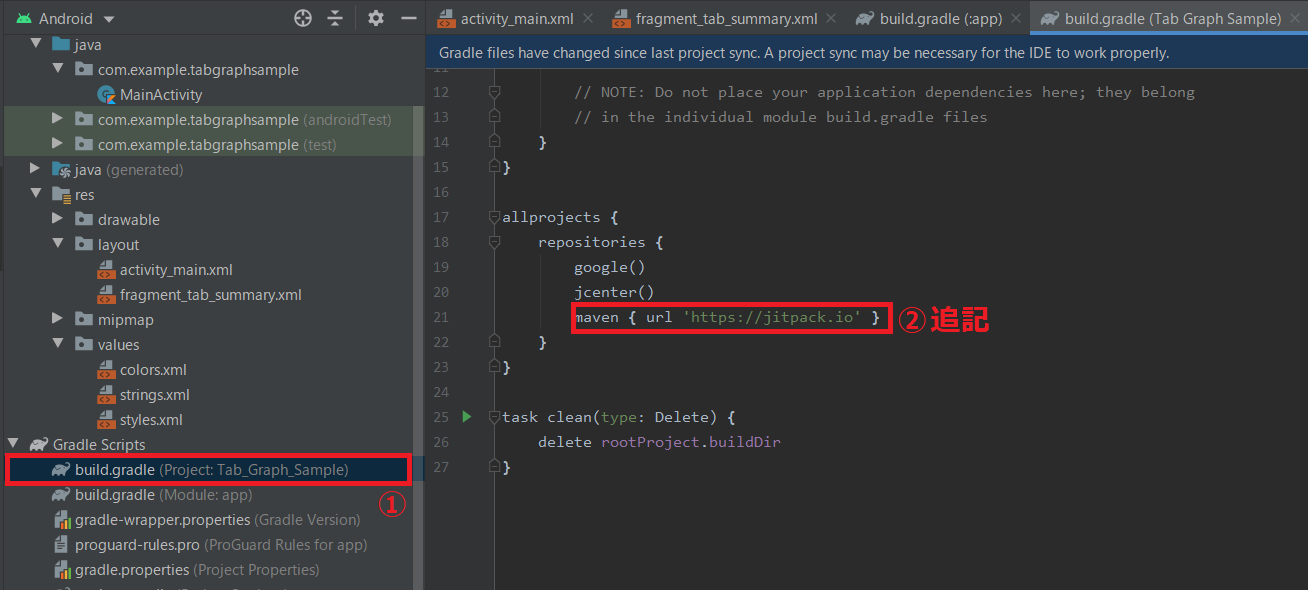
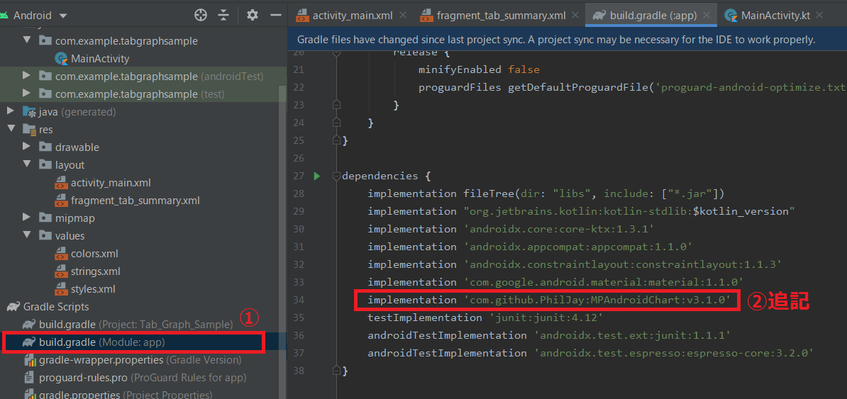
下記のような手順となります
1. MPAndroidChartの導入
2. CustomMPAndroidChartパッケージの導入1. MPAndroidChartの導入
プロジェクト内に、グラフ描画ライブラリであるMPAndroidChartを導入します
build.grandle(Project)に、
allprojects {
    repositories{
        :
        maven { url 'https://jitpack.io' }
        :
という記載を加えます。
build.grandle(Module:app)に、
dependencies {
    :
    implementation 'com.github.PhilJay:MPAndroidChart:v3.1.0'
    :
という記載を加えます。
メニューバーの「File → Close Project」でプロジェクトを閉じて開き直すと、
ライブラリが反映されます。2. CustomMPAndroidChartパッケージの導入
上記MPAndroidChartのグラフを簡易的に作成するためのメソッド・クラス集を、
「CustomMPAndroidChart」としてパッケージ化しました。
Githubにもアップロードしておりますパッケージ概要
下記の6つのモジュールからなります
・LineChartMethods.kt:折れ線グラフ用メソッド集
・BarChartMethods.kt:棒グラフ用メソッド集
・CandleStickChartMethods.kt:ローソク足グラフ(株価のチャートのようなグラフ)用メソッド集
・PieChartMethods.kt:折れ線グラフ用メソッド集
・MarkerViews.kt:ツールヒント表示用クラス
・ChartFormats.kt:UIフォーマット指定用クラスを集めたモジュールまた、ツールヒントで使用するレイアウトファイル
simple_marker_view.xmlの導入も必要となります。パッケージの導入方法
グラフを作成するプロジェクト内に、下記の手順で導入します。
※手動操作が多いので、より良い提供方法ご存知であればご教示いただけるとありがたいですjavaフォルダ直下のパッケージフォルダを右クリックし、New → Packageを選択し、"chart"と名前をつけます
折れ線グラフ描画用モジュールの作成
上記作成したchartフォルダを右クリックし、New → Kotlin File/Classを選択し、"LineChartMethods"と名前を付け、GitHub上のLineChartMethods.ktをコピペします。
※コード上部の「プロジェクト構成に合わせ変更」とコメントしてある部分は、プロジェクト構成に合わせて適宜修正してください棒グラフ描画用モジュールの作成
上記作成したchartフォルダを右クリックし、New → Kotlin File/Classを選択し、"BarChartMethods"と名前を付け、GitHub上のBarChartMethods.ktをコピペします。
※コード上部の「プロジェクト構成に合わせ変更」とコメントしてある部分は、プロジェクト構成に合わせて適宜修正してくださいローソク足グラフ描画用モジュールの作成
上記作成したchartフォルダを右クリックし、New → Kotlin File/Classを選択し、"CandleStickChartMethods"と名前を付け、GitHub上のCandleStickChartMethods.ktをコピペします。
※コード上部の「プロジェクト構成に合わせ変更」とコメントしてある部分は、プロジェクト構成に合わせて適宜修正してください円グラフ描画用モジュールの作成
上記作成したchartフォルダを右クリックし、New → Kotlin File/Classを選択し、"PieChartMethods"と名前を付け、GitHub上のPieChartMethods.ktをコピペします。
※コード上部の「プロジェクト構成に合わせ変更」とコメントしてある部分は、プロジェクト構成に合わせて適宜修正してくださいツールヒント表示用クラスの作成
上記作成したchartフォルダを右クリックし、New → Kotlin File/Classを選択し、"MarkerViews"と名前を付け、GitHub上のMarkerViews.ktをコピペします。
※コード上部の「プロジェクト構成に合わせ変更」とコメントしてある部分は、プロジェクト構成に合わせて適宜修正してくださいUIフォーマット指定用クラスの作成
上記作成したchartフォルダを右クリックし、New → Kotlin File/Classを選択し、"ChartFormats"と名前を付け、GitHub上のChartFormats.ktをコピペします。
※コード上部の「プロジェクト構成に合わせ変更」とコメントしてある部分は、プロジェクト構成に合わせて適宜修正してくださいツールヒント用レイアウトファイルの作成
クリック時のツールヒント用レイアウトファイルを、下記手順で作成します。
res/layoutを右クリックし、New → Layout Resource Fileを選択し、"simple_marker_view"と名前をつけます
作成されたxmlファイルを、下記内容に書き換えます
simple_marker_view.xml<?xml version="1.0" encoding="utf-8"?> <RelativeLayout xmlns:android="http://schemas.android.com/apk/res/android" xmlns:tools="http://schemas.android.com/tools" android:layout_width="wrap_content" android:layout_height="40dp" android:background="@color/toolTipBgColor" tools:ignore="Overdraw"> <TextView android:id="@+id/tvSimple" android:layout_width="wrap_content" android:layout_height="wrap_content" android:layout_centerHorizontal="true" android:layout_marginTop="7dp" android:layout_marginLeft="5dp" android:layout_marginRight="5dp" android:text="" android:textSize="12sp" android:textColor="@color/toolTipTextColor" android:ellipsize="end" android:gravity="center_vertical|center_horizontal" android:textAppearance="?android:attr/textAppearanceSmall" /> </RelativeLayout>res/values/colors.xmlに、下記内容を追記します。
(色コードはこちらを参考に適宜変更してください)colors.xml: <color name="toolTipBgColor">#999999</color>//背景色コード <color name="toolTipTextColor">#ffffff</color>//テキスト色コード :以上で、パッケージの導入が完了しました
使用方法
折れ線グラフ、棒グラフ、ローソク足グラフ、円グラフそれぞれに関して、
実装方法を解説します。GitHubにサンプルコードをアップしていますので、こちらも参照頂けると分かりやすいかと思います
1. 折れ線グラフの実装方法
折れ線グラフの実装方法を、レイアウト(.xml)と処理部(.kt)にわけて解説します。
レイアウトの実装
下記のように、LineChart用のウィジェットをレイアウト(例:activity_main.xml)中に組み込みます。
activity_main.xml: <com.github.mikephil.charting.charts.LineChart android:id="@+id/lineChartExample" android:layout_width="match_parent" android:layout_height="match_parent"/> :折れ線グラフ作成メソッド呼び出し処理の実装
折れ線グラフ作成メソッドを呼び出す処理を、Kotlinファイル(例:MainActivity.kt)内に実装します。
・線が1本のとき
・横軸を時系列にしたいとき
・複数のとき
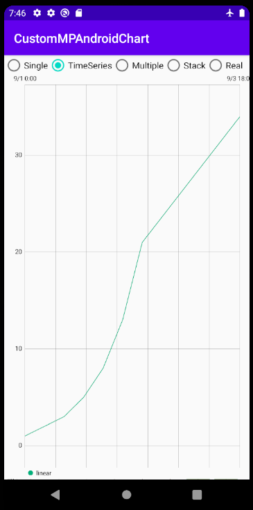
で例を分けて解説します。線が1本のとき
基本的な流れとしては
・Chartフォーマットの指定
・DataSetフォーマットの指定
・EntryにmakeLineChartDataメソッドでデータ格納
・setupLineChartメソッドでグラフ描画
となります。//表示用サンプルデータの作成// val x = listOf<Float>(1f, 2f, 3f, 5f, 8f, 13f, 21f, 34f)//X軸データ val y = x.map{it*it}//Y軸データ(X軸の2乗) //Chartフォーマット var lineChartFormat = LineChartFormat(/*ここでChartフォーマット指定*/) //DataSetフォーマット(カテゴリ名のMap) var lineDataSetFormat = mapOf( "linear" to LineDataSetFormat(/*ここでDataSetフォーマット指定*/) ) //①Entryにデータ格納(カテゴリ名のMap) val allLinesEntries: MutableMap<String, MutableList<Entry>> = mutableMapOf( "linear" to makeLineChartData(x, y) ) //②~⑦グラフの作成 setupLineChart(allLinesEntries, findViewById(R.id.lineChartExample), lineChartFormat, lineDataSetFormat, context)ChartフォーマットやDataSetフォーマットはグラフのUIを指定します。詳しくは後述します
上記コードを実行すると、下図のようなグラフが表示されます
横軸を時系列にしたいとき
横軸を時系列にしたいときは、Entryにデータ格納するメソッドを、
makeLineChartData() → makeDateLineChartData()
に変更します//表示用サンプルデータの作成// //X軸データ(時間) val sdf: SimpleDateFormat = SimpleDateFormat("yyyy/MM/dd HH:mm:ss") val x = listOf<Date>( sdf.parse("2020/09/01 00:00:00"), sdf.parse("2020/09/01 06:00:00"), sdf.parse("2020/09/01 12:00:00"), sdf.parse("2020/09/01 18:00:00"), sdf.parse("2020/09/02 00:00:00"), sdf.parse("2020/09/02 06:00:00"), sdf.parse("2020/09/02 12:00:00"), sdf.parse("2020/09/03 18:00:00"), ) val y = listOf<Float>(1f, 2f, 3f, 5f, 8f, 13f, 21f, 34f)//Y軸データ(数値) //Chartフォーマット var lineChartFormat = LineChartFormat(/*ここでChartフォーマット指定*/) //DataSetフォーマット(カテゴリ名のMap) var lineDataSetFormat = mapOf( "linear" to LineDataSetFormat(/*ここでDataSetフォーマット指定*/) ) //①Entryにデータ格納(カテゴリ名のMap) val allLinesEntries: MutableMap<String, MutableList<Entry>> = mutableMapOf( "linear" to makeDateLineChartData(x, y, lineChartFormat.timeAccuracy) ) //②~⑦グラフの作成 setupLineChart(allLinesEntries, findViewById(R.id.lineChartExample), lineChartFormat, lineDataSetFormat, context)
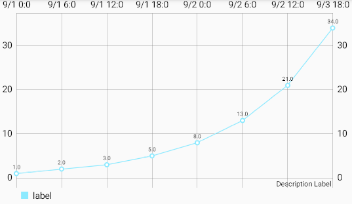
非等間隔な時間を正確に表現したいとき
前述のように、上記の方法はデータ点がX方向に等間隔にプロットされるため、
データの取得間隔が一定でないときは、時間が横軸上で正確に表現されません。このようなときに時間を正確に表現したい時は、Chartフォーマットで
timeAccuracy = true
と指定します。//Chartフォーマット var lineChartFormat = LineChartFormat( timeAccuracy = true, /*ここでその他のChartフォーマット指定*/ )
※ラベルは最初と最後のみ表示されます線が複数本のとき
1本の時との違いは、
・DataSetフォーマットを線の本数だけ指定
・Entryに線の本数だけデータ格納
となります。//表示用サンプルデータの作成// val x = listOf<Float>(1f, 2f, 3f, 5f, 8f, 13f, 21f, 34f)//X軸データ val y1 = x.map{it}//Y軸データ1(X軸の1乗) val y2 = x.map{it*it}//Y軸データ2(X軸の2乗) //Chartフォーマット var lineChartFormat = LineChartFormat(/*ここでChartフォーマット指定*/) //DataSetフォーマット(カテゴリ名のMap) var lineDataSetFormat = mapOf( "linear" to LineDataSetFormat(/*ここでDataSetフォーマット指定*/), "square" to LineDataSetFormat(/*ここでDataSetフォーマット指定*/) ) //①Entryにデータ格納(カテゴリ名のMap) val allLinesEntries: MutableMap<String, MutableList<Entry>> = mutableMapOf( "linear" to makeLineChartData(x, y1), "square" to makeLineChartData(x, y2) ) //②~⑦グラフの作成 setupLineChart(allLinesEntries, lineChart, lineChartFormat, lineDataSetFormat, context)
なお、データ格納時のメソッドをmakeDateLineChartDataにすれば、複数線かつ時系列のグラフも作成可能です2. 棒グラフの実装方法
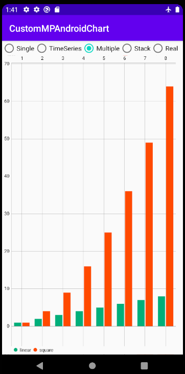
棒グラフの実装方法を、レイアウト(.xml)と処理部(.kt)にわけて解説します。
レイアウトの実装
LineChartのときと同様に、BarChart用のウィジェットをレイアウト(例:activity_main.xml)中に組み込みます。
activity_main.xml: <com.github.mikephil.charting.charts.BarChart android:id="@+id/barChartExample" android:layout_width="match_parent" android:layout_height="match_parent"/> :実行コードの実装
棒グラフ作成メソッドを呼び出す処理を、Kotlinファイル(例:MainActivity.kt)内に実装します。
・棒が1本のとき
・横軸を時系列にしたいとき
・複数の棒を積み上げ表示するとき
・複数の棒を横に並べて表示するとき
で例を分けて解説します。棒が1本のとき
折れ線グラフのときとほぼ同様です。
"Line~"という名前になっているクラス名を"Bar~"と変えるだけでいけるかと思います。//表示用サンプルデータの作成// val x = listOf<Float>(1f, 2f, 3f, 4f, 6f, 7f, 8f, 9f)//X軸データ val y = x.map{it*it}//Y軸データ(X軸の2乗) //Chartフォーマット var barChartFormat = BarChartFormat(/*ここでChartフォーマット指定*/) //DataSetフォーマット(カテゴリ名のMap) var barDataSetFormat = mapOf( "square" to BarDataSetFormat(/*ここでDataSetフォーマット指定*/) ) //①Entryにデータ格納(カテゴリ名のMap) val allBarsEntries: MutableMap<String, MutableList<BarEntry>> = mutableMapOf( "square" to makeBarChartData(x, y) ) //②~⑦グラフの作成 setupBarChart(allBarsEntries, barChart, barChartFormat, barDataSetFormat, context)
横軸を時系列にしたいとき
横軸を時系列にしたいときは、Entryにデータ格納するメソッドを、
makeBarChartData() → makeDateBarChartData()
に変更します※折れ線グラフのときと異なり、timeAccuracyプロパティ指定はできません
        //表示用サンプルデータの作成//
        //X軸データ(時間)
        val sdf: SimpleDateFormat = SimpleDateFormat("yyyy/MM/dd HH:mm:ss")
        val x = listOf<Date>(
            sdf.parse("2020/09/01 00:00:00"),
            sdf.parse("2020/09/01 06:00:00"),
            sdf.parse("2020/09/01 12:00:00"),
            sdf.parse("2020/09/01 18:00:00"),
            sdf.parse("2020/09/02 00:00:00"),
            sdf.parse("2020/09/02 06:00:00"),
            sdf.parse("2020/09/02 12:00:00"),
            sdf.parse("2020/09/03 18:00:00"),
        )
        val y = listOf<Float>(1f, 2f, 3f, 5f, 8f, 13f, 21f, 34f)//Y軸データ(数値)

        //Chartフォーマット
        var barChartFormat = BarChartFormat(/*ここでChartフォーマット指定*/)
        //DataSetフォーマット(カテゴリ名のMap)
        var barDataSetFormat =  mapOf(
            "square" to BarDataSetFormat(/*ここでDataSetフォーマット指定*/)
        )

        //①Entryにデータ格納(カテゴリ名のMap)
        val allBarsEntries: MutableMap<String, MutableList<BarEntry>> = mutableMapOf(
            "square" to makeDateBarChartData(x, y)
        )

        //②~⑦グラフの作成
        setupBarChart(allBarsEntries, barChart, barChartFormat, barDataSetFormat, context)
複数の棒を積み上げ表示するとき
1本の時との違いは、
・Entryに格納するY軸データは、List<MutableList<Float>>で積み上げたいデータをまとめて格納
・棒ごとのカテゴリ名は、DataSetフォーマットのプロパティstackLabelsに、Listで指定
・棒ごと色指定は、プロパティ"color"ではなく、"colors"にリストで指定が必要(参考)
となります。//表示用サンプルデータの作成// val x = listOf<Float>(1f, 2f, 3f, 4f, 6f, 7f, 8f, 9f)//X軸データ val y = x.map{ mutableListOf(it, it*it)}//Y軸データ(1項目:X軸の1乗、2項目:Xの2乗) //Chartフォーマット var barChartFormat = BarChartFormat(/*ここでChartフォーマット指定*/) //DataSetフォーマット(カテゴリ名のMap) var barDataSetFormat = mapOf( "stack" to BarDataSetFormat( stackLabels = listOf("linear","square"), /*ここでその他のDataSetフォーマット指定*/ ) ) //①Entryにデータ格納(カテゴリ名のMap) val allBarsEntries: MutableMap<String, MutableList<BarEntry>> = mutableMapOf( "stack" to makeStackBarChartData(x, y) ) //②~⑦グラフの作成 setupBarChart(allBarsEntries, barChart, barChartFormat, barDataSetFormat, context)
複数の棒を横に並べて表示するとき
複数折れ線と同様、1本の時との違いは、
・DataSetフォーマットを棒の本数だけ指定
・Entryに棒の本数だけデータ格納
となります。
※横軸間隔が一定のときのみ使用可能なので、ご注意ください//表示用サンプルデータの作成 val x = listOf<Float>(1f, 2f, 3f, 4f, 5f, 6f, 7f, 8f)//X軸データ val y1 = x.map{it}//Y軸データ1(X軸の1乗) val y2 = x.map{it*it}//Y軸データ2(X軸の2乗) //Chartフォーマット var barChartFormat = BarChartFormat(/*ここでChartフォーマット指定*/) //DataSetフォーマット(カテゴリ名のMap) var barDataSetFormat = mapOf( "linear" to BarDataSetFormat(/*ここでDataSetフォーマット指定*/), "square" to BarDataSetFormat(/*ここでDataSetフォーマット指定*/) ) //①Entryにデータ格納(カテゴリ名のMap) val allBarsEntries: MutableMap<String, MutableList<BarEntry>> = mutableMapOf( "linear" to makeBarChartData(x, y1), "square" to makeBarChartData(x, y2) ) //②~⑦グラフの作成 setupBarChart(allBarsEntries, barChart, barChartFormat, barDataSetFormat, context)
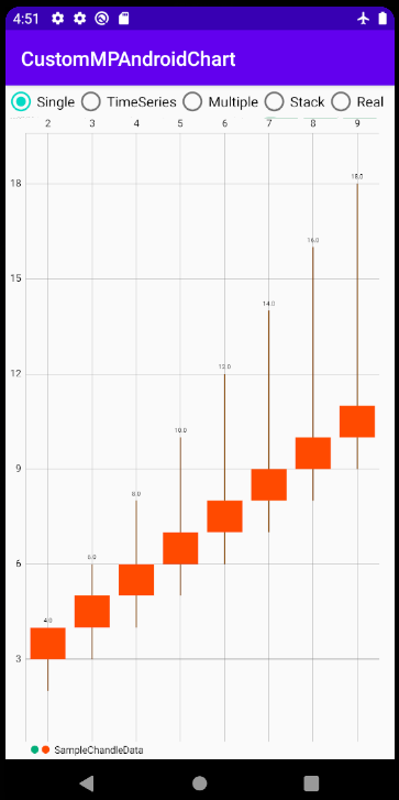
3. ローソク足グラフの実装方法
「ローソク足グラフ」とは株価のチャートで使われているグラフで、
箱ひげ図の代用にも使えます実装方法を、レイアウト(.xml)と処理部(.kt)にわけて解説します。
レイアウトの実装
LineChartのときと同様に、CandleStickChart用のウィジェットをレイアウト(例:activity_main.xml)中に組み込みます。
activity_main.xml: <com.github.mikephil.charting.charts.CandleStickChart android:id="@+id/candleStickChartExample" android:layout_width="match_parent" android:layout_height="match_parent"/> :実行コードの実装
ローソク足グラフ作成メソッドを呼び出す処理を、Kotlinファイル(例:MainActivity.kt)内に実装します。
・横軸が数値のとき
・横軸を時系列にしたいとき
で例を分けて解説します。横軸が数値のとき
Entryへのデータ格納時に、X軸の値、Y最大値、Y最小値、Y開始値、Y終了値の5種類の引数を指定する必要があることに注意してください
        //表示用サンプルデータの作成//
        val x = listOf<Float>(2f, 3f, 4f, 5f, 6f, 7f, 8f, 9f)//X軸データ
        val yHigh = x.map{it * 2}//Y軸データ(最大値)
        val yLow = x.map{it}//Y軸データ(最小値)
        val yOpen = x.map{it + 1}//Y軸データ(開始値)
        val yClose = x.map{it + 2}//Y軸データ(終了値)

        //Chartフォーマット
        var candleChartFormat = CandleChartFormat(/*ここでChartフォーマット指定*/)
        //DataSetフォーマット(カテゴリ名のMap)
        var candleDataSetFormat = CandleDataSetFormat(/*ここでDataSetフォーマット指定*/)

        //①Entryにデータ格納(カテゴリ名のMap)
        val candleEntries = makeCandleChartData(x, yHigh, yLow, yOpen, yClose)

        //②~⑦グラフの作成
        setupCandleStickChart(candleEntries, candleStickChart, candleChartFormat, candleDataSetFormat, context)
横軸を時系列にしたいとき
横軸を時系列にしたいときは、Entryにデータ格納するメソッドを、
makeCandleChartData() → makeDateCandleChartData()
に変更します※timeAccuracyプロパティ指定はできません
        //表示用サンプルデータの作成//
        //X軸データ(時間)
        val sdf: SimpleDateFormat = SimpleDateFormat("yyyy/MM/dd HH:mm:ss")
        val x = listOf<Date>(
            sdf.parse("2020/09/01 00:00:00"),
            sdf.parse("2020/09/01 06:00:00"),
            sdf.parse("2020/09/01 12:00:00"),
            sdf.parse("2020/09/01 18:00:00"),
            sdf.parse("2020/09/02 00:00:00"),
            sdf.parse("2020/09/02 06:00:00"),
            sdf.parse("2020/09/02 12:00:00"),
            sdf.parse("2020/09/03 18:00:00"),
        )
        val ySeed = listOf<Float>(2f, 3f, 4f, 5f, 6f, 7f, 8f, 9f)//Y軸データ生成用
        val yHigh = ySeed.map{it * 2}//Y軸データ(最大値)
        val yLow = ySeed.map{it}//Y軸データ(最小値)
        val yOpen = ySeed.map{it + 1}//Y軸データ(開始値)
        val yClose = ySeed.map{it + 2}//Y軸データ(終了値)

        //Chartフォーマット
        var candleChartFormat = CandleChartFormat(/*ここでChartフォーマット指定*/)
        //DataSetフォーマット
        var candleDataSetFormat = CandleDataSetFormat(/*ここでDataSetフォーマット指定*/)

        //①Entryにデータ格納
        val candleEntries = makeDateCandleChartData(x, yHigh, yLow, yOpen, yClose)

        //②~⑦グラフの作成
        setupCandleStickChart(candleEntries, candleStickChart, candleChartFormat, candleDataSetFormat, context)
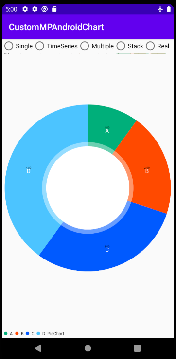
4. 円グラフの実装方法
円グラフの実装方法を、レイアウト(.xml)と処理部(.ktあるいは.java)にわけて解説します。
レイアウトの実装
LineChartのときと同様に、PieChart用のウィジェットをレイアウト(例:activity_main.xml)中に組み込みます。
activity_main.xml: <com.github.mikephil.charting.charts.PieChart android:id="@+id/pieChartExample" android:layout_width="match_parent" android:layout_height="match_parent"/> :実行コードの実装
円グラフ作成メソッドを呼び出す処理を、Kotlinファイル(例:MainActivity.kt)内に実装します。
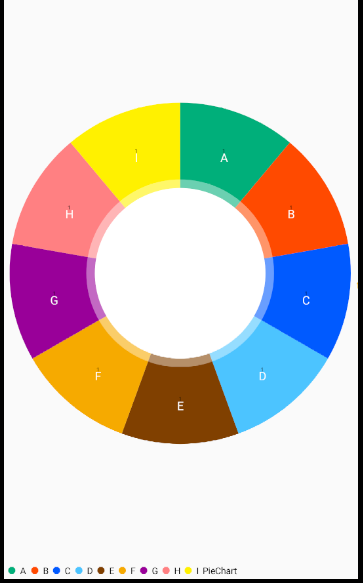
        //表示用サンプルデータの作成//
        val dimensions = listOf("A", "B", "C", "D")//分割円の名称(String型)
        val values = listOf(1f, 2f, 3f, 4f)//分割円の大きさ(Float型)

        //Chartフォーマット
        var pieChartFormat = PieChartFormat(/*ここでChartフォーマット指定*/)
        //DataSetフォーマット
        var pieDataSetFormat = PieDataSetFormat(/*ここでDataSetフォーマット指定*/)

        //①Entryにデータ格納
        val pieEntries = makePieChartEntries(dimensions, values)

        //②~⑦グラフの作成
        setupPieChart(pieEntries, pieChart, "PieChart", pieChartFormat, pieDataSetFormat)
UIフォーマットの指定方法
グラフ全体(Chart)に適用するものと、カテゴリ毎(DataSet)に適用するものを分けて解説します。
適用方法は、下のようにコンストラクタに引数を与えることで各プロパティ内容が指定できます。
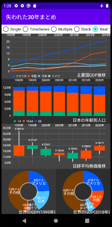
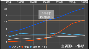
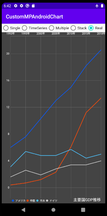
(指定がない場合は前章「使用方法」で図示しているようなUIとなります)//表示用サンプルデータの作成// //X軸データ(時間) val sdf: SimpleDateFormat = SimpleDateFormat("yyyy/M") val x = listOf<Date>( sdf.parse("1990/1"), sdf.parse("1995/1"), sdf.parse("2000/1"), sdf.parse("2005/1"), sdf.parse("2010/1"), sdf.parse("2015/1"), sdf.parse("2018/1") ) val y1 = listOf(6.0f, 7.6f, 10.3f, 13.0f, 15.0f, 18.2f, 20.6f)//Y軸データ1(アメリカ) val y2 = listOf(0.4f, 0.7f, 1.2f, 2.3f, 6.1f, 11.2f, 13.4f)//Y軸データ2(中国) val y3 = listOf(3.1f, 5.4f, 4.8f, 4.8f, 5.7f, 4.4f, 5.0f)//Y軸データ3(日本) val y4 = listOf(1.6f, 2.6f, 1.9f, 2.8f, 3.4f, 3.4f, 4.0f)//Y軸データ4(ドイツ) ///////////ここでChartフォーマットの指定/////////// var lineChartFormat = LineChartFormat( legendTextSize = 10f, description = "主要国GDP推移", descriptionTextSize = 15f, descriptionYOffset = -10f, bgColor = Color.DKGRAY, xAxisDateFormat = SimpleDateFormat("yyyy年"), toolTipDateFormat = SimpleDateFormat("yyyy年"), toolTipDirection = "xy", toolTipUnitY = "兆ドル" ) ///////////ここでDataSetフォーマットの指定(カテゴリ名のMap)/////////// var lineDataSetFormat = mapOf( "アメリカ" to LineDataSetFormat(//線1のDataSetフォーマット指定 lineColor = UNIVERSAL_BLUE, lineWidth = 2f ), "中国" to LineDataSetFormat(//線2のDataSetフォーマット指定 lineColor = UNIVERSAL_RED, lineWidth = 2f ), "日本" to LineDataSetFormat(//線3のDataSetフォーマット指定 lineColor = UNIVERSAL_SKYBLUE, lineWidth = 2f ), "ドイツ" to LineDataSetFormat(//線4のDataSetフォーマット指定 lineColor = Color.LTGRAY, lineWidth = 2f ) ) //①Entryにデータ格納(カテゴリ名のMap) val allLinesEntries: MutableMap<String, MutableList<Entry>> = mutableMapOf( "アメリカ" to makeDateLineChartData(x, y1, false), "中国" to makeDateLineChartData(x, y2, false), "日本" to makeDateLineChartData(x, y3, false), "ドイツ" to makeDateLineChartData(x, y4, false) ) //②~⑦グラフの作成 setupLineChart(allLinesEntries, lineChart, lineChartFormat, lineDataSetFormat, context)
GitHubのMainActivity.ktに実装例がいくつかある(特に後半の4メソッド)ので、こちらを参照頂けると分かりやすいかと思います
グラフ全体(Chart)に適用するUIフォーマット一覧
下記に、Chartフォーマットにおいて指定可能なプロパティ一覧を記載します。
「MPAndroidChartでのプロパティ名」列のリンクで、実際にどのようにUIが変わるかを図示しました(別記事)
※MPAndroidChartに対応が存在しない本パッケージオリジナルプロパティに関しては、本記事内で別途変化を図示しております。
適用対象 変更項目 Chartフォーマットでのプロパティ名 型 備考 MPAndroidChartでのプロパティ名 折れ線 棒グラフ ローソク足 円グラフ 凡例 マーク形状 legendFormat Legend.LegendForm? nullなら凡例表示なし .legend.form 〇 〇 〇 〇 凡例 文字色 legentTextColor Int? nullならデフォルト(黒) .legend.textColor 〇 〇 〇 〇 凡例 文字サイズ legendTextSize Float? nullならデフォルト .legend.textSize 〇 〇 〇 〇 説明ラベル 表示文字列 description String? nullなら説明ラベルなし .description.text 〇 〇 〇 〇 説明ラベル 文字色 descriptionTextColor Int? nullならデフォルト(黒) .description.textColor 〇 〇 〇 〇 説明ラベル 文字サイズ descriptionTextSize Float? nullならデフォルト .description.textSize 〇 〇 〇 〇 説明ラベル 横位置微調整 descriptionXOffset Float? nullならデフォルト .description.xOffset 〇 〇 〇 〇 説明ラベル 縦位置微調整 descriptionYOffset Float? nullならデフォルト .description.yOffset 〇 〇 〇 〇 背景 背景色 bgColor Int? nullならデフォルト(白) .setBackgroundColor() 〇 〇 〇 〇 タッチ操作 有効無効 touch Boolean .setTouchEnabled() 〇 〇 〇 X軸ラベル 表示有無 xAxisEnabled Boolean .xAxis.isEnabled 〇 〇 〇 X軸ラベル 文字色 xAxisTextColor Int? nullならデフォルト(黒) .xAxis.textColor 〇 〇 〇 X軸ラベル 文字サイズ xAxisTextSize Float? nullならデフォルト .xAxis.textSize 〇 〇 〇 X軸ラベル 時刻表示フォーマット xAxisDateFormat SimpleDateFormat? nullならM/d H:mm - 〇 〇 〇 左Y軸ラベル 表示有無 yAxisLeftEnabled Boolean .axisLeft.isEnabled 〇 〇 〇 左Y軸ラベル 文字色 yAxisLeftTextColor Int? nullならデフォルト(黒) .axisLeft.textColor 〇 〇 〇 左Y軸ラベル 文字サイズ yAxisLeftTextSize Float? nullならデフォルト .axisLeft.textSize 〇 〇 〇 左Y軸ラベル 表示下限 yAxisLeftMin Float? nullなら下限なし .axisLeft.axisMinimum 〇 〇 〇 左Y軸ラベル 表示上限 yAxisLeftMax Float? nullなら上限なし .axisLeft.axisMaximam 〇 〇 〇 右Y軸ラベル 表示有無 yAxisRightEnabled Boolean .axisRight.isEnabled 〇 〇 〇 右Y軸ラベル 文字色 yAxisRightTextColor Int? nullならデフォルト(黒) .axisRight.textColor 〇 〇 〇 右Y軸ラベル 文字サイズ yAxisRightTextSize Float? nullならデフォルト .axisRight.textSize 〇 〇 〇 右Y軸ラベル 表示下限 yAxisRightMin Float? nullなら下限なし .axisRight.axisMinimum 〇 〇 〇 右Y軸ラベル 表示上限 yAxisRightMax Float? nullなら上限なし .axisRight.axisMaximam 〇 〇 〇 拡大操作 拡大方向 zoomDirection String? "x", "y", "xy"
nullなら拡大無効.isScaleXEnabled
.isScaleYEnabled
.setScaleEnabled()〇 〇 〇 拡大操作 ピンチ操作有効 zoomPinch Boolean .setPinchZoom() 〇 〇 〇 ツールヒント 表示する軸 toolTipDirection String? "x", "y", "xy"
nullならツールヒントなし.marker 〇 〇 〇 ツールヒント 時系列グラフのときのフォーマット toolTipDateFormat SimpleDateFormat? nullならM/d H:mm .marker 〇 〇 〇 ツールヒント X軸の単位 toolTipUnitX String デフォルトは単位なし("") .marker 〇 〇 〇 ツールヒント Y軸の単位 toolTipUnitY String デフォルトは単位なし("") .marker 〇 〇 〇 X軸表示法 時間軸スケールの正確性 timeAccuracy Boolean Trueなら時間軸を正確表示(ラベルは最大最小値のみ) - 〇 ラベル 文字色 labelColor Int? nullならデフォルト(黒) .setEntryLabelColor() 〇 ラベル 文字サイズ labelTextSize Float? nullならデフォルト .setEntryLabelTextSize() 〇 中央のテキスト 表示文字列 centerText String? nullなら中央テキストなし .centerText 〇 中央のテキスト 文字色 centerTextColor Int? nullならデフォルト(黒) .setCenterTextColor() 〇 中央のテキスト 文字サイズ centerTextSize Float? nullならデフォルト .setCenterTextSize() 〇 中央の穴 穴の半径 holeRadius Float? nullならデフォルト .holeRadius 〇 中央の穴 穴周辺の色が薄い部分の幅 transparentCircleRadius Float? nullならデフォルト .transparentCircleRadius 〇 中央の穴 穴の塗りつぶし色 holeColor Int? nullならデフォルト(黒) .setHoleColor() 〇 ______________ ____________ ________________ 本パッケージオリジナルメソッド
xAxisDateFormat
X軸の時刻表示フォーマットを変更します(時系列グラフのときのみ。デフォルトは"M/d H:mm")
var lineChartFormat = LineChartFormat(xAxisDateFormat = SimpleDateFormat("d日H時"))
timeAccuracy
前述した内容と同様に、時間軸スケールの正確性を指定します(時系列折れ線グラフのみ)
スケールを正確に表示し、時間ラベルは最大最小のみ表示var lineChartFormat = LineChartFormat(timeAccuracy=true)
正確性は下がるが、時間ラベルを全て表示var lineChartFormat = LineChartFormat(timeAccuracy=false)
toolTipDirection
ツールヒント表示なしvar lineChartFormat = LineChartFormat(toolTipDirection=null)
ツールヒントにX軸の値を表示var lineChartFormat = LineChartFormat(toolTipDirection="x")
ツールヒントにY軸の値を表示var lineChartFormat = LineChartFormat(toolTipDirection="y")
ツールヒントにX軸Y軸両方の値を表示var lineChartFormat = LineChartFormat(toolTipDirection="xy")
toolTipDateFormat
ツールヒントの時刻表示フォーマットを変更します(時系列グラフのときのみ。デフォルトは"M/d H:mm")
ツールヒントの時刻表示フォーマットを"d日H時"にするvar lineChartFormat = LineChartFormat( toolTipDirection="xy", toolTipDateFormat = SimpleDateFormat("d日H時") )
toolTipUnitX
ツールヒントのX軸表示に付加する単位を指定します(デフォルトは単位なし)
ツールヒントのX軸単位を"日目"にするvar lineChartFormat = LineChartFormat( toolTipDirection="xy", toolTipUnitX = "日目" )
toolTipUnitY
ツールヒントのY軸表示に付加する単位を指定します(デフォルトは単位なし)
ツールヒントのY軸単位を"円"にするvar lineChartFormat = LineChartFormat( toolTipDirection="xy", toolTipUnitY = "円" )
カテゴリごと(DataSet)に適用するUIフォーマット一覧
下記に、DataSetフォーマット(線ごと、棒ごとetc.に指定)において指定可能なプロパティ一覧を記載します。
「MPAndroidChartでのプロパティ名」列のリンクで、実際にどのようにUIが変わるかを図示しました(別記事)
※MPAndroidChartに対応が存在しない本パッケージオリジナルプロパティに関しては、本記事内で別途変化を図示しております。
適用対象 変更項目 DataSetフォーマットでのプロパティ名 型 備考 MPAndroidChartでのプロパティ名 折れ線 棒グラフ ローソク足 円グラフ 値表示 値表示の有無 drawValue Boolean .setDrawValues() 〇 〇 〇 〇 値表示 値表示の文字色 valueTextColor Int? nullならデフォルト(黒) .valueTextColor 〇 〇 〇 〇 値表示 値表示の文字サイズ valueTextSize Float? nullならデフォルト .valueTextSize 〇 〇 〇 〇 値表示 値表示のフォーマット valueTextFormatter String? nullならデフォルト .valueFormatter 〇 〇 〇 〇 軸 左右軸どちらを使用するか axisDependency YAxis.AxisDependency? nullなら左Y軸 .axisDependency 〇 〇 線 線の色 lineColor Int? nullならデフォルト(水色) .color 〇 線 幅 lineWidth Float? nullならデフォルト .lineWidth 〇 線 補完方法 fittingMode LineDataSet.Mode? nullならデフォルト(直線補完) .mode 〇 データ点 表示有無 drawCircles Boolean .setDrawCircles() 〇 データ点 枠の色 circleColor Int? nullならデフォルト(水色) .setCircleColor() 〇 データ点 枠の半径 circleRadius Float? nullならデフォルト .circleRadius 〇 データ点 穴の塗りつぶし色 circleHoleColor Int? nullならデフォルト(白) .circleHoleRadius 〇 データ点 穴の半径 circleHoleRadius Float? nullならデフォルト .circleHoleColor 〇 棒 棒の色 barColor Int? nullならデフォルト(水色) .color 積み上げ以外 棒 各積み上げ棒の色リスト barColors List .colors 積み上げ 棒 積み上げ棒のカテゴリ名 stackLabels List? nullならデフォルト(ラベル名で埋める) .stackLabels 積み上げ ローソク細線 線の色 shadowColor Int .shadowColor 〇 ローソク細線 幅 shadowWidth Float? nullならデフォルト .shadowWidth 〇 ローソク太線 減少時の色 decreasingColor Int .decreasingColor 〇 ローソク太線 減少時の塗りつぶし形式 decreasingPaint Paint.Style? nullなら塗りつぶしあり .decreasingPaintStyle 〇 ローソク太線 増加時の色 increasingColor Int? nullなら色なし .increasingColor 〇 ローソク太線 増加時の塗りつぶし形式 increasingPaint Paint.Style? nullなら塗りつぶしなし .increasingPaintStyle 〇 分割円 分割円の色 colors List .colors 〇 ______________ ____________ ________________ 本パッケージオリジナルメソッド
valueTextFormatter
値表示のフォーマットを指定します
(MPAndroidChartではValueFormatterクラス内をオーバーライドして指定しますが、本パッケージではString型で指定します)整数(小数点以下0位)で表示var lineDataSetFormat = mapOf( "linear" to LineDataSetFormat( drawValue = true, valueTextSize = 12f, valueTextFormatter = "%.0f" ) )
小数点以下2位で表示var lineDataSetFormat = mapOf( "linear" to LineDataSetFormat( drawValue = true, valueTextSize = 12f, valueTextFormatter = "%.2f" ) )
小数点以下1位+"円"で表示var lineDataSetFormat = mapOf( "linear" to LineDataSetFormat( drawValue = true, valueTextSize = 12f, valueTextFormatter = "%.1f円" ) )
参考
MPAndroidChartにおける時系列グラフの作り方
時系列でないグラフの場合
時系列ではない(X軸がFloat型の数値)グラフでは、
val x = listOf<Float>(1f, 2f, 3f, 5f, 8f, 13f, 21f, 34f)
val y = x.map{it*it}
var entryList = mutableListOf<Entry>()
for(i in x.indices){
    entryList.add(Entry(x[i], y[i]))
}
というように、Entryの第一項にX軸の値を、第二項にY軸の値を入れれば、入力したX軸の値に合わせて
val lineDataSets = ListOf<ILineDataSet>(LineDataSet())
lineChart.data = LineData(lineDataSets)
とすれば、下図のように両軸共に正しくプロットされます。
時系列グラフの場合
X軸がDate(java.util.Date)型の数値のとき、Entryの第一項にX軸の値を入力することができません。
        val sdf: SimpleDateFormat = SimpleDateFormat("yyyy/MM/dd HH:mm:ss")
        val x = listOf<Date>(
            sdf.parse("2020/09/01 00:00:00"),
            sdf.parse("2020/09/01 06:00:00"),
            sdf.parse("2020/09/01 12:00:00"),
            sdf.parse("2020/09/01 18:00:00"),
            sdf.parse("2020/09/02 00:00:00"),
            sdf.parse("2020/09/02 06:00:00"),
            sdf.parse("2020/09/02 12:00:00"),
            sdf.parse("2020/09/02 18:00:00"),
        )
        val y = listOf<Float>(1f, 2f, 3f, 5f, 8f, 13f, 21f, 34f)
        //Entryにデータ格納
        var entryList = mutableListOf<Entry>()
        for(i in x.indices){
            entryList.add(
                Entry(x[i], y[i])//←ここでエラーが出る
            )
        }
        val lineDataSets = listOf<ILineDataSet>(LineDataSet(entryList,"label"))
        lineChart.data = LineData(lineDataSets)
Entryの第一項にはFloat型を格納する必要があるので、indexをFloat型に変換して格納します(代わりに第3項に日付データを保持しておく)
          :
        //Entryにデータ格納
        var entryList = mutableListOf<Entry>()
        for(i in x.indices){
            entryList.add(
                Entry(i.toFloat(), y[i], x[i])
            )
        }
          :
しかしこのままでは
!
のように、X軸のラベルがただのインデックスとなってしまい、時刻が何時だか分かりません。
下記のように、時刻を文字列リストに変換してX軸ラベルに指定することで、ラベルを表示することができます。: //X軸の値を日付型→文字列に変換し、X軸ラベルに指定 val xStr = x.map { SimpleDateFormat("M/d H:mm").format(it)} lineChart.xAxis.valueFormatter = IndexAxisValueFormatter(xStr) val lineDataSets = listOf<ILineDataSet>(LineDataSet(entryList,"label")) lineChart.data = LineData(lineDataSets)


- 投稿日:2020-09-28T01:16:33+09:00
【入門】iOS アプリ開発 #10【ゲームの各種設定(難易度やスピードレベル)】
はじめに
今回はラウンドによって変化する難易度やスピードレベルの詳細を作り込み、#5【シーケンスの設計】で作成した各画面モードを結合して、ほぼ完成の状態に持っていく(以下がイメージ動画)。ソースコードは GitHub に公開しているので参照してほしい。
※YouTube動画
仕様書
ラウンドによって変化する難易度やスピードレベルの仕様は以下の通り。
今回、難易度表の外国用バージョンと、スパート②設定は作成しない。
難易度表とスピード表の実装
タプルの配列として、難易度表とスピード表を実装する。
以下、各画面モードの結合を除き、全て CgContextクラスに含める。enum EnLevel: Int { case Level_A = 0, Level_B, Level_C, Level_D } let table_difficultySettings: [(round: Int, levelOfSpeed: EnLevel, timeWithPower: Int, numberOfFeedsRemaingToSpurt: Int, levelOfAppearance: EnLevel, kindOfSpecialTarget: CgSpecialTarget.EnSpecialTarget, timeNotToEat: Int, intermission: Int)] = [ //round, speedLevel, PowerTime[ms], Spurtfeeds, GhostAppear, SpecialTarget, NoEatTime[ms], Intermission ( 1, .Level_A, 6000, 20, .Level_A, .Cherry, 4000, 0 ), ( 2, .Level_B, 5000, 30, .Level_B, .Strawberry, 4000, 1 ), ( 3, .Level_B, 4000, 40, .Level_C, .Orange, 3000, 0 ), ( 4, .Level_B, 3000, 40, .Level_C, .Orange, 3000, 0 ), ( 5, .Level_C, 2000, 40, .Level_C, .Apple, 3000, 2 ), ( 6, .Level_C, 5000, 50, .Level_C, .Apple, 3000, 0 ), ( 7, .Level_C, 2000, 50, .Level_C, .Melon, 3000, 0 ), ( 8, .Level_C, 2000, 50, .Level_C, .Melon, 3000, 0 ), ( 9, .Level_C, 1000, 60, .Level_C, .Galaxian, 3000, 3 ), ( 10, .Level_C, 5000, 60, .Level_C, .Galaxian, 3000, 0 ), ( 11, .Level_C, 2000, 60, .Level_C, .Bell, 3000, 0 ), ( 12, .Level_C, 1000, 80, .Level_C, .Bell, 3000, 0 ), ( 13, .Level_C, 1000, 80, .Level_C, .Key, 3000, 3 ), ( 14, .Level_C, 3000, 80, .Level_C, .Key, 3000, 0 ), ( 15, .Level_C, 1000, 100, .Level_C, .Key, 3000, 0 ), ( 16, .Level_C, 1000, 100, .Level_C, .Key, 3000, 0 ), ( 17, .Level_C, 0, 100, .Level_C, .Key, 3000, 3 ), ( 18, .Level_C, 1000, 100, .Level_C, .Key, 3000, 0 ), ( 19, .Level_C, 0, 100, .Level_C, .Key, 3000, 0 ), ( 20, .Level_C, 0, 100, .Level_C, .Key, 3000, 0 ), ( 21, .Level_C, 0, 100, .Level_C, .Key, 3000, 0 ), ( 22, .Level_D, 0, 100, .Level_C, .Key, 3000, 0 ) ] let table_speedSettings: [ (eatNone: Int, eatFeed: Int, eatPow: Int, eatNoneInPow: Int, eatFeedInPow: Int, eatPowInPow: Int, ghost: Int, ghostInSpurt: Int, ghostInPow: Int, ghostInWarp: Int) ] = [ // Level A ( eatNone: 16, eatFeed: 15, eatPow: 13, eatNoneInPow: 18, eatFeedInPow: 17, eatPowInPow: 15, ghost: 15, ghostInSpurt: 16, ghostInPow: 10, ghostInWarp: 8 ), // Level B ( eatNone: 18, eatFeed: 17, eatPow: 15, eatNoneInPow: 19, eatFeedInPow: 18, eatPowInPow: 16, ghost: 17, ghostInSpurt: 18, ghostInPow: 11, ghostInWarp: 9 ), // Level C ( eatNone: 20, eatFeed: 19, eatPow: 17, eatNoneInPow: 20, eatFeedInPow: 19, eatPowInPow: 17, ghost: 19, ghostInSpurt: 20, ghostInPow: 12, ghostInWarp: 10 ), // Level D ( eatNone: 18, eatFeed: 17, eatPow: 15, eatNoneInPow: 18, eatFeedInPow: 17, eatPowInPow: 15, ghost: 19, ghostInSpurt: 20, ghostInPow: 10, ghostInWarp: 9 ) ]このタプルの配列からラウンドに合わせたデータを取り出して、CgContext クラスのメンバにそれぞれ設定する。
    /// Set difficulty of the round
    func setDifficulty() {
        let index = demo ? 0 : round-1
        let count = table_difficultySettings.count
        let table = (index < count) ? table_difficultySettings[index] : table_difficultySettings[count-1]

        levelOfSpeed = table.levelOfSpeed
        timeWithPower = table.timeWithPower
        numberOfFeedsRemaingToSpurt = table.numberOfFeedsRemaingToSpurt
        levelOfAppearance = table.levelOfAppearance
        kindOfSpecialTarget = table.kindOfSpecialTarget
        timeNotToEat = table.timeNotToEat
        intermission = table.intermission
    }
プレイヤー(パックマン)のスピードを取得するメソッドについては以下の通り。パワーエサを食べて逆転している時と、そうでない時で取得する値を変える。
    func getPlayerSpeed(action: CgPlayer.EnPlayerAction, with power: Bool ) -> Int {
        let index = levelOfSpeed.rawValue
        let count = table_speedSettings.count
        let table = (index < count) ? table_speedSettings[index] : table_speedSettings[count-1]

        switch action {
            case .Walking where !power : return table.eatNone
            case .Walking where  power : return table.eatNoneInPow
            case .EatingFeed where !power : return table.eatFeed
            case .EatingFeed where  power : return table.eatFeedInPow
            case .EatingPower where !power : return table.eatPow
            case .EatingPower where  power : return table.eatPowInPow
            case .EatingFruit where !power : return table.eatNone
            case .EatingFruit where  power : return table.eatNoneInPow
            default: return 16
        }
    }
モンスター(ゴースト)出現タイミングの実装
パックマンがプレイ開始からエサを食べた数 numberOfFeedsEated によって、レベル毎に出現するゴーストの数を返す。
    func getNumberOfGhostsForAppearace() -> Int {
        let numberOfGhosts: Int
        // Miss Bypass Sequence
        if playerMiss {
            if numberOfFeedsEatedByMiss < 7 {
                numberOfGhosts = 1
            } else if numberOfFeedsEatedByMiss < 17 {
                numberOfGhosts = 2
            } else if numberOfFeedsEatedByMiss < 32 {
                numberOfGhosts = 3
            } else {
                playerMiss = false
                numberOfGhosts = getNumberOfGhostsForAppearace()
            }
        } else {
            switch levelOfAppearance {
                case .Level_A:
                    if numberOfFeedsEated < 30 {
                        numberOfGhosts = 2
                    } else if numberOfFeedsEated < 90 {
                        numberOfGhosts = 3
                    } else {
                        numberOfGhosts = 4
                    }
                case .Level_B:
                    if numberOfFeedsEated < 50 {
                        numberOfGhosts = 3
                    } else {
                        numberOfGhosts = 4
                    }
                case .Level_C: fallthrough
                default:
                    numberOfGhosts = 4
            }
        }
        return numberOfGhosts
    }
波状攻撃の実装
スタート時からカウントしている時間によって、ChaseMode と ScatterMode を切り替える。レベル毎に ChaseMode の時間を判定する。
    func judgeGhostsWavyChase(time: Int) -> Bool {
        var chaseMode: Bool = false
        switch levelOfSpeed {
            case .Level_A:
                chaseMode = (time >= 7000 && time < 27000) || (time >= 34000 && time < 54000)
                         || (time >= 59000 && time < 79000) || (time >= 84000)
            case .Level_B:
                chaseMode = (time >= 7000 && time < 27000) || (time >= 34000 && time < 54000)
                         || (time >= 59000)
            case .Level_C: fallthrough
            case .Level_D:
                chaseMode = (time >= 5000 && time < 25000) || (time >= 30000 && time < 50000)
                         || (time >= 55000)
        }
        return chaseMode
    }
各画面モードの結合
最後に CgGameMainクラスに、今まで作成した各モードを結合していく。
- アトラクトモード:CgSceneAttractMode
- クレジットモード:CgSceneCreditMode ※今回作成 GameSequences.swift に追加
- スタートモード:CgSceneMaze
- プレイモード:CgSceneMaze実行中
class CgGameMain : CgSceneFrame {

    enum EnMainMode: Int {
        case AttractMode = 0, CreditMode, WaitForStartButton, StartMode, PlayMode
    }

    enum EnSubMode: Int {
        case Character = 0, StartDemo, PlayDemo
    }

    private var scene_attractMode: CgSceneAttractMode!
    private var scene_creditMode: CgSceneCreditMode!
    private var scene_maze: CgSceneMaze!
    private var subMode: EnSubMode = .Character

    init(skscene: SKScene) {
        super.init()

        // Create SpriteKit managers.
        self.sprite = CgSpriteManager(view: skscene, imageNamed: "pacman16_16.png", width: 16, height: 16, maxNumber: 64)
        self.background = CgCustomBackgroundManager(view: skscene, imageNamed: "pacman8_8.png", width: 8, height: 8, maxNumber: 2)
        self.sound = CgSoundManager(binding: self, view: skscene)
        self.context = CgContext()

        scene_attractMode = CgSceneAttractMode(object: self)
        scene_creditMode = CgSceneCreditMode(object: self)
        scene_maze = CgSceneMaze(object: self)
    }

    /// Event handler
    /// - Parameters:
    ///   - sender: Message sender
    ///   - id: Message ID
    ///   - values: Parameters of message
    override func handleEvent(sender: CbObject, message: EnMessage, parameter values: [Int]) {
        if message == .Touch {
            if let mode: EnMainMode = EnMainMode(rawValue: getSequence()) {
                if mode == .AttractMode || mode == .WaitForStartButton {
                    goToNextSequence()
                }
            }
        }
    }

    /// Handle sequence
    /// To override in a derived class.
    /// - Parameter sequence: Sequence number
    /// - Returns: If true, continue the sequence, if not, end the sequence.
    override func handleSequence(sequence: Int) -> Bool {
        guard let mode: EnMainMode = EnMainMode(rawValue: sequence) else { return false }

        switch mode {
            case .AttractMode: attarctMode()
            case .CreditMode: creditMode()
            case .WaitForStartButton: break // Forever loop
            case .StartMode: startMode()
            case .PlayMode: playMode()
        }

        // Continue running sequence.
        return true
    }

    // ============================================================
    //  Execute each mode.
    // ============================================================

    func attarctMode() {
        switch subMode {
            case .Character:
                scene_attractMode.resetSequence()
                scene_attractMode.startSequence()
                subMode = .StartDemo

            case .StartDemo:
                if !scene_attractMode.enabled {
                    context.demo = true
                    sound.enableOutput(false)
                    scene_maze.resetSequence()
                    scene_maze.startSequence()
                    subMode = .PlayDemo
                }

            case .PlayDemo:
                if !scene_maze.enabled {
                    subMode = .Character
                }
        }
    }

    func creditMode() {
        context.demo = false
        if scene_attractMode.enabled {
            scene_attractMode.stopSequence()
            scene_attractMode.clear()
        }
        if scene_maze.enabled {
            scene_maze.stopSequence()
            scene_maze.clear()
        }

        context.credit += 1
        scene_creditMode.resetSequence()
        scene_creditMode.startSequence()
        sound.enableOutput(true)
        sound.playSE(.Credit)
        goToNextSequence()
    }

    func startMode() {
        context.credit -= 1
        scene_creditMode.stopSequence()
        scene_maze.resetSequence()
        scene_maze.startSequence()
        goToNextSequence()
    }

    func playMode() {
        if !scene_maze.enabled {
            subMode = .Character
            goToNextSequence(EnMainMode.AttractMode.rawValue)
        }
    }

}
またアトラクトモードにはキャラクター紹介に加えてプレイのデモがある。
こちらは、demo のフラグで、スワイプ操作と予め用意した操作テーブルを切り替えることで簡単に実装できた。操作テーブルと取得メソッドは CgContextクラスに実装。
スタートからのフレーム数によって方向を取り出す。let table_operationInDemo: [ (frameCount: Int, direction: EnDirection) ] = [ (9, .Left), (36, .Down), (61, .Right), (82, .Down), (109, .Right), (133, .Up), (162, .Right), (189, .Up), (215, .Right), (238, .Down), (261, .Right), (308, .Down), (335, .Left), (523, .Up), (555, .Right), (569, .Up), (609, .Left), (632, .Up), (648, .Right), (684, .Up), (732, .Left), (831, .Down), (864, .Left), (931, .Up), (948, .Left), (970, .Up), (1063, .Right), (1113, .Down), (1157, .Right), (1218, .Down) ] func getOperationForDemo() -> EnDirection { guard(demoSequence < table_operationInDemo.count) else { return .None } let table = table_operationInDemo[demoSequence] var direction: EnDirection = .None if counterByFrame >= table.frameCount { direction = table.direction demoSequence += 1 } return direction }getOperationForDemo メソッドで操作方向を取得してプレイヤーに設定する。CgSceneMazeクラスの sequenceUpdating シーケンスに追加実装。
    func sequenceUpdating() {
        // Operate player in demonstration automatically.
        if context.demo {
            let direction = context.getOperationForDemo()
            if direction != .None {
                player.targetDirecition = direction
            }
        }

        // 以下、省略
まとめ
ようやく、ほぼ完成の状態になった。
ゲームの動作スピードも問題ない。
ソースコードも 5000行程度のままで、結構簡単にできるものだ。次回は、せっかく自作しているので色々とアレンジを行って完成としたい。

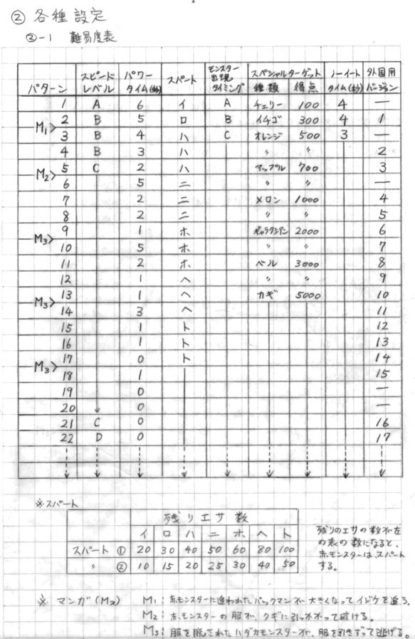
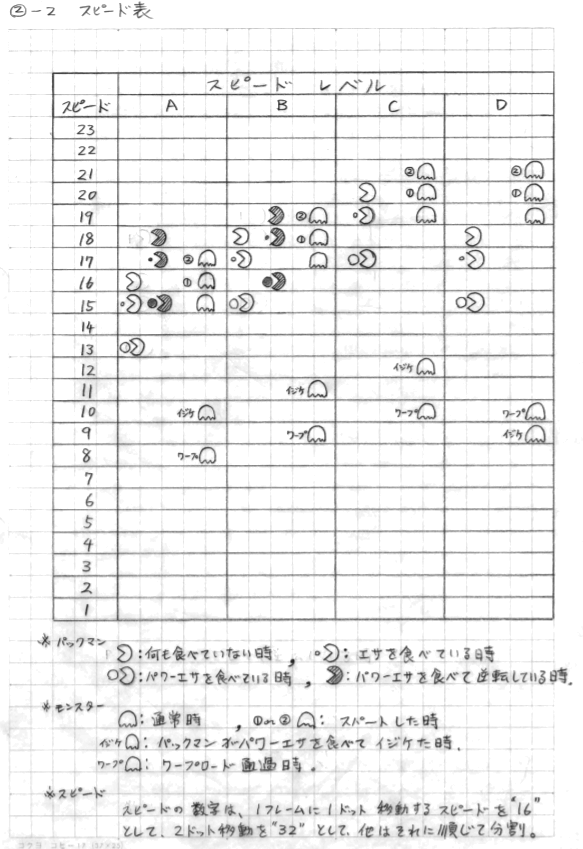
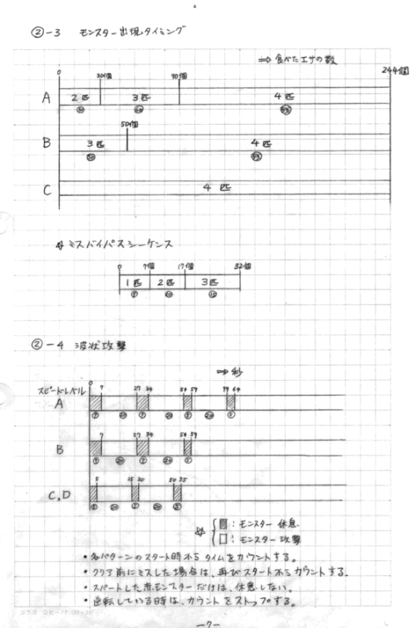
- 投稿日:2020-09-28T01:08:09+09:00
Swift:脱Realmする方法。
データベースを利用するためにRealmを使っていたのですが、よく考えるとRealmを使うほどでもない情報の保存しかしていないことに気づき、脱Realmしようと思い至りました。
そこで、Realmのデータを完全に削除する方法について調べると、公式リファレンスにてlet realmURL = Realm.Configuration.defaultConfiguration.fileURL! let realmURLs = [ realmURL, realmURL.appendingPathExtension("lock"), realmURL.appendingPathExtension("note"), realmURL.appendingPathExtension("management") ] let manager = NSFileManager.defaultManager() for URL in realmURLs { do { try FileManager.default.removeItem(at: URL) } catch { // handle error } }こんな感じで、
Realm.Configuration.defaultConfiguration.fileURLを用いてデータファイルを削除できるよって書いてありました。つまり、脱RealmするにはRealmが必要ってこと?? ヤダー? となったのですが、要はこのURLをなんとか生成できればいいんでしょという方針で対策することにしました。
func destroyRealm() {
    guard let dir = FileManager.default.urls(for: .applicationSupportDirectory, in: .userDomainMask).first
    else { return }
    let realmURLs: [URL] = [
        dir.appendingPathComponent("default.realm"),
        dir.appendingPathComponent("default.realm.lock"),
        dir.appendingPathComponent("default.realm.note"),
        dir.appendingPathComponent("default.realm.management")
    ]
    for url in realmURLs {
        try? FileManager.default.removeItem(at: url)
    }
}
これで、同等のURLを指定してファイルやディレクトリを削除することができるはずです。