- 投稿日:2020-09-12T21:59:48+09:00
[MERN⑥] Redux Setup & Alerts
~~~~~~~~~~ (Contents) MERN ~~~~~~~~~~~
[MERN①] Express & MongoDB Setup
https://qiita.com/niyomong/private/3281af84486876f897f7
[MERN②]User API Routes & JWT Authentication
https://qiita.com/niyomong/private/c11616ff7b64925f9a2b
[MERN③] Profile API Routes
https://qiita.com/niyomong/private/8cff4e6fa0e81b92cb49
[MERN④] Post API
https://qiita.com/niyomong/private/3ce66f15375ad04b8989
[MERN⑤] Getting Started With React & The Frontend
https://qiita.com/niyomong/private/a5759e2fb89c9f222b6b
[MERN⑥] Redux Setup & Alerts
https://qiita.com/niyomong/private/074c27259924c7fd306b
[MERN⑦] React User Authentication
https://qiita.com/niyomong/private/37151784671eff3b92b6
[MERN⑧] Dashboard & Profile Management
https://qiita.com/niyomong/private/ab7e5da1b1983a226aca
[MERN⑨] Profile Display
https://qiita.com/niyomong/private/42426135e959c7844dcb
[MERN⑩] Posts & Comments
https://qiita.com/niyomong/private/19c78aea482b734c3cf5
[MERN11] デプロイ
https://qiita.com/niyomong/private/150f9000ce51548134ad
~~~~~~~~~~~~~~~~~~~~~~~~~~~~~~~~~~~~~~1. Creating a Redux Store
boilerplate code(定型コード)
①src/store.jsファイルを生成 -> 定型コードを追加
src/store.jsimport { createStore, applyMiddleware } from 'redux'; import { composeWithDevTools } from 'redux-devtools-extension'; import thunk from 'redux-thunk'; import rootReducer from './reducers'; //reducersフォルダを全てimport const initialState = {}; const middleware = [thunk]; const store = createStore( rootReducer, initialState, composeWithDevTools(applyMiddleware(...middleware)) ); export default store;②
src/reducersフォルダを生成 -> src/reducers/index.jsファイルを生成③
App.jsに定型コードを追加。src/App.jsimport React, { Fragment } from 'react'; import { BrowserRouter as Router, Route, Switch } from 'react-router-dom'; import Navbar from './components/layout/Navbar'; import Landing from './components/layout/Landing'; import Register from './components/auth/Register'; import Login from './components/auth/Login'; + //Redux + import { Provider } from 'react-redux'; + import store from './store'; import './App.css'; const App = () => ( + <Provider store={store}> <Router> <Fragment> ... </Fragment> </Router> + </Provider> );④
reducers/index.jsに定型コードを追加。src/reducers/index.jsimport { combineReducers } from 'redux'; export default combineReducers({});⑤GoogleChromeの拡張機能(Reduxのdevtools)
・Reduxのdevtools追加前
・devtools追加後
2. Alert Reducer, Action & Types
Reduxの仕組みはアラート機能が一番わかりやすいのでAlert機能から進める。
①Alert Reducerファイルを生成 ->
reducers/index.jsにimportreducers/alert.jsimport { combineReducers } from 'redux'; + import alert from './alert'; export default combineReducers({});②Alert Reducerファイル生成。
recuers/alert.jsimport { SET_ALERT, REMOVE_ALERT } from '../actions/types'; const initialState = []; export default function (state = initialState, action) { const { type, payload } = action; switch (type) { case SET_ALERT: return [...state, payload]; case REMOVE_ALERT: return state.filter((alert) => alert.id !== payload); default: return state; } }③Actionフォルダ生成 -> actions/types.jsファイルを生成
actions/types.jsexport const SET_ALERT = 'SET_ALERT'; export const REMOVE_ALERT = 'REMOVE_ALERT';④AlertActionファイル生成
(1) uuid(Universally Unique ID)をインストール
$ npm i uuid
https://www.npmjs.com/package/uuid
(2) Registerコンポで記述したアラート内容とAlertType(CSSから呼び出すCSSデザイン)をtype(SET_ALERT)に乗せてdispatch->Reduceractions/alert.js(1) import { v4 as uuidv4 } from 'uuid'; import { SET_ALERT, REMOVE_ALERT } from './types'; export const setAlert = (msg, alertType, timeout = 5000) => (dispatch) => { const id = uuidv4(); dispatch({ type: SET_ALERT, (2) payload: { msg, alertType, id }, }); setTimeout(() => dispatch({ type: REMOVE_ALERT, payload: id }), timeout); };3. Alert Component & Action Call
①Register.jsにエラー時のAlert発火装置を設置
(1) Connect設置:Action{setAlert}の呼び出しのみ、Stateの呼び出し(mapStateToProps)はAlertコンポーネントで呼び出す。
・export default connect(A, B)(コンポーネント)
A: State、 B: Action
(2) PropTypesの設定: コンポーネントの props の型チェック
impt(ショートカット) -> import PropTypes from 'prop-types';
ptfr(ショートカット)= -> PropTypes.func.isRequired
*f->function, a->array, b->object
(3) Actionで記述したsetAlert(Action発火装置)を設置components/auth/Register.jsimport React, { Fragment, useState } from 'react'; (1)+ import { connect } from 'react-redux'; import { Link } from 'react-router-dom'; (3)+ import { setAlert } from '../../actions/alert'; (2)+ import PropTypes from 'prop-types'; (3)+ const Register = (setAlert) => { const [formData, setFormData] = useState({ name: '', email: '', password: '', password2: '', }); ... const onSubmit = (e) => { e.preventDefault(); if (password !== password2) { (3)+ setAlert('Passwords do not match', 'danger'); } else { .. return ( ... (2)+ Register.propTypes = { + setAlert: PropTypes.func.isRequired, + }; (1)+ export default connect(null, { setAlert })(Register);② Alertコンポーネント
racfp(ショートカット) -> 'Enter'
~~~ 詳細な記述 ~~~
(1) connect設置:Stateの呼び出し(mapStateToProps)のみ、ActionはRegister.jsで発火されるので、ここではnull。
(2) PropTypesの設定: コンポーネントの props の型チェック
(3) mapStateToProps: StateからPropsにデータ(エラーメッセージ)を渡す
(4) nullではない。
(5) array(エラー項目)が0ではない(何かしらのエラーがある)
(6) JSX(HTML風に書けるJS拡張構文) -> エラーメッセージを配列する
-> alertType: Register.jsで'danger'を設定
-> CSSにalert alert-danger(赤色ハイライト等)を記述している
->xxx-${ダイナミック}<- これダイナミック(動的)っていうらしい。components/layout/Alert.jsimport React from 'react'; (2) import PropTypes from 'prop-types'; (1) import { connect } from 'react-redux'; const Alert = ({ alerts }) => (4) alerts !== null && (5) alerts.length > 0 && (6) alerts.map((alert) => ( <div key={alert.id} className={`alert alert-${alert.alertType}`}> {alert.msg} </div> )); (2) Alert.propTypes = { alerts: PropTypes.array.isRequired, }; (3) const mapStateToProps = (state) => ({ alerts: state.alert, }); (1) export default connect(mapStateToProps)(Alert);③Alertコンポーネントはの上に持ってくる。
全ての画面に
Alertコンポーネントが常にある状態。要は、エラーが発生した時に、Navbarコンポーネントよりは下、コンポーネント(今回はRegisterコンポーネント)より上に表示される。src/App.js... import Login from './components/auth/Login'; + import Alert from './components/layout/Alert'; //Redux import { Provider } from 'react-redux'; ... const App = () => ( <Provider store={store}> <Router> <Fragment> <Navbar /> <Route exact path="/" component={Landing} /> <section className="container"> + <Alert /> <Switch> ...


- 投稿日:2020-09-12T19:59:48+09:00
【React】ライフサイクル
こちらの記事は以下の書籍を参考にアウトプットとして執筆しました。
React入門 React・Reduxの導入からサーバサイドレンダリングによるUXの向上まで私的アウトプットです。
ライフサイクル
ライフサイクルの種類
- コンポーネントのマウントで呼ばれるメソッド
- コンポーネントでのデータの変化によって呼ばれるメソッド
- エラーハンドリングで使うメソッド
マウントのライフサイクル
用語 説明 マウント 新たにReactコンポーネントが配置されること。 renderメソッドを初めて呼び出してマウント
2回目の呼び出しでアップデート
コンポーネントがDOMからなくなったらアンマウントoncomponentWillMount
マウント直前に呼ばれる
普通はコンストラクタで十分oncomponenDidMount
マウント直後に呼ばれる
イベントリスナの登録をするoncomponentWillUnMount
アンマウント直前に呼ばれる
後処理
setIntervalのcleaIntervalを実行するなどデータアップデートのライフサイクル
componentWillReceiveProps
引数 説明 引数 受け取る予定のpropsをとる componentWillReceiveProps(NextProps)今のthis.propsをNextPropsを比較できる
shoulComponentUpdate
引数 説明 第1引数 受け取る予定のpropsをとる 第2引数 受け取る予定のstateをとる shoulComponentUpdate(NextProps,NextState)主にパフォーマンスチューニングに使われる
componentWillUpdate
引数 説明 第1引数 受け取る予定のpropsをとる 第2引数 受け取る予定のstateをとる componentWillUpdate(NextProps,NextState)render前に呼ばれる最後のメソッド
エラーハンドリング関連のライフサイクル
エラーが起きたときに呼ばれる
componentDidCatch
子コンポーネントでエラーが起きたときによばれる
componentDidCatch(error,info)
引数 説明 error 受け取る予定のpropsをとる info 受け取る予定のstateをとる
- 投稿日:2020-09-12T15:52:28+09:00
react-bootstrapが原因でbuild時にエラーになる
webアプリを作成しているとあるあるなことなのですが、ブラウザ環境で確認した場合はうまくいくのに、実際buildをするとエラーになるということがあります。
今回はそれで結構詰まってしまったので参考までに残します。
何が起こったか
React、next.js、TypeScriptでwebアプリを作成していて、ブラウザ環境(localhost:3000)で確認が完了したのでbuildしようとするとエラーが起きた。
エラー文は下記(一部)
$ npm run build

Failed to compile.

./components/nav.tsx:71:15
Type error: Type '{ children: Element[]; variant: string; title: TFunctionResult; id: string; }' is not assignable to type 'IntrinsicAttributes & Pick<Pick<DetailedHTMLProps<HTMLAttributes<HTMLDivElement>, HTMLDivElement>, "slot" | ... 253 more ... | "key"> & { ...; }, "ref" | ... 250 more ... | "key"> & BsPrefixProps<...> & NavDropdownProps & { ...; }'.
  Property 'variant' does not exist on type 'IntrinsicAttributes & Pick<Pick<DetailedHTMLProps<HTMLAttributes<HTMLDivElement>, HTMLDivElement>, "slot" | ... 253 more ... | "key"> & { ...; }, "ref" | ... 250 more ... | "key"> & BsPrefixProps<...> & NavDropdownProps & { ...; }'.

  69 |           <Nav>
  70 |             <NavDropdown
> 71 |               variant="success"
     |               ^
info  - Creating an optimized production build .npm ERR! code ELIFECYCLE
npm ERR! errno 1
npm ERR! Exit status 1
npm ERR!
なんか色々と出ました。
解決策
今回、上記のエラーを見て、本来はエラーになるはずがないreact-bootstrapの書き方の部分でエラーになっていることがわかります。
このエラーのみを解消しても、他のreact-bootstrapを使った部分でエラーになるので、どうやらこれはreact-bootstrapが原因で起こっているということがわかりました。そこで公式のgithubを確認するとissue報告されていました。
https://github.com/react-bootstrap/react-bootstrap/issues/5267どうやら、v1.0.1までは問題なく動くものの、v1.1.0からはエラーとなるようです。
というわけで下記コマンドを実行してあっさりと解決
$ npm add react-bootstrap@1.0.1
- 投稿日:2020-09-12T15:46:24+09:00
react-bootstrap-table2ならDOM要素1つでテーブルを書ける
Reactでテーブルを書くためのパッケージ、react-bootstrap-table2を使ってみたので備忘録です。
react-bootstrap-table2 https://github.com/react-bootstrap-table/react-bootstrap-table2テーブルの作成
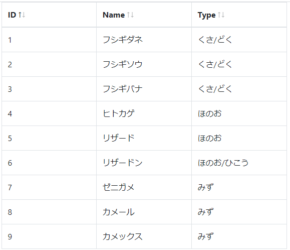
まずはただデータを表示するだけのテーブルを作成します。
データとカラム定義はそれぞれ配列として用意し、react-bootstrap-table2のpropsに渡すだけです。
このパッケージはその名の通りbootstrapを使用しています。あらかじめbootstrapを導入しておきます。App.jsximport React from 'react'; import BootstrapTable from "react-bootstrap-table-next"; import 'react-bootstrap-table-next/dist/react-bootstrap-table2.min.css'; import { Container } from 'reactstrap'; const data = [ { id: 1, name: "フシギダネ", type: "くさ/どく" }, { id: 2, name: "フシギソウ", type: "くさ/どく" }, { id: 3, name: "フシギバナ", type: "くさ/どく" }, { id: 4, name: "ヒトカゲ", type: "ほのお" }, { id: 5, name: "リザード", type: "ほのお" }, { id: 6, name: "リザードン", type: "ほのお/ひこう" }, { id: 7, name: "ゼニガメ", type: "みず" }, { id: 8, name: "カメール", type: "みず" }, { id: 9, name: "カメックス", type: "みず" }, ] const columns = [ { dataField: "id", text: "ID", sort: true, editable: false }, { dataField: "name", text: "Name", sort: true, editable: false }, { dataField: "type", text: "Type", sort: true, editable: false }, ] const App = () => { return ( <Container style={{ width: "600px" }}> <BootstrapTable data={data} // データ columns={columns} // カラム定義 keyField="id" // キー bootstrap4={true} // Bootstrap4を指定。デフォルトではBootstrap3 bordered={true} // 表のボーダー /> </Container> ); } export default App;データ編集可能にする
編集機能も用意されているので使ってみます。
任意のセルをクリックすると編集モードに切り替わります。
カラム定義でeditableプロパティを有効にします。
これによりデフォルトでTextボックスによる編集が有効化されます。IDは編集されたくないのでそのままです。また、今回データ例としているポケモンのタイプは選択肢から選ぶようにしたいと思うので、
editorプロパティで編集モードがSelectボックスになるように指定します。最後にreact-bootstrap-table2要素のpropsとしてcellEditに
関連パッケージであるreact-bootstrap-table2-editorの関数を渡します。
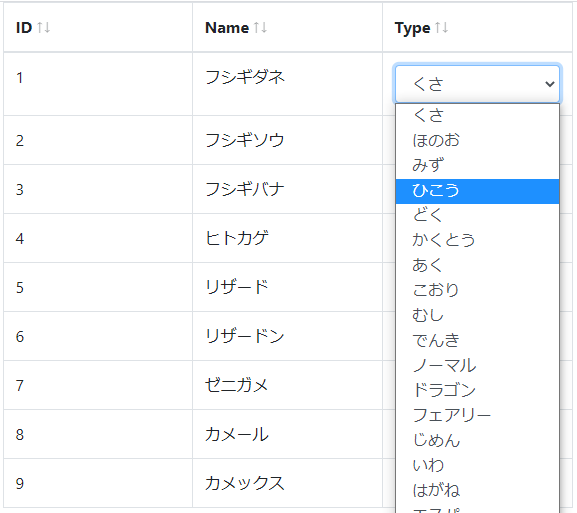
blurToSaveをtrueにしておくことで編集後にコンポーネント外にフォーカスが移った場合にも変更が保存されるようになります。App.js// ommit import cellEditFactory, { Type } from "react-bootstrap-table2-editor"; const data = [ { id: 1, name: "フシギダネ", type: "くさ" }, { id: 2, name: "フシギソウ", type: "くさ" }, { id: 3, name: "フシギバナ", type: "くさ" }, { id: 4, name: "ヒトカゲ", type: "ほのお" }, { id: 5, name: "リザード", type:"ほのお" }, { id: 6, name: "リザードン", type: "ほのお" }, { id: 7, name: "ゼニガメ", type: "みず" }, { id: 8, name: "カメール", type: "みず" }, { id: 9, name: "カメックス", type: "みず" }, ] const types = [ "くさ", "ほのお", "みず", "ひこう", "どく", "かくとう", "あく", "こおり", "むし", "でんき", "ノーマル", "ドラゴン", "フェアリー", "じめん", "いわ", "はがね", "エスパー", "ゴースト" ] const columns = [ { dataField: "id", text: "ID", sort: true, editable: false }, { dataField: "name", text: "Name", sort: true, editable: true }, { dataField: "type", text: "Type", sort: true, editable: true, editor: { type: Type.SELECT, getOptions: () => types.map((type) => { return { value: type, label: type } }) } }, ] const App = () => { return ( <Container style={{ width: "600px" }}> <BootstrapTable data={data} // データ columns={columns} // カラム定義 keyField="id" // キー bootstrap4={true} // Bootstrap4を指定。デフォルトではBootstrap3 bordered={true} // 表のボーダー cellEdit={cellEditFactory({ mode: "click", blurToSave: true })} // セルの編集を有効にする /> </Container> ); } export default App;エディタをカスタマイズする
編集はできるようになりましたが、
ポケモンは一匹で複数のタイプを持つ場合が数多くあり、現状のSelectボックスでは機能が足りません。(下画像)
しかし調べた限り、react-bootstrap-table2には複数選択のSelectボックスにする機能がないようなので、
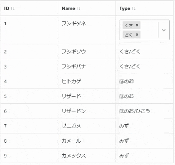
かわりにエディタのカスタマイズ機能を使って別のSelectボックスを表示するようにします。Selectボックスにはreact-selectを使っていきます。
react-select https://github.com/jedwatson/react-selectまずは元データのタイプを配列にしておきます。
カラム定義のformatterプロパティで通常表示時のフォーマットを指定できるので、配列を文字列に変換して表示するようにします。続いて、カラム定義のeditorRendererプロパティで、react-selectを使ったコンポーネントを指定します。
複数選択を有効にする場合、配列の更新となるためちょっと厄介で、実装これで合ってるのかはよくわかりません。
(とりあえず動いてる)App.js// ommit import Select from "react-select"; import PropTypes from "prop-types"; const data = [ { id: 1, name: "フシギダネ", type: ["くさ", "どく"] }, { id: 2, name: "フシギソウ", type: ["くさ", "どく"] }, { id: 3, name: "フシギバナ", type: ["くさ", "どく"] }, { id: 4, name: "ヒトカゲ", type: ["ほのお"] }, { id: 5, name: "リザード", type: ["ほのお"] }, { id: 6, name: "リザードン", type: ["ほのお", "ひこう"] }, { id: 7, name: "ゼニガメ", type: ["みず"] }, { id: 8, name: "カメール", type: ["みず"] }, { id: 9, name: "カメックス", type: ["みず"] }, ] const types = [ "くさ", "ほのお", "みず", "ひこう", "どく", "かくとう", "あく", "こおり", "むし", "でんき", "ノーマル", "ドラゴン", "フェアリー", "じめん", "いわ", "はがね", "エスパー", "ゴースト" ] const columns = [ { dataField: "id", text: "ID", sort: true, editable: false }, { dataField: "name", text: "Name", sort: true, editable: true }, { dataField: "type", text: "Type", sort: true, editable: true, formatter: (cell, row) => { return row.type.join("/"); }, editorRenderer: (editorProps, value, row, column, rowIndex, columnIndex) => ( <TypeSelect {...editorProps} value={value} row={row} options={types} /> ) }, ] const App = () => { return ( <Container style={{ width: "600px" }}> <BootstrapTable data={data} // データ columns={columns} // カラム定義 keyField="id" // キー bootstrap4={true} // Bootstrap4を指定。デフォルトではBootstrap3 bordered={true} // 表のボーダー cellEdit={cellEditFactory({ mode: "click", blurToSave: true })} // セルの編集を有効にする /> </Container> ); } export default App; class TypeSelect extends React.Component { constructor(props) { super(props); this.state = { value: this.props.row.type }; } static propTypes = { value: PropTypes.array, onUpdate: PropTypes.func.isRequired } getValue() { return this.state.value; } // かならず一つはタイプを選択した状態にしたいので、 // とりあえず配列が0にならないようにする。本来ならバリデーションで拾うべき。 handleOnUpdate(event) { if (event) { console.log(event) this.setState({ value: event.map(x => x.value) }) return event.map(x => x.value); } else { return this.state.value; } } render() { const { value, onUpdate, ...rest } = this.props; return ( <Select {...rest} isMulti isClearable={false} key="type" name="Type" onChange={(event) => { onUpdate(this.handleOnUpdate(event)) }} className="basic-single" classNamePrefix="select" defaultValue={this.props.row.type.map((type) => { return { value: type, label: type } })} options={this.props.options.map((option) => { return { value: option, label: option } })} /> ) } }タイプの複数選択が可能になりました。
と、上記のようにエディタのカスタマイズができたり、デザインの指定やバリデーションチェックの実装などもできるうえ、
関連パッケージを導入するとページネーションも楽に追加することができます。
比較的柔軟にやりたいことがやれるパッケージでした。コンポーネントそのもののコードもまあまあ読みやすいままを保てる一方で、
カラム定義を弄りはじめると結構ごちゃごちゃしてきちゃうところが懸念点でしょうか。参考
- React Select https://react-select.com/home
- react-bootstrap-table2 https://react-bootstrap-table.github.io/react-bootstrap-table2/
- react-bootstrap-table2 storybook https://react-bootstrap-table.github.io/react-bootstrap-table2/storybook/

- 投稿日:2020-09-12T15:39:05+09:00
レンダリングと描画の違いを整理する
ブログ:
https://in-thepink.com/rendering/はじめに
レンダリングと描画を同じ意味で使っていませんか?
会話などカジュアルな場合には気にする必要はありませんが、厳密には違うので整理して理解しましょう!!DOMの種類
DOMはリアルDOMと仮想DOMがあります。
また、そもそもDOMとはHTMLを操作するためのAPIです。
DOMの紹介
- リアルDOM
- 実際に表示されているDOM
- 変更すると画面がそのまま変わる
- 変更しようとする場合、負荷が大きい処理になる
- VDOM
- 単なるデータ
- 変更しても画面が変更されない
- 負荷が小さい処理で変更できる
レンダリングとは
state(props)変更前のVDOMと変更後の差分を比較し、差分を検知することでVDOMを再構築すること
レンダリングフロー
- 変更前と変更後の差分を比較するための仮想DOMを二つ用意する
- 変更を反映させるため、VDOMをJavascriptで操作(一般的にリアルDOMを操作するより速い)
- 変更前と変更後のVDOMの差分を比較
- 差分だけをリアルDOMに反映する
リアルDOMを操作するよりなぜ早いか
- DOMを操作するより負荷の小さい処理だから
- jQueryなどを使用してDOM操作を行う場合、関係のないところも再描画されるから
- 変更前のVDOMと変更後のVDOMの差分のみを反映させるから
- 「差分のみ」というのがキモです
描画とは
上記レンダリングフローで反映されたリアルDOMをブラウザに表示させること
再描画のタイミング
- 関数が再生成された時
- 変数が再生成された時
- stateの変更があった時
- 親コンポーネントが再描画された時
- 親コンポーネントから引き渡されているpropsが変化した時
- コンポーネント内でuseStateで定義している変数が変化した時
- カスタムフックより受け取っている変数が変化した時
React.memo,useCallbackなどを使用することで、無駄な再レンダリングを防ぐことができます。
無駄な再レンダリングを防ぐことで、パフォーマンス向上につながります。参考
- 投稿日:2020-09-12T00:00:00+09:00
React Nativeをいちから始める<公式ドキュメントを読んでいく> Part.1 The Basics
こんにちは。
スマホアプリを作成するフレームワークであるReact Nativeをいちから勉強しようと思います。
せっかくなので、やってみたことの要点をまとめてあとから復習できるように記事にまとめました。React Nativeをざっと知りたい方、基礎をざっと復習したい方は参考にしてみてください。
本記事の位置づけ
基本的に、公式ドキュメントの解説を上から順番に見て、ざっとまとめた記事です。
また、本ページは、下記公式ドキュメントの一番最初「The Basics」の部分をまとめた記事となります。https://reactnative.dev/docs/getting-started
- The Basics ←今ココ★
- Environment setup
- Workflow
- Design
- Interaction
- Inclusion
- Performance
- JavaScript Runtime
- Connectivity
- Native Components and Modules
- Guides (Android)
- Guides (iOS)なお、本ページに記載のソースコードはすべて上記サイトから引用したものとなります。
React Nativeとは何か
Facebookが作成したオープンソースのモバイルアプリケーションフレームワークのこと。
iOSおよびAndroidのプラットフォーム向けに共通のコードでアプリを作成できる。言語、フレームワークのベースはJavaScript、React。
用語
- View … UIを構成するブロックであり、画像を表示するImageView、テキストを表示するTextViewなどがある。
- Native Component … AndroidやiOSのプラットフォームのコンポーネントのこと
- Core Component … React Nativeが扱うコンポーネントのことで、各プラットフォームのネイティブコンポーネントと一対一対応している。 https://reactnative.dev/docs/intro-react-native-components#core-components
まずはHello World
コード
import React from 'react';
import { Text } from 'react-native';

const Cat = () => {
  return (
    <Text>Hello, I am your cat!</Text>
  );
}

export default Cat;
上記はfunctionとしての定義だが、classとしても書ける(functionとclassはどちらで書いてもよい)。
ただfunctionのほうが機能追加の点で将来性があるとのことで、公式ドキュメントはfunctionをメインで書かれている。プログラムの構造
- importでReactコンポーネントやReact NativeのText コアコンポーネントをインポートしている。
- 「const Cat = () => {};」の部分がfunctionの定義。これによりCatコンポーネントが定義できる。
- 「export default Cat;」でCatファンクションをプログラム内で呼び出せるようにする。
- <Text>~</Text>の部分は、JavaScript内にエレメントを記載するJSX記法。JSX記法自体はJavaScriptのため、変数を中括弧とともに内部に記載することが可能。
- JSX記法内で {getFullName("Rum", "Tum", "Tugger")} のように関数を呼ぶこともできる。
Props
propertiesの略で、関数に値を渡す機構。いわゆる、関数の引数。
...

const Cat = (props) => {
  return (
    <View>
      <Text>Hello, I am {props.name}!</Text>
    </View>
  );
}

const Cafe = () => {
  return (
    <View>
      <Cat name="Maru" />
      <Cat name="Jellylorum" />
      <Cat name="Spot" />
    </View>
  );
}

...
関数で「Cat = (props)」のように記載することで、propを受け取ることができるようになる。
値の渡し方は、JSX記法内に「name="Maru"」のように記載する。
関数内では、「{props.name}」の記載で値を参照できる。propsではJSオブジェクトを受け渡せるので、下記のような記載も可能。
      <Image
        source={{uri: "https://reactnative.dev/docs/assets/p_cat1.png"}}
        style={{width: 200, height: 200}}
      />
curly bracesが二重になっている理由:内側の{}はJSオブジェクトの記載方法。外側の{}はJSXで受け渡すための記載。
State
関数の状態を保持する。いわゆる内部変数。
持てる値の型は、strings, numbers, Booleans, arrays, objects。stateを使う3ステップ
1.useStateをインポートする。
import React, { useState } from 'react';」2.useStateを使い、getter、setter、初期値をセットする。
[<getter>, <setter>] = useState(<initialValue>).例
const [isHungry, setIsHungry] = useState(true);3.getter、setterで値を読み書きする。
setterの例
<Button
  onPress={() => {
    setIsHungry(false);
  }}
/>
getterの例
<Button
  disabled={!isHungry}
  title={isHungry ? 'Pour me some milk, please!' : 'Thank you!'}
/>
あれ?isHungryはconstで定義したのになぜ値が書き換えられるの?
⇒setterが実行されると大元の関数が再度実行され、関数自体がリセットされている。なので値を書き換えているわけではない。上記全体を含めた例
import React, { useState } from "react";
import { Button, Text, View } from "react-native";

const Cat = (props) => {
  const [isHungry, setIsHungry] = useState(true);

  return (
    <View>
      <Text>
        I am {props.name}, and I am {isHungry ? "hungry" : "full"}!
      </Text>
      <Button
        onPress={() => {
          setIsHungry(false);
        }}
        disabled={!isHungry}
        title={isHungry ? "Pour me some milk, please!" : "Thank you!"}
      />
    </View>
  );
}

const Cafe = () => {
  return (
    <>
      <Cat name="Munkustrap" />
      <Cat name="Spot" />
    </>
  );
}

export default Cafe;
<>~</>って何?
⇒JSXの断片(fragments)。エレメントを複数並べて書く場合は必ず別のエレメントでくくる必要があるが、Viewなどを使うとネストしてしまうので、単にエレメントをまとめたい場合はこのように書くことができる。PropsとStateの使い分け
Propsは関数に値を渡すことで動作を変えたいとき、Stateは関数に状態(値)を保持したいときに使う。
Core Component:Text Input
文字列を入力できるコアコンポーネント。
よく使うprop
- onChangeText … テキストが変更されたときに発火する。
- onSubmitEditing … テキストがsubmitされたときに発火する。
例
import React, { useState } from 'react';
import { Text, TextInput, View } from 'react-native';

const PizzaTranslator = () => {
  const [text, setText] = useState('');
  return (
    <View style={{padding: 10}}>
      <TextInput
        style={{height: 40}}
        placeholder="Type here to translate!"
        onChangeText={text => setText(text)}
        defaultValue={text}
      />
      <Text style={{padding: 10, fontSize: 42}}>
        {text.split(' ').map((word) => word && '?').join(' ')}
      </Text>
    </View>
  );
}

export default PizzaTranslator;
このプログラムは、入力された単語の数だけピザアイコンを画面表示するもの。
onChangeTextで、setterであるsetTextを呼び出し、入力された値をTextにセットしている。TextInputの詳細は下記を見るべし。
https://reactnative.dev/docs/textinputCore Component:ScrollView
スクロールができるコンテナ。
複数の異なる種類のコンポーネントやビューを含むことができる。
horizontalプロパティで、垂直スクロール、水平スクロールかを指定する。... export default App = () => ( <ScrollView> <Text style={{ fontSize: 96 }}>Scroll me plz</Text> <Image source={logo} /> <Image source={logo} /> </ScrollView> );pagingEnabledプロパティで、スワイプジェスチャーを可能にする。
maximumZoomScale、minimumZoomScaleプロパティで、拡大縮小ができるようにする。ScrollViewとFlatListどっちを使う?
データ数が少ない場合は、スクロールの際リスト全体を再描画するScrollViewのほうが軽量。
データ数が多い場合は、スクロールの際リスト全体ではなく画面に表示されている部分のみを再描画するFlatListが高速。
Core Component:List Views
複数の項目をリストで表示するコンポーネント。
FlatList、SectionListの2種類ある。FlatList
FlatListは下記2つのプロパティを指定する必要がある。
- data … 表示するリストデータ
- renderItem … リストの各項目に適用する処理
FlatListの例
import React from 'react';
import { FlatList, StyleSheet, Text, View } from 'react-native';

const styles = StyleSheet.create({
  container: {
   flex: 1,
   paddingTop: 22
  },
  item: {
    fontSize: 18,
    height: 44,
  },
});

const FlatListBasics = () => {
  return (
    <View style={styles.container}>
      <FlatList
        data={[
          {key: 'Devin'},
          {key: 'Dan'},
          {key: 'Dominic'},
          {key: 'Jackson'},
          {key: 'James'},
          {key: 'Joel'},
          {key: 'John'},
          {key: 'Jillian'},
          {key: 'Jimmy'},
          {key: 'Julie'},
        ]}
        renderItem={({item}) => <Text style={styles.item}>{item.key}</Text>}
      />
    </View>
  );
}

export default FlatListBasics;
FlatList
https://reactnative.dev/docs/flatlistSectionList
もしセクションごとに分かれたデータを表示したい場合(セクションにヘッダを付けたいなどのケース)は、 SectionListを使うとよい。
        <SectionList
          sections={[
            {title: 'D', data: ['Devin', 'Dan', 'Dominic']},
            {title: 'J', data: ['Jackson', 'James', 'Jillian', 'Jimmy', 'Joel', 'John', 'Julie']},
          ]}
          renderItem={({item}) => <Text style={styles.item}>{item}</Text>}
          renderSectionHeader={({section}) => <Text style={styles.sectionHeader}>{section.title}</Text>}
          keyExtractor={(item, index) => index}
        />
dataの代わりにsectionsプロパティで、セクション付きの値を指定。
renderItemに加えて、renderSectionHeaderプロパティでセクションヘッダのスタイルも指定。
keyExtractorで、リストデータのキーとして使う値を指定。SectionList
https://reactnative.dev/docs/sectionlistTroubleshooting
React Nativeのセットアップ、実行時にエラーが出たら、下記を参照のこと。
https://reactnative.dev/docs/troubleshooting
https://github.com/facebook/react-native/issues/プラットフォーム依存のコード
AndroidやiOSのネイティブコードを書きたいとき、下記2つの方法がある。
- Platformモジュールを使用する方法
- ファイルの拡張子を使用する方法
各モジュールには特定のプラットフォームでしか使用されないプラットフォーム依存のプロパティがあり、それらは @platform と指定されている。
使用方法は各プロパティ項目にリンクがはられているのでそれを参照するとよい。Platformモジュールを使用する方法
ネイティブコードをごく少量使う場合は、Platform.OSを使った書き方で。
import { Platform, StyleSheet } from 'react-native';

const styles = StyleSheet.create({
  height: Platform.OS === 'ios' ? 200 : 100
});
Platform.OSの値は、「ios」または「android」になる。
ある程度のコード量になる場合は、Platform.selectを使った書き方で。
import { Platform, StyleSheet } from 'react-native';

const styles = StyleSheet.create({
  container: {
    flex: 1,
    ...Platform.select({
      ios: {
        backgroundColor: 'red'
      },
      android: {
        backgroundColor: 'green'
      },
      default: {
        // other platforms, web for example
        backgroundColor: 'blue'
      }
    })
  }
});
Platform.selectの値は、'ios' | 'android' | 'native' | 'default'。
Webでの表示の場合は、defaultに入る。iOS/AndroidとWebで処理を書き分けたければ、以下のようにnativeで判定するとよい。
const Component = Platform.select({
  native: () => require('ComponentForNative'),
  default: () => require('ComponentForWeb')
})();

<Component />;
iOS/Androidの場合は、nativeの処理が実行される。
Webの場合は、defaultの処理が実行される。プラットフォームのバージョンを取得する
Android
import { Platform } from 'react-native';

if (Platform.Version === 25) {
  console.log('Running on Nougat!');
}
Platform.Versionにて取得。
iOS
import { Platform } from 'react-native';

const majorVersionIOS = parseInt(Platform.Version, 10);
if (majorVersionIOS <= 9) {
  console.log('Work around a change in behavior');
}
Platform.Versionには、-[UIDevice systemVersion]の実行結果が入っており、"10.3"のような値となっている。
そのため、parseIntなどを使って数値を抽出する。ファイルの拡張子を使用する方法
プラットフォーム依存コードをファイルごとに書き分け、ファイル名で判定する方法。
.ios.または.android.という文字列が含まれるファイルを作成することで、実行するプラットフォームに応じて適切なほうが読み込まれる。より多くのプラットフォーム依存コードがある場合はこちらの方法で。
BigButton.ios.js
BigButton.android.js
のようにファイル名で分けておき、
import BigButton from './BigButton';とすることで、プラットフォームに合わせて適切なほうのファイルが読み込まれる。
ネイティブ環境とWeb環境で書き分けたいときは、「.native.」も使える。
Container.js
Container.native.js
のようにファイル名で分けておき、
import Container from './Container';とする。
おわりに
ここまでが「The Basics」の章の内容となります。
引き続き順番に公式ドキュメントを読んで勉強していきます。
少しでもご参考になったならば幸いです。