- 投稿日:2020-06-28T22:55:59+09:00
TechAcademyが無料公開している「HTML・CSS入門講座」を受講する~CSS第5回~
アジェンダ
- 要素の余白
- 要素の表示形式
- 要素のサイズ
- 実践
要素の余白
padding
要素の内側の余白を指定する場合、以下のように書く。
padding: <上下左右の余白サイズ>;
padding: <上下の余白サイズ> <左右の余白サイズ>;
padding: <上の余白サイズ> <下の余白サイズ> <右の余白サイズ> <左の余白サイズ>;
値(サイズ)は数値で指定する。
また、padding-top/right/bottom/leftを用いで、個別で指定することもできる。margin
要素の外側の余白を指定する場合、以下のように書く。
margin: <上下左右の余白サイズ>;
margin: <上下の余白サイズ> <左右の余白サイズ>;
margin: <上の余白サイズ> <下の余白サイズ> <右の余白サイズ> <左の余白サイズ>;
値(サイズ)は数値で指定する。数値には負数も指定できる。
また、margin-top/right/bottom/leftを用いで、個別で指定することもできる。paddingとmarginの違い
以下の図のとおり。それぞれ、要素内と要素外の余白を指定している。
要素の表示形式
display
要素の表示形式を指定する場合、以下のように書く。
display: 値;値は以下の単語で指定する。
- block
- ブロック要素として表示する。
- inline
- インライン要素として表示する。
- inline-block
- インライン要素として扱うブロック要素として表示する。
主に、ブロック要素にしか使用できないプロパティを使用する際に用いる。- none
- 表示しない。
- ...
- その他多数存在する。
visibility
要素の表示・非表示を指定する場合、以下のように書く。
visibility: 値;値は以下の単語で指定する。
- visible
- 表示する。
- hidden
- 表示しない。
display: none; と visibility: hidden; の違い
display: none;を使用すると、要素が無いものとして扱われる。
そのため、指定した要素が表示される箇所に、他の要素が詰めて表示される。
visibility: hidden;を使用すると、要素は存在するが、内容が表示されない。
そのため、指定した要素の表示される箇所は空欄となり、他の要素が詰めて表示されることはない。要素のサイズ
要素の幅
要素の幅の最大幅、最小幅を指定する場合、以下のように書く。
# 最大幅
max-width: 値;

# 最小幅
min-width: 値;
値は数値で指定する。
高さ
要素の高さの最大高さ、最小高さを指定する場合、以下のように書く。
# 最大高さ
max-height: 値;

# 最小高さ
min-height: 値;
値は数値で指定する。
要素のサイズの算出方法
要素の算出方法を指定する場合、以下のように書く。
box-sizing: 値;値は以下の単語で指定する。
- content-box
- paddingやborderを含めない。
- border-box
- paddingやborderを含める。
文書が収まりきらない場合の取り扱い
文書が収まりきらない場合の取り扱いを指定する場合、以下のように書く。
overflow: 値;値は以下の単語で指定する。
- visible
- 要素からはみ出して表示する。
- scroll
- スクロールバーを用いて、要素内でスクロール表示する。
- hidden
- はみ出した部分を表示しない。
実践
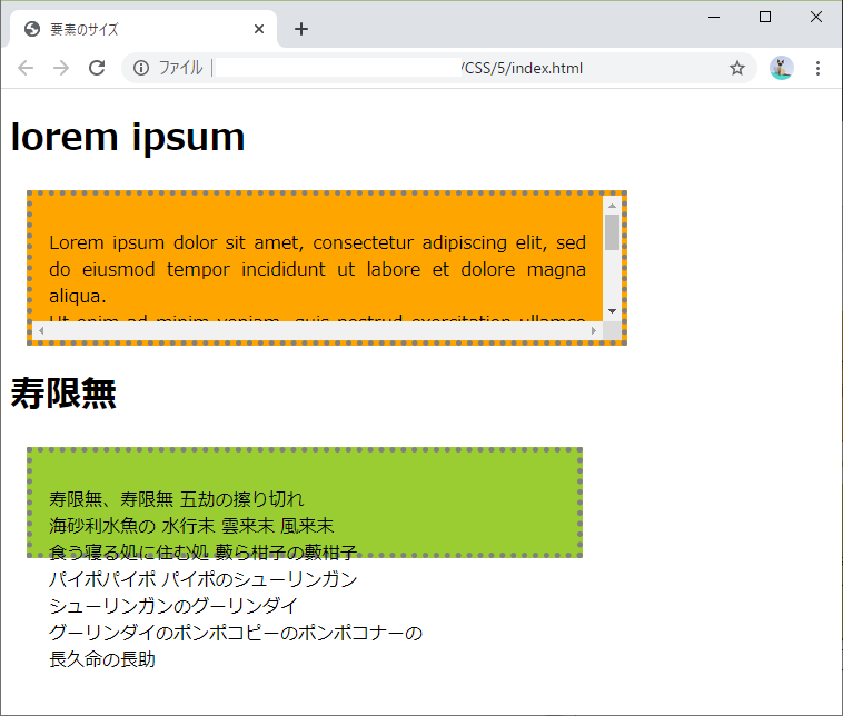
上記内容を用いて、以下のindex.htmlとstyle.cssを作成した。
index.html<!DOCTYPE html> <html lang="ja"> <head> <meta charset="UTF-8"> <link type="text/css" rel="stylesheet" href="./style.css"> <title>要素のサイズ</title> </head> <body> <h1>lorem ipsum</h1> <div class="lorem_ipsum"> <p> Lorem ipsum dolor sit amet, consectetur adipiscing elit, sed do eiusmod tempor incididunt ut labore et dolore magna aliqua. <br> Ut enim ad minim veniam, quis nostrud exercitation ullamco laboris nisi ut aliquip ex ea commodo consequat. <br> Duis aute irure dolor in reprehenderit in voluptate velit esse cillum dolore eu fugiat nulla pariatur. <br> Excepteur sint occaecat cupidatat non proident, sunt in culpa qui officia deserunt mollit anim id est laborum. </p> </div> <h1>寿限無</h1> <div class="jugemu"> <p> 寿限無、寿限無 五劫の擦り切れ<br> 海砂利水魚の 水行末 雲来末 風来末<br> 食う寝る処に住む処 藪ら柑子の藪柑子<br> パイポパイポ パイポのシューリンガン<br> シューリンガンのグーリンダイ<br> グーリンダイのポンポコピーのポンポコナーの<br> 長久命の長助 </p> </div> </body> </html>style.css.lorem_ipsum { background-color: orange; border-style: dotted; border-color: gray; border-width: 5px; padding: 15px; margin: 15px; text-align: justify; max-width: 500px; max-height: 100px; /* サイズに余白を含めない. */ box-sizing: content-box; /* はみ出る分はスクロール表示にする. */ overflow: scroll; } .jugemu { background-color: yellowgreen; border-style: dotted; border-color: gray; border-width: 5px; padding: 15px; margin: 15px; max-width: 500px; max-height: 100px; /* サイズに余白を含める. */ box-sizing: border-box; /* はみ出る分をそのまま表示する. */ overflow: visible; }これをWebブラウザに表示させるとこんな感じ。
なるほど、わかりやすい。はみ出るのはカッコ悪い。
おわりに
今回は、要素のサイズに関する内容だった。
言語で書かれている要素を表示させた時にどう表示されるのか、いちいち確認しないとわからないのは不便だと感じた。
テンプレートがあれば作りやすいだろう。次回 >> ☆まだ☆
参考
5-1 paddingプロパティ(CSSのボックスモデル)
5-2 marginプロパティ(CSSのボックスモデル)
5-3 displayプロパティvisibilityプロパティ(CSSのボックスモデル)
5-4 boxサイズの考え方(CSSのボックスモデル)

- 投稿日:2020-06-28T21:59:02+09:00
【初心者でもわかる】いちょう切り。part1(4つの要素を2×2に並べる方法-flexbox編-)
どうも、7noteです。今回はflexboxを使っていちょう切り、やって行こうと思います。
「♪〜〜(オープニング曲が流れる)」
「7noteクッキングレッスンへようこそ!」
「今回はオレンジを使っていちょう切りをマスターしましょう。」
「全2パートあるので、みなさん最後までついてきてください。」最終完成予定イメージ
今回の材料はこちら(1人前)
ファイル CSSプロパティ 意味 index.html style.css width: ~~;
display: flex;
flex-wrap: wrap;横幅を設定
フレックスボックスの設定
端までいったら改行させるorange_01.png オレンジの画像(左上) orange_02.png オレンジの画像(右上) orange_03.png オレンジの画像(左下) orange_04.png オレンジの画像(右下) 作り方
- index.htmlに4枚のオレンジの画像を用意
- style.cssで、2×2に画像を並べる
- それぞれの間に隙間を作って完成!(part2で作ります。)
1. index.htmlに4枚のオレンジの画像を用意
index.html<div class="dish"> <img src="orange_01.png" alt="オレンジ左上"> <img src="orange_02.png" alt="オレンジ右上"> <img src="orange_03.png" alt="オレンジ左下"> <img src="orange_04.png" alt="オレンジ右下"> </div>2. style.cssで、2×2に画像を並べる
style.css.dish { width: 400px; /*200pxの画像を2×2で並べるので400pxを指定*/ display: flex; /*子要素を横並びにさせます。*/ flex-wrap: wrap; /*並べたコンテンツが親要素からはみでたら、次の行にコンテンツを改行させる*/ }\完成/(part2で続きを作るよ。)
解説・作り方のコツ
- part1では全部親要素にCSSを書くよ。
- [display: flex;]がないと、[flex-wrap: wrap;]は効かないから気をつけて!
明日「【初心者でもわかる】いちょう切り。part2(並べた要素に隙間を作る方法-flexbox編-)」公開予定。公開までお楽しみに!
素材データ配布
真似して作りたい人はこの画像をダウンロードして使ってね!
おそまつ!
(コメント・質問・ソースの指摘等なんでもウェルカムです!初心者の方でも気軽に質問ください!)


- 投稿日:2020-06-28T21:13:51+09:00
cssの用語解説
rel=reration(関係)
href=hrefはhyper reference(参照、参考、引用)
- 投稿日:2020-06-28T17:45:41+09:00
【Vue.js】Scoped CSSのscoped具合を検証してみた
Vue.jsのScoped CSSは完全にはscopedじゃない、という話を聞いたので検証してみました。
結果、コンポーネント最上位の要素と、slotについては気をつける必要があることが分かりました。参考記事
親コンポーネントのstyleが子コンポーネントに影響を与える仕組みは、以下が詳しいです。
- https://qiita.com/wintyo/items/dfc232255ad45fdf376f
- https://www.dkrk-blog.net/javascript/vue_scopedcss
検証環境
- OS: macOS Catalina 10.15.5
- ブラウザ: Google Chrome 83.0.4103.116(Official Build)(64bit)
- Vue.js: 2.6.11
検証1: 素朴にstyleを当てた場合
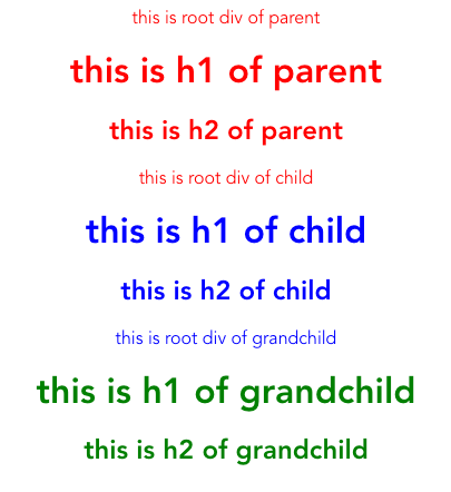
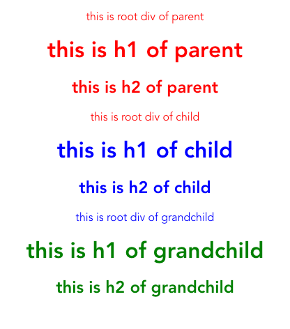
親、子、孫コンポーネントにそれぞれ違った色を割り当てました。
すると、各コンポーネントの最上位の要素には親コンポーネントのスタイルが適用されてしまいました。
Parent.vue<template> <div class="root-div"> this is root div of parent <h1 class="my-title">this is h1 of parent</h1> <div class="h2-container"> <h2>this is h2 of parent</h2> </div> <Child /> </div> </template> <script lang="ts"> import Vue from "vue"; import Child from "@/components/Child.vue"; export default Vue.extend({ name: "Parent", components: { Child, }, }); </script> <style scoped lang="scss"> .root-div { color: red; } .my-title { color: red; } h2 { color: red; } </style>Child.vue<template> <div class="root-div"> this is root div of child <h1 class="my-title">this is h1 of child</h1> <div class="h2-container"> <h2>this is h2 of child</h2> </div> <GrandChild /> </div> </template> <script lang="ts"> import Vue from "vue"; import GrandChild from "@/components/GrandChild.vue"; export default Vue.extend({ name: "Child", components: { GrandChild, }, }); </script> <style scoped lang="scss"> .root-div { color: blue; // こいつが効いていない } .my-title { color: blue; } h2 { color: blue; } </style>GrandChild.vue<template> <div class="root-div"> this is root div of grandchild <h1 class="my-title">this is h1 of grandchild</h1> <div class="h2-container"> <h2>this is h2 of grandchild</h2> </div> </div> </template> <script lang="ts"> import Vue from "vue"; export default Vue.extend({ name: "GrandChild", }); </script> <style scoped lang="scss"> .root-div { color: green; } .my-title { color: green; } h2 { color: green; } </style>
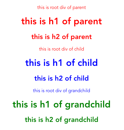
検証2: 全称セレクタ(*)を使った場合
*を使って乱暴にstyleを指定した場合どうなるかを見てみました。
結果、検証1と同じく、各コンポーネント最上位の要素だけは親コンポーネントのstyleの影響が出ました。
※検証1のコードから、Child.vueだけ変更しました。
Child.vue<template> <div class="root-div"> this is root div of child <h1 class="my-title">this is h1 of child</h1> <div class="h2-container"> <h2>this is h2 of child</h2> </div> <GrandChild /> </div> </template> <script lang="ts"> import Vue from "vue"; import GrandChild from "@/components/GrandChild.vue"; export default Vue.extend({ name: "Child", components: { GrandChild, }, }); </script> <style scoped lang="scss"> .root-div * { color: blue; } * { color: blue; } * * { color: blue; } </style>
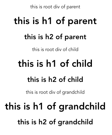
検証3: globalのcssがある場合
当たり前ですが、ページ全体に適用されているcssがある場合、競合します。
例えば、ページ全体に* { color: black!important }を当てたら、すべて黒になります。
App.vue<style lang="scss"> * { color: black!important; // プロダクトコードで書いたら殴られるやつ } </style>
もちろん、!importantを付けなければ、コンポーネント内のcssが優先的に適用されます。
(この辺はScoped CSSというよりはCSSそのものの話)
App.vue<style lang="scss"> * { color: black; } </style>
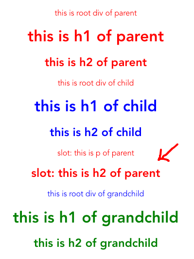
検証4: slotを使った場合
slotを使って、親から子へタグを渡した場合、渡したタグには親コンポーネントのstyleが適用されました。
Parent.vue<template> <div class="root-div"> this is root div of parent <h1 class="my-title">this is h1 of parent</h1> <div class="h2-container"> <h2>this is h2 of parent</h2> </div> <Child> <!-- 親からタグごとslotを挟むと、親のstyleが適用される --> <template #my-slot> <p>slot: this is p of parent</p> <div> <h2>slot: this is h2 of parent</h2> </div> </template> </Child> </div> </template> <script lang="ts"> import Vue from "vue"; import Child from "@/components/Child.vue"; export default Vue.extend({ name: "Parent", components: { Child, }, }); </script> <style scoped lang="scss"> .root-div { color: red; } .my-title { color: red; } h2 { color: red; } p { color: red; } </style>Child.vue<template> <div class="root-div"> this is root div of child <h1 class="my-title">this is h1 of child</h1> <div class="h2-container"> <h2>this is h2 of child</h2> </div> <slot name="my-slot"> <p>slot: this is p of child</p> <div> <h2>slot: this is h2 of child</h2> </div> </slot> <GrandChild /> </div> </template> <script lang="ts"> import Vue from "vue"; import GrandChild from "@/components/GrandChild.vue"; export default Vue.extend({ name: "Child", components: { GrandChild, }, }); </script> <style scoped lang="scss"> .root-div { color: blue; } .my-title { color: blue; } h2 { color: blue; } p { color: blue; } </style>
一方、親から子へ文字列だけを渡した場合、子のstyleが適用されました。
Parent.vue<template> <div class="root-div"> this is root div of parent <h1 class="my-title">this is h1 of parent</h1> <div class="h2-container"> <h2>this is h2 of parent</h2> </div> <Child> <!-- 親から文字列だけを渡すようにすれば、親のstyleは適用されない --> <template #my-slot-p>slot: this is p of parent</template> <template #my-slot-h2>slot: this is h2 of parent</template> </Child> </div> </template> <script lang="ts"> import Vue from "vue"; import Child from "@/components/Child.vue"; export default Vue.extend({ name: "Parent", components: { Child, }, }); </script> <style scoped lang="scss"> .root-div { color: red; } .my-title { color: red; } h2 { color: red; } p { color: red; } </style>Child.vue<template> <div class="root-div"> this is root div of child <h1 class="my-title">this is h1 of child</h1> <div class="h2-container"> <h2>this is h2 of child</h2> </div> <p><slot name="my-slot-p">slot: this is p of child</slot></p> <div> <h2><slot name="my-slot-h2">slot: this is h2 of child</slot></h2> </div> <GrandChild /> </div> </template> <script lang="ts"> import Vue from "vue"; import GrandChild from "@/components/GrandChild.vue"; export default Vue.extend({ name: "Child", components: { GrandChild, }, }); </script> <style scoped lang="scss"> .root-div { color: blue; } .my-title { color: blue; } h2 { color: blue; } p { color: blue; } </style>
で、結局何に気をつければいいのか
- コンポーネント最上位の要素になるべくstyleを当てない
- 当てざるを得ない場合、
.component-name-root { display: flex }のように、重複しないクラス名を付けて、styleを指定する- 自前でslotを作る場合、極力DOM構造は子コンポーネント側で定義する
- デザインフレームワーク(vuetifyとか)の制約上slotにDOMを渡さざるを得ない場合は、予期せぬstyleが適用されないよう気をつける
所感
完全でないとはいえ、知らずに使っていてもそんなに気にならない程度にはscopedにできていると感じました。
個人的にはslotを使わないため、各コンポーネントの最上位のクラス名だけ気をつければ問題なし! という印象です。
Scoped CSS便利。

- 投稿日:2020-06-28T11:39:13+09:00
stylelint による スタイリング宗教の統一
はじめに
CSS の記述は自由度が高いため、個人的な好みによって記述方法に差異が生まれやすいです。
「半角、一行の開ける or 開けない」 であったり、「小数点での記述時に一桁目に 0 をつける or つけない 」 であったり、人の数だけ宗教が生まれます。
コーディング宗教問題はなかなか解決の難しい問題ですし、チーム内での宗教戦争すら起こり得ます。複数人での作業の場合、基本的にはチーム内で共有された聖書(コーディングルール)に則って作業を行うわけですが、聖書をいちいち確認しながら記述していくのもなかなかに骨の折れる作業です。
そこで stylelint の出番です。
コーディングルールを開発環境に設定し、エラーチェックを自動化することで平和への一歩を踏み出していきましょう。本記事では、stylelint の導入からチームのコーディングルールにあわせたルールの設定まで行なっていきます。
stylelint とは
stylelint は CSS のエラーチェックおよび整形ツールです。
公式ページでは、以下のように銘打たれています。A mighty, modern linter that helps you avoid errors and enforce conventions in your styles.
エラーを回避し、スタイルルールを強制するための強力でモダンなリンター(意訳)stylelint の導入
早速ですが stylelint を導入していきましょう。
stylelint を使用することでルールから逸脱した CSS の記述やミスなどを防ぎ、さらに自動で修正可能なものは自動整形まで行うことが可能です。まずは公式ガイドに則って導入を進めていきます。
npmを使用してstylelint本体と、ベースとなるルールが記述されたstylelint-config-standardをインストールします。Terminal$ npm install --save-dev stylelint stylelint-config-standard続けて以下のように記載した
.stylelint.jsonをプロジェクトルートに配置します。
この記述によってstylelint-config-standardに記述されたルールが.stylelint.jsonに継承されるようになります。.stylelint.json{ "extends": "stylelint-config-standard" }最後に以下のコマンドで、stylelint による記述エラーチェックを実行します。
Terminal$ npx stylelint "**/*.css"
stylelint-config-standardのルールから逸脱している記述は、実行時にエラーとして出力されます。
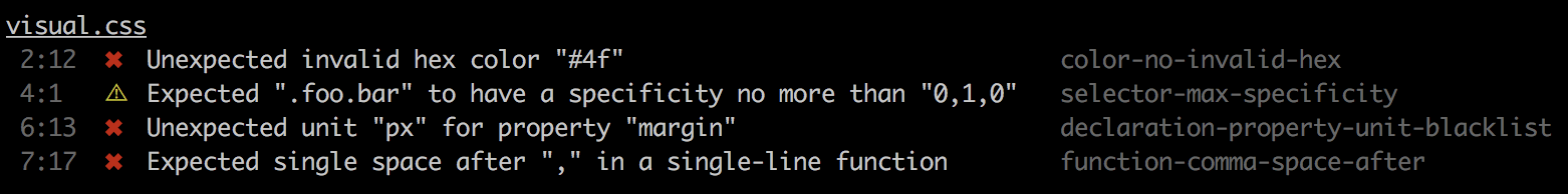
また--fixをオプションとして付与してコマンド実行することで、自動整形が行われます。Example output(stylelint 公式ページより)
stylelint のルール設定
次にチームのコーディングルールに合わせて stylelint の設定をしていきます。
全ルールを記述していくのはかなり手間なので、公開されている既存のルールを extends し、そこに必要なルールを追加・上書きをしていきます。既存ルールとして stylelint-config-recommended および stylelint-config-standard が有名なようですので、これらを extends することによって設定されるルールを確認し、ルール選定を行なっていきます。
npm trend によると、stylelint-config-recommended の方が若干人気があるようです。
stylelint-config-recommended による設定ルール
stylelint-config-recommendedの設定ルールが記載されているindex.jsをチェックしていきます。index.js"use strict"; module.exports = { rules: { "at-rule-no-unknown": true, // @ 指定の記述が正しいか "block-no-empty": true, // 空の宣言ブロックをチェック "color-no-invalid-hex": true, // 16進数表記が正しいか "comment-no-empty": true, // 空コメントをチェック "declaration-block-no-duplicate-properties": [ true, // 同一セレクタ内で同じプロパティをチェック { ignore: ["consecutive-duplicates-with-different-values"], // 異なる値を持つ、連続する重複するプロパティを無視(フォールバックとして同一プロパティが指定されることがあるため) }, ], "declaration-block-no-shorthand-property-overrides": true, // 宣言ブロック内でのショートハンドプロパティによる上書きをチェック "font-family-no-duplicate-names": true, // font-family の重複指定をチェック "font-family-no-missing-generic-family-keyword": true, // 総称フォントファミリーの指定を要求 "function-calc-no-invalid": true, // calc() の表記が正しいか "function-calc-no-unspaced-operator": true, // calc() 内の演算子左右にスペースが入っているか "function-linear-gradient-no-nonstandard-direction": true, // linear-gradient の表記チェック "keyframe-declaration-no-important": true, // keyframes 内での !important をチェック "media-feature-name-no-unknown": true, // メディアクエリの指定が正しいか "no-descending-specificity": true, // 同一セレクタの記述順が詳細度の低いものから順になっているか "no-duplicate-at-import-rules": true, // import 宣言に被りがないか "no-duplicate-selectors": true, // 重複するセレクタが無いか "no-empty-source": true, // 空の CSS ファイルが無いか "no-extra-semicolons": true, // セミコロンの重複がないか "no-invalid-double-slash-comments": true, // // で始まるコメントアウトがないか "property-no-unknown": true, // 存在しないプロパティが使われていないか "selector-pseudo-class-no-unknown": true, // hover など、擬似クラスの名前が正しいか "selector-pseudo-element-no-unknown": true, // before など、擬似要素の名前が正しいか "selector-type-no-unknown": true, // 指定されている HTML 要素が正しいか "string-no-newline": true, // content 内などで文字列に改行が入っていないか "unit-no-unknown": true, // 単位の記述(px, em など)が正しいか }, };stylelint-config-standard による設定ルール
stylelint-config-standardのindex.jsを確認してみると、先に紹介したstylelint-config-recommendedの設定を継承し、追加で細かいルールを上書きしているようです。
こちらで設定されているルールの詳細は公式ページの stylelint: List of rules をご参照ください。index.js"use strict"; module.exports = { extends: "stylelint-config-recommended", rules: { "at-rule-empty-line-before": [ "always", { except: ["blockless-after-same-name-blockless", "first-nested"], ignore: ["after-comment"], }, ], "at-rule-name-case": "lower", "at-rule-name-space-after": "always-single-line", "at-rule-semicolon-newline-after": "always", "block-closing-brace-empty-line-before": "never", "block-closing-brace-newline-after": "always", "block-closing-brace-newline-before": "always-multi-line", "block-closing-brace-space-before": "always-single-line", "block-opening-brace-newline-after": "always-multi-line", "block-opening-brace-space-after": "always-single-line", "block-opening-brace-space-before": "always", "color-hex-case": "lower", "color-hex-length": "short", "comment-empty-line-before": [ "always", { except: ["first-nested"], ignore: ["stylelint-commands"], }, ], "comment-whitespace-inside": "always", "custom-property-empty-line-before": [ "always", { except: ["after-custom-property", "first-nested"], ignore: ["after-comment", "inside-single-line-block"], }, ], "declaration-bang-space-after": "never", "declaration-bang-space-before": "always", "declaration-block-semicolon-newline-after": "always-multi-line", "declaration-block-semicolon-space-after": "always-single-line", "declaration-block-semicolon-space-before": "never", "declaration-block-single-line-max-declarations": 1, "declaration-block-trailing-semicolon": "always", "declaration-colon-newline-after": "always-multi-line", "declaration-colon-space-after": "always-single-line", "declaration-colon-space-before": "never", "declaration-empty-line-before": [ "always", { except: ["after-declaration", "first-nested"], ignore: ["after-comment", "inside-single-line-block"], }, ], "function-comma-newline-after": "always-multi-line", "function-comma-space-after": "always-single-line", "function-comma-space-before": "never", "function-max-empty-lines": 0, "function-name-case": "lower", "function-parentheses-newline-inside": "always-multi-line", "function-parentheses-space-inside": "never-single-line", "function-whitespace-after": "always", indentation: 2, "length-zero-no-unit": true, "max-empty-lines": 1, "media-feature-colon-space-after": "always", "media-feature-colon-space-before": "never", "media-feature-name-case": "lower", "media-feature-parentheses-space-inside": "never", "media-feature-range-operator-space-after": "always", "media-feature-range-operator-space-before": "always", "media-query-list-comma-newline-after": "always-multi-line", "media-query-list-comma-space-after": "always-single-line", "media-query-list-comma-space-before": "never", "no-eol-whitespace": true, "no-missing-end-of-source-newline": true, "number-leading-zero": "always", "number-no-trailing-zeros": true, "property-case": "lower", "rule-empty-line-before": [ "always-multi-line", { except: ["first-nested"], ignore: ["after-comment"], }, ], "selector-attribute-brackets-space-inside": "never", "selector-attribute-operator-space-after": "never", "selector-attribute-operator-space-before": "never", "selector-combinator-space-after": "always", "selector-combinator-space-before": "always", "selector-descendant-combinator-no-non-space": true, "selector-list-comma-newline-after": "always", "selector-list-comma-space-before": "never", "selector-max-empty-lines": 0, "selector-pseudo-class-case": "lower", "selector-pseudo-class-parentheses-space-inside": "never", "selector-pseudo-element-case": "lower", "selector-pseudo-element-colon-notation": "double", "selector-type-case": "lower", "unit-case": "lower", "value-keyword-case": "lower", "value-list-comma-newline-after": "always-multi-line", "value-list-comma-space-after": "always-single-line", "value-list-comma-space-before": "never", "value-list-max-empty-lines": 0, }, };実用にあたってのカスタマイズ
stylelint-config-standardは、そのまま使用するなら良いかもしれませんが、チームのコーディングルールに合わせて細かいカスタマイズを行うなら少し融通が効きにくいかもしれません。
設定ルールの少なさによる見通しの良さもあり、stylelint-config-recommendedをカスタマイズして使用することとしました。npm scripts の設定
毎回 npx コマンドやディレクトリパスを打つのも手間ですので、
npm run stylelintでコマンドを実行できるようにpackage.jsonにスクリプトを記述しておきます。
ディレクトリパスは開発環境に応じて随時変更して下さい。package.json(追加したscripts部分のみ)"scripts": { "stylelint": "stylelint 'src/_scss/**/*.scss'", "stylelint:fix": "stylelint --fix 'src/_scss/**/*.scss'" }.stylelint.json のカスタマイズ
stylelint-config-recommendedをベースとして設定を追加していきます。.stylelint.json{ "extends": "stylelint-config-recommended" "rules": { "at-rule-no-unknown": null, // SCSS @ の記述でエラーが出るため stylelint-config-recommended の設定を null で上書き "block-opening-brace-space-before": "always" // { の前に必ずスペースを入れる "declaration-colon-space-after": "always", // コロンの後に必ずスペースを入れる "string-quotes": "double", // クオーテーションはダブルを使用 "selector-list-comma-newline-after": "always" // セレクターリストのカンマ後は改行 "color-hex-case": "lower", // 16 進数での色指定は小文字 "color-hex-length": "short", // 省略可能であれば 16 進数での色指定を省略する "length-zero-no-unit": true, // 値 0 の指定に単位を付与しない "number-leading-zero": "always", // 1 以下の小数で頭の 0 を省略しない "rule-empty-line-before": [ "always-multi-line", // 複数行ルールの前に空の行を要求 { "ignore": ["after-comment", "first-nested"] // コメント後、およびネストされているルールの最初の子は無視する } ] } }叩き台ですが、これで一旦弊社コーディングルールに沿った形での設定を行うことができました。
まとめ
運用していく上で変更や追加などあれば随時変更をおこなっていきます。
今回導入したstylelint-config-recommendedですが、自分が普段使用している SCSS での記述には最適化されていません。
公式スタートガイドにて、SCSS での使用の場合、stylelint-config-sass-guidelines を使いたい場合があるでしょう
というような記述を見つけたので、こちらのほうが適しているのではと考えています。
こちらで設定されるルールは未確認ですので、後ほど確認し良さそうであれば変更予定です。
- 投稿日:2020-06-28T04:26:42+09:00
アコーディオンの開閉時にアイコンを変える
プログラミングの勉強日記
2020年6月28日 Progate Lv.148
ポートフォリオ作成中
前回作成したwebページの調整をしている目標物
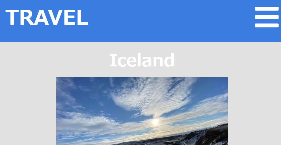
こちらの記事でアコーディオン機能について説明している。(今回はアコーディオン機能については触れない)
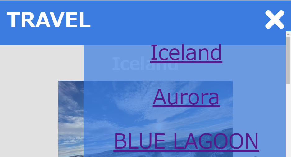
アコーディオンメニューで以下のようにアイコンを切り替えたい。アコーディオン機能を利用して写真のようにアコーディオンが閉じているときはメニューバーのFont Awesomeを表示して、アコーディオンが開いているときは「×」のFont Awesomeを表示したい。
コード
HTMLファイル<div class="navigation"> <span class="fas fa-bars naviTop"></span> <nav> <ul> <li><a href="#iceland">Iceland</a></li> <li><a href="#aurora">Aurora</a></li> <li><a href="#blueLagoon">BLUE LAGOON</a></li> <li><a href="#london">London</a></li> <li><a href="#paris">Paris</a></li> <li><a href="#iceland">Iceland</a></li> <li><a href="#spain">Spain</a></li> <li><a href="#map">Map</a></li> <li><a href="#food">Foods</a></li> </ul> </nav> </div>childrenメソッド:指定したセレクタが持つ子要素(1階層だけ下)の中から指定したセレクタに合致した要素を取得したいときに使う。
removeClassメソッド:指定した要素から指定したクラスを取り除ける。
HTML:<p class="text-contents text-active">...</p>
jQuery:$('.text-contents').removeClass('text-active');addClassメソッド:指定した要素にクラスを追加できる。
HTML:<p class="text-contents">...</p>
jQuery:$('.text-contents').addClass('text-active');
text-contentsクラスのついた要素にtext-activeというクラスを追加する。これらを利用すると、アイコンの切り替えができる。
1. childrenメソッドでnavigationクラスの1つ下の階層の中からspanタグに合う要素を取得する。
2. removeClassメソッドでクラスを取り除く。
3. addClassメソッドでクラスを追加する。
実際にコードは以下のようになる。jsファイル(jQuery)$('.naviTop').click(function(){ // メニューバーが開かれているなら if($('nav').hasClass('open')){ $('nav').removeClass('open'); $('nav').slideDown(); // Font Awesomeを×にする $('.navigation').children('span').removeClass().addClass('fas fa-times naviTop'); } // メニューバーが開かれていないなら else{ $('nav').addClass('open'); $('nav').slideUp(); // Font Awesomeをメニューバーにする $('.navigation').children('span').removeClass().addClass('fas fa-bars naviTop'); } });感想
classの操作であるのに、最初はhtmlメソッドやtextメソッドで変えようとしてしまって、なかなかうまくいかなかった。この1つの機能をつくのに時間がとてもかかったが、復習をする良い機会になった。
- 投稿日:2020-06-28T00:20:36+09:00
CSSで、背景画像の自動ループ(横スライド)
イメージ
コード
index.html<div class = "l-index"> </div>index.css.l-index{ background-image: url(../../img/about_back.jpeg); background-size: 50vw 100vh; animation: bgscroll 20s linear infinite; height: 100vh; } @-webkit-keyframes bgscroll { 0% {background-position: 0 0;} 100% {background-position: 50vw 0;} } @keyframes bgscroll { 0% {background-position: 0 0;} 100% {background-position: 50vw 0;} }参考

- 投稿日:2020-06-28T00:14:08+09:00
初心者あるある pngってなんだ?webでの画像の使い方
お久しぶりです。プログラミング勉強中高校生の白乃です。今回は初心者が画像を使うときに引っかかるpngについて説明します。
pngってなに?
端的に言うと拡張子の一種です。
拡張子ってなんぞ?という方に説明するとファイルの種類をシステムが見分けられるようにする目印です。拡張子の内容によって役割は異なります。
今回使うpngはwebで画像を扱うために作られた拡張子です。簡単に言うとこの形にファイルを変換すればwebで画像を使えるようになるということです。具体的にどうやって変換するの?
ここからは手順に沿って変換方法を紹介します。
1.画像をダウンロードしてくる
まずは使いたい画像をダウンロードしてきます。
2.拡張子を確認する
次に拡張子を確認してください。大体jpgというものになっていると思います。
3.拡張子ごとの変換サイトを探す
次は変換してくれるサイトを探します。僕が使っているお気に入りのjpg-png変換サイトをご紹介させていただきます。
https://jpg2png.com/ja/
日本語で書いてあり構造もわかりやすいので非常に便利です。
拡張子が違った方は 「拡張子名 png 変換」で調べれば出ると思われますのでご活用ください。最後までお読みくださりありがとうございました。
この記事がお役に立ったなら幸いです。
今後も初心者ならではの問題と解決法を発信していくのでぜひともフォローお願いいたします。