- 投稿日:2020-03-24T22:46:13+09:00
CSSの擬似クラス
- 投稿日:2020-03-24T22:31:16+09:00
商品出品画面を作る
メルカリの商品出品画面を参考にコピーを作る
参考画面メルカリ
使用する機能
- ActiveStorage(画像投稿)リンク
- ancestry(多階層カテゴリー)
- active_hash(静的データ作成)
Haml
new.html.haml.sell %header.sell-header = link_to root_path do = image_tag 'mercari_top_logo.svg', alt: 'mercari', height: '49', width: '185' -#メイン部分 %main %section.sell-container = form_with model: @item do |f| -# 画像部分 .sell-container__content .sell-title %h3.sell-title__text 出品画像 %span.sell-title__require 必須 .sell-container__content__max-sheet 最大10枚までアップロードできます .sell-container__content__upload .sell-container__content__upload__items .sell-container__content__upload__items__box %ul#output-box %div#image-input{tabindex:"0"} = f.label :images, for: "item_images0", class: 'sell-container__content__upload__items__box__label', data: {label_id: 0 } do = f.file_field :images, multiple: true, class: "sell-container__content__upload__items__box__input", id: "item_images0", style: 'display: none;' %pre %i.fas.fa-camera.fa-lg ドラッグアンドドロップ またはクリックしてファイルをアップロード .error-messages#error-image -#商品名部分 .sell-container__content .sell-title %h3.sell-title__text 商品名 %span.sell-title__require 必須 = f.text_field :name, {class:'sell-container__content__name', required: "required", placeholder: '商品名(必須 40文字まで)'} .error-messages#error-name .sell-title %h3.sell-title__text 商品の説明 %span.sell-title__require 必須 = f.text_area :text,{class: 'sell-container__content__description', required: "required", rows: '7', maxlength: '1000', placeholder: text_placeholder} -# placeholderでtems_helperを呼び出す .sell-container__content__word-count %span#word-count 0 /1000 .error-messages#error-text -# 詳細部分 .sell-container__content %h3.sell-sub-head 商品の詳細 .sell-container__content__details .sell-title %h3.sell-title__text カテゴリー %span.sell-title__require 必須 .sell-collection_select = f.label :category_id, {class: 'sell-collection_select__label'} do = f.collection_select :category_id, @category_parent, :id, :name, {prompt: "選択して下さい"},{ class: 'sell-collection_select__input', id: 'category-select', required: "required"} %i.fas.fa-chevron-down .error-messages#error-category .sell-title %h3.sell-title__text 商品の状態 %span.sell-title__require 必須 .sell-collection_select = f.label :condition_id, {class: 'sell-collection_select__label'} do = f.collection_select :condition_id, Condition.all, :id, :condition, {prompt: '選択して下さい'},{ class: 'sell-collection_select__input', id: 'condition-select', required: "required"} %i.fas.fa-chevron-down .error-messages#error-condition -# 配送部分 .sell-container__content %h3.sell-sub-head %p 配送について = link_to '/delivery',target: '_blank',class: 'sell-sub-head__guides-link' do %i.far.fa-question-circle .sell-container__content__delivery .sell-title %h3.sell-title__text 配送料の負担 %span.sell-title__require 必須 .sell-collection_select = f.label :deliverycost_id, {class: 'sell-collection_select__label'} do = f.collection_select :deliverycost_id, Deliverycost.all, :id, :payer, {prompt: '選択して下さい'},{ class: 'sell-collection_select__input', id: 'deliverycost-select', required: "required"} %i.fas.fa-chevron-down .error-messages#error-deliverycost .sell-title %h3.sell-title__text 発送元の地域 %span.sell-title__require 必須 .sell-collection_select = f.label :pref_id, class: 'sell-collection_select__label' do = f.collection_select :pref_id, Pref.all, :id, :name, {prompt: '選択して下さい'},{ class: 'sell-collection_select__input', id: 'pref-select', required: "required"} %i.fas.fa-chevron-down .error-messages#error-pref .sell-title %h3.sell-title__text 発送までの日数 %span.sell-title__require 必須 .sell-collection_select = f.label :delivery_days_id, class: 'sell-collection_select__label' do = f.collection_select :delivery_days_id, DeliveryDays.all, :id, :days, {prompt: '選択して下さい'},{ class: 'sell-collection_select__input', id: 'delivery_days-select', required: "required"} %i.fas.fa-chevron-down .error-messages#error-delivery_days -# 価格部分 .sell-container__content %h3.sell-sub-head %p 販売価格(300〜9,999,999) = link_to '/price',target: '_blank', class: 'sell-sub-head__guides-link' do %i.far.fa-question-circle .sell-container__content__price .sell-title %h3.sell-title__text 販売価格 %span.sell-title__require 必須 .sell-container__content__price__form = f.label :price, class: 'sell-container__content__price__form__label' do ¥ = f.number_field :price, {placeholder: '0', value: '', autocomplete:"off", class: 'sell-container__content__price__form__box', required: "required"} .error-messages#error-price .sell-container__content__commission .sell-container__content__commission__left 販売手数料 (10%) .sell-container__content__commission__right ー .sell-container__content__profit .sell-container__content__profit__left 販売利益 .sell-container__content__profit__right ー .submit-btn = f.submit '出品する', class: 'submit-btn__sell-btn' = link_to 'もどる', root_path, class: 'submit-btn__return-btn' .attention-box %p 禁止されている = link_to '行為', '/prohibited_conduct', target: '_blank' および = link_to '出品物', '/prohibited_item', target: '_blank' を必ずご確認ください。 = link_to '偽ブランド品', '/counterfeit_goods', target: '_blank' や = link_to '盗品物', '/stolen_goods', target: '_blank' などの販売は犯罪であり、法律により処罰される可能性があります。また、出品をもちまして = link_to '加盟店規約', '/seller_terms', target: '_blank' に同意したことになります。 %footer.sell-footer %nav %ul.clearfix %li = link_to '#' do プライバシーポリシー %li = link_to '#' do メルカリ利用規約 %li = link_to '#' do 特定商取引に関する表記 = link_to root_path, class: 'footer__logo' do = image_tag 'logo-gray.svg', alt: 'mercari', height: '65', width: '80' %p %small © Mercari, Inc.CSS
items_new.scssa { color: inherit;j[i text-decoration: none; box-sizing: border-box; } img { vertical-align: middle; box-sizing: border-box; } .error-messages{ color: #ff0211; font-size: 14px; line-height: 1.4em; margin: 16px 0; box-sizing: border-box; } .sell-title{ align-items: center; margin: 0!important; box-sizing: border-box; &__text{ font-size: 14px; font-weight: 600; line-height: 1.4em; } &__require{ margin-left: 8px; font-size: 12px; padding: 0 4px; background-color: #ff0211; color: #fff; border-radius: 2px; display: inline-block; font-style: normal; font-weight: 600; line-height: 1.4em; margin: 0; } } .sell-sub-head{ box-sizing: border-box; color: rgb(136, 136, 136); font-size: 14px; font-weight: 600; line-height: 1.4em; margin-bottom: 24px; display: flex; &__guides-link{ color: rgb(0, 149, 238); margin-left: 4px; } } .sell-collection_select{ box-sizing: border-box; margin-top: 16px; &__label{ display: inline-block; position: relative; width: 100%; .fas.fa-chevron-down{ box-sizing: border-box; pointer-events: none; position: absolute; right: 16px; top: 40%; color: rgb(136, 136, 136); height: 48px; } } &__input{ -webkit-appearance: none; -moz-appearance: none; appearance: none; background-color: #fff; border: 1px solid #ccc; border-radius: 4px; box-sizing: border-box; color: #222; font-size: 16px; height: 48px; line-height: 1; margin: 0; outline: none; padding: 0 56px 0 16px; width: 100%; } } // ここより上は繰り返し使用するパーツ .sell { box-sizing: border-box; position: relative; color: rgb(51, 51, 51); background-color: rgb(245, 245, 245); font-family: Arial, 游ゴシック体, YuGothic, メイリオ, Meiryo, sans-serif; font-size: 14px; line-height: 1; box-sizing: border-box; .sell-header{ box-sizing: border-box; height: 128px; align-items: center; display: flex; justify-content: center; } .sell-container{ box-sizing: border-box; max-width: 700px; width: 100%; margin: 0px auto; background-color: rgb(255, 255, 255); // 画像部分 &__content{ height: auto; padding: 40px; border-bottom: 1px; border-bottom-color: #efefef; border-bottom-style: solid; &__max-sheet{ margin-top: 16px; } &__upload{ margin-top: 16px; display: flex; flex-wrap: wrap; &__items{ height: auto; width: 100%; &__box{ height: auto; align-content: center; align-items: center; cursor: pointer; display: flex; flex-wrap: wrap; justify-content: center; position: relative; border-width: 1px; #output-box{ box-sizing: border-box; display: flex; flex-wrap: wrap; width: 100%; height: auto; .preview-image{ box-sizing: border-box; height: 150px; width: 20%; padding: 0px 4px; margin-top: 8px; &__figure{ margin:0 auto; height: 118px; background-color: rgb(245, 245, 245); img{ box-sizing: border-box; width: 100%; height: 100%; object-fit: contain; } } &__button{ border-top-width: 1px; border-top-color: rgb(204, 204, 204); border-top-style: solid; background-color: rgb(245, 245, 245); justify-content: space-around; display: flex; align-items: center; height: 32px; color: rgb(0, 149, 238); } } #image-input{ box-sizing: border-box; height: 100%; -webkit-flex: 1; flex: 1; margin-top: 8px; .sell-container__content__upload__items__box__label{ box-sizing: border-box; background-color: rgb(245, 245, 245); height: 150px; border-width: 1px; border-style: dashed; border-color: rgb(204, 204, 204); text-align: center; display: flex; align-items: center; justify-content: center; i{ box-sizing: border-box; margin-bottom: 8px; } } } } } } } } // 商品名部分 &__content{ &__name{ margin-top: 16px; border: 1px solid #ccc; border-radius: 4px; box-sizing: border-box; height: 48px; padding: 0 16px; width: 100%; } &__description{ margin-top: 16px; border: 1px solid #ccc; border-radius: 4px; box-sizing: border-box; padding: 16px; width: 100%; font-size: 16px; display: block; } &__word-count{ text-align: right; color: #888; font-size: 12px; line-height: 1.4em; } } // 詳細は共通パーツのみ // 配送は共通パーツのみ // 価格部分 &__content{ &__price{ -webkit-box-align: center; align-items: center; box-sizing: content-box; display: flex; height: 46px; justify-content:space-between; &form__label{ font-size: 14px; } &__form__box{ border: 1px solid #ccc; border-radius: 4px; height: 48px; margin-left: 8px; padding: 0 16px; width: 300px; align-items: center; display: inline-flex; text-align: right; } } #error-price{ box-sizing: border-box; text-align: right; } &__commission{ display: flex; justify-content:space-between; height: 70px; padding: 12px 0px; align-items: center; border-bottom: 1px; border-bottom-color: #efefef; border-bottom-style: solid; } &__profit{ display: flex; justify-content:space-between; height: 70px; padding: 12px 0px; align-items: center; } } .submit-btn{ box-sizing: border-box; margin: 0 auto; width: 360px; margin-bottom: 32px; &__sell-btn{ background-color: #ea352d; color: #fff; margin-bottom: 24px; width: 100%; font-size: 17px; height: 48px; font-weight: 600; border-radius: 4px; } &__return-btn{ background-color: #ccc; color: #222; width: 100%; font-size: 17px; height: 48px; font-weight: 600; padding: 14px 0; border-radius: 4px; display: inline-block; text-align: center; } } .attention-box{ box-sizing: border-box; font-size: 12px; line-height: 1.4em; word-break: keep-all; a{ box-sizing: border-box; color: #0095ee; } } } .sell-footer{ box-sizing: border-box; padding: 40px 0px; text-align: center; nav{ box-sizing: border-box; .clearfix{ box-sizing: border-box; display: inline-block; font-size: 12px; display: flex; justify-content: center; margin-bottom: 40px; li{ box-sizing: border-box; margin: 0px 8px; } } } } }JS
items_new.js$(document).on('turbolinks:load', function(){ // 画像が選択された時プレビュー表示、inputの親要素のdivをイベント元に指定 $('#image-input').on('change', function(e){ //ファイルオブジェクトを取得する let files = e.target.files; $.each(files, function(index, file) { let reader = new FileReader(); //画像でない場合は処理終了 if(file.type.indexOf("image") < 0){ alert("画像ファイルを指定してください。"); return false; } //アップロードした画像を設定する reader.onload = (function(file){ return function(e){ let imageLength = $('#output-box').children('li').length; // 表示されているプレビューの数を数える let labelLength = $("#image-input>label").eq(-1).data('label-id'); // #image-inputの子要素labelの中から最後の要素のカスタムデータidを取得 // プレビュー表示 $('#image-input').before(`<li class="preview-image" id="upload-image${labelLength}" data-image-id="${labelLength}"> <figure class="preview-image__figure"> <img src='${e.target.result}' title='${file.name}' > </figure> <div class="preview-image__button"> <a class="preview-image__button__edit" href="">編集</a> <a class="preview-image__button__delete" data-image-id="${labelLength}">削除</a> </div> </li>`); $("#image-input>label").eq(-1).css('display','none'); // 入力されたlabelを見えなくする if (imageLength < 9) { // 表示されているプレビューが9以下なら、新たにinputを生成する $("#image-input").append(`<label for="item_images${labelLength+1}" class="sell-container__content__upload__items__box__label" data-label-id="${labelLength+1}"> <input multiple="multiple" class="sell-container__content__upload__items__box__input" id="item_images${labelLength+1}" style="display: none;" type="file" name="item[images][]"> <i class="fas fa-camera fa-lg"></i> </label>`); }; }; })(file); reader.readAsDataURL(file); }); }); //削除ボタンが押された時 $(document).on('click', '.preview-image__button__delete', function(){ let targetImageId = $(this).data('image-id'); // イベント元のカスタムデータ属性の値を取得 $(`#upload-image${targetImageId}`).remove(); //プレビューを削除 $(`[for=item_images${targetImageId}]`).remove(); //削除したプレビューに関連したinputを削除 let imageLength = $('#output-box').children('li').length; // 表示されているプレビューの数を数える if (imageLength ==9) { let labelLength = $("#image-input>label").eq(-1).data('label-id'); // 表示されているプレビューが9なら,#image-inputの子要素labelの中から最後の要素のカスタムデータidを取得 $("#image-input").append(`<label for="item_images${labelLength+1}" class="sell-container__content__upload__items__box__label" data-label-id="${labelLength+1}"> <input multiple="multiple" class="sell-container__content__upload__items__box__input" id="item_images${labelLength+1}" style="display: none;" type="file" name="item[images][]"> <i class="fas fa-camera fa-lg"></i> </label>`); }; }); // f.text_areaの文字数カウント $("textarea").keyup(function(){ let txtcount = $(this).val().length; $("#word-count").text(txtcount); }); //販売価格入力時の手数料計算 $('#item_price').keyup(function(){ let price= $(this).val(); if (price >= 300 && price <= 9999999){ let fee = Math.floor(price * 0.1); // 小数点以下切り捨て let profit = (price - fee); $('.sell-container__content__commission__right').text('¥'+fee.toLocaleString()); // 対象要素の文字列書き換える $('.sell-container__content__profit__right').text('¥'+profit.toLocaleString()); } else{ $('.sell-container__content__commission__right').html('ー'); $('.sell-container__content__profit__right').html('ー'); } }); $(function(){ // カテゴリーセレクトボックスのオプションを作成 function categoryOption(category){ var optionHtml = `<option value="${category.id}">${category.name}</option>`; return optionHtml; } // 親カテゴリー選択後のイベント $('#category-select-parent').on('change', function(){ let parentCategoryId = $(this).val(); //選択された親カテゴリーのIDを取得 if (parentCategoryId == ''){ //親カテゴリーが空(初期値)の時 $('#select-children-box').remove(); $('#select-grandchildren-box').remove(); //子と孫を削除するする }else{ $.ajax({ url: '/items/category_children', type: 'GET', data: { parent_id: parentCategoryId }, dataType: 'json' }) .done(function(category_children){ $('#select-children-box').remove(); $('#select-grandchildren-box').remove(); //親が変更された時、子と孫を削除するする let optionHtml = ''; category_children.forEach(function(child){ optionHtml += categoryOption(child); //option要素を作成する }); $('#error-category').before(`<div class="sell-collection_select " id="select-children-box"> <label class="sell-collection_select__label" for="item_category_id"> <select class="sell-collection_select__input" id="category-select-children" required="required" name="item[category_id]"> <option value="">選択して下さい</option> ${optionHtml} </select> <i class="fas fa-chevron-down"></i> </label> </div>` ); }) .fail(function(){ alert('カテゴリー取得に失敗しました'); }); } }); // 子カテゴリー選択後のイベント $('.sell-container__content__details').on('change', '#category-select-children', function(){ let childrenCategoryId = $(this).val(); //選択された子カテゴリーのIDを取得 if (childrenCategoryId == ''){ //子カテゴリーが空(初期値)の時 $('#select-grandchildren-box').remove(); //孫以下を削除する }else{ $.ajax({ url: '/items/category_grandchildren', type: 'GET', data: { child_id: childrenCategoryId }, dataType: 'json' }) .done(function(category_grandchildren){ $('#select-grandchildren-box').remove(); //子が変更された時、孫を削除するする let optionHtml = ''; category_grandchildren.forEach(function(grandchildren){ optionHtml += categoryOption(grandchildren); //option要素を作成する }); $('#error-category').before(`<div class="sell-collection_select " id="select-grandchildren-box"> <label class="sell-collection_select__label" for="item_category_id"> <select class="sell-collection_select__input" id="category-select-grandchildren" required="required" name="item[category_id]"> <option value="">選択して下さい</option> ${optionHtml} </select> <i class="fas fa-chevron-down"></i> </label> </div>` ); }) .fail(function(){ alert('カテゴリー取得に失敗しました'); }); } }); }); // 各フォームの入力チェック $(function(){ //画像 $('#image-input').on('focus',function(){ $('#error-image').text(''); $('#image-input').on('blur',function(){ $('#error-image').text(''); let imageLength = $('#output-box').children('li').length; if(imageLength ==''){ $('#error-image').text('画像がありません'); }else if(imageLength >10){ $('#error-image').text('画像を10枚以下にして下さい'); }else{ $('#error-image').text(''); } }); }); //送信しようとした時 $('form').on('submit',function(){ let imageLength = $('#output-box').children('li').length; if(imageLength ==''){ $('body, html').animate({ scrollTop: 0 }, 500); $('#error-image').text('画像がありません'); }else if(imageLength >10){ $('body, html').animate({ scrollTop: 0 }, 500); $('#error-image').text('画像を10枚以下にして下さい'); }else{ return true; } }); //画像を削除した時 $(document).on('click','.preview-image__button__delete',function(){ let imageLength = $('#output-box').children('li').length; if(imageLength ==''){ $('#error-image').text('画像がありません'); }else if(imageLength >10){ $('#error-image').text('画像を10枚以下にして下さい'); }else{ $('#error-image').text(''); } }); //商品名 $('.sell-container__content__name').on('blur',function(){ let value = $(this).val(); if(value == ""){ $('#error-name').text('入力してください'); $(this).css('border-color','red'); }else{ $('#error-name').text(''); $(this).css('border-color','rgb(204, 204, 204)'); } }); //商品説明 $('.sell-container__content__description').on('blur',function(){ let value = $(this).val(); if(value == ""){ $('#error-text').text('入力してください'); $(this).css('border-color','red'); }else{ $('#error-text').text(''); $(this).css('border-color','rgb(204, 204, 204)'); } }); //カテゴリーのエラーハンドリング function categoryError(categorySelect){ let value = $(categorySelect).val(); if(value == ""){ $('#error-category').text('選択して下さい'); $(categorySelect).css('border-color','red'); }else{ $('#error-category').text(''); $(categorySelect).css('border-color','rgb(204, 204, 204)'); } }; //親カテゴリー $('#category-select-parent').on('blur',function(){ categoryError('#category-select-parent') }); //子カテゴリー $('.sell-container__content__details').on('blur', '#category-select-children', function(){ categoryError('#category-select-children') }); //孫カテゴリー $('.sell-container__content__details').on('blur', '#category-select-grandchildren', function(){ categoryError('#category-select-grandchildren') }); //状態 $('#condition-select').on('blur',function(){ let value = $(this).val(); if(value == ""){ $('#error-condition').text('選択して下さい'); $(this).css('border-color','red'); }else{ $('#error-condition').text(''); $(this).css('border-color','rgb(204, 204, 204)'); } }); //送料負担 $('#deliverycost-select').on('blur',function(){ let value = $(this).val(); if(value == ""){ $('#error-deliverycost').text('選択して下さい'); $(this).css('border-color','red'); }else{ $('#error-deliverycost').text(''); $(this).css('border-color','rgb(204, 204, 204)'); } }); //発送元 $('#pref-select').on('blur',function(){ let value = $(this).val(); if(value == ""){ $('#error-pref').text('選択して下さい'); $(this).css('border-color','red'); }else{ $('#error-pref').text(''); $(this).css('border-color','rgb(204, 204, 204)'); } }); //発送までの日数 $('#delivery_days-select').on('blur',function(){ let value = $(this).val(); if(value == ""){ $('#error-delivery_days').text('選択して下さい'); $(this).css('border-color','red'); }else{ $('#error-delivery_days').text(''); $(this).css('border-color','rgb(204, 204, 204)'); } }); //価格 $('.sell-container__content__price__form__box').on('blur',function(){ let value = $(this).val(); if(value < 300 || value > 9999999){ $('#error-price').text('300以上9999999以下で入力してください'); $(this).css('border-color','red'); }else{ $('#error-price').text(''); $(this).css('border-color','rgb(204, 204, 204)'); } }); }); });コントローラー
items.controller.rbdef new @item = Item.new @category_parent = Category.where("ancestry is null") end # 親カテゴリーが選択された後に動くアクション def category_children @category_children = Category.find("#{params[:parent_id]}").children #親カテゴリーに紐付く子カテゴリーを取得 end # 子カテゴリーが選択された後に動くアクション def category_grandchildren @category_grandchildren = Category.find("#{params[:child_id]}").children #子カテゴリーに紐付く孫カテゴリーの配列を取得 end def create @item = Item.new(item_params) if @item.save redirect_to root_path else render :new end end private def item_params params.require(:item).permit(:name, :text, :category_id, :condition_id, :deliverycost_id, :pref_id, :delivery_days_id, :price, images: []).merge(user_id: current_user.id, boughtflg_id:"1") end endモデル
item.rbclass Item < ApplicationRecord extend ActiveHash::Associations::ActiveRecordExtensions belongs_to_active_hash :condition belongs_to_active_hash :pref belongs_to_active_hash :deliverycost belongs_to_active_hash :delivery_days belongs_to_active_hash :boughtflg # 上記active_hashのアソシエーション validate :images_presence validates :name, :text, :category_id, :condition_id, :deliverycost_id, :pref_id, :delivery_days_id, :boughtflg_id, presence: true validates :price, presence: true, inclusion: 300..9999999 has_many_attached :images belongs_to :user, foreign_key: 'user_id' # optional: true後で消す belongs_toのnotnull制約解放のため使用している belongs_to :category #imageのバリデーション def images_presence if images.attached? # inputに保持されているimagesがあるかを確認 if images.length > 10 errors.add(:image, '10枚まで投稿できます') end else errors.add(:image, '画像がありません') end end endjbuilder
category_children.json.jbuilderjson.array! @category_children do |child| json.id child.id json.name child.name endcategory_grandchildren.json.jbuilderjson.array! @category_grandchildren do |grandchild| json.id grandchild.id json.name grandchild.name end機能の実装
長いですね、すみません
冒頭の3つ機能についてはリンクで飛んで下さい。
- 投稿日:2020-03-24T22:02:46+09:00
初心者が見落としてしまったメディアクエリの書き順
こんにちは。今回はSASSでメディアクエリを使い始めた頃に詰まってしまった所をお伝えしたいと思います。
index.html...(省略) <body> <h1>hogehoge</h1> </body> ...(省略)このhtmlに対して、以下のように設定するとmdサイズのときの設定(
color:blue)が反映されません。何故でしょうか?style.scss$breakpoints: ( "sm": "screen and (min-width: 375px)", "md": "screen and (min-width: 425px)" ) !default; @mixin mq($breakpoint: md) { @media #{map-get($breakpoints, $breakpoint)} { @content; } } h1 { color: blue; @include mq(md) { // 「425px以上はcolor: red」 color: red; } @include mq(sm) { // 「375px以上はcolor: green」 color: green; } }そう、
@include mq(md)の後に@include mq(sm)を設定しているからです。超基本なことですが、(詳細度が同じだったら)CSSのルールは後に書いた方が反映されます。なので、@include mq(md)と@include mq(sm)の順番を入れ替えましょう。そうするとちゃんと意図した通りに反映されます。style.scss$breakpoints: ( "sm": "screen and (min-width: 375px)", "md": "screen and (min-width: 425px)" ) !default; @mixin mq($breakpoint: md) { @media #{map-get($breakpoints, $breakpoint)} { @content; } } h1 { color: blue; @include mq(sm) { // 「375px以上はcolor: green」 color: green; } @include mq(md) { // 「425px以上はcolor: red」 color: red; } }
- 投稿日:2020-03-24T18:14:00+09:00
selectをカスタマイズするやーつ
See the Pen custom select by Tadatsugu Sampei (@pe-ta) on CodePen.
- 投稿日:2020-03-24T16:33:00+09:00
メンテナンスページのHTMLの書き方
Webサービスをメンテナンスモードに入れるためのサーバー設定の記事は数多くあるが、肝心の「メンテナンス告知ページのHTMLをどう作るか」という部分があまり語られないので、そのことを中心にまとめた。
前提:ウェブサーバーをメンテナンスモードにするには
メンテナンスページを除いた全てのページでHTTPステータスコード503を返すようにする。
正しくステータスコードを返さないと格好悪いことになってしまうので気をつける。設定例は「Apache メンテナンス」とか「nginx メンテナンス」とかでググると山ほど出てくるので割愛。
AWSを利用している場合はALBやCloudFrontでメンテナンスページ(Sorry Page)の機能がIaaS側にあるのでそれを利用すると良い。
DNSレベルでサーバーを切り替えてメンテナンスページを表示する方法(僕は心の中で乙武法と呼んでいる)は、DNS切り替えのタイミングがきっちりしないというのと、切り替え先で503を返すなど手間なので、本当に緊急な時以外はあまり採用したくない。メンテナンスページの作り方
メンテナンスページは複雑なことをしようと思うとトラブルのもとなので極力シンプルな実装を心がける。
1ファイルで完結させる
CSSや画像を別ファイルで用意するとApacheやnginxの設定がややこしくなるし、ALBのSorry Pageのような複数ファイルに対応していない場合に利用できないので、CSSはhead内に書くかインラインで、画像はbase64で埋め込み1ファイルにまとめる。
ログファイル的にも画像やCSSの200アクセスがなくなるので状況を把握しやすくなる(と思う)。
(一応faviconもbase64で埋め込むことが可能だが、IE11, Edgeでは表示されないようなので無理して入れることはない)HTML5(プログレッシブ・エンハンスメント)
サービス自体がIE11を未だサポートしていたりする場合はメンテナンスページも対応せざるを得ないのでプログレッシブ・エンハンスメントで実装する。
ただ複雑なことをやるわけでもないので普通に書けばIE11でも正常に表示されるはず。日本語UTF-8対応
今どきめったなことでは文字化けなんてしないけれども、お行儀よくlangとcharsetの指定はしたい。幅640pxくらいでレスポンシブ
スマホであれば幅はママでいいが、さすがにPCで幅の制限をかけないと少し間抜けになってしまうので多少狭めで。Analyticsは入れなくてもいいのでは
判断が分かれるかもしれないが、個人的には意図的に起こしている503ページのアクセスは統計に入れたくないというのと、メンテナンス中にプライバシーポリシーページが見られないことやGDPRのことを考えると入れなくて良いと思う。連絡手段を提示する
メンテナンスに入っているということは問い合わせフォームも見られないため、ユーザーからすると連絡手段が見えなくなってしまう。
メンテナンス中にユーザーから問い合わせ電話が入ったという話も聞くので、電話に対応できるリソースがないのであればメールアドレスなりGoogleフォームなりを明記したほうが良い。いつからいつまでのメンテナンスか
Backlogの503ページにTwitterが埋め込まれていて、メンテナンス状況がリアルタイムで把握できてなかなかいいやり方だなと思ったので、定期メンテナンスなどが必要な場合は検討したい。
ただ基本的に意図的に入れたメンテナンスであればシンプルに終了時刻を目立たせてあげる方がユーザーにはわかりやすいと思うので、Twitterは単にリンクなどで見せるだけでも良いような気もする。HTMLの例
簡易的な表示確認しかしていないので擬似コード程度のものとして見てほしい。
<!DOCTYPE html> <html lang="ja"> <head> <meta charset="UTF-8"> <meta name="viewport" content="width=device-width, initial-scale=1.0"> <title>ただいまメンテナンス中です | EXAMPLE.COM</title> <style> body { margin: 0; padding: 0; background: #eee; } #conainer { margin: 0 auto; padding: 20px; max-width: 600px; background: #fff; } h1 { font-size: 2em; } .warn { padding: 1em; background: #ff7; } .note { font-size: 0.8em; } #footer { text-align: center; } </style> </head> <body> <div id="conainer"> <img src="data:image/png;base64,略" alt="EXAMPLE.COM"> <h1>ただいまメンテナンス中です</h1> <p> システムアップデートのためサービスを停止しています。<br> ユーザーの皆様にはご不便をおかけしますが、メンテナンス終了まで今しばらくお待ち下さい。<br> </p> <h2>メンテナンス期間</h2> <p class="warn"> 2020年1月1日(水) 00:00 〜 <strong>12月31日(木) 23:59</strong><br> </p> <p class="note"> 実施時間は前後する可能性があります。<br> 最新の情報は<a href="https://twitter.com/{username}">Twitter</a>にて更新しています。<br> </p> <h2> お問い合わせ </h2> <p> メンテナンスに関するお問い合わせは<a href="mailto:maintenance@example.com">maintenance@example.com</a>までお願いします。 </p> <hr> <div id="footer"> © example.com </div> </div> </body> </html>
- 投稿日:2020-03-24T15:56:47+09:00
[CSS/js]tableの行/列ヘッダーを固定する
はじめに
最近Webアプリ周辺の技術を学び始めた者です。普段は製造業で設計業務を担当しておりますが、社内システム構築用にいろいろと勉強しています。主に使うのは下記。
- 言語 : python/C#
- Web framework : django
記事に書き出すことで自身の理解も深まると考え、今回初投稿をさせて頂きます。
動機
休日に妻と共同でアプリ開発をしています(この開発記録もつけられたらなーと思っています)。
tableを多用するのですが、その際列ヘッダーと行ヘッダーを固定してtbodyのデータセルだけスクロールできないかなと考え、いろいろ調べていました。
便利なプラグインもたくさんありましたが、
- 複数ヘッダーを固定できるものが限られていた
- なるべく既存のtableに変更を加えたくない
という理由で手を出せず。position:stickyというステキなオプションがあるので、どうにかこれを使ってできないかと思い、やってみました。
なおこちらのstackoverflowの質問を参考にしました→Table with fixed header and fixed column on pure csshtml
下記のようなtableと、wrapperとなるdivを用意します。class名はbootstrapを意識しています。
sample.html<div class="table-wrapper"> <table class="table text-nowrap sticky-table table-borderless"> <thead class="thead-light"> <tr class="fixed-header-0"> <th class="fixed-column-0">日付</th> <th>1/1</th> <th>1/2</th> <th>1/3</th> <th>1/4</th> <th>1/5</th> <th>1/6</th> <th>1/7</th> </tr> <tr class="fixed-header-1"> <th class="fixed-column-0">曜日</th> <th>月</th> <th>火</th> <th>水</th> <th>木</th> <th>金</th> <th>土</th> <th>日</th> </tr> </thead> <tbody> <tr> <th class="fixed-column-0 table-light">AM</th> <td>〇</td> <td>〇</td> <td>〇</td> <td>×</td> <td>×</td> <td>〇</td> <td>〇</td> </tr> <tr> <th class="fixed-column-0 table-light">PM</th> <td>×</td> <td>〇</td> <td>〇</td> <td>×</td> <td>〇</td> <td>×</td> <td>〇</td> </tr> <tr> <th class="fixed-column-0 table-light">夜</th> <td>〇</td> <td>〇</td> <td>〇</td> <td>〇</td> <td>〇</td> <td>〇</td> <td>×</td> </tr> </tbody> </table> </div>
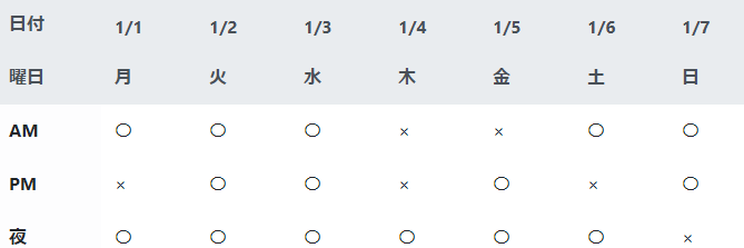
日付 1/1 1/2 1/3 1/4 1/5 1/6 1/7 曜日 月 火 水 木 金 土 日 AM 〇 〇 〇 × × 〇 〇 PM × 〇 〇 × 〇 × 〇 夜 〇 〇 〇 〇 〇 〇 × ゴールは上記tableの「日付」「曜日」行を固定しつつ、「AM」「PM」「夜」も常に表示することです。
wrapperにはclass=table-wrapper、tableにはclass=sticky-tableを指定します。また、固定したい行ヘッダーとなる各trには上から順にclass=fixed-header-n(nは0始まりの番号)を指定し、固定したい列ヘッダーとなる各thには左から順にclass=fixed-column-m(mは0始まりの番号)を指定します。
tableの左上の場所は行列方向に拘束したいので、tr.fixed-header-nおよびth.fixed-column-mの両方の指定が必要です。ちなみにヘッダーにtable-lightやthead-lightで色を付けているのは、透明のままだとヘッダー固定したときに他のセルと重なってしまうからです。
css/js
下記のようなcssとjsを作成します。
sticky-table.css/*ラッパー*/ div.table-wrapper { overflow: scroll; max-height:500px; /*任意*/ max-width:1000px; /*任意*/ } /*行ヘッダーを固定する。topの値はjsで動的に指定*/ table.sticky-table thead tr[class*="fixed-header-"] th { position: -webkit-sticky; /* for Safari */ position: sticky; /* tbody tdより手前に表示する */ z-index: 1; } /*行ヘッダーと列ヘッダーが重なる部分を固定する。top,leftの値はjsで動的に指定*/ table.sticky-table thead tr[class*="fixed-header-"] th[class*="fixed-column-"] { /* 全てのセルより手前に表示する */ z-index: 2; } /*列ヘッダーを固定する。leftの値はjsで動的に指定*/ table.sticky-table tbody th[class*="fixed-column-"] { position: -webkit-sticky; /* for Safari */ position: sticky; /* tbody tdより手前に表示する */ z-index: 1; }コメントを添えていますが、
div.table-wrapper {
  overflow: scroll;
  max-height:500px; /*任意*/
  max-width:1000px; /*任意*/
}
はwrapperの挙動です。max-height/max-widthは任意の値に設定してください。
続いて下記のような.jsを作成します。結局jqueryで書いてしまった。
sticky-table.js//行ヘッダーに対しtopを設定 height = 0; for (var i = 0; i < fixed_header_num; i++) { $(".fixed-header-" + i + " th").css('top', height); height += $(".fixed-header-" + i + " th").outerHeight(); } //列ヘッダーに対しleftを設定 width = 0; for (var j = 0; j < fixed_column_num; j++) { $("th.fixed-column-" + j).css('left', width); width += $("th.fixed-column-" + j).outerWidth(true); }jsでは固定したい各ヘッダーに対し、「どこまでの位置に達したら上/左方向への移動を拘束するか」の値となるtop/leftの値を動的に設定しています。一番上のヘッダーはtop=0でよいのですが、二番目以降のヘッダーは自身の上にあるヘッダーの累積高さ分の値を設定しています。列ヘッダーも同様。
fixed_header_num, fixed_column_numはそれぞれ、固定したい行/列ヘッダーの数なのですが、これらは使用シーンに合わせて変わると思うので、グローバルで宣言することにします。
使用例
下記のツリー構造を仮定します。
sticky-table/ ├ sample.html └ static/ ├ css/ │ └ sticky-table.css └ js/ └ sticky-table.jssample.html<html> <head> <meta name="viewport" content="width=device-width,initial-scale=1"> <meta charset="utf-8" /> <title>ヘッダー固定</title> <!--bootstrap--> <link rel="stylesheet" href="https://stackpath.bootstrapcdn.com/bootstrap/4.3.1/css/bootstrap.min.css" integrity="sha384-ggOyR0iXCbMQv3Xipma34MD+dH/1fQ784/j6cY/iJTQUOhcWr7x9JvoRxT2MZw1T" crossorigin="anonymous"> <!--sticky-table--> <link rel="stylesheet" href="static/css/sticky-table.css"> </head> <body> <!--https://stackoverflow.com/questions/15811653/table-with-fixed-header-and-fixed-column-on-pure-css--> <div class="container"> <div class="table-wrapper"> <table class="table text-nowrap sticky-table table-borderless"> <thead class="thead-light"> <tr class="fixed-header-0"> <th class="fixed-column-0">日付</th> <th>1/1</th> <th>1/2</th> <th>1/3</th> <th>1/4</th> <th>1/5</th> <th>1/6</th> <th>1/7</th> </tr> <tr class="fixed-header-1"> <th class="fixed-column-0">曜日</th> <th>月</th> <th>火</th> <th>水</th> <th>木</th> <th>金</th> <th>土</th> <th>日</th> </tr> </thead> <tbody> <tr> <th class="fixed-column-0 table-light">AM</th> <td>〇</td> <td>〇</td> <td>〇</td> <td>×</td> <td>×</td> <td>〇</td> <td>〇</td> </tr> <tr> <th class="fixed-column-0 table-light">PM</th> <td>×</td> <td>〇</td> <td>〇</td> <td>×</td> <td>〇</td> <td>×</td> <td>〇</td> </tr> <tr> <th class="fixed-column-0 table-light">夜</th> <td>〇</td> <td>〇</td> <td>〇</td> <td>〇</td> <td>〇</td> <td>〇</td> <td>×</td> </tr> </tbody> </table> </div> </div> <!--jquery+bootstrap--> <script src="https://code.jquery.com/jquery-3.3.1.slim.min.js" integrity="sha384-q8i/X+965DzO0rT7abK41JStQIAqVgRVzpbzo5smXKp4YfRvH+8abtTE1Pi6jizo" crossorigin="anonymous"></script> <script src="https://cdnjs.cloudflare.com/ajax/libs/popper.js/1.14.7/umd/popper.min.js" integrity="sha384-UO2eT0CpHqdSJQ6hJty5KVphtPhzWj9WO1clHTMGa3JDZwrnQq4sF86dIHNDz0W1" crossorigin="anonymous"></script> <script src="https://stackpath.bootstrapcdn.com/bootstrap/4.3.1/js/bootstrap.min.js" integrity="sha384-JjSmVgyd0p3pXB1rRibZUAYoIIy6OrQ6VrjIEaFf/nJGzIxFDsf4x0xIM+B07jRM" crossorigin="anonymous"></script> <!--sticky-table--> <script type="text/javascript"> //固定するヘッダーの数 var fixed_header_num = 2; //固定するカラムの数 var fixed_column_num = 1; </script> <script src="static/js/sticky-table.js"></script> </body> </html>
これで任意の数の行/列ヘッダーをcss/jsのみで固定することができます。
課題
Chromeでは動作確認しましたが、IEだとpolyfillが必要みたいです。
stickyfillまた、globalで変数指定が必要だったり、洗練されてないイメージもあるので、もっとうまいやり方がありましたらご教示頂ければ幸いです。
参考
Table with fixed header and fixed column on pure css
stickyfill

- 投稿日:2020-03-24T15:56:47+09:00
[CSS/jsのみ]tableの行/列ヘッダーを固定する
はじめに
最近Webアプリ周辺の技術を学び始めた者です。普段は製造業で設計業務を担当しておりますが、社内システム構築用にいろいろと勉強しています。主に使うのは下記。
- 言語 : python/C#
- Web framework : django
記事に書き出すことで自身の理解も深まると考え、今回初投稿をさせて頂きます。
動機
休日に妻と共同でアプリ開発をしています(この開発記録もつけられたらなーと思っています)。
tableを多用するのですが、その際列ヘッダーと行ヘッダーを固定してtbodyのデータセルだけスクロールできないかなと考え、いろいろ調べていました。
便利なプラグインもたくさんありましたが、
- 複数ヘッダーを固定できるものが限られていた
- なるべく既存のtableに変更を加えたくない
という理由で手を出せず。position:stickyというステキなオプションがあるので、どうにかこれを使ってできないかと思い、やってみました。
なおこちらのstackoverflowの質問を参考にしました→Table with fixed header and fixed column on pure csshtml
下記のようなtableと、wrapperとなるdivを用意します。class名はbootstrapを意識しています。
sample.html<div class="table-wrapper"> <table class="table text-nowrap sticky-table table-borderless"> <thead class="thead-light"> <tr class="fixed-header-0"> <th class="fixed-column-0">日付</th> <th>1/1</th> <th>1/2</th> <th>1/3</th> <th>1/4</th> <th>1/5</th> <th>1/6</th> <th>1/7</th> </tr> <tr class="fixed-header-1"> <th class="fixed-column-0">曜日</th> <th>月</th> <th>火</th> <th>水</th> <th>木</th> <th>金</th> <th>土</th> <th>日</th> </tr> </thead> <tbody> <tr> <th class="fixed-column-0 table-light">AM</th> <td>〇</td> <td>〇</td> <td>〇</td> <td>×</td> <td>×</td> <td>〇</td> <td>〇</td> </tr> <tr> <th class="fixed-column-0 table-light">PM</th> <td>×</td> <td>〇</td> <td>〇</td> <td>×</td> <td>〇</td> <td>×</td> <td>〇</td> </tr> <tr> <th class="fixed-column-0 table-light">夜</th> <td>〇</td> <td>〇</td> <td>〇</td> <td>〇</td> <td>〇</td> <td>〇</td> <td>×</td> </tr> </tbody> </table> </div>
ゴールは上記tableの「日付」「曜日」行を固定しつつ、「AM」「PM」「夜」も常に表示することです。
wrapperにはclass=table-wrapper、tableにはclass=sticky-tableを指定します。また、固定したい行ヘッダーとなる各trには上から順にclass=fixed-header-n(nは0始まりの番号)を指定し、固定したい列ヘッダーとなる各thには左から順にclass=fixed-column-m(mは0始まりの番号)を指定します。
tableの左上の場所は行列方向に拘束したいので、tr.fixed-header-nおよびth.fixed-column-mの両方の指定が必要です。ちなみにヘッダーにtable-lightやthead-lightで色を付けているのは、透明のままだとヘッダー固定したときに他のセルと重なってしまうからです。
css/js
下記のようなcssとjsを作成します。
sticky-table.css/*ラッパー*/ div.table-wrapper { overflow: scroll; max-height:200px; /*任意*/ max-width:400px; /*任意*/ } /*行ヘッダーを固定する。topの値はjsで動的に指定*/ table.sticky-table thead tr[class*="fixed-header-"] th { position: -webkit-sticky; /* for Safari */ position: sticky; /* tbody tdより手前に表示する */ z-index: 1; } /*行ヘッダーと列ヘッダーが重なる部分を固定する。top,leftの値はjsで動的に指定*/ table.sticky-table thead tr[class*="fixed-header-"] th[class*="fixed-column-"] { /* 全てのセルより手前に表示する */ z-index: 2; } /*列ヘッダーを固定する。leftの値はjsで動的に指定*/ table.sticky-table tbody th[class*="fixed-column-"] { position: -webkit-sticky; /* for Safari */ position: sticky; /* tbody tdより手前に表示する */ z-index: 1; }コメントを添えていますが、
div.table-wrapper {
  overflow: scroll;
  max-height:200px; /*任意*/
  max-width:400px; /*任意*/
}
はwrapperの挙動です。max-height/max-widthは任意の値に設定してください。
続いて下記のような.jsを作成します。結局jqueryで書いてしまった。
sticky-table.js//行ヘッダーに対しtopを設定 height = 0; for (var i = 0; i < fixed_header_num; i++) { $(".fixed-header-" + i + " th").css('top', height); height += $(".fixed-header-" + i + " th").outerHeight(); } //列ヘッダーに対しleftを設定 width = 0; for (var j = 0; j < fixed_column_num; j++) { $("th.fixed-column-" + j).css('left', width); width += $("th.fixed-column-" + j).outerWidth(true); }jsでは固定したい各ヘッダーに対し、「どこまでの位置に達したら上/左方向への移動を拘束するか」の値となるtop/leftの値を動的に設定しています。一番上のヘッダーはtop=0でよいのですが、二番目以降のヘッダーは自身の上にあるヘッダーの累積高さ分の値を設定しています。列ヘッダーも同様。
fixed_header_num, fixed_column_numはそれぞれ、固定したい行/列ヘッダーの数なのですが、これらは使用シーンに合わせて変わると思うので、グローバルで宣言することにします。
使用例
下記のツリー構造を仮定します。
sticky-table/ ├ sample.html └ static/ ├ css/ │ └ sticky-table.css └ js/ └ sticky-table.jssample.html<html> <head> <meta name="viewport" content="width=device-width,initial-scale=1"> <meta charset="utf-8" /> <title>ヘッダー固定</title> <!--bootstrap--> <link rel="stylesheet" href="https://stackpath.bootstrapcdn.com/bootstrap/4.3.1/css/bootstrap.min.css" integrity="sha384-ggOyR0iXCbMQv3Xipma34MD+dH/1fQ784/j6cY/iJTQUOhcWr7x9JvoRxT2MZw1T" crossorigin="anonymous"> <!--sticky-table--> <link rel="stylesheet" href="static/css/sticky-table.css"> </head> <body> <!--https://stackoverflow.com/questions/15811653/table-with-fixed-header-and-fixed-column-on-pure-css--> <div class="container"> <div class="table-wrapper"> <table class="table text-nowrap sticky-table table-borderless"> <thead class="thead-light"> <tr class="fixed-header-0"> <th class="fixed-column-0">日付</th> <th>1/1</th> <th>1/2</th> <th>1/3</th> <th>1/4</th> <th>1/5</th> <th>1/6</th> <th>1/7</th> </tr> <tr class="fixed-header-1"> <th class="fixed-column-0">曜日</th> <th>月</th> <th>火</th> <th>水</th> <th>木</th> <th>金</th> <th>土</th> <th>日</th> </tr> </thead> <tbody> <tr> <th class="fixed-column-0 table-light">AM</th> <td>〇</td> <td>〇</td> <td>〇</td> <td>×</td> <td>×</td> <td>〇</td> <td>〇</td> </tr> <tr> <th class="fixed-column-0 table-light">PM</th> <td>×</td> <td>〇</td> <td>〇</td> <td>×</td> <td>〇</td> <td>×</td> <td>〇</td> </tr> <tr> <th class="fixed-column-0 table-light">夜</th> <td>〇</td> <td>〇</td> <td>〇</td> <td>〇</td> <td>〇</td> <td>〇</td> <td>×</td> </tr> </tbody> </table> </div> </div> <!--jquery+bootstrap--> <script src="https://code.jquery.com/jquery-3.3.1.slim.min.js" integrity="sha384-q8i/X+965DzO0rT7abK41JStQIAqVgRVzpbzo5smXKp4YfRvH+8abtTE1Pi6jizo" crossorigin="anonymous"></script> <script src="https://cdnjs.cloudflare.com/ajax/libs/popper.js/1.14.7/umd/popper.min.js" integrity="sha384-UO2eT0CpHqdSJQ6hJty5KVphtPhzWj9WO1clHTMGa3JDZwrnQq4sF86dIHNDz0W1" crossorigin="anonymous"></script> <script src="https://stackpath.bootstrapcdn.com/bootstrap/4.3.1/js/bootstrap.min.js" integrity="sha384-JjSmVgyd0p3pXB1rRibZUAYoIIy6OrQ6VrjIEaFf/nJGzIxFDsf4x0xIM+B07jRM" crossorigin="anonymous"></script> <!--sticky-table--> <script type="text/javascript"> //固定するヘッダーの数 var fixed_header_num = 2; //固定するカラムの数 var fixed_column_num = 1; </script> <script src="static/js/sticky-table.js"></script> </body> </html>
これで任意の数の行/列ヘッダーをcss/jsのみで固定することができます。
課題
Chromeでは動作確認しましたが、IEだとpolyfillが必要みたいです。
stickyfillまた、globalで変数指定が必要だったり、洗練されてないイメージもあるので、もっとうまいやり方がありましたらご教示頂ければ幸いです。
参考
Table with fixed header and fixed column on pure css
stickyfill
- 投稿日:2020-03-24T15:08:31+09:00
【初心者向け】はじめてのGulpでのSassトランスパイル
Gulp手順
1. Node.js導入
①Node.js導入
公式サイトより安定版パッケージをダウンロードしインストールする
https://nodejs.org/ja/
node-v12.16.1.pkg(2020/02/24時点)②Node.jsの存在確認
node -v③デスクトップにテスト用のGulpディレクトリを作成
cd desktop
mkdir sample-gulp
cd sample-gulp
2. Gulp実行
①npmパッケージマネジャーにて初期化
npm init -y②Gulpプラグインをインストール(※1 Mac OSでエラー)
Sassトランスパイルを実現したいので今回B手順を実施。A.gulpをインストールする場合
npm install -D gulpB.gulpとgulp-sassをインストールする場合
npm install -D gulp gulp-sass※1 Mac OSでエラー
■課題
Catalina macOS 10.15にnpm installが失敗し次のエラーが出る(2020/02/24時点)
No Xcode or CLT version detected!■対策
「Xcodeをインストールして、Command Line ToolsをXcode同梱版に切り替えてみた。」を参考にした。
https://qiita.com/UTA6966/items/6f8b1fd21c2dc9591488手順①App StoreでXcodeをインストール
手順②ターミナルにてnode-gypをインストール$ sudo xcode-select --switch /Applications/Xcode.app $ npm install node-gyp③トランスパイル対象フォルダを用意
・cssフォルダを作成
desktop/sample-gulp/css・SCSSファイルを用意
style.scssファイルを作成
desktop/sample-gulp/css/style.scss// ネストのテスト div { p { font-weight: bold; } } // 変数のテスト $fontColor: #525252; h1 { color: $fontColor; }④タスクランナー処理記述
・gulpfile.js処理の記述
プロジェクトファイル直下にgulpfile.jsというファイルを作成gulpfile.js
// gulpプラグインの読み込み
const gulp = require("gulp");
// Sassをコンパイルするプラグインの読み込み
const sass = require("gulp-sass");

// style.scssをタスクを作成する
gulp.task("default", function() {
  // style.scssファイルを取得
  return (
    gulp
      .src("css/style.scss")
      // Sassのコンパイルを実行
      .pipe(sass())
      // cssフォルダー以下に保存
      .pipe(gulp.dest("css"))
  );
});
⑤タスク実行(トランスパイル)
npx gulp参考サイト
絶対つまずかないGulp 4入門(2019年版)インストールとSassを使うまでの手順
https://ics.media/entry/3290/macOS 10.15 Catalinaをクリーンインストール後のnode-gypインストール
https://qiita.com/UTA6966/items/6f8b1fd21c2dc9591488【デザイナー向け】gulpでかんたん画像圧縮
https://qiita.com/MikaShirahama/items/ab91624709510c496e53
- 投稿日:2020-03-24T13:02:06+09:00
React版ReactivesearchアプリをiPhone縦でも見やすくする
はじめに
PC用に作ったReactアプリを、CSSの@media(メディアクエリ)を使って、iPhone縦のときも見やすくします。ReactでなくてもHTMLアプリであれば使えます。
事前準備
「React版Reactivesearch v3を使ってゼロから最速でElasticsearchフロントアプリを作る」で作ったコードをサンプルに説明します。
手順
CSSファイルに@media記述を付け加えるだけです。
CityRank.cssの修正
アプリのCSSで全体幅を指定しているmain-classセレクタの下に、横幅が768px以下の画面のときにmain-classセレクタを上書きする定義を@mediaを使って記述します。
CityRank.css.main-class { width: 480px; margin-top: 10px; } @media screen and (width <= 768px) { .main-class { width: 360px; margin-top: 10px; } }リンク
- 投稿日:2020-03-24T12:03:25+09:00
CSS一部の要素だけを変更したい時
全体の要素を変更してしまうと思わぬところに影響を及ぼすことがあります。
なので、一部だけに適応した時は以下のような例で対応できる時もある。
- こちらのCSSが全体の要素としてかかっている時、htmlで対応させる。.mutual-dependence-content { box-sizing: border-box; display: flex; }<div class="mutual-dependence-content" style="box-sizing: initial;">initalは規定値という意味。
参考:initialとは
参考:box-sizingとは
- 投稿日:2020-03-24T10:09:52+09:00
以下のサイトのコードの完全版欲しいです
GASで作る社内ツール (キャンセル・報告編
https://qiita.com/nyanko-box/items/905d224d3ba8d3d00796ソースコードそのままコピペしても、
キャンセル、報告ボタンが書かれておらず動きません。完全に動くソースコードが欲しいです。当方、プログラミング初心者につき、最初は先人のマネから入って、
カスタマイズして、業務に応用させたく、どなたかお力添えはただけると幸いです。
- 投稿日:2020-03-24T05:08:46+09:00
初心者によるプログラミング学習ログ 271日目
100日チャレンジの271日目
twitterの100日チャレンジ#タグ、#100DaysOfCode実施中です。
すでに100日超えましたが、継続。
100日チャレンジは、ぱぺまぺの中ではプログラミングに限らず継続学習のために使っています。
271日目は、おはようございます
— ぱぺまぺ@webエンジニアを目指したい社畜 (@yudapinokio) March 23, 2020
271日目
・XDデザインカンプからのwebサイト模写
・あと、gitも併用#早起きチャレンジ#駆け出しエンジニアと繋がりたい#100DaysOfCode
- 投稿日:2020-03-24T01:03:19+09:00
【StyledComponent + CSSアニメーション】keyframesに引数をつける
StyledComponentを使ってCSSアニメーションを作る時に使う
keyframesに引数を渡して動的にアニメーションを調整する方法を、忘備録として。結論
こんな感じ。
keyframesimport { keyframes } from 'styled-components' export const zoomInToAnyScale = (num: number) => keyframes` from { transform: scale(0) } to { transform: scale(${num}) } `使い方const StyledDiv = styled.div` animation: ${zoomInToAnyScale(3)} 0.3s ease 0.5s forwards; ` const ZoomInDiv = styled.div<{ scale: nuber }>` animation: ${({scale}) => zoomInToAnyScale(scale) } 0.3s ease 0.5s forwards; `環境
一応、環境はこんな感じ。
package version React 16.13.0 StyledComponents 5.0.1 TypeScript 3.8.3 解説
(解説というほどのものでもないけど)
StyledComponentsで宣言するkeyframesは元はただの関数です。引数にとるのはTemplateStringsArray | CSSKeyframesとなっていますが、要はCSSが書かれた文字列orオブジェクトなので、こんな書き方もできます。keyframesimport { keyframes } from 'styled-components' export const zoomInToAnyScale = (num: number) => { return keyframes({ from: { transform: `scale(0)` }, to: { transform: `scale(${num})` } })つまりは、テンプレートリテラルなどに埋めてそのまま引数として渡せばいいだけ。
ちなみにstyled.divなどはただの関数もうちょっと複雑になってるようです。終わりに
最近CSSアニメーションに夢中になって、いろいろな作品を見て「すげええええ」って言いながら勉強しています。
いや、本当にすごいんですよ。CSSアニメーターの方全員尊敬してます。神。StyledComponents自体の記事は多いのですが、keyframesはあまり見かけなかったので書いてみました。
実務とかだと、ただのCSSアニメーションは扱いづらいのかもしれないですね。トリガーで発火させるようなアニメーションは、JS側で管理しやすいreact-springとかの方が良さそうです。