- 投稿日:2020-01-17T20:52:17+09:00
条件分岐
if maxmin.to_i <= 14
Auter hoode-f pant shose==================================================================
maxmin.to_i <=14
1 2 3 4 5
TOP auter-f,
TOP2 jaket-s
inner t-long
pant
shose6 8 10 12 14
TOP auter-f
inner t-long
pant
shose7 9 11 13
TOP auter
innner Hoode-f t-long
pant
shose15 16 17 18
TOP Jaket-s Jaket-m
inner hoode-f t-long
pant
shose19 20 21 22 24 26
TOP Jaket-s Jaket-m hoode-j
inner t-long t-short
pant
shose
23 25 27 28
TOP hoode-f
pant
shose29以上
TOP t-short
pant
shose
- 投稿日:2020-01-17T20:22:16+09:00
Swift: カスタムセルを駆使してヘッダーや細かいセクション切りをする
はじめに
超絶シンプルなアプリ、画面構成でない限り、ただリストを表示だけというのは少ないと思います。
大体はAPIレスポンスに応じて動的に表示したり、一画面にいくつかセクションが切られてあったり、セクションごとに見出し(ヘッダー)を用意せねばいかんこともあると思います。業務で使っている構成が使いやすいので備忘録。
実装したい条件
APIレスポンスに応じて、データを動的にリスト表示させたい時は多いと思います。
一画面に複数セクションを切って、別々な情報を羅列したい時もあると思います。
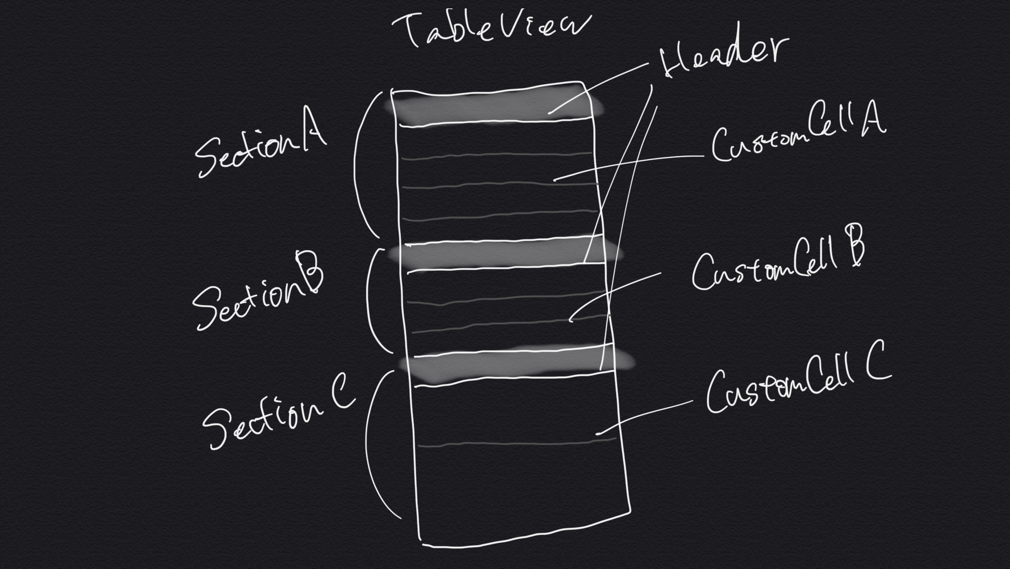
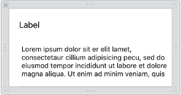
上記のように、3つの別のセクションがあり、セクションごとに別のカスタムセルを使用しなければいけないケースなど、ちょっと考えるのが面倒です。
そういう場合はセクションヘッダーもまとめてカスタムセルで作成してしまいましょう。
セクションもカスタムビューを割り当てて作成できますが、
tableViewを.grouped設定したり、設定したらしたで細かい設定も必要なので1つの案として。実装していく
考え方
切り分けは以下のように考えます。
enum Section {
    case header(String)
    case sectionA([String])
    case sectionB([String])
    case sectionC([String])
}

var sections: [Section] = [.header("Section A"), .sectionA(["item 1", "item 2", "item 3"]),
                           .header("Section A"), .sectionB(["item 1", "item 2", "item 3"]),
                           .header("Section A"), .sectionC(["item 1", "item 2", "item 3"])]

// 必要なカスタムセル
class HeaderCell { }
class CustomCellA { }
class CustomCellB { }
class CustomCellC { }

// --- UITableViewDataSource

func numberOfSections(in tableView: UITableView) -> Int {
    return sections.count
}

func tableView(_ tableView: UITableView, numberOfRowsInSection section: Int) -> Int {
    switch sections[section] {
    case .header:
        return 1
    case .sectionA(let titles):
        return titles.count
    case .sectionB(let titles):
        return titles.count
    case .sectionC(let titles):
        return titles.count
    }
}
セクション切りは、
(sectionA's header, sectionA's cells) というグルーピングではなく、
(sectionA's header), (sectionA's cells), (sectionB's header)...
という切り方をしてnumberOfSectionsに設定します。この構成の何が嬉しいかというと、
enum Section型を作成し、それをベースにした配列を用意することで、cellForRowAtでswitch分岐できる- セクション数と
sections配列の数が比例しているので、switch sections[indexPath.section]でセルの種類ごと=セクションの種類ごとに分岐可能case sectionA([String])と配列を与えているので、numberOfRowsInSectionでセクション毎のセル数をカウントして返せる上記の構成をすることで、実際に
cellForRowAtでセル作成していくときにindexPath.sectionindexPath.rowの数とsectionsの構成している値の数がマッチして操作しやすいです。コード
実際に
cellForRowAtも加えると以下のようになります。enum Section { case header(String) case sectionA([String]) case sectionB([String]) case sectionC([String]) } var sections: [Section] = [.header("Section A"), .sectionA(["item 1", "item 2", "item 3"]), .header("Section A"), .sectionB(["item 1", "item 2", "item 3"]), .header("Section A"), .sectionC(["item 1", "item 2", "item 3"])] // 必要なカスタムセル class HeaderCell { } class CustomCellA { } class CustomCellB { } class CustomCellC { } // --- UITableViewDataSource func numberOfSections(in tableView: UITableView) -> Int { return sections.count } func tableView(_ tableView: UITableView, numberOfRowsInSection section: Int) -> Int { switch sections[section] { case .header: return 1 case .sectionA(let titles): return titles.count case .sectionB(let titles): return titles.count case .sectionC(let titles): return titles.count } } func tableView(_ tableView: UITableView, cellForRowAt indexPath: IndexPath) -> UITableViewCell { // sections.count = indexPath.sectionの回数なので、sctionsに設定してenum case毎に切り分けられる switch sections[indexPath.section] { // イテレーションがheaderならHeaderCell case .header(let title): let cell = tableView.dequeueReusableCell(withIdentifier: "HeaderCell") as? HeaderCell cell.title = title return cell // イテレーションがsectionAならCustomCellA case .sectionA(let titles): let cell = tableView.dequeueReusableCell(withIdentifier: "CustomCellA") as? CustomCellA // numberOfRowsInSectionでenum case毎に持つ配列の値数を返しているので、indexPath.rowで合わせる cell.configure(title: titles[indexPath.row]) return cell // 同様 case .sectionB(let titles): let cell = tableView.dequeueReusableCell(withIdentifier: "CustomCellB") as? CustomCellB cell.configure(title: titles[indexPath.row]) return cell // 同様 case .sectionC(let titles): let cell = tableView.dequeueReusableCell(withIdentifier: "CustomCellC") as? CustomCellC cell.configure(title: titles[indexPath.row]) return cell } }な感じになります。すごく使い勝手がいいです。
enum caseに上記ではStringを与えていますが、別に構造体でもいいですし、ベースとなるenum Sectionにケースを用意し、
処理を組んでからsectionsに値を返すようにすれば、APIレスポンスから動的に構成を整えることも可能です。この辺とかで
mapしたりreduceしたり。
https://qiita.com/57shota/items/8321ea6237fc6ef86487何より全てカスタムセルで成しているのと、
cellForRowAtがすごくリーダブルなのが魅力です。終わりに
補完を使うこと、見やすくすること、動的なデータにも対応すること、
など書き手読み手に優しい構成だなと感じました。
sectionHeaderをまた別の用途で使えるのもいいっすね。
- 投稿日:2020-01-17T19:48:30+09:00
NeumorphismをSwiftUIで簡単に実装できるライブラリ、Neumorphismicを作ってみた
先日Neumorphism: 令和時代のスキューモーフィズムを読みました。
これが流行る頃にはSwiftUIも使えるようになってるだろう…ということでSwiftUIでNeumorphismのライブラリを作ってみました。
SwiftPMにしか対応していませんが、Xcode 11からとても使いやすくなりましたし、SwiftUIのOSSなのでこれで十分だと思います。スターつけてくださると嬉しいです!
完成形
Demoの画面です。SwiftUIということで全プラットフォームのDemoを一応作りましたが、iOS以外は図形が表示されるだけの手抜きです。
使い方
簡単な使い方はこんな感じです。2層目以降は
ZStackで背景色をつける必要もないですし、.environmentも必要ありません。下のコードだと少し複雑に見えるかもしれませんが、各Viewで増えるのは.modifier(NMConvexModifier())のみです。下のコードもSwiftUIを少し触った方ならすぐわかると思います。struct ContentView: View { let baseColor = Color(hex: "C1D2EB") var body: some View { ZStack { baseColor .edgesIgnoringSafeArea(.all) Circle() .fill(baseColor) .frame(width: 300, height: 200) .modifier(NMConvexModifier()) .environment(\.nmBaseColor, baseColor) } } }作り方
実際のコードとは多少違います。
ModifierでShadowを実装する
Modifierについてはこの記事でひと通りわかると思います。簡単にいうと
.fontとか.frameとかをまとめてViewに適合できるやつです。
SwiftUIでもshodowは1つしか追加できません。なのでZStackでViewを2つ重ねてそれぞれに.shadowをつける必要があります。struct ConvexModifier: ViewModifier { let lightShadowColor: Color let darkShadowColor: Color func body(content: Content) -> some View { ZStack { content .shadow(color: darkShadowColor, radius: 16, x: 9, y: 9) content .shadow(color: lightShadowColor, radius: 16, x: -9, y: -9) } } }しかし、これだけでは影の色をいちいち入力する必要があります。
色をEnvironmentで伝搬する
SwiftUIでは
@Environmentを使うことでその子View全てに値を伝えることができます。詳しくはこの記事を読んでください。
そしてこれは自作することもできます。Neumorphismでは基本的にViewに1色しか使わないためこれが非常に有効です。さらに、ConvexModifierもbaseColorを基準に影の色を決めればよくなります。自作する方法はこちらをご覧ください。struct BaseColorKey: EnvironmentKey { static let defaultValue: Color = .gray } extension EnvironmentValues { var baseColor: Color { get { self[BaseColorKey.self] } set { self[BaseColorKey.self] = newValue } } }さて、色を変換したいわけだけど…
パッと見、SwiftUIの
Colorからはrgbやhueや取得できそうにありません。しかし#C1D2EBFFのようにカラーコードを返してくれる.descriptionがあります。ということでカラーコードからColorを生成(このリンクではUIColor)できるようにし、RGBとHSL、RGBとHSBの変換コードを用意します。
Colorから色情報を取れるとわかったので、早速lighterColorを実装します。func getRGBA() -> (r: Double, g: Double, b: Double, a: Double) { let string = String(self.description.dropFirst()) let v = Int(string, radix: 16) ?? 0 let r = Double(v / Int(powf(256, 3)) % 256) / 255 let g = Double(v / Int(powf(256, 2)) % 256) / 255 let b = Double(v / Int(powf(256, 1)) % 256) / 255 let a = Double(v / Int(powf(256, 0)) % 256) / 255 return (r, g, b, a) } func getHSLA() -> (h: Double, s: Double, l: Double, a: Double) { let (r, g, b, a) = getRGBA() let (h, s, l) = ColorTransformer.rgbToHsl(r: r, g: g, b: b) return (h, s, l, a) } func lighter(_ value: Double) -> Color { let (h, s, l, a) = getHSLA() return Color(hue: h, saturation: s, lightness: min(l + value, 1), opacity: a) } func darker(_ value: Double) -> Color { let (h, s, l, a) = getHSLA() return Color(hue: hsb.h, saturation: hsb.s, lightness: max(l - value, 0), opacity: a) }struct ColorExtension_Previews: PreviewProvider { static var previews: some View { let color = Color(hex: "C1D2EB") return Group { ColorPreview(color) ColorPreview(color.lighter(0.12)) ColorPreview(color.darker(0.18)) } .previewLayout(.fixed(width: 200, height: 100)) } }
こうなりました。影として使わないとよくわかりませんね。ConvexModifierを完成させる
材料は揃ったので合わせてみましょう。
struct ConvexModifier: ViewModifier {

    @Environment(\.baseColor) var baseColor: Color

    func body(content: Content) -> some View {
        ZStack {
            content
                .shadow(color: baseColor.darker(0.18), radius: 16, x: 9, y: 9)
            content
                .shadow(color: baseColor.lighter(0.12), radius: 16, x: -9, y: -9)
        }
    }
}
struct ConvexModifier_Previews: PreviewProvider { static var previews: some View { ZStack { Color(hex: "C1D2EB") .edgesIgnoringSafeArea(.all) Circle() .fill(Color(hex: "C1D2EB")) .modifier(ConvexModifier()) .frame(width: 300, height: 300) } .environment(\.baseColor, Color(hex: "C1D2EB")) } }
.environmentでbaseColorを伝えるの忘れないようにしましょう。
いい感じですね!
environmentを使ったので当然struct ConvexModifier_Previews: PreviewProvider { static var previews: some View { ZStack { Color(hex: "C1D2EB") .edgesIgnoringSafeArea(.all) Circle() .fill(Color(hex: "C1D2EB")) .frame(width: 300, height: 300) .modifier(ConvexModifier()) // `environment`で影の色を変える .environment(\.baseColor, Color.red) } .environment(\.baseColor, Color(hex: "C1D2EB")) } }とできるだろうと思っていたのですができませんでした。
.redの時は黒い影が出てきて、その他の場合は影がなくなりました。Color(hex:)を使ったら行けたのでよくわかりません。Highlight時に表示を変えられるButtonも作ってみた
ハイライト時にNeumorphismではどうするのが正解なんだろうと考えるためにとりあえず作ってみました。個人的に標準
Buttonは ハイライト時に色が薄すぎる気がするのでこれを使ってますが、標準のButtonでもいい気がします。押下時にボタンを小さくしたいときなどに使ってみてください。struct HighlightableButton<Label>: View where Label: View { private let action: () -> Void private let label: (Bool) -> Label public init( action: @escaping () -> Void, label: @escaping (Bool) -> Label ) { self.action = action self.label = label } @State private var isHighlighted = false public var body: some View { label(isHighlighted) .animation(.easeOut(duration: 0.05)) .gesture(DragGesture(minimumDistance: 0) .onChanged { _ in withAnimation { self.isHighlighted = true } } .onEnded { _ in self.action() withAnimation { self.isHighlighted = false } } ) } }struct ConvexModifier_HighlightableButton_ForPreviews: View { @State var isSelected = false var body: some View { HighlightableButton(action: { self.isSelected.toggle() }) { isH in Image(systemName: self.isSelected ? "house.fill" : "house") .resizable() .aspectRatio(contentMode: .fit) .frame(width: isH ? 54 : 60) .foregroundColor(Color(hex: "C1D2EB").darker(value: 0.18)) .background( Circle() .fill(Color(hex: "C1D2EB")) .frame(width: isH ? 90 : 100, height: isH ? 90 : 100) .modifier(ConvexModifier()) ) .opacity(isH ? 0.6 : 1) } } }
.modifier(ConvexModifier())はButtonの中に書いてください(標準のButtonでも同じです)。外に書くときちんと適用されません。ForPreviewsみたいな名前になっているのは、PreviewProviderの中には@Stateが置けないからです。
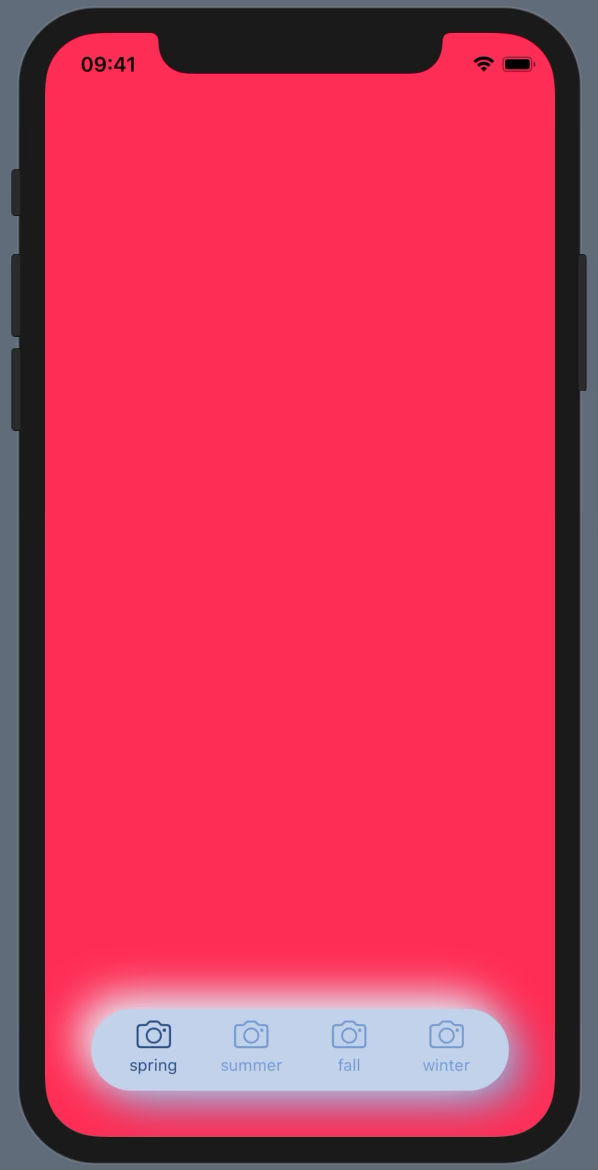
FloatingTabViewも作ってみた
@touyouさんもタブを作ってることだし作るかーみたいな感じで作ってみました。
ViewBuilderを読み解こうとまでは思わなかったので(そもそもできるんですかね)、標準のTabViewのような綺麗さはありませんが、まあ使えるのではないでしょうか。タブの数は4つまでにしてみました。標準のTabViewにあるその他を実装する気力はなかったので切り捨てています。
使い方はこんな感じです。struct FloatingTabView_ForPreviews: View { enum Season: String, CaseIterable { case spring, summer, fall, winter var color: Color { switch self { case .spring: return .pink case .summer: return .blue case .fall: return .orange case .winter: return .white } } } @State var season: Season = .spring var body: some View { FloatingTabView(selection: $season, labelText: { s in s.rawValue }, labelImage: { _ in Image(systemName: "camera") }) { s in s.color.edgesIgnoringSafeArea(.all) } } }例を作るのが面倒なのが目に見えますね…。
labelImageなんてカメラだけですし。この例では色を変えていますが、Neumorphismでは色を変えるのはご法度なので注意。(もちろん局所的にアクセントとして使うのはOKです)
ああ、影の色が汚い…。まあ色変えるとこうなるよっていう悪い例と思ってください。
ちなみにGeometryReaderのせいかLive PreviewにしていないとTabが下に落ちてしまいました。SwiftUIは7不思議どころじゃありません。そこら辺に穴が一杯です。全く理由がわからず何となくLive Previewにしてみたところ合っていたことがわかりました。恐ろしや。凹も作りたかったけど
凹凸どちらも作りたかったのですが、凹の方はいい案が思い浮かばず、凸だけになってしまいました。適合したい
aViewよりひとまわり大きいbViewを作って、そこからaViewの大きさを切り抜いて、aViewの上にbViewを2つ置いて影をつければ行けそうだなとは思ったんですが、くり抜く方法がわかりませんでした。Pathを使えば何とかなりそうですが、Viewの形を取る方法もないですし…。使う上での諸注意
HighlightableButtonのところでも書きましたが、Buttonで使う際は.modifier(ConvexModifier())をButtonの中に書いてください。そうしないときれいに作れません。
またBinding系のコンポーネントは2つ同時にViewに存在すると使えなくなるようです。TextField("C1D2EB", text: $model.userInput) .foregroundColor(baseColor.darker(0.5)) .padding(5) .background( RoundedRectangle(cornerRadius: 5, style: .continuous) .fill(baseColor) .modifier(NMConvexModifier(radius: 9)) )のように
backgroundに設定したViewに.modifier(ConvexModifier())してください。Viewの量的にもこちらの方がパフォーマンスもいいです。NeumorphismではViewの量が多くなりがちなので。初OSS & 初Qiita?
cocoapodsなどにも対応したかったのですが、SwiftUIのOSSですし、自分の学ぶ量としてもSwiftPMだけで十分だろうとSPMのみになっています。それでも十分つまづきまくりましたし。
初めてのOSSなので、改善点などたくさんあると思います。もしなんかあったらTwitterなどに送ってくださると嬉しいです!(もちろんissueでも)Qiitaも初投稿ですが、そろそろ開発から離れて受験勉強しないと浪人する未来しか見えないので当分記事を書くことはないでしょう。1年後に戻って来れるように頑張ります。
いいねとスターつけてくださると嬉しいです!
Neumorphismic - GitHub


- 投稿日:2020-01-17T14:38:32+09:00
iOS の Dynamic Type でテキストサイズはどのくらい変化するのか?
はじめに
iOS のアクセシビリティ機能の1つにユーザーインターフェース上のテキストサイズを自動的にスケーリングする Dynamic Type があります。
Scaling Fonts Automatically - UIKit | Apple Developer
Android ではテキストに対して Scale-independent Pixels (sp) という単位でのサイズ指定するのとは異なり、テキストに対して Header, Body のような用途別のスタイルで指定するのが特色です。
そのため、ユーザーのサイズ設定に応じて各スタイルのフォントサイズがどのように変化するのかが想像しにくいため、サンプルアプリを作って見た目と数値で確認できるようにしてみました。
サンプルアプリ
サンプルアプリのリポジトリはこちらです。
temoki/UIKit_DynamicType - GitHub
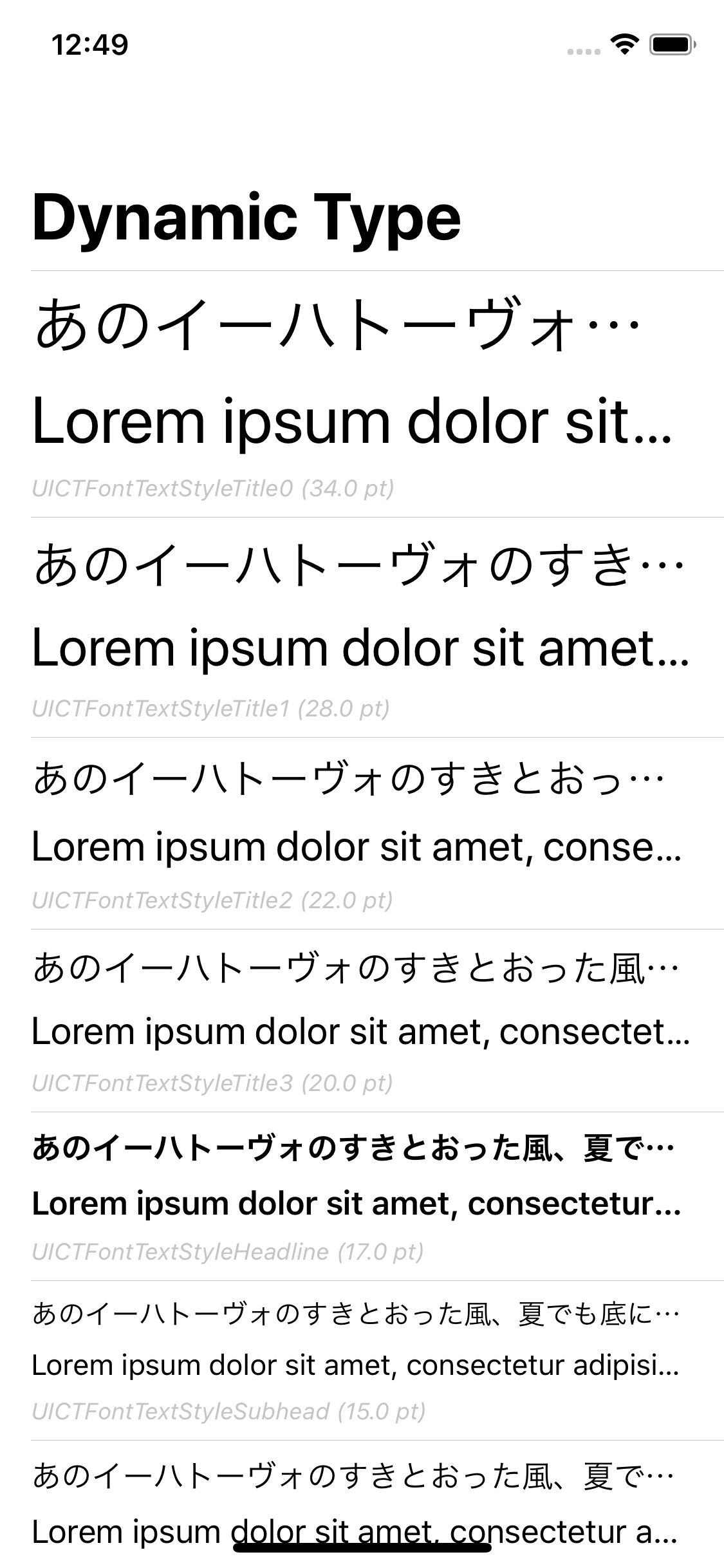
アプリを起動すると、デバイスの現在の設定に応じてカテゴリ別にテキストとそのサイズが表示されます。
フォントサイズを決める変数
UIContentSizeCategory
UIContentSizeCategory - UIKit | Apple Developer Documentation
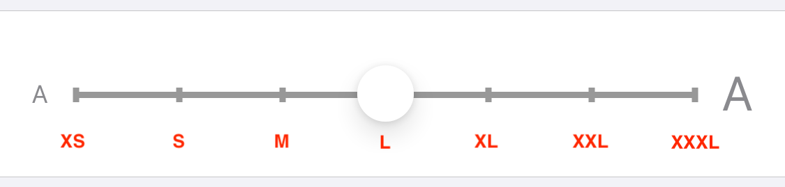
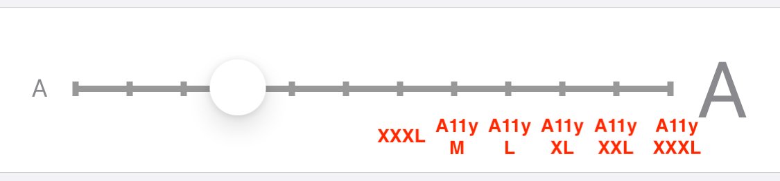
ユーザーが iOS のアクセシビリティ設定で変更可能なテキストサイズのカテゴリです。「さらに大きな文字」を ON にすると、最大 12 段階でサイズを変更できることになります。
さらに大きな文字 OFF
さらに大きな文字 ON
name case rawValue XS .extraSmall"UICTContentSizeCategoryXS"S .small"UICTContentSizeCategoryS"M .medium"UICTContentSizeCategoryM"L .large"UICTContentSizeCategoryL"XL .extraLarge"UICTContentSizeCategoryXL"XXL .extraExtraLarge"UICTContentSizeCategoryXXL"XXXL .extraExtraExtraLarge"UICTContentSizeCategoryXXXL"A11yM .accessibilityMedium"UICTContentSizeCategoryAccessibilityM"A11yL .accessibilityLarge"UICTContentSizeCategoryAccessibilityL"A11yXL .accessibilityExtraLarge"UICTContentSizeCategoryAccessibilityXL"A11yXXL .accessibilityExtraExtraLarge"UICTContentSizeCategoryAccessibilityXXL"A11yXXXL .accessibilityExtraExtraExtraLarge"UICTContentSizeCategoryAccessibilityXXXL"UIFont.TextStyle
UIFont.TextStyle - UIFont | Apple Developer Documentation
UIKit の各種コントロールに設定するテキストスタイルです。
name case rawValue Large Title .largeTitle"UICTFontTextStyleTitle0"Title 1 .title1"UICTFontTextStyleTitle1"Title 2 .title2"UICTFontTextStyleTitle2"Title 3 .title3"UICTFontTextStyleTitle3"Headline .headline"UICTFontTextStyleHeadline"Subhead .subheadline"UICTFontTextStyleSubhead"Body .body"UICTFontTextStyleBody"Callout .callout"UICTFontTextStyleCallout"Footnote .footnote"UICTFontTextStyleFootnote"Caption1 .caption1"UICTFontTextStyleCaption1"Caption2 .caption2"UICTFontTextStyleCaption2"テキストサイズの変化
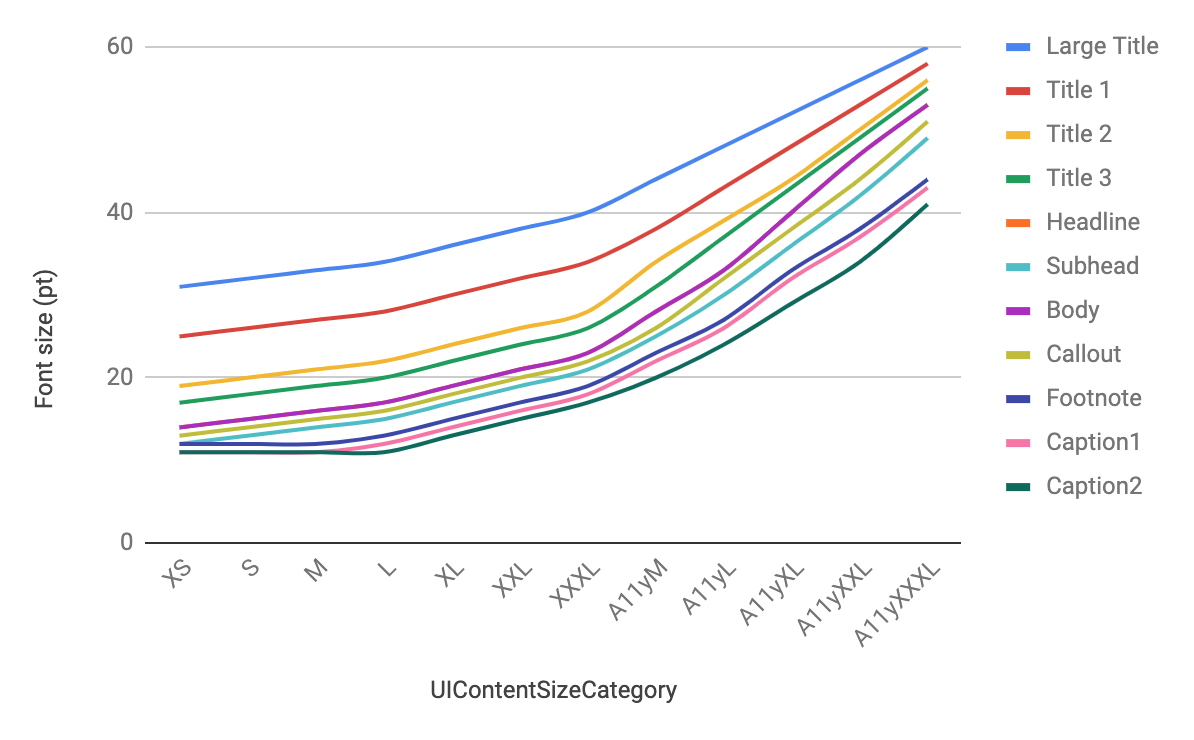
UIContentSizeCategory と UIKit.TextStyle の組み合わせによるフォントサイズを表にまとめてみました。
XS S M L XL XXL XXXL A11yM A11yL A11yXL A11yXXL A11yXXXL Large Title 31 32 33 34 36 38 40 44 48 52 56 60 Title 1 25 26 27 28 30 32 34 38 43 48 53 58 Title 2 19 20 21 22 24 26 28 34 39 44 50 56 Title 3 17 18 19 20 22 24 26 31 37 43 49 55 Headline 14 15 16 17 19 21 23 28 33 40 47 53 Subhead 12 13 14 15 17 19 21 25 30 36 42 49 Body 14 15 16 17 19 21 23 28 33 40 47 53 Callout 13 14 15 16 18 20 22 26 32 38 44 51 Footnote 12 12 12 13 15 17 19 23 27 33 38 44 Caption1 11 11 11 12 14 16 18 22 26 32 37 43 Caption2 11 11 11 11 13 15 17 20 24 29 34 41 グラフにもしてみました。
「さらに大きな文字」が ON の場合に想像以上に大きなフォントサイズになることがわかりますね。この状態でもレイアウトが破綻しないアプリを作るのはなかなか大変そうです?
MAXまで大きくしたら設定アプリはこうなる pic.twitter.com/Qn3sFIpGEn
— Tomoki Kobayashi??? (@temoki) January 7, 2020
この記事では Xcode 11.3 と iOS 13.3 シミュレータで確認した結果を掲載しています。
- 投稿日:2020-01-17T14:28:10+09:00
iOS13でSceneDelegateを使わないでアプリを作る
iOS13からSceneDelegateが標準装備になった!
SceneDelegateは同じアプリを複数立ち上げる際に使われる仕組みです。Apple製のアプリはほとんど対応しています。
しかし技術的な理由から、複数立ち上げられないようにしたい、また立ち上げる必要がないといった場合、iOS12以前と同じく、SceneDelegateを使用せず、AppDelegateだけで開発をしたいということもあるでしょう(AppDelegateとSceneDelegateの両方を管理しないといけないし、、)。そーゆう時にどうすればいいかを調べたので、備忘録をかねて、投稿しておきます。検証環境
Xcode11.3
iOS13.3脱SceneDelegateに必要な手順は2つ!
1. AppDelegateにあるSceneの設定に使用するメソッドを削除
AppDelegate.swiftに書かれている以下のメソッドを削除します。AppDelegate.swift// MARK: UISceneSession Lifecycle func application(_ application: UIApplication, configurationForConnecting connectingSceneSession: UISceneSession, options: UIScene.ConnectionOptions) -> UISceneConfiguration { // Called when a new scene session is being created. // Use this method to select a configuration to create the new scene with. return UISceneConfiguration(name: "Default Configuration", sessionRole: connectingSceneSession.role) } func application(_ application: UIApplication, didDiscardSceneSessions sceneSessions: Set<UISceneSession>) { // Called when the user discards a scene session. // If any sessions were discarded while the application was not running, this will be called shortly after application:didFinishLaunchingWithOptions. // Use this method to release any resources that were specific to the discarded scenes, as they will not return. }2. Info.plistのUIApplicationSceneManifestのkeyを削除
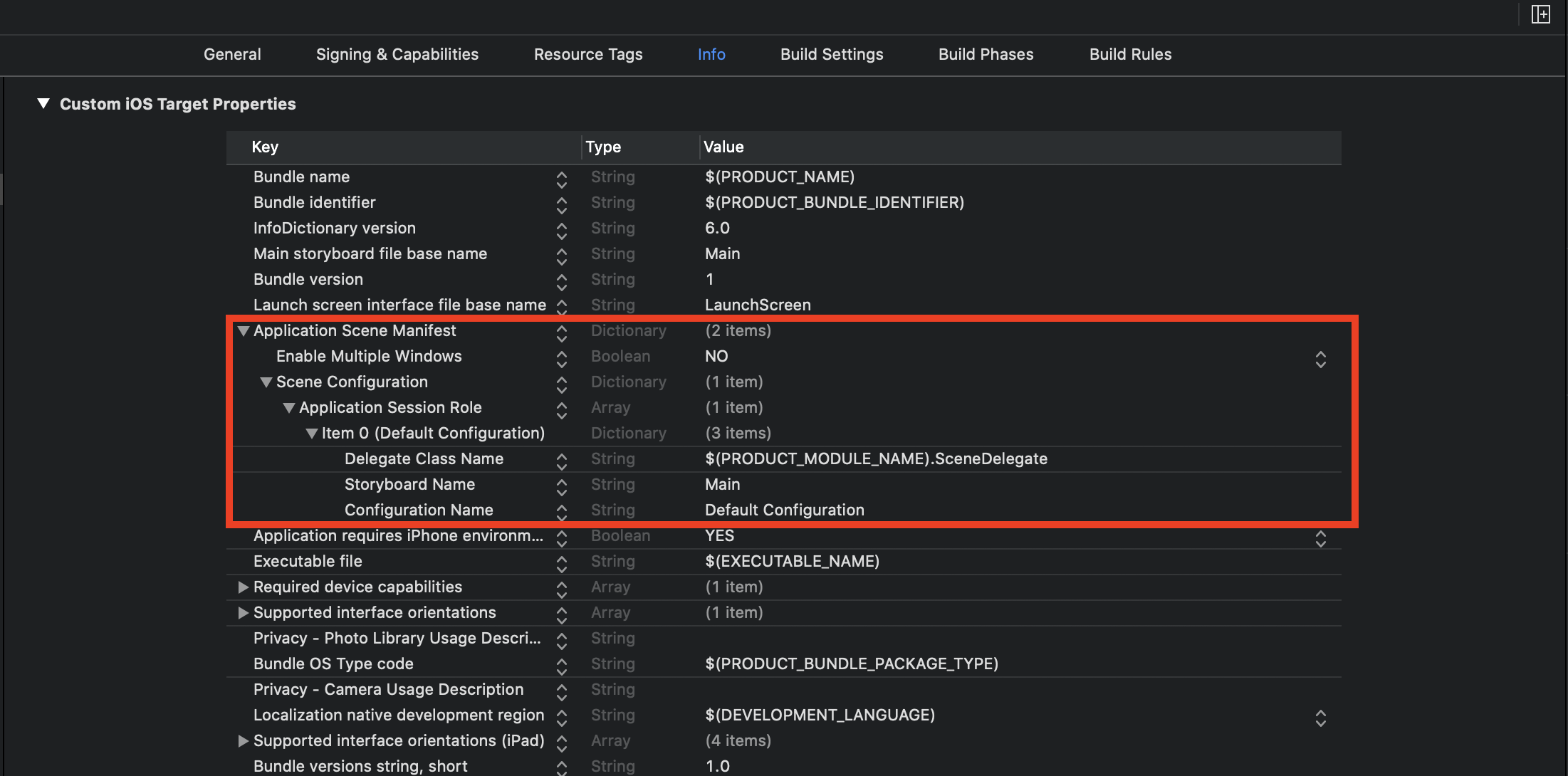
info.plistのUIApplicationSceneManifestのkeyを項目ごと全て削除します。この項目は、アプリのSceneの動作に関する設定が記載されています。SceneDelegateを使わない場合は、不要になります。
これで後は
SceneDelegate.swiftファイルを削除するだけです!
修正点あれば、指摘ください!
- 投稿日:2020-01-17T13:02:21+09:00
CustomCellで部分的にタップイベントが取れない
CustomCellタップ時に画面遷移するtableView作ってたらtextViewタップ時だけイベントが取れなかった時のメモ。
やったこと
labelの下にtextViewをおいたCustomCellをTableViewに表示した。
発生した問題
①textViewタップ時イベントが発生しない。
②cell内labelt、空欄をタップ(選択)時、イベントは発生するがtextViewの色だけ変わらない。
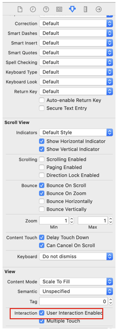
発生した問題①の原因
textViewの userInteraction Enabled がtrueになっていた。
この設定があるとタップイベントを拾ってしまう。
親の部品のタップイベントを拾わせるにはfalseにする必要があった。
発生した問題②の原因
textViewの背景色がwhiteに設定されていた。
解決後
- 投稿日:2020-01-17T12:48:05+09:00
【swift】Xibで作成したCollectionViewにカスタムセルを適用させる方法【Objective-c】
どうもです。
どこ探してもStoryboardの記事ばっかで探してるもんが見つからないので投稿します。
Swift
ViewController.swiftclass ViewController: UIViewController,UICollectionViewDelegate,UICollectionViewDataSource,UICollectionViewDelegateFlowLayout { @IBOutlet var collectionView: UICollectionView! override func viewDidLoad() { super.viewDidLoad() self.initCollectionView() self.initCollectionViewCell() } func initCollectionView() { collectionView.delegate = self collectionView.dataSource = self } func initCollectionViewCell() { let className : String = String(describing: type(of: カスタムセルのクラス())) collectionView.register(UINib(nibName: className, bundle: nil), forCellWithReuseIdentifier: className) } func collectionView(_ collectionView: UICollectionView, numberOfItemsInSection section: Int) -> Int { return 返したいセル数 } func collectionView(_ collectionView: UICollectionView, layout collectionViewLayout: UICollectionViewLayout, sizeForItemAt indexPath: IndexPath) -> CGSize { return CGSize(width: 横の大きさ, height: 縦の大きさ) } func collectionView(_ collectionView: UICollectionView, cellForItemAt indexPath: IndexPath) -> UICollectionViewCell { let cell = collectionView.dequeueReusableCell(withReuseIdentifier: String(describing: type(of: カスタムセルのクラス())), for: indexPath) as! カスタムセルのクラス cell.紐付けしたラベル.text = "aiueo" return cell } }Objective-c
viewController.m//collectionViewの紐付け、Delegateの採用をしておいてください。 - (void)viewDidLoad { [super viewDidLoad]; [self initCollectionViewCell]; [self initCollectionView]; } - (void)initCollectionView{ self.collectionView.delegate = self; self.collectionView.dataSource = self; } - (void)initCollectionViewCell{ NSString *cellName = NSStringFromClass([カスタムセルクラス名 class]); UINib *nib = [UINib nibWithNibName:cellName bundle:nil]; [self.collectionView registerNib:nib forCellWithReuseIdentifier:cellName]; } - (CGSize)collectionView:(UICollectionView *)collectionView layout:(UICollectionViewLayout*)collectionViewLayout sizeForItemAtIndexPath:(NSIndexPath *)indexPath{ return CGSizeMake(縦のサイズ, 横のサイズ); } - (UICollectionViewCell *)collectionView:(UICollectionView *)collectionView cellForItemAtIndexPath:(NSIndexPath *)indexPath{ NSString *cellName = NSStringFromClass([カスタムセルクラス名 class]); カスタムセルクラス名 *cell = [collectionView dequeueReusableCellWithReuseIdentifier:cellName forIndexPath:indexPath]; cell.紐付けラベル.text = @"aiueo"; return cell; } - (NSInteger)numberOfSectionsInCollectionView:(UICollectionView *)collectionView{ return 1; } - (NSInteger)collectionView:(UICollectionView *)collectionView numberOfItemsInSection:(NSInteger)section{ return セル数; }
- 投稿日:2020-01-17T07:06:26+09:00
[Swift]パン屋で学ぶ、ClassとStructの違い?
Swiftを勉強してて、おそらく誰もがこう思うはず、、、『ClassとStructの違いってなんや…一緒やんけ?』
なんならenumもなんやねんって思ってます(ふふふでもそんな僕でも今回ざっくりと理解出来たので書いちゃいます?
Swift v.5.1.3でやります
1番の違い
まずClassとStructの1番の違いは、Classは参照、Structはコピーです。
もっと噛み砕いた言い方をすると、Classは原本です。例えば10人程のメンバーが集まって会議をするとしましょう、Classを使って会議をする場合は原本しか使えないので、1つの用紙を使って10人の意見や結果内容を書いていきます。
原本なので上書き保存の繰り返し、、、当然中身は無茶苦茶になり大炎上です??(oh!
そんな時に役立つのがStructです!Structはコピーなので10人分の用紙を用意して意見を交わし合えます!これで炎上を避けて会議が出来ます?(やったぜパン屋の経営に置き換えてコードで実践してみましょう?
とある町にパン屋がありました、このパン屋さんはクロワッサンと食パンを売っていて、とても美味しいと評判でいつも大賑わいです??{忙しい
class ClassBakery {
    // クロワッサン
    var croissant: Int
    // 食パン
    var plainBread: Int

    init(croissant: Int, plainBread: Int) {
        self.croissant = croissant
        self.plainBread = plainBread
    }
}

var price = ClassBakery(croissant: 200, plainBread: 300)

// クロワッサン200円
print("クロワッサン\(price.croissant)円")
// 食パン300円
print("食パン\(price.plainBread)円")
そんなパン屋さんが努力の甲斐があり、ついに2号店をオープンする事になりました!新店舗オープン価格で2号店のみ半額で販売します!
// 1号店
var price = ClassBakery(croissant: 200, plainBread: 300)
// 2号店
var newBakeryPrice = price
// 2号店は半額に設定
newBakeryPrice.croissant = 100
newBakeryPrice.plainBread = 150


// クロワッサン200円?
print("1号店 クロワッサン\(price.croissant)円")
// 食パン300円?
print("1号店 食パン\(price.plainBread)円")

// クロワッサン100円?
print("2号店 クロワッサン\(newBakeryPrice.croissant)円")
// 食パン150円?
print("2号店 食パン\(newBakeryPrice.plainBread)円")
これで1号店は通常価格、2号店は半額セールで販売ができるはずです!早速販売しましょう!?
ってあれ!? 1号店も半額になってしまっています!!?
これはマズい!!このままだと大赤字になってしまいます!2号店の価格が1号店にも反映されてしまっているのでしょう、急いで価格を修正します?
でも当然ながらそんな事したら2号店の価格が半額になりません!!!?
お客さんは半額になってないじゃないかと大激怒!?Twitterで詐欺パン屋と拡散されてしまい大炎上???
もう破産待った無しです。。。?Sturctを使おう!
悲しい事件でしたね?今回の敗因はClassを使って価格の設定をしてしまっている事です。Classは原本なので、途中で価格を変更すると紐づいてる全てのデータが変わってしまいます。ゲーム風に言うと上書き保存です!
なので、このパン屋が生き残る世界線を作るにはStructを使います!早速やっていきましょう!
Structの場合はClassと違ってinitを書く必要がありません!内部で自動的にやってくれます!struct StructBakery { // クロワッサン var croissant: Int // 食パン var plainBread: Int }そしてさっきのコードをClassBakeryからStructBakeryに変更します!
// 1号店 ?ここをStructBakeryにする var price = StructBakery(croissant: 200, plainBread: 300) // 2号店 var newBakeryPrice = price // 2号店は半額に設定 newBakeryPrice.croissant = 100 newBakeryPrice.plainBread = 150 // クロワッサン200円? print("1号店 クロワッサン\(price.croissant)円") // 食パン300円? print("1号店 食パン\(price.plainBread)円") // クロワッサン100円? print("2号店 クロワッサン\(newBakeryPrice.croissant)円") // 食パン150円? print("2号店 食パン\(newBakeryPrice.plainBread)円")これで準備完了です!販売してみましょう、結果は、、、??{ドキドキ
おめでとうございます!無事に1号店は通常価格、2号店は半額で販売できました!!??
これでお客さんは怒ることもなく、Twitterも炎上せずに破産せずに済みます!??{よかった、よかったこれが実現できたのはStructがコピーだからです。1号店からデータを参照しているのではなく、データをコピーしているので、2号店で価格を変更しても1号店に影響は起きなかったのです!
こんな感じ?// 1号店 var price = StructBakery(croissant: 200, plainBread: 300) // 2号店 var newBakeryPrice = price ?ここでコピー // 2号店は半額に設定 newBakeryPrice.croissant = 100 ?コピーしたデータを変更 newBakeryPrice.plainBread = 150 ?コピーしたデータを変更 // クロワッサン200円? print("1号店 クロワッサン\(price.croissant)円") ?元のデータが反映される // 食パン300円? print("1号店 食パン\(price.plainBread)円") ?元のデータが反映される // クロワッサン100円? print("2号店 クロワッサン\(newBakeryPrice.croissant)円") ?コピーして変更したデータが反映される // 食パン150円? print("2号店 食パン\(newBakeryPrice.plainBread)円") ?コピーして変更したデータが反映されるなのでClassにはSuperClassといってクラスを継承し、親クラスを作ることが出来ますが、Structはコピーなので親を作って継承することが出来ません。(コピーだから親も糞もない)
終わり
以上がClassとStructの1番の違いでした!ざっくりとですが理解出来ましたでしょうか?
ClassとStructの違いは他にもデータの保存場所の違いなど、いろいろあるのですが、そこら辺はまだしっかり理解出来ていないので、もっと知識が固まったら細かい違いなども別記事で書いていきたいと思います!それでは
??{ See you

- 投稿日:2020-01-17T05:15:02+09:00
(swift)画像のデータサイズを縮小する方法(UIImage)
方法
UIGraphicsImageRendererを使用することで、画像のデータサイズを変更することができます。以下の
Extensionを使用することで、resizedメソッドが使えます。
(参考: https://stackoverflow.com/questions/29137488/how-do-i-resize-the-uiimage-to-reduce-upload-image-size)extensionextension UIImage { //データサイズを変更する func resized(withPercentage percentage: CGFloat) -> UIImage? { let canvas = CGSize(width: size.width * percentage, height: size.height * percentage) return UIGraphicsImageRenderer(size: canvas, format: imageRendererFormat).image { _ in draw(in: CGRect(origin: .zero, size: canvas)) } } }使用例var usersImage = UIImage() //ここでは、UIImagePickerControllerを使用しています。 let pickerImage = info[UIImagePickerController.InfoKey.originalImage] as? UIImage //pickerで取得したUIImageのサイズを90%カットする。 let resizedImage = pickerImage?.resized(withPercentage: 0.1) //usersImageに代入する usersImage = resizedImage
UIGraphicsImageRendererとは?A graphics renderer for creating Core Graphics-backed images.
(和訳:Core Graphics-backed画像を作成するためのグラフィックスレンダラー。)
(引用: https://developer.apple.com/documentation/uikit/uigraphicsimagerenderer)
Core Graphicsとは?
Quartzテクノロジーのパワーを活用して、高忠実度の出力で軽量の2Dレンダリングを実行します。パスベースの描画、アンチエイリアスレンダリング、グラデーション、画像、カラーマネジメント、PDFドキュメントなどを処理します。
(引用: https://developer.apple.com/documentation/coregraphics)
Quartzとは?ユーザーがスライドショーとCore Imageフィルターを使用して、画像を閲覧、編集、保存できるようにします。
(引用: https://developer.apple.com/documentation/quartz)つまり?
UIGraphicsImageRendererは、Core GraphicsフレームワークとQuartzフレームワークを使用して、画像(UIImage)の作成や編集を実行します。引用文献(スペシャルサンクス)
- 投稿日:2020-01-17T00:32:20+09:00
SwiftUIでキーボードで文字が隠れないように処理をいれる
UIKit同様にキーボードが閉じる処理は元々入っていない
- iOSの開発をすると必ず直面するキーボードを閉じる処理。
- Returnキーを押したときや、他の箇所をタップした時に閉じたり、キーボードで入力される文字が隠れないように自分で処理を作成しなければならない。
- 今回は
キーボードで入力される文字が隠れないようにする処理を作成する- UIKitの時と同様にNotificationCenterを使ってキーボードの監視を行う。
実装
キーボードを監視するクラス
import SwiftUI
import Combine

class KeyboardObserver: ObservableObject {

  @Published var keyboardHeight: CGFloat = 0.0

  /// Observerの追加
  func addObserver() {
    NotificationCenter
      .default
      .addObserver(self,
                   selector: #selector(self.keyboardWillChangeFrame(_:)),
                   name: UIResponder.keyboardWillChangeFrameNotification,
                   object: nil)
  }

  /// Observerの削除
  func removeObserver() {
    NotificationCenter
      .default
      .removeObserver(self,
                      name: UIResponder.keyboardWillChangeFrameNotification,
                      object: nil)
  }

  /// キーボードのフレーム検知処理
  /// - Parameter notification: Notification
  @objc func keyboardWillChangeFrame(_ notification: Notification) {
    if let endFrame = notification
      .userInfo?[UIResponder.keyboardFrameEndUserInfoKey] as? NSValue,
    let beginFrame = notification
      .userInfo?[UIResponder.keyboardFrameBeginUserInfoKey] as? NSValue {
      let endFrameMinY: CGFloat = endFrame.cgRectValue.minY
      let beginFrameMinY: CGFloat = beginFrame.cgRectValue.minY

      self.keyboardHeight = beginFrameMinY - endFrameMinY
      if self.keyboardHeight < 0 {
        self.keyboardHeight = 0
      }
    }
  }

}
Viewのクラス
struct ContentView: View {

  @ObservedObject var keyboard = KeyboardObserver()
  @State var text: String = ""

  var body: some View {
    VStack {
      Spacer()
      Rectangle()
        .frame(width: 300, height: 300)
      TextField("入力", text: self.$text)
        .padding()
    }.onAppear(perform: {
      self.keyboard.addObserver()
    }).onDisappear(perform: {
      self.keyboard.removeObserver()
    }).padding(.bottom,
               self.keyboard.keyboardHeight)
      .animation(.easeOut)
  }

}
実行結果
まとめ
- SwiftUIでも文字が隠れないように処理を入れることができた。
- つぎは他の箇所をタップした際にも閉じられる処理を掲載する。