- 投稿日:2019-11-30T22:56:14+09:00
高専祭でARスタンプラリーのウェブページを作った時の話
沼津高専2019アドベントカレンダーのトップバッターを務めます、Hoppyです。
今年のアドベントカレンダーは下級生の参加が多い分昨年とはまた違った雰囲気のアドベントカレンダーになると思います。今年もどうぞよろしくお願いいたします。
さて、簡単に自己紹介すると
・高2の春に初めて自分のパソコン(13万くらいのゲーミングノートPC)を持つ
・高2夏からAviUtlで映像を作り始める
・プログラミングの知識は高2、高3に授業でやったC言語の知識(弊学科では親関数と子関数、ポインタなどまでやります)だけ
・ゲーミングノートPCなのにPCゲームなんもやってない
といった感じです。よわよわこうせんせいとか言わないで
そんな僕ですがこの度沼津高専の学生会直属の組織、NIT2.0の企画でARスタンプラリーのサイト制作のほとんどを任されました。ARスタンプラリーとは、学校内に配置されたQRコードを探し、作成したウェブページ上でマーカーを読み込むことで各学科をモチーフにしたモデルのスタンプを集め、景品をもらうという企画。
ウェブサイトを作る際、デザイン作成→コーディングの順に行うことが多いと思いますが僕はコーディングのみを行いました(デザインはつよつよがいたのでそちらにお願いしました…)
作ったページのリンクです
NIT2.0 ARスタンプラリー苦労した点を以下にまとめていきます
CSSでハンバーガーメニューの実装、めっちゃ大変やん
HTMLとCSSの基礎知識は某プログラミングについてめっちゃ詳しく教えてくれるサイトのスライドを見たり自分でも本を買うなどし容易に知識を得ることができましたがハンバーガーメニューについてはだいぶ困りました。正直何をどう使えばいいのか全く分からず、3日くらいググりまくりました。
コピペしてそのまま使える!というサイトのコードをコピペしたのにコレジャナイ感あったのはいい思い出(遠い目)
そして色々調べまくった結果、以下のコードにより実装ができました。base-style.css#ham-menu{ background-color: #457389; box-sizing: border-box; height: 100%; padding: 10px 40px; position: fixed; right: -300px; top: 0; transition: transform 0.1s linear 0s; width: 300px; z-index: 1000; } #ham-menu::before { background-color: #457389; border-radius: 0 0 0 10px; color: #333; content: "≡"; display: block; font-size: 60px; height: 60px; line-height: 60px; position: absolute; right: 100%; text-align: center; top: 0; width: 60px; } #menu-background { background-color: #333; display: block; height: 100%; opacity: 0; position: fixed; right: 0; top: 0; transition: all 0.1s linear 0s; width: 100%; z-index: -1; } #ham-menu:hover { transform: translate(-300px); } #ham-menu:hover + #menu-background { opacity: 0.5; z-index: 999; }いろいろなサイトの記事を参考にしながらなんとか実装できました。
しかし、ここまでできたものの、最後の最後まであることに苦しめられていました。ワイ「ハンバーガーメニュー開いてカメラ開いたろ」
ホームのメニュー「ええで」
ワイ「カメラは大丈夫やな、次チケットのページいこ」
カメラの画面のメニュー「…(反応ナシ)」
な ぜ な の かこれも3日くらい悩みましたが、メニューのul要素の前にに以下のコードをはめ込むことで問題解決できました。
index.html<div id="ham-menu" ontouchstart="">問題解決できたのは嬉しいですがなんでホームのメニューは反応したのにカメラや他のページのメニューは反応しなかったのかわからずもやもやしています。原因分かるつよつよの方いらっしゃればコメントお願いします。
AR.jsすげえな!
ARスタンプラリーの肝となるQRコードを読み取りモデルを表示させスタンプを押すARカメラの部分。
今回モデルのデータを取り込んだQRコードはこちらのサイトを使用しました。
AR.js Marker Traning
各学科をモチーフにしたモデル、スタンプはFusion360,Blenderにてメンバーが製作しました。
ARカメラを使用する部分については昨年度使用したコードを参考にし、要点をざっくりまとめると
・aframe.min.js、aframe-ar.min.jsを使用
・a-assetsタグで使用するモデル(.objファイルと.mtlファイル)を指定
・a-markerタグで名称、サイズ、表示される向きを指定
をしました。反省点
・カメラを起動する際読み込みが遅い→モデルのデータが重いから?
・スタンプがどこにあるかのマップを準備できなかった
・知名度が低く参加率が悪かった
・本当はコーディング班があったが全員忙しくて作業の分担ができず、一人でずっと制作していたため自分だけの負担が大きかった実際に作ってみた感想
学校でやったCに比べ、HTMLやCSSは勉強が少し楽に感じました。HTMLのコードを書いている際、プログラムを組んでるというよりかはどちらかというと映像を作ったりポスターを書いている感覚に近いものがありました。
また初めはARは敷居が高いように感じていましたが実装してみてaframe.min.jsなどを使えば容易にARコンテンツを作ることができとても驚きました。ここ最近様々な分野でARなどが使われている理由がなんとなくわかった気がします。
もっと勉強して自分の作った映像作品を載せるページなども作ってみようと強く思いました。最後まで読んでくださりありがとうございました。これからのNIT2.0の活動もどうぞよろしくお願いいたします。
Twitter:NIT2.0
個人のやつ
ほっぴー()(本垢) Hoppy(映像等技術関連)
- 投稿日:2019-11-30T21:25:56+09:00
初心者によるプログラミング学習ログ 173日目
100日チャレンジの173日目
twitterの100日チャレンジ#タグ、#100DaysOfCode実施中です。
すでに100日超えましたが、継続。100日チャレンジは、ぱぺまぺの中ではプログラミングに限らず継続学習のために使っています。
173日目は
おはようございます
— ぱぺまぺ@webエンジニアを目指したい社畜 (@yudapinokio) November 29, 2019
173日目
今日もwebサイトコーディングの課題
すすみがわるい。
メンターさんに聞いてしまった。。。#100DaysOfCode #早起きチャレンジ#駆け出しエンジニアと繋がりたい
- 投稿日:2019-11-30T21:07:41+09:00
よく使われるscss mixinをシェアします
今までよく使われるscss mixinをシェアします。
更新中。一、真 1pxボーダー
Retinaディスプレイのピクセル密度比により、実際の1pxボーダーは予想以上太く見えます。より細くしたいために、以下のコードを使用できます。
parameter説明:
name description type default directions 4つのborderを示す場合 (top, left, bottom, right)で設定する、下borderのみ示す場合bottomで設定するList又はString bottom color border-color Colors #ccc radius border-radius List (0, 0, 0, 0)position 擬似要素 String after mixin.scss@mixin realOneBorder( $directionMaps: bottom, $color: #ccc, $radius: ( 0, 0, 0, 0 ), $position: after ) { // 渡されるdirectionMapsのtypeはListかStringかを判断する $isOnlyOneDir: string==type-of($directionMaps); @if ($isOnlyOneDir) { $directionMaps: ($directionMaps); } @each $directionMap in $directionMaps { border-#{$directionMap}: 1px solid $color; } @if (list==type-of($radius)) { border-radius: nth($radius, 1) + px nth($radius, 2) + px nth($radius, 3) + px nth($radius, 4) + px; } @else { border-radius: $radius; } @media only screen and (-webkit-min-device-pixel-ratio: 2) { & { position: relative; @each $directionMap in $directionMaps { border-#{$directionMap}: none; } } &:#{$position} { content: ""; position: absolute; top: 0; left: 0; display: block; width: 200%; height: 200%; transform: scale(0.5); box-sizing: border-box; padding: 1px; transform-origin: 0 0; pointer-events: none; border: 0 solid $color; @each $directionMap in $directionMaps { border-#{$directionMap}-width: 1px; } @if (list==type-of($radius)) { border-radius: nth($radius, 1) * 2 + px nth($radius, 2) * 2 + px nth($radius, 3) * 2 + px nth($radius, 4) * 2 + px; } @else { border-radius: $radius * 2; } } } @media only screen and (-webkit-min-device-pixel-ratio: 3) { &:#{$position} { @if (list==type-of($radius)) { border-radius: nth($radius, 1) * 3 + px nth($radius, 2) * 3 + px nth($radius, 3) * 3 + px nth($radius, 4) * 3 + px; } @else { border-radius: $radius * 3; } width: 300%; height: 300%; transform: scale(0.3333); } } }DEMOはこちらです:
二、長いテキストに省略記号(…)を付ける方法
name description type default rowCount 行数、単一行または複数行を支持してる Number 1 mixin.scss@mixin ellipsis($rowCount: 1) { @if $rowCount <=1 { overflow: hidden; text-overflow: ellipsis; white-space: nowrap; } @else { min-width: 0; overflow: hidden; text-overflow: ellipsis; display: -webkit-box; -webkit-line-clamp: $rowCount; -webkit-box-orient: vertical; } }DEMOはこちらです:
三、正三角形
ドロップダウンメニューなどの方向を示すiconとしてよく使われますね〜、
name description type default size サイズ String 5px color color Colors rgba(0, 0, 0, 0.6) dir 方向 String bottom mixin.scss@mixin triangle($size: 5px, $color: rgba(0, 0, 0, 0.6), $dir: bottom) { width: 0; height: 0; border-style: solid; @if (bottom==$dir) { border-width: $size $size 0 $size; border-color: $color transparent transparent transparent; } @else if (top==$dir) { border-width: 0 $size $size $size; border-color: transparent transparent $color transparent; } @else if (right==$dir) { border-width: $size 0 $size $size; border-color: transparent transparent transparent $color; } @else if (left==$dir) { border-width: $size $size $size 0; border-color: transparent $color transparent transparent; } }DEMOはこちらです:

- 投稿日:2019-11-30T21:07:41+09:00
よく使われるscss mixinをまとめます
今までよく使われるscss mixinをまとめします。
更新中。一、真 1pxボーダー
Retinaディスプレイのピクセル密度比により、実際の1pxボーダーは予想以上太く見えます。より細くしたいために、以下のコードを使用できます。
parameter説明:
name description type default directions 4つのborderを示す場合 (top, left, bottom, right)で設定する、下borderのみ示す場合bottomで設定するList又はString bottom color border-color Colors #ccc radius border-radius List (0, 0, 0, 0)position 擬似要素 String after mixin.scss@mixin realOneBorder( $directionMaps: bottom, $color: #ccc, $radius: ( 0, 0, 0, 0 ), $position: after ) { // 渡されるdirectionMapsのtypeはListかStringかを判断する $isOnlyOneDir: string==type-of($directionMaps); @if ($isOnlyOneDir) { $directionMaps: ($directionMaps); } @each $directionMap in $directionMaps { border-#{$directionMap}: 1px solid $color; } @if (list==type-of($radius)) { border-radius: nth($radius, 1) + px nth($radius, 2) + px nth($radius, 3) + px nth($radius, 4) + px; } @else { border-radius: $radius; } @media only screen and (-webkit-min-device-pixel-ratio: 2) { & { position: relative; @each $directionMap in $directionMaps { border-#{$directionMap}: none; } } &:#{$position} { content: ""; position: absolute; top: 0; left: 0; display: block; width: 200%; height: 200%; transform: scale(0.5); box-sizing: border-box; padding: 1px; transform-origin: 0 0; pointer-events: none; border: 0 solid $color; @each $directionMap in $directionMaps { border-#{$directionMap}-width: 1px; } @if (list==type-of($radius)) { border-radius: nth($radius, 1) * 2 + px nth($radius, 2) * 2 + px nth($radius, 3) * 2 + px nth($radius, 4) * 2 + px; } @else { border-radius: $radius * 2; } } } @media only screen and (-webkit-min-device-pixel-ratio: 3) { &:#{$position} { @if (list==type-of($radius)) { border-radius: nth($radius, 1) * 3 + px nth($radius, 2) * 3 + px nth($radius, 3) * 3 + px nth($radius, 4) * 3 + px; } @else { border-radius: $radius * 3; } width: 300%; height: 300%; transform: scale(0.3333); } } }DEMO:
二、長いテキストに省略記号(…)を付ける方法
name description type default rowCount 行数、単一行または複数行を支持してる Number 1 mixin.scss@mixin ellipsis($rowCount: 1) { @if $rowCount <=1 { overflow: hidden; text-overflow: ellipsis; white-space: nowrap; } @else { min-width: 0; overflow: hidden; text-overflow: ellipsis; display: -webkit-box; -webkit-line-clamp: $rowCount; -webkit-box-orient: vertical; } }DEMO:
三、正三角形
ドロップダウンメニューなどの方向を示すiconとしてよく使われますね〜、
name description type default size サイズ String 5px color color Colors rgba(0, 0, 0, 0.6) dir 方向 String bottom mixin.scss@mixin triangle($size: 5px, $color: rgba(0, 0, 0, 0.6), $dir: bottom) { width: 0; height: 0; border-style: solid; @if (bottom==$dir) { border-width: $size $size 0 $size; border-color: $color transparent transparent transparent; } @else if (top==$dir) { border-width: 0 $size $size $size; border-color: transparent transparent $color transparent; } @else if (right==$dir) { border-width: $size 0 $size $size; border-color: transparent transparent transparent $color; } @else if (left==$dir) { border-width: $size $size $size 0; border-color: transparent $color transparent transparent; } }DEMO:
- 投稿日:2019-11-30T21:04:23+09:00
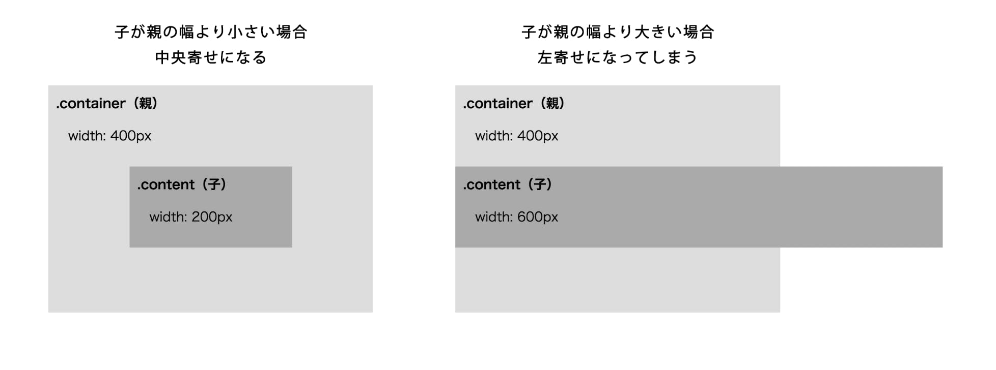
あまり知られていない(と思う)CSS中央寄せテクニック
CSS中央寄せテクニックとして、
position: absolute;
left: 0;
right: 0;
margin: auto;
はあまりにも有名だが、
親要素より大きな要素を中央寄せしようとすると左寄せになってしまう問題がある。
この問題を解消するためのCSSの書き方が以下になります。
cssposition: absolute; left: -100%; right: -100%; margin: auto;
※leftrightは必ずしも-100%でなくてもよい。
厳密には親要素からはみ出した数値の半分をleftrightにマイナス値で設定する。
上記の場合だと、
親:400px - 子:600px = -200px
-200px / 2 = -100px
left: -100px;right: -100pxこんなときに使える
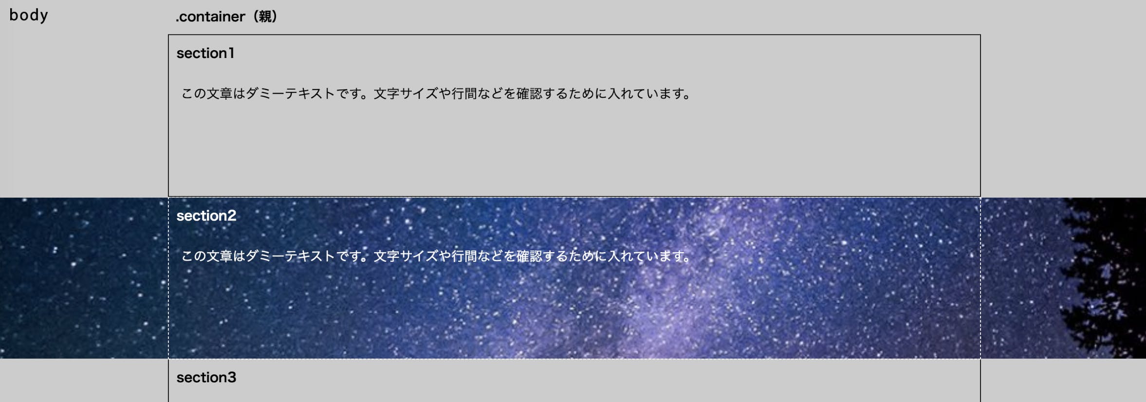
コンテナー内にあるセクション要素の背景が、コンテナーを突き抜けてるようなデザインだった場合、いちいちコンテナー内からセクション要素を外に出す必要がなくなる。
csssection2 { position: relative; &::before { content: ''; display: block; position: absolute; z-index: -1; left: -100%; right: -100%; margin: auto; width: 100vw; height: 100%; background: url(bg.jpg); } }

- 投稿日:2019-11-30T20:47:21+09:00
【React】コンポーネントの外がクリックされたら閉じるポップアップメニューを実装しよう
ポップアップのカラーピッカーを React で作っているときに、いくつかの問題に直面したのでまとめておこうと思います。
作ったものは下のGIFのようなカラーピッカーです。
この記事では、カラーピッカー機能を取り除いた、下のポップアップメニューの作り方を紹介します。
完成品の CodePen を先に置いておくので、コピペしたい人はこちらをお使いください。See the Pen React Popup Menu by ジフォ (@G4RDS) on CodePen.
ポップアップメニューの機能
今回作るポップアップメニューには以下のような機能があります。
- ボタンがクリックされるまでポップアップメニューを表示しない。
- ポップアップメニュー範囲外をクリックすると、ポップアップメニューを閉じる。
- ポップアップメニューの内側をクリックされても、ポップアップメニューは閉じない。
- ポップアップメニューの内側に、ポップアップメニューを閉じるボタンを用意する。
ポップアップメニューを作ろう
Functional Component で作っていきます。
Hooks を使うので、基礎を理解している必要があります。まずはベースを作ろう
メニューの表示を切り替えるボタンと、メニューを持つコンポーネントを作ります。
// PopupMenu.js
import './PopupMenu.scss'

const PopupMenu = () => {
  return (
    <div className="popup-menu-container">
      <button>
        Toggle Menu
      </button>
      <div className="popoup-menu">
        <div>menu</div>
        <button>
          Close Menu
        </button>
      </div>
    </div>
  )
}
適当なスタイルを当てておきます。
.popup-menuがレイアウトに影響しないよう、position: absoluteを適用します。// PopupMenu.scss .popup-menu-container { position: relative; } .popup-menu { position: absolute; z-index: 2; width: 10rem; margin-top: 0.5rem; padding: 1rem; background: #fff; border-radius: 0.5rem; }メニューの表示を切り替えよう
React Hook の
useStateを使って、メニューを表示したり非表示にしたりできるようにします。// PopupMenu.js import React, { useState } from 'react' const PopupMenu = () => { const [isShown, setIsShown] = useState(false) const handleToggleButtonClick = () => { setIsShown(true) } const handleCloseButtonClick = () => { setIsShown(false) } return ( <div className="popup-menu-container"> <button onClick={handleToggleButtonClick}> Toggle Menu </button> <div className={`popup-menu ${isShown ? 'shown' : ''}`}> <div>menu</div> <button onClick={handleCloseButtonClick}> Close Menu </button> </div> </div> ) }// PopupMenu.scss .popup-menu { transform: scale(0); transform-origin: top left; transition: transform 0.2s; &.shown { transform: scale(1); } }ポップアップメニュー範囲外がクリックされたら閉じるようにしよう
click イベントは通常、クリックされた場所に一番近い要素から遠い要素へ順番にイベントリスナーを実行していきます。
つまり、HTML DOM の一番外側であるbodyに設定されたイベントリスナーは、そこに伝播するまでの要素に設定されたイベントリスナーが伝播を止めない限り、どこがクリックされても必ず実行されます。とりあえず、どこをクリックしても閉じるようにしよう
この機能を実装するには、
document.bodyにポップアップメニューを閉じるためのイベントリスナーを設定すれば良さそうです。const handleToggleButtonClick = () => { setIsShown(true) document.body.addEventListener('click', e => { setIsShown(false) document.body.removeEventListener('click', documentClickHandler) }) }しかし、このコードには問題があります。
React DOM の onClick などのイベントリスナーは、HTML DOM のイベントリスナーよりも後で呼ばれることが確定しているため、トグルボタンをクリックした時に
isShownがdocument.bodyに設定したイベントリスナーによってfalseになった後、トグルボタンのイベントリスナーがtrueにしてしまうのです。
また、isShownをtrueにした後、document.bodyにイベントリスナーを再設定してしまいます。これを解決するには、範囲外イベントリスナーを React DOM イベントリスナーよりも後に実行される場所に設定する必要があります。
それは、documentです。
React DOM はdocumentにクリックイベントリスナーを設定することで、どの React DOM 要素がクリックされたのかを判断しています。
同じ要素に複数のリスナーが設定されている場合、先に設定されたリスナーから順番に実行されます。
つまり、React DOM と同じdocumentにイベントリスナーを設定することで、React DOM のイベントリスナーが処理された後に実行されるようにできるのです。document.addEventListener('click', e => { setIsShown(false) document.removeEventListener('click', documentClickHandler) })ポップアップメニューの範囲がクリックされたのなら閉じないようにしよう
現状だとメニューを利用することができないので、ポップアップメニューの範囲内かどうかを判定し、範囲内なら閉じる処理を行わないようにしましょう。
これには、二つの実装方法が考えられます。
- ポップアップメニュー
.popup-menuに、これ以上イベントが伝播しないようにするイベントリスナーを設定する。documentに設定したイベントリスナーで、クリック対象の要素がポップアップメニュー要素もしくはその子要素であるかどうかを判定する。簡単なのは前者ですが、React DOM のイベントリスナーで
e.stopPropagation()を実行しても、HTML DOM のイベント伝播は止まらないため、機能しません。
面倒ですが、後者の方法で実装します。ポップアップメニュー要素にアクセスできるようにする
まず、ポップアップメニュー要素を取得するため、
useRefフックを使います。const popupRef = useRef() // ... <div className={`popup-menu ${isShown ? 'shown' : ''}`} ref={popupRef} > ... </div>これで、
popupRef.currentでポップアップメニュー要素にアクセスできるようになりました。クリックされた要素がポップアップメニュー要素以下であるかを判定する
popupRef.currentで取得できるElementのスーパークラスであるNodeには、引数に指定したノードがこのノードの子孫ノード(自分自身を含む)であるかどうかを判定する Node.contains メソッドがあります。
これを使うことで、クリックされた要素がポップアップメニュー要素以下であるかどうかを判定できます。const documentClickHandler = e => { if (popupRef.current.contains(e.target)) return setIsShown(false) document.body.removeEventListener('click', documentClickHandler) }ポップアップメニュー内に閉じるボタンを用意しよう
一番初めに紹介したカラーピッカーでは、カラーが選択されたらポップアップメニューを閉じるようにしています。
この機能を実装してみましょう。閉じるときに、
documentに設定したイベントリスナーを削除するのを忘れないようにしましょう!const documentClickHandler = e => { if (popupRef.current.contains(e.target)) return setIsShown(false) removeDocumentClickHandler() } const removeDocumentClickHandler = () => { document.removeEventListener('click', documentClickHandler) } const handleCloseButtonClick = () => { setIsShown(false) removeDocumentClickHandler() }しかし、このコードは正しく動作しません。
removeEventListnerは第二引数が同じ参照を指すイベントリスナーを除去するという働きをする関数ですが、documentClickHandlerがReact がレンダリングするたびに新しく生成されてしまうため、イベントリスナーを除去できずに残り続けてしまいます。
これを解決するために、useRef を使ったdocumentClickHandlerインスタンス変数を用意し、useEffectで最初のレンダリング後に関数をセットするようにします。const PopupMenu = () => { // ... const documentClickHandler = useRef() useEffect(() => { documentClickHandler.current = e => { // ... } }, []) const removeDocumentClickHandler = () => { document.removeEventListener('click', documentClickHandler.current) } const handleToggleButtonClick = () => { // ... document.addEventListener('click', documentClickHandler.current) }正しく動作するようになりましたね!
? 完成! お疲れ様でした
React DOM は HTML DOM の要素にセットしているイベントリスナーはダミーで、実際は
documentにセットしたイベントリスナーが処理していたとは、まったく気づきませんでした。今回はメニューの内部も含めて一つのコンポーネントにしましたが、実際に運用する React プロジェクトでは機能だけを提供するコンポーネントを用意して、再利用できるようにすると良いのかなと思います。
最後に宣伝をさせてください!
今年の春ごろに、毎日やりたいことを習慣づけるアプリ「コツコツ忍者」を作りました!
毎日開発する!とか、毎週土日はランニングする!とかの目標を作り、記録することでモチベーションを保つアプリです!
Nuxt.js で作ったもので、何を使っているのかなどを書いた記事もありますので、ぜひそちらもご覧ください。また、英語リスニング学習アプリを Flutter で開発中です。
ある程度までできたら、事前登録サイトを用意しようと思っていますので、Twitterをフォローしていただけると幸いです!最後までご覧いただきありがとうございました!
参考文献
- DOMイベントのキャプチャ/バブリングを整理する 〜 JSおくのほそ道 #017
https://qiita.com/hosomichi/items/49500fea5fdf43f59c58- Event propagation with React bubbling out of order
https://stackoverflow.com/questions/45212840/event-propagation-with-react-bubbling-out-of-order
- 投稿日:2019-11-30T16:17:11+09:00
【未完成】ドットインストールでHTML/CSS,JavaScriptを学習してみた所感と学習内容
はじめに
フロントエンドに興味がある新人技術者がプログラミング学習サービス「ドットインストール」で学習してみた感想と、そこで得た知識をアウトプットしてみました。
実施したレッスンは以下。
・HTML/CSSの学習環境を整えよう macOS編 (全5回)
・はじめてのHTML (全14回)
・はじめてのCSS (全15回)
・はじめてのJavaScript (全11回)活用してみた所感
今回「ドットインストール」を初めて活用して感じた所感をあげていきます。
①動画なので操作がわかりやすい
書籍で学習する際との決定的な違いです。
書籍だと省略されがちな操作方法を動画で見ながら確認できるので、「説明書いてあるけど難しすぎてどう操作していいか分からない」といった詰み状態にならないのが最大のメリットだと思いました。②手軽に学習できるため、学習がストップしない
動画1本の時間が1〜3分くらいと短めなので、集中力が切れることなくサクサク進められるのが特徴です。
ゲームのステージをこなしていく感覚で実際に手を使いながらどんどん学習できます。③OSごとの解説がある
環境設定やショートカットキーなど、Mac環境とWindows環境で異なる部分の解説をしっかりとしてくれているため、誰でもスムーズに学習に取り組めます。
個人的に、覚えておいて役立つショートカットキーを動画内で説明してくれるのはありがたかったです。④自分に必要なレッスンが分かりやすい
目的別でやるべきレッスンがまとめられているため、初心者にありがちな「何から手をつけていいか分からない問題」が起こりづらいのではないでしょうか。
動画内でも事前に受けておいた方が良いレッスンを教えてくれるので、迷いなく学習に入れます。実際に学習した内容
以下、実施したレッスンのアウトプットです。
なぜこのレッスンを選んだのかも記載していきます。① HTML/CSSの学習環境を整えよう [macOS編]
もともとJavaScriptを勉強しよう!と思い、後に出てくる「はじめてのJavaScript (全11回)」を始めたのですが、動画冒頭で「HTML/CSS」の学習が大前提と説明があったため、HTML/CSSの学習から始めることに。
エディター環境が整っていなかったため、このレッスンをまず実施しました。
MacOS編とWindows編があり、とても親切。
レッスン内容は以下。
・Chromeブラウザの導入方法
・VS Codeの導入と設定②はじめてのHTML
①の経緯で学習を開始。
実際に手を動かしながら簡単なプロフィールサイトを作成していきます。
以下、レッスンのアウトプット。■タグでテキストを意味付けしていくことを”マークアップする”という
index.html<h1>ダイエット</h1> <p>健康的なダイエット法を紹介します。</p>■タグの種類
<h1></h1>: 見出しタグ。数字が小さいほど大きな見出しになる。
<p></p>: 段落タグ。
<img src="画像のファイル名">: 画像を表示するためのタグ。マークアップする文章がないため、終了タグは不要。
- 投稿日:2019-11-30T15:02:31+09:00
よく使う画面遷移のCSS
iosにありがちなモーダルの遷移とプッシュの遷移のサンプル
デモ
https://nakadoribooks.github.io/modal_and_push/
使うもの
create-react-app
styled-componentsコード
- styleの定義
- Reactの実装
スタイル
アニメーションはだいたいこのくらい
duration: 600
ease: 'cubic-bezier(.17,.71,0,1)'styles.jsimport React from 'react'; import styled from 'styled-components'; const sizes = { headerHeight: 72 } // だいたいこのくらい const animation = { page: { duration: 600, ease: 'cubic-bezier(.17,.71,0,1)' }, } animation.page.transition = `transform ${animation.page.duration}ms ${animation.page.ease}, opacity ${animation.page.duration}ms ${animation.page.ease}` const colors = { primary: "#3880ff", secondary: "#0cd1e8", border: "#eeeeee", white: "#ffffff", black: "#000000", } const Header = styled.div` width: 100%; padding:0px 20px; position:absolute; height: ${sizes.headerHeight}px; border-bottom:1px solid ${colors.border}; background-color:${colors.white}; padding-top:1px; justify-content:space-between; display:flex; align-items:center; box-shadow: 0 2px 2px rgba(200,200,200,.1); h1{ font-size:20px; } ` const HeaderButton = styled.a` display:inline-block; height:40px; font-size:14px; line-height:38px; border: 1px solid ${colors.primary}; border-radius:5px; color:${colors.primary}; padding:0px 20px; min-width: 100px; text-align:center; cursor:pointer; :hover{ background-color:${colors.primary}; color:${colors.white}; } ` const HeaderSpace = styled.div` width:100px; ` const RootView = styled.div`` const PageWrapper = styled.div` position:fixed; top:0px;left:0px;right:0px;bottom:0px; ` // 後ろにある半透明の黒 const BehindLayer = styled.div` background-color:${colors.black}; opacity: 0; position:absolute; top:0px;left:0px;right:0px;bottom:0px; transition: opacity ${animation.page.duration}ms ease; ${(props)=>props.showed && ` opacity:0.3; `} ` const PageContainer = styled.div` height:100%; position:relative; top:0px; transition: ${animation.page.transition}; ` const RootContainer = styled(PageContainer)` /* 上にモーダルきた時に少しちっさくなるやつ */ ${props=>props.modaling && ` transform: scale(0.99) `} /* プッシュされた時につこし左に行くやつ */ ${props=>props.pushing && ` transform: translateX(-10vh) `} ` const ModalContainer = styled(PageContainer)` transform: translateY(100vh); ${props=>props.showed && ` transform: translateY(0vh); `} ` const PushContainer = styled(PageContainer)` transform: translateX(50vh); opacity: 0; ${props=>props.showed && ` opacity: 1.0; transform: translateX(0vh); `} ` const PageContents = styled.div` height:calc(100vh - ${sizes.headerHeight}px); position:relative; top:${sizes.headerHeight}px; overflow-y:scroll; background-color:${colors.white}; ` const LinkButton = styled.p` text-align:center; a{ display:inline-block; padding:10px 20px; border-radius: 10px; border: 1px solid ${colors.border}; cursor:pointer; transition: background-color 300ms ease, transform 300ms ease; :hover{ opacity: 0.7; } } /* フォーカス残るよう */ ${props=>props.focus && ` a{ background-color:${colors.border}; transofrm:scale(0.99); } `} ` const CenterContainer = styled.div` width:100%; height:100%; display: flex; justify-content: center; align-items: center; ` export { animation, Header, HeaderButton, HeaderSpace, RootView, PageWrapper, BehindLayer, RootContainer, ModalContainer, PushContainer , PageContents, LinkButton, CenterContainer }React 実装
遷移先は didMountで少し遅らせてアニメーション表示
setTimeout(()=>{
  this.setState({showed: true})
}, 10)
遷移元は アニメーション中のフラグとmodal/pushを表示する用のフラグ二つづつもつ。
const {modaling, pushing, showingModal, showingPush} = this.stateApp.jsimport React from 'react'; import { animation, Header, HeaderButton, HeaderSpace, RootView, PageWrapper, BehindLayer, RootContainer, ModalContainer, PushContainer , PageContents, LinkButton, CenterContainer } from './styles' class ModalPage extends React.Component{ state = { showed: false } componentDidMount(){ // アニメーションで表示 setTimeout(()=>{ this.setState({showed: true}) }, 10) } render = () =>{ const {showed} = this.state return <PageWrapper> <BehindLayer showed={showed} /> <ModalContainer showed={showed}> <Header> <HeaderButton onClick={this.handleClickClose}>閉じる</HeaderButton> <h1>モーダル</h1> <HeaderSpace /> </Header> <PageContents> <CenterContainer> <h1>モーダル</h1> </CenterContainer> </PageContents> </ModalContainer> </PageWrapper> } handleClickClose = (event) => { this.setState({showed: false}) this.props.onClose() } } class PushPage extends React.Component{ state = { showed: false } componentDidMount(){ // アニメーションで表示 setTimeout(()=>{ this.setState({showed: true}) }, 10) } render = () =>{ const {showed} = this.state return <PageWrapper> <BehindLayer showed={showed} /> <PushContainer showed={showed}> <Header> <HeaderButton onClick={this.handleClickClose}>戻る</HeaderButton> <h1>プッシュ</h1> <HeaderSpace /> </Header> <PageContents> <CenterContainer> <h1>プッシュ</h1> </CenterContainer> </PageContents> </PushContainer> </PageWrapper> } handleClickClose = (event) => { this.setState({showed: false}) this.props.onBack() } } class App extends React.Component{ state = { pushing: false, modaling: false, showingModal: false, showingPush: false } render = () => { const {modaling, pushing, showingModal, showingPush} = this.state return <RootView> <PageWrapper> <RootContainer modaling={modaling} pushing={pushing}> <Header><div /><h1>ページ遷移サンプル</h1><div /></Header> <PageContents> <CenterContainer> <div> {/* 戻ってきた時に分かりやすいようにフォーカスを残しておく */} <LinkButton focus={showingModal}><a onClick={this.handleClickModal}>モーダル</a></LinkButton> <LinkButton focus={showingPush}><a onClick={this.handleClickPush}>プッシュ</a></LinkButton> </div> </CenterContainer> </PageContents> </RootContainer> </PageWrapper> {showingModal && <ModalPage onClose={this.handleCloseModal} />} {showingPush && <PushPage onBack={this.handleBackPush} />} </RootView> } handleClickModal = (event) => { this.setState({modaling: true, showingModal:true}) } handleClickPush = (event) => { this.setState({pushing: true, showingPush: true}) } handleCloseModal = (event) => { this.setState({ modaling: false }) setTimeout(()=>{ this.setState({showingModal: false}) }, animation.page.duration) } handleBackPush = (event) => { this.setState({pushing: false}) setTimeout(()=>{ this.setState({showingPush: false}) }, animation.page.duration) } } export default App;

- 投稿日:2019-11-30T12:26:11+09:00
新卒がHTML5プロフェッショナル認定試験レベル1に合格した方法
2019年11月2日に、HTML5プロフェッショナル認定試験レベル1に無事合格することができました。試験対策や実際のテストについてまとめてみようと思います。
私は今年の4月にプログラミングを始めたばかりの新卒で、HTMLやCSSにはほとんど触ったことがないところからのスタートだったので、以下に当てはまる方には、特に参考になればうれしいです。
- プログラミングに触れて1年未満
- HTML,CSSに触ったことがない
- 未経験からのプログラミング
- フロントやデザインという言葉になんとなく惹かれる
HTML5プロフェッショナル認定試験とは?
テスト概要
所要時間:90分
問題数:60問
受験料:15,000円(税別)
日時・会場:全国各地のテストセンターから自由に選択できる
試験方式:コンピュータベーストテスト(CBT)キーボード入力問題がいくつか出題される。
認定の有効期限:5年間この資格の認定者は、下記のスキルと知識を持つ
Webプロフェッショナルであることを証明できます。
・HTML5を使ってWebコンテンツを制作することができる。
・ユーザー体験を考慮したWebコンテンツを設計・制作することができる。
・スマートフォンや組み込み機器など、様々なデバイスに対応したコンテンツ制作ができる。
・HTML5で何ができるのか、どういった技術を使うべきかの広範囲の基礎知識を有する。
HTML5プロフェッショナル認定試験公式サイト問題のほとんどが選択式であること、また、全国各地のテストセンターで好きな日程を選択して受けられることから、比較的受験しやすいテストだと思います。
受験動機
- 初心者でも受験しやすい
- コーディングベースのWeb基礎知識を身につけたかった
Webデザイン系の試験はいくつかありますが、日常の業務でコーディングを中心に行っているので、すぐに現場で生かせることがこの試験の受験のきっかけになりました。
試験対策
- 参考書を読む
- LPI主催の試験対策セミナーに参加★
- Ping-tのオンライン問題集をひたすら解く★
以上の3点を中心に、7月末から11月の試験まで、約3か月ほど勉強しました。
勉強時間は平均で、平日が15分、休日が1,2時間。試験1,2週間前には平日30分、休日5時間ほどまとまった勉強時間を確保しました。予定通りに進まない日も多々あったので、直前で丸2日くらいは一日中勉強した日もありました。。笑
★が付いたものは特に役立った勉強法なので、時間がない方はそちらから読んでいただけたら幸いです。参考書を読む(7月末~8月末)
- すぐにとりかかりやすい勉強法
- 毎日取り組む分量を決めやすい
- まず情報をインプットしたい初期には最適
最初のうちは、参考書を読んで、練習問題を解く、ということを繰り返しました。
私が使っていたのは、マイナビ出版のHTML5プロフェッショナル認定試験 レベル1 対策テキスト&問題集 Ver2.0対応版です。
HTML、CSS、レスポンシブWebデザイン、API概要、Web関連の規格と技術の5つのチャプターに分かれています。
勉強法としては
・平日:隙間時間で5ページ前後読み進めていく。
・休日:章末の問題を解き、間違った問題をノートにとる。
といった感じです。
個人的にアウトプットにはあまり向かなかったので、最初の導入とわからない時に調べるための辞書的な役割として私は重宝しました。LPI主催の試験対策セミナーに参加★(8/25)
- 参加費無料
- APIやレスポンシブWebデザインなど独学では勉強しにくい部分を講義でカバーしてくれる
- 参加特典として試験の割引と学習サイトの有料コンテンツを1か月無料で使える
HTML5プロフェッショナル認定試験公式サイトのトップページに試験の無料解説セミナーの案内が表示されています。
日程は指定があり、直近の開催日だと5月、8月、11月なので大体3か月に1回ほどの頻度のようです。
公式サイトから事前に参加予約が必要ですが無料で参加することができます。大体3時間ほどの実施で、私が参加した8月の回は主にAPIについての集中的な講義でした。HTMLやCSSについてはほとんど暗記して勉強することになりますが、APIなどの仕組みについては、少し事前知識があるだけでその後の勉強における理解度がかなり変わりました。
各回の内容を見たところ、APIやWebレスポンシブデザインなどの仕組み部分に関する講義が多い印象です。また、参加特典として、認定試験を10%割引きで受験できる割引クーポンと、オンラインで試験勉強が出来る学習サイトPing-tの有料コンテンツを無料で30日間使える権利を獲得できます。
私はこのPing-tでほとんど試験勉強をカバーできたので、とてもおすすめです。Ping-tのオンライン問題集をひたすら解く★(8月末~10月末)
Ping-tとは
- Ping-tは、問題を解いたり、模擬試験を受けることができる学習サイト
- 学習ログが残るので得点率の遷移をみることができる
- HTML5の他にもCCNA ICND1、LinuC、Oracle Master Bronze SQL基礎、ITILファンデーション、ITパスポートなどユーザー登録をすれば無料で利用できるコンテンツもある
勉強法としては
・全470問ある問題を電車の移動時間など隙間時間でざっと解いていく。
・解ける問題が増えてきたら模擬試験を行う。
・とにかく正答率が上がるように繰り返し解いていく。
・よく間違える問題は簡単にまとめておいて隙間時間などに見返す。
・試験前までに全問題を2回以上正答の状態、模擬試験の正答率を90%以上にしておく。あまりにも使いやすくて、1ヶ月は特典で利用して、2ヶ月目は購入して継続しました。HTML5は有料コンテンツのみだったので…
ただ、期限内であれば延長後も少し安く購入できました。(定価で1か月2400円、割引価格は2100円でした。)模擬試験は実際の試験同様、60問で90分時間を自動的に計ってくれますが、30分ほどで回答できます。解答を確認する時間を含めると模擬試験1回分の勉強時間は1時間ほどでした。
最初は全ての問題が銅メダルマークですが、正答率を上げていくごとに銀、金とレベルが上がっていくので、得意、苦手なカテゴリーが分かりやすいのと、何よりモチベーションが上がります。頑張るとランキングに入れたりするのも嬉しいところです。最後はこんな感じ。
・全問題をレベル金の状態にする。
・模擬試験で90%以上を取れるようにする(受験直前でブーストがかかりだしたのがまるわかりのログ)
実際の試験
- 獲得点数70点(最低点)
- 時間は十分間に合う
- キーボード入力問題が2問ほど
- 自信のある問題が50%、少し自信がない問題20%、かなり自信がない問題20%、わからない問題10%
試験時間は体感的に多く感じました。45分ほどで解き終わり、2.3回はゆっくり見直せる時間がありました。
問題の内2問ほどキーボード入力式の問題がありましたが、基礎的な単語と、数字を入力するものだったので、そんなに難しさはなかったです。
聞き方は違うものの、Ping-tで解いたような問題が多かった印象でした。解答に書いてある細かな情報までインプットできていればもう少し自信を持って解答できたかなと思います。Ping-tでもやったことのない問題は全体の10%ほどでした。私は70点でギリギリの合格だったのでもっと確実に得点を取得するためには、Ping-tの問題の解答部分の補足もよく読み込む必要があるかと思います。私が正答率を7、8割超えてきたタイミングが試験の一週間前くらいだったので、もう少し早い段階で合格県内に入っておくと安心だと思います。
ただ、問題集の章末問題や、公式サンプルの問題は実際の試験より難しかった印象なので、Ping-tをやっている場合は、他のテキストで勉強するよりはPing-tを極めていくのが効率が良さそうだと感じました。
受験してよかったこと
- ソースコードに苦手意識を感じなくなった
- ウェブサイトを作るイメージが沸くようになった
まずは、今まではHTMLやCSSのソースには特になじみがなかった分、見るたびに苦手が先行して、内容がわからずじまいでしたが、何か指示が書いてあるぞ、ふむふむここに画像を入れるんだな、ということくらいには理解ができるようになりました。積極的に触ってみたい、やってみたいという気持ちが大きくなったことは自分の中でかなりの成長です。
また、Webサイトを自作してみるなどできることが広がりました。現場でも、フロント言語への取り組みを評価していただき、画面を任せていただいたりすることもあり、モチベーションにつながっています。
全体的にPing-tの回し者かのような書きっぷりになってしまいましたが、全くそんなことはありませんので、ご安心ください。ただ、本当にわかりやすくておすすめなので、もしも気になる方がいたら是非試してみてください。

- 投稿日:2019-11-30T08:16:32+09:00
margin-topを指定したら親要素を超えて上にはみ出た問題
- 投稿日:2019-11-30T08:14:19+09:00
height: 100%; で画面全体に
- 投稿日:2019-11-30T08:13:28+09:00
リセットCSSを使おう
リセットCSSとは
ブラウザがデフォルトで勝手にあてているCSSを解除するものです。
リセットCSSで自分の思い通りにデザインしましょう!
※数あるリセットCSSの中で、今回はressというものを使います。
※Railsでsassを使うことを想定しています。【その1】リセット用のファイルを作成
_reset.scssファイルを作成し、以下をコピペ。
長い。。_reset.scss/*! * ress.css • v1.2.2 * MIT License * github.com/filipelinhares/ress */ /* # ================================================================= # Global selectors # ================================================================= */ html { box-sizing: border-box; overflow-y: scroll; /* All browsers without overlaying scrollbars */ -webkit-text-size-adjust: 100%; /* iOS 8+ */ } *, ::before, ::after { background-repeat: no-repeat; /* Set `background-repeat: no-repeat` to all elements and pseudo elements */ box-sizing: inherit; } ::before, ::after { text-decoration: inherit; /* Inherit text-decoration and vertical align to ::before and ::after pseudo elements */ vertical-align: inherit; } * { padding: 0; /* Reset `padding` and `margin` of all elements */ margin: 0; } /* # ================================================================= # General elements # ================================================================= */ /* Add the correct display in iOS 4-7.*/ audio:not([controls]) { display: none; height: 0; } hr { overflow: visible; /* Show the overflow in Edge and IE */ } /* * Correct `block` display not defined for any HTML5 element in IE 8/9 * Correct `block` display not defined for `details` or `summary` in IE 10/11 * and Firefox * Correct `block` display not defined for `main` in IE 11 */ article, aside, details, figcaption, figure, footer, header, main, menu, nav, section, summary { display: block; } summary { display: list-item; /* Add the correct display in all browsers */ } small { font-size: 80%; /* Set font-size to 80% in `small` elements */ } [hidden], template { display: none; /* Add the correct display in IE */ } abbr[title] { border-bottom: 1px dotted; /* Add a bordered underline effect in all browsers */ text-decoration: none; /* Remove text decoration in Firefox 40+ */ } a { background-color: transparent; /* Remove the gray background on active links in IE 10 */ -webkit-text-decoration-skip: objects; /* Remove gaps in links underline in iOS 8+ and Safari 8+ */ } a:active, a:hover { outline-width: 0; /* Remove the outline when hovering in all browsers */ } code, kbd, pre, samp { font-family: monospace, monospace; /* Specify the font family of code elements */ } b, strong { font-weight: bolder; /* Correct style set to `bold` in Edge 12+, Safari 6.2+, and Chrome 18+ */ } dfn { font-style: italic; /* Address styling not present in Safari and Chrome */ } /* Address styling not present in IE 8/9 */ mark { background-color: #ff0; color: #000; } /* https://gist.github.com/unruthless/413930 */ sub, sup { font-size: 75%; line-height: 0; position: relative; vertical-align: baseline; } sub { bottom: -0.25em; } sup { top: -0.5em; } /* # ================================================================= # Forms # ================================================================= */ input { border-radius: 0; } /* Apply cursor pointer to button elements */ button, [type="button"], [type="reset"], [type="submit"], [role="button"] { cursor: pointer; } /* Replace pointer cursor in disabled elements */ [disabled] { cursor: default; } [type="number"] { width: auto; /* Firefox 36+ */ } [type="search"] { -webkit-appearance: textfield; /* Safari 8+ */ } [type="search"]::-webkit-search-decoration { -webkit-appearance: none; /* Safari 8 */ } textarea { overflow: auto; /* Internet Explorer 11+ */ resize: vertical; /* Specify textarea resizability */ } button, input, optgroup, select, textarea { font: inherit; /* Specify font inheritance of form elements */ } optgroup { font-weight: bold; /* Restore the font weight unset by the previous rule. */ } button { overflow: visible; /* Address `overflow` set to `hidden` in IE 8/9/10/11 */ } /* Remove inner padding and border in Firefox 4+ */ button::-moz-focus-inner, [type="submit"]::-moz-focus-inner { border-style: 0; padding: 0; } /* Replace focus style removed in the border reset above */ button:-moz-focusring, [type="submit"]::-moz-focus-inner { outline: 1px dotted ButtonText; } button, html [type="button"], /* Prevent a WebKit bug where (2) destroys native `audio` and `video`controls in Android 4 */ [type="reset"], [type="submit"] { -webkit-appearance: button; /* Correct the inability to style clickable types in iOS */ } button, select { text-transform: none; /* Firefox 40+, Internet Explorer 11- */ } /* Remove the default button styling in all browsers */ button, input, select, textarea { background-color: transparent; border-style: none; color: inherit; } /* Style select like a standard input */ select { -moz-appearance: none; /* Firefox 36+ */ -webkit-appearance: none; /* Chrome 41+ */ } select::-ms-expand { display: none; /* Internet Explorer 11+ */ } select::-ms-value { color: currentColor; /* Internet Explorer 11+ */ } legend { border: 0; /* Correct `color` not being inherited in IE 8/9/10/11 */ color: inherit; /* Correct the color inheritance from `fieldset` elements in IE */ display: table; /* Correct the text wrapping in Edge and IE */ max-width: 100%; /* Correct the text wrapping in Edge and IE */ white-space: normal; /* Correct the text wrapping in Edge and IE */ } ::-webkit-file-upload-button { -webkit-appearance: button; /* Correct the inability to style clickable types in iOS and Safari */ font: inherit; /* Change font properties to `inherit` in Chrome and Safari */ } [type="search"] { -webkit-appearance: textfield; /* Correct the odd appearance in Chrome and Safari */ outline-offset: -2px; /* Correct the outline style in Safari */ } /* # ================================================================= # Specify media element style # ================================================================= */ img { border-style: none; /* Remove border when inside `a` element in IE 8/9/10 */ } /* Add the correct vertical alignment in Chrome, Firefox, and Opera */ progress { vertical-align: baseline; } svg:not(:root) { overflow: hidden; /* Internet Explorer 11- */ } audio, canvas, progress, video { display: inline-block; /* Internet Explorer 11+, Windows Phone 8.1+ */ } /* # ================================================================= # Accessibility # ================================================================= */ /* Hide content from screens but not screenreaders */ @media screen { [hidden~="screen"] { display: inherit; } [hidden~="screen"]:not(:active):not(:focus):not(:target) { position: absolute !important; clip: rect(0 0 0 0) !important; } } /* Specify the progress cursor of updating elements */ [aria-busy="true"] { cursor: progress; } /* Specify the pointer cursor of trigger elements */ [aria-controls] { cursor: pointer; } /* Specify the unstyled cursor of disabled, not-editable, or otherwise inoperable elements */ [aria-disabled] { cursor: default; } /* # ================================================================= # Selection # ================================================================= */ /* Specify text selection background color and omit drop shadow */ ::-moz-selection { background-color: #b3d4fc; /* Required when declaring ::selection */ color: #000; text-shadow: none; } ::selection { background-color: #b3d4fc; /* Required when declaring ::selection */ color: #000; text-shadow: none; }【その2】読み込む
先程のファイルを
application.scssに読み込みます。application.scss@import "reset";以上でリセット完了です。
application.cssファイルならある!って人は語尾を.scssに名前を変えましょう。
参考
ではまた!
- 投稿日:2019-11-30T00:53:50+09:00
CSSで三角形を作る
borderで作る
ポイント
borderのtop, right, bottom, leftの境目は賞状を入れる額縁のようになっている。
この性質を利用して三角形を作る。borderの境目は、こんな感じで斜めになっている。
See the Pen triangle1 by ckona (@ckona) on CodePen.
上記の
widthとheightを0pxにして、border-widthを大きくしたものが下記。See the Pen triangle2 by ckona (@ckona) on CodePen.
あとは、 不要な場所のborder-colorを transparentなり背景色と同色なりに設定してあげれば、三角形の完成。
See the Pen triangle3 by ckona (@ckona) on CodePen.
応用
これを応用すれば草を生やすこともできる。
See the Pen grass by ckona (@ckona) on CodePen.
参考
- http://www.htmq.com/style/border.shtml
- ドキュメント的なやつ
- https://www.granfairs.com/blog/staff/make-triangle-with-css
- めっちゃわかりやすい
- https://qiita.com/Qiita/items/edae7417214c8e957f54
- Qiita記事にCodePenを埋め込む方法
- 投稿日:2019-11-30T00:53:50+09:00
CSSで三角形を作る [border編]
三角形の作り方は、調べた限りだと2通りの方法がある。
- borderを利用する
- rotateする
- qiitaのタグなんかはこの方法
- ここの左側部分ね↓
今回はborderで作る方法を紹介します。
borderで作る
ポイント
borderのtop, right, bottom, leftの境目は賞状を入れる額縁のようになっている。
この性質を利用して三角形を作る。borderの境目は、こんな感じで斜めになっている。
See the Pen triangle1 by ckona (@ckona) on CodePen.
上記の
widthとheightを0pxにして、border-widthを大きくしたものが下記。See the Pen triangle2 by ckona (@ckona) on CodePen.
あとは、 不要な場所のborder-colorを transparentなり背景色と同色なりに設定してあげれば、三角形の完成。
See the Pen triangle3 by ckona (@ckona) on CodePen.
応用
これを応用すれば草を生やすこともできる。
See the Pen grass by ckona (@ckona) on CodePen.
参考
- http://www.htmq.com/style/border.shtml
- ドキュメント的なやつ
- https://www.granfairs.com/blog/staff/make-triangle-with-css
- めっちゃわかりやすい
- https://qiita.com/Qiita/items/edae7417214c8e957f54
- Qiita記事にCodePenを埋め込む方法
- 投稿日:2019-11-30T00:25:15+09:00
GitHubのポップアップメニューはdetailsタグと:beforeが使われててクレバーだった
概要
普段使ってるGitHubのUIパーツの実装を見てみたら真似したいエッセンスがあったので紹介します。
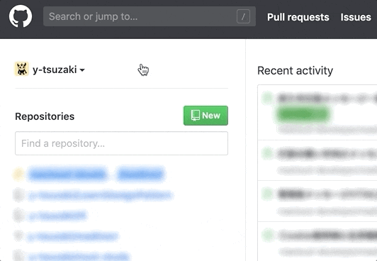
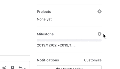
GitHub上でちょいちょい使われてるポップアップメニュー
図 マイページのコンテキスト切り替えメニュー
図 プルリクエストページのプロジェクト選択メニューなにが優れてる?
- Javascript使ってない
- メニュー外をクリックしたらメニューが閉じる
サンプルコード
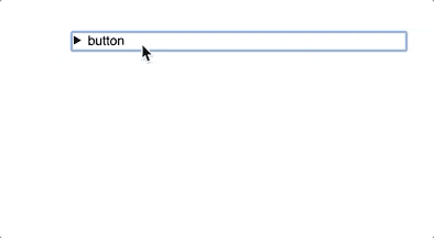
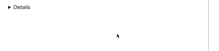
https://codepen.io/y-tsuzaki/pen/abzoOgL
<div class="wrap">
  <details>
    <summary>button</summary>
    <div>menu</div>
  </details>
</div>
*, *:before, *:after { box-sizing: border-box; } .wrap { width: 500px; height: 500px; margin: 0 auto; padding: 50px 50px; } details > div { position: absolute; display: block; width: 200px; height: 200px; border: 1px solid rgba(27, 31, 35, 0.15); border-radius: 3px; box-shadow: 0 3px 12px rgba(27, 31, 35, 0.15); z-index: 100; } details[open] > summary:before { content: " "; display: block; position: fixed; top: 0; right: 0; bottom: 0; left: 0; z-index: 50; background: transparent; }Javascript使ってない
GitHubで使われてるHTMLタグをみてみましょう
HTML抜粋したコード<details> <summary> メニュー開くボタン </summary> <details-menu> コンテンツ内容 </details-menu> </details>ポップアップメニューは、
detailsとsummaryというタグで構成されています。
(details-menuはカスタムエレメントです。今回は割愛してdivとして扱います。)
detailsとsummaryは,HTML5.1にて追加されたHTMLタグです。Detailsタグとは
HTML の詳細折りたたみ要素 (
<details>) は、ウィジェットが open 状態になった時のみ情報が表示される折りたたみウィジェットを作成します。概要やラベルは<summary>要素を使用して提供することができます。https://developer.mozilla.org/ja/docs/Web/HTML/Element/details
このタグを装飾することでメニューの開閉をJavascriptなしで実現することが出来ます。
今回の例ではdetails > divをposition: absoluteとして、box-shadowで影を落とすことで、浮き出たメニューを表現しています。detailsタグを使う以外にもJavascriptなしでこのような開閉メニューを作る方法あります。
見えないcheckboxを作って、checked属性の有無でスタイルを変更するというテクニックです。しかし、checkboxはそう行った目的のタグではないため、メニューの開閉に使うというのは直感的ではありません。
details、summaryの方が表示の開閉をイメージしやすく直感的なためこちらの方が目的にあったタグだと考えます。
(対応ブラウザの話はさておいて)メニュー外をクリックした時にメニューが閉じる
detailsタグをそのまま使っただけでは、summary部分をクリックしない限り閉じてくれません。
GitHubでは、:beforeを使ったテクニックを使っていました。
わかりやすくするために:beforeの要素を赤い半透明にしてみました。
メニュー外に透明な当たり判定用のパネルを広げているんですね。:beforeを使わない場合は、Javascriptで処理を書かなければいけないと思いますが、
このやり方だとJavascriptなしでスッキリかけますね。デメリット
- detailsタグは、IE、EDGEで使えない
- Polyfillがあるのでそれで対応したい
- 開閉のアニメーションが出来ない
- Mozilla情報だと出来ないらしい(出来そうな気もする、未検証)
- https://developer.mozilla.org/ja/docs/Web/HTML/Element/details

まとめ
- GitHubのポップアップメニューはJavascriptなしで動いてすごい
- detailsタグ
- HTML5.1で追加になった
- 詳細折りたたみ要素
- めっちゃいいけどIEとEDGE未対応
- 透明な:beforeをヒットボックスにするアイデアいいね