どうも7noteです。CSSで水玉模様を作ります。 背景パターンを画像で作るのもいいですが、CSSで再現することもできます。 規則性のある水玉模様の背景 style.css body { background-image: radial-gradient(#7bded9 20%, transparent 20%), radial-gradient(#7bded9 20%, transparent 20%); background-size: 40px 40px; background-position: 0 0, 20px 20px; } 結果 ランダム風に見える水玉模様の背景 style.css body { background-image: radial-gradient(290px 300px , rgba(123,222,217, 0.5) 20%, transparent 20%), radial-gradient(800px 780px , rgba(123,222,217, 0.5) 20%, transparent 20%), radial-gradient(1000px 990px , rgba(123,222,217, 0.5) 20%, transparent 20%), radial-gradient(400px 380px , rgba(123,222,217, 0.5) 20%, transparent 20%), radial-gradient(750px 750px , rgba(123,222,217, 0.5) 20%, transparent 20%), radial-gradient(100px 100px , rgba(123,222,217, 0.5) 20%, transparent 20%); background-size: 1230px 1280px, 810px 910px, 1470px 990px, 1200px 1700px, 1520px 1200px, 1100px 1300px; background-position: -300px -550px, -200px 100px, 50px 510px, -200px -550px, -180px -250px, 130px -150px; } 結果 複数のバラバラのサイズの丸い背景を重ねて作ります。 重なった部分が綺麗に見えるように色は16進数ではなくrgbaで書くことで重なり部分が綺麗に見えます。 ※スクロールしたらこんなかんじ 色もバラバラに変えても綺麗ですね。 まとめ 水玉模様はcanvasやjsを使った方法もあるようです。 適材適所で画像にしたり、CSSで作ったり使い分けるのがいいかなと思います。 アニメーションと組み合わせて水玉模様をふわふわさせたり、回転させたりしても面白いサイトができるかもしれませんね! 参考:https://www.esz.co.jp/blog/2766.html おそまつ! ~ Qiitaで毎日投稿中!! ~ 【初心者向け】WEB制作のちょいテク詰め合わせ
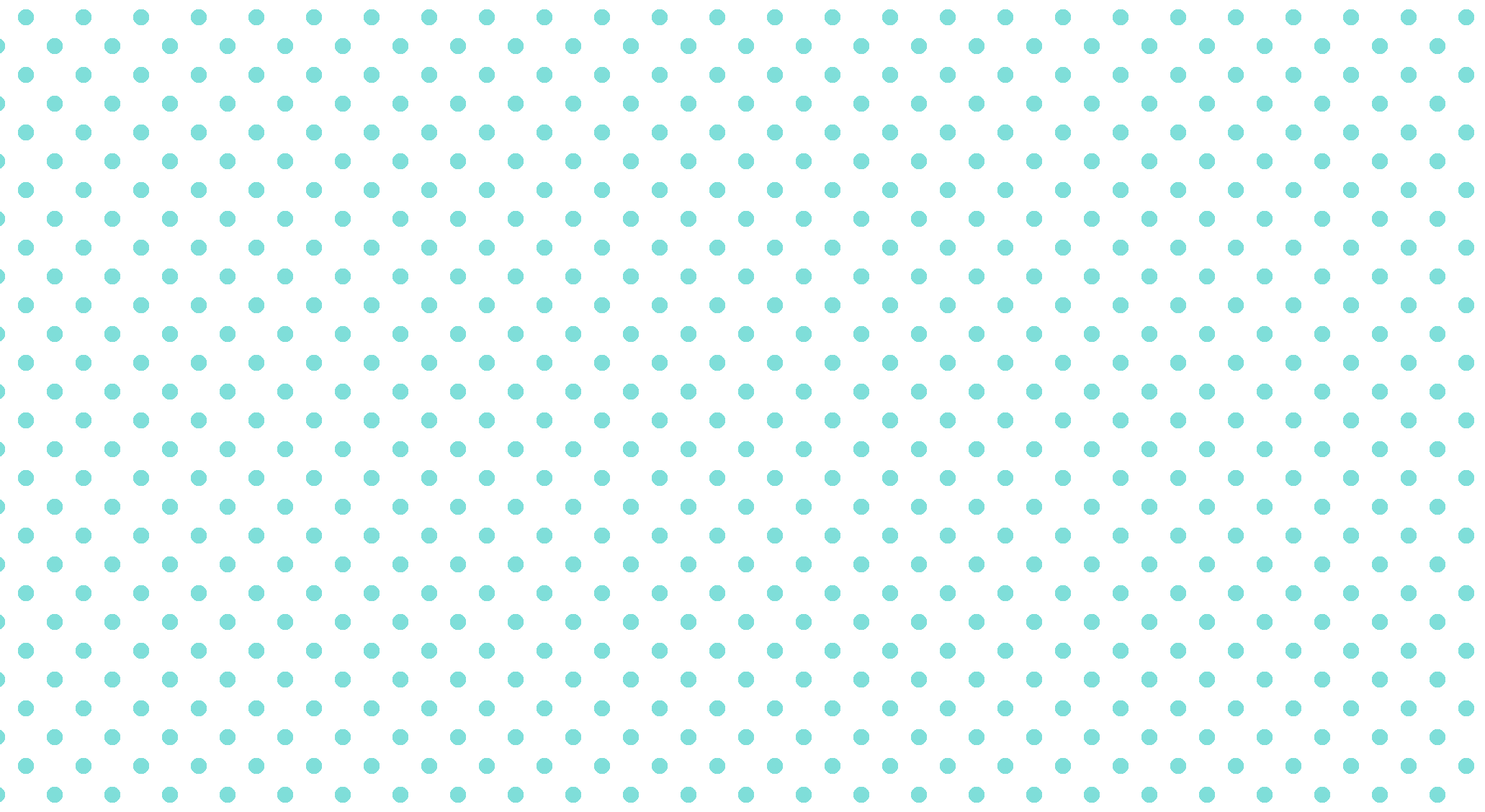
背景パターンを画像で作るのもいいですが、CSSで再現することもできます。
body {
  background-image:
    radial-gradient(#7bded9 20%, transparent 20%),
    radial-gradient(#7bded9 20%, transparent 20%);
  background-size: 40px 40px;
  background-position: 0 0, 20px 20px;
}
結果
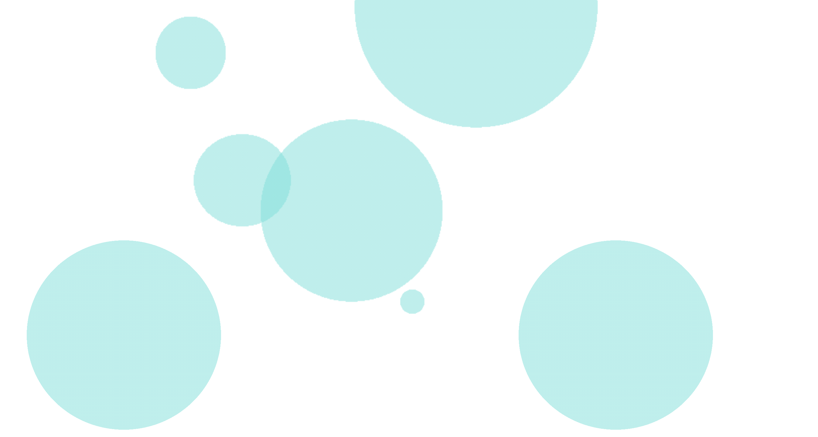
body {
        background-image:
            radial-gradient(290px 300px , rgba(123,222,217, 0.5) 20%, transparent 20%),
            radial-gradient(800px 780px , rgba(123,222,217, 0.5) 20%, transparent 20%),
            radial-gradient(1000px 990px , rgba(123,222,217, 0.5) 20%, transparent 20%),
            radial-gradient(400px 380px , rgba(123,222,217, 0.5) 20%, transparent 20%),
            radial-gradient(750px 750px , rgba(123,222,217, 0.5) 20%, transparent 20%),
            radial-gradient(100px 100px , rgba(123,222,217, 0.5) 20%, transparent 20%);
        background-size:
            1230px 1280px,
            810px 910px,
            1470px 990px,
            1200px 1700px,
            1520px 1200px,
            1100px 1300px;
        background-position:
            -300px -550px,
            -200px 100px,
            50px 510px,
            -200px -550px,
            -180px -250px,
            130px -150px;
}
複数のバラバラのサイズの丸い背景を重ねて作ります。 重なった部分が綺麗に見えるように色は16進数ではなくrgbaで書くことで重なり部分が綺麗に見えます。
※スクロールしたらこんなかんじ
色もバラバラに変えても綺麗ですね。
水玉模様はcanvasやjsを使った方法もあるようです。 適材適所で画像にしたり、CSSで作ったり使い分けるのがいいかなと思います。
アニメーションと組み合わせて水玉模様をふわふわさせたり、回転させたりしても面白いサイトができるかもしれませんね!
参考:https://www.esz.co.jp/blog/2766.html
~ Qiitaで毎日投稿中!! ~ 【初心者向け】WEB制作のちょいテク詰め合わせ
目的 z-index使用時に、重なり順が想定と違っていた 重なりの仕組みについて整理する スタックコンテキスト スタック(stack)は積み上げる、コンテキスト(context)は文脈という意味 positionをstatic以外、かつz-indexを指定した場合に生成される集まりのとこ z-indexを使用することで、同じスタックコンテキストの要素同士の重なり順を指定できる 実例 CSSとHTMLはこんな感じ(色や位置の記述は割愛) <div class="squares"> <div class="square square-red">z-index:2</div> <div class="square square-green"> z-index:3 <div class="square square-blue">z-index:1</div> </div> </div> .squares { position: relative; } .square { position: absolute; width: 10rem; height: 10rem; } .square--red { z-index: 2; } .square--blue { z-index: 1; } .square--green { z-index: 3; } ・z-indexが1の要素が、一番上に表示されている ・これは、z-indexが3の親要素が起点となっているから ・各要素の重なり順序は下表のようになっている 色 z-index スタックコンテキスト 重なり順 赤 2 root root→赤(z-index:2) 青 1 緑 緑(z-index:3)→青(z-index:1) 緑 3 root root→緑(z-index:3) 青はz-index:3の緑を起点としているため、一番上に表示される まとめ z-indexを使用するときは、起点に注意しよう
CSSとHTMLはこんな感じ(色や位置の記述は割愛)
<div class="squares">
  <div class="square square-red">z-index:2</div>
  <div class="square square-green">
    z-index:3
    <div class="square square-blue">z-index:1</div>
  </div>
</div>
.squares {
  position: relative;
}

.square {
  position: absolute;
  width: 10rem;
  height: 10rem;
}

.square--red {
  z-index: 2;
}

.square--blue {
  z-index: 1;
}

.square--green {
  z-index: 3;
}
・z-indexが1の要素が、一番上に表示されている ・これは、z-indexが3の親要素が起点となっているから ・各要素の重なり順序は下表のようになっている
青はz-index:3の緑を起点としているため、一番上に表示される
z-indexを使用するときは、起点に注意しよう
「基本的なAngularアプリをはじめる」をやってみる(4) [Angular] 「基本的なAngularアプリをはじめる」をやってみる(準備) [Angular] 「基本的なAngularアプリをはじめる」をやってみる(1) [Angular] 「基本的なAngularアプリをはじめる」をやってみる(2) [Angular] 「基本的なAngularアプリをはじめる」をやってみる(3)子コンポーネントにデータを渡す Angular のチュートリアルをやってみています。 親コンポーネントにデータを渡す Angular公式ページ : 親コンポーネントにデータを渡す Notify Meボタンを動作させるには、子コンポーネントが通知して親コンポーネントにデータを渡す必要があります。 1.product-alerts.component.ts で、Output と EventEmitter をインポートする product-alerts.component.ts import { Component } from '@angular/core'; import { Input } from '@angular/core'; import { Output, EventEmitter } from '@angular/core'; 2.notify という名前のプロパティを @Output() デコレーターと EventEmitter() のインスタンスで定義する product-alerts.component.ts export class ProductAlertsComponent { @Input() product; @Output() notify = new EventEmitter(); } 3.Notify Meボタンをイベントバインディングで更新し、notify.emit()メソッドを呼び出す product-alerts.component.html <p *ngIf="product.price > 700"> <button (click)="notify.emit()">Notify Me</button> </p> 4.product-list.component.ts で onNotify() メソッドを定義 product-list.component.ts export class ProductListComponent { products = products; test_1 = '製品'; share() { window.alert('The product has been shared!'); } onNotify() { window.alert('メッセージ : You will be notified when the product goes on sale'); } } 親の ProductListComponentは、ProductAlertsComponentがイベントを発生させたときに動作します。 5.product-list.component.html で、 を製品リストコンポーネントの onNotify() メソッドにバインドする product-list.component.html <button (click)="share()"> shareボタン </button> <app-product-alerts [product]="product" (notify)="onNotify()"> </app-product-alerts> Notify Meボタンをクリックすると、下図のようなアラートが表示されるようになります。 ここまでで、いちおうAngularチュートリアルの入門編は終わりです。
[Angular] 「基本的なAngularアプリをはじめる」をやってみる(準備)
[Angular] 「基本的なAngularアプリをはじめる」をやってみる(1)
[Angular] 「基本的なAngularアプリをはじめる」をやってみる(2)
[Angular] 「基本的なAngularアプリをはじめる」をやってみる(3)子コンポーネントにデータを渡す
Angular のチュートリアルをやってみています。
Angular公式ページ : 親コンポーネントにデータを渡す
Notify Meボタンを動作させるには、子コンポーネントが通知して親コンポーネントにデータを渡す必要があります。
import { Component } from '@angular/core';
import { Input } from '@angular/core';
import { Output, EventEmitter } from '@angular/core';
export class ProductAlertsComponent {
  @Input() product;
  @Output() notify = new EventEmitter();
}
<p *ngIf="product.price > 700">
  <button (click)="notify.emit()">Notify Me</button>
</p>
export class ProductListComponent {
  products = products;
  test_1 = '製品';

  share() {
    window.alert('The product has been shared!');
  }

  onNotify() {
    window.alert('メッセージ : You will be notified when the product goes on sale');
  }
}
親の ProductListComponentは、ProductAlertsComponentがイベントを発生させたときに動作します。
<button (click)="share()">
  shareボタン
</button>

<app-product-alerts
  [product]="product"
  (notify)="onNotify()">
</app-product-alerts>
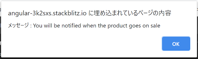
Notify Meボタンをクリックすると、下図のようなアラートが表示されるようになります。
ここまでで、いちおうAngularチュートリアルの入門編は終わりです。
やりたいのは上に説明文があって、残りを画像で埋めたい、みたいなケースです。 Flexible Box Layout を使います。 <!DOCTYPE html> <html> <head> <meta charset="UTF-8"/> <style> body { margin: 0; } #content { display: flex; position: absolute; flex-direction: column; margin: 10px; width: 95vw; height: 95vh; } #content>p:last-of-type { flex: 1; min-height: 100px; } .image { height: 100%; max-width: 100%; } </style> </head> <body> <div id="content"> <h1>Flexible Box Layoutのサンプル</h1> <ul> <li>hogehoge</li> <li>fugafuga</li> </ul> <p><img src="computer_desktop_document.png" class="image"></p> </div> </body> </html>
やりたいのは上に説明文があって、残りを画像で埋めたい、みたいなケースです。
Flexible Box Layout を使います。
<!DOCTYPE html>
<html>

<head>
    <meta charset="UTF-8"/>
    <style>
        body {
            margin: 0;
        }

        #content {
            display: flex;
            position: absolute;
            flex-direction: column;
            margin: 10px;
            width: 95vw;
            height: 95vh;
        }

        #content>p:last-of-type {
            flex: 1;
            min-height: 100px;
        }

        .image {
            height: 100%;
            max-width: 100%;
        }
    </style>
</head>

<body>
    <div id="content">
        <h1>Flexible Box Layoutのサンプル</h1>
        <ul>
            <li>hogehoge</li>
            <li>fugafuga</li>
        </ul>
        <p><img src="computer_desktop_document.png" class="image"></p>
    </div>
</body>

</html>
入門背景 Pugで書かれたコードを見た時に動揺してしまったので、Pug入門してみた Pugとは HTMLを簡単に書くためのテンプレートエンジン。 Node.jsで動いている。 vueのテンプレートで書ける。 メリット < > がいらない。(閉じタグがいらない) → 最高。 共通部分を分割して再利用できる。 → コンポーネント化? 変数が使える。 → ややこしくなりそう。 ループやifが使える。 → ん? 慣れたらすごい楽そう。 とりあえずPugで書かれたコードが読めるのを目標にサクッと入門してみる。 書き方 インデントで階層化していく test.pug body h1 Pugの練習タイトルです。 p Pugの練習パラグラフ test.html <body> <h1>Pugの練習タイトルです。</h1> <p>Pugの練習パラグラフ</p> <body> あゝ、見やすい classは . idは # で test.pug body h1.title 簡単にclassがつけれる p#description もちろんidも .text divは省略可能 test.html <body> <h1 class="title">簡単にclassがつけれる</h1> <p id="description">もちろんidも</p> <div class="text">divは省略可能</div> <body> 直感的! 属性は()で test.pug body input(type="email") test.html <body> <input type="email"> <body> 半角スペースで何個も追加可能 変数も使える test.pug body -const myClasses = ["class1", "class2", "class3"] div(class=myClasses) test.html <body> <div class="class1 class2 class3"></div> <body> おわり とりあえずこれで少しは読めるとなったと思う。
Pugで書かれたコードを見た時に動揺してしまったので、Pug入門してみた
HTMLを簡単に書くためのテンプレートエンジン。 Node.jsで動いている。 vueのテンプレートで書ける。
慣れたらすごい楽そう。 とりあえずPugで書かれたコードが読めるのを目標にサクッと入門してみる。
body
    h1 Pugの練習タイトルです。
    p Pugの練習パラグラフ
<body>
    <h1>Pugの練習タイトルです。</h1>
    <p>Pugの練習パラグラフ</p>
<body>
あゝ、見やすい
body
   h1.title 簡単にclassがつけれる
  p#description もちろんidも
   .text divは省略可能
<body>
    <h1 class="title">簡単にclassがつけれる</h1>
    <p id="description">もちろんidも</p>
    <div class="text">divは省略可能</div>
<body>
直感的!
body
    input(type="email")
<body>
   <input type="email">
<body>
半角スペースで何個も追加可能
body
    -const myClasses = ["class1", "class2", "class3"]
    div(class=myClasses)
<body>
   <div class="class1 class2 class3"></div>
<body>
とりあえずこれで少しは読めるとなったと思う。
優良な企業のHPによくみられるヘッダーのテンプレート 今回ご紹介するテンプレの内容、特徴。 ヘッダーがposition:fixed;で固定されている。 企業様の名前やロゴ、ナビメニューが両端に表示されている。 ナビメニューに触れた時アクションが起こる。 主にこのような特徴があると思います。思い当たる節はございませんか? 上記のような構成のコードを紹介いたします。 HTML <header> <img src="images/dualslogo.png" alt="logo" class="dualslogo"> <ul> <li>HOME</li> <li>WORKS</li> <li>ABOUT</li> <li>CONTACT</li> </ul> </header> CSS header { position: fixed; width: 100%; display: flex; justify-content: space-between; } ul { display: flex; list-style: none; } li { color: white; transition: all 0.3s; cursor: pointer; //padding,marginなどの調節 } li:hover { 色が変わったりすると良いかもしれません。 } *個人的な意見ですが全体的にパステルカラーを使うと綺麗に見えます。
今回ご紹介するテンプレの内容、特徴。
主にこのような特徴があると思います。思い当たる節はございませんか? 上記のような構成のコードを紹介いたします。
HTML
<header>
<img src="images/dualslogo.png" alt="logo" class="dualslogo">
<ul>
<li>HOME</li>
<li>WORKS</li>
<li>ABOUT</li>
<li>CONTACT</li>
</ul>
</header>
CSS
header {
  position: fixed;
  width: 100%;
  display: flex;
  justify-content: space-between;
}
ul {
  display: flex;
  list-style: none;
}

li {
  color: white;
  transition: all 0.3s;
  cursor: pointer;
 //padding,marginなどの調節
}

li:hover {
  色が変わったりすると良いかもしれません。
  }
*個人的な意見ですが全体的にパステルカラーを使うと綺麗に見えます。