- 投稿日:2020-06-25T23:44:42+09:00
【R8/ProGuard】マージ後のProGuardルールファイルを確認する方法
ライブラリ モジュールの開発に関する考慮事項 の ライブラリ モジュールには独自の ProGuard 構成ファイルを含めることができる に記載がある通り、ライブラリ側がProGuardルールファイルを内包している場合があります。(
consumerProguardFiles)そういうライブラリを使っている場合、最終的に生成されるProGuardルールファイルは、それぞれのProGuardルールファイルがマージされたものになります。
今回は、そのマージされたProGuardルールファイルを確認する方法を記載します。
printconfigurationを使う
方法は簡単で、アプリ側で使っている
proguard-rules.proに-printconfiguration proguard-rules-full.proと記述し、
minifyEnabled trueな状態でビルドするとproguard-rules-full.proというファイル名で出力することができます。参考:https://developer.android.com/studio/build/shrink-code?hl=ja#configuration-files
(おまけ)メンテナンスがしやすい

出力されたProGuardルールファイルは、単純に各ProGuardルールファイルを結合しただけのようでした。
そのため、例えばあるライブラリを使っていて、そのライブラリのルールをアプリ側に記述していたが、実はライブラリが内包しているProGuardルールファイルにそもそも記述されているので不要、といったこともわかるため、ProGuardルールファイルのメンテナンスがしやすいです。
(ProGuardルールファイルは一度書くと、なかなか変更などしないですよね。)
例えば「Glide」の場合
画像ライブラリで有名なGlideですが、GitHubのREADMEに ProGuard の記述があるため、特に調べることなく、アプリ側のProGuardルールファイルにルールをコピペしがちです。
しかしながら、 build.gradleを見てみるとconsumerProguardFiles の記述があり、 proguard-rules.txt を覗いていると、READMEに書かれているルールとほぼ同じもの 1 が書かれているため、アプリ側のProGuardルールファイルにルールを書く必要がないことがわかったりしました。
正確には
for DexGuard onlyのところがコメントアウトされていました。 ↩
- 投稿日:2020-06-25T21:56:15+09:00
[Modern Android] Jetpack Compose その4
JetNewを続いて見ながら、
Jetpack Composeを理解しようと思います。出来ればFlutterと比べながらみようと思います。
今日は
まず、DrawerButtonとtopAppBarを見てみます。
DrawerButton
- DrawerButtonはAppDrawerのComposable関数の中で使われている。
- DrawerButtonはicon、label、isSelected、actionmodifierをパラメータとしている
@Composable
private fun DrawerButton(
    icon: VectorAsset,
    label: String,
    isSelected: Boolean,
    action: () -> Unit,
    modifier: Modifier = Modifier
) {
    val colors = MaterialTheme.colors
    val imageAlpha = if (isSelected) {
        1f
    } else {
        0.6f
    }
    val textIconColor = if (isSelected) {
        colors.primary
    } else {
        colors.onSurface.copy(alpha = 0.6f)
    }
    val backgroundColor = if (isSelected) {
        colors.primary.copy(alpha = 0.12f)
    } else {
        colors.surface
    }

    val surfaceModifier = modifier
        .padding(start = 8.dp, top = 8.dp, end = 8.dp)
        .fillMaxWidth()
    Surface(
        modifier = surfaceModifier,
        color = backgroundColor,
        shape = MaterialTheme.shapes.small
    ) {
        TextButton(
            onClick = action,
            modifier = Modifier.fillMaxWidth()
        ) {
            Row(
                horizontalArrangement = Arrangement.Start,
                verticalGravity = Alignment.CenterVertically,
                modifier = Modifier.fillMaxWidth()) {
                Image(
                    asset = icon,
                    colorFilter = ColorFilter.tint(textIconColor),
                    alpha = imageAlpha
                )
                Spacer(Modifier.preferredWidth(16.dp))
                Text(
                    text = label,
                    style = MaterialTheme.typography.body2,
                    color = textIconColor,
                    modifier = Modifier.fillMaxWidth()
                )
            }
        }
    }
}
Surface Composable 関数
/**
 * The [Surface] is responsible for:
 *
 * 1) Clipping: Surface clips its children to the shape specified by [shape]
 *
 * 2) Elevation: Surface elevates its children on the Z axis by [elevation] pixels,
 *   and draws the appropriate shadow.
 *
 * 3) Borders: If [shape] has a border, then it will also be drawn.
 *
 * Material surface is the central metaphor in material design. Each surface
 * exists at a given elevation, which influences how that piece of surface
 * visually relates to other surfaces and how that surface casts shadows.
 *
 * [contentColor] is the preferred color for any children inside this surface - any [Text] inside
 * this Surface will use this color by default.
 *
 * If no [contentColor] is set, this surface will try and match its background color to a color
 * defined in the theme [ColorPalette], and return the corresponding `onFoo` color. For example,
 * if the [color] of this surface is [ColorPalette.surface], [contentColor] will be set to
 * [ColorPalette.onSurface]. If [color] is not part of the theme palette, [contentColor] will keep
 * the same value set above this Surface.
 *
 * To modify these default style values used by text, use [ProvideTextStyle] or explicitly
 * pass a new [TextStyle] to your text.
 *
 * To manually retrieve the content color inside a surface, use [contentColor].
 *
 * @param modifier Modifier to be applied to the layout corresponding to the surface
 * @param shape Defines the surface's shape as well its shadow. A shadow is only
 *  displayed if the [elevation] is greater than zero.
 * @param color The background color. Use [Color.Transparent] to have no color.
 * @param contentColor The preferred content color provided by this Surface to its children.
 * Defaults to either the matching `onFoo` color for [color], or if [color] is not a color from
 * the theme, this will keep the same value set above this Surface.
 * @param border Optional border to draw on top of the surface
 * @param elevation The z-coordinate at which to place this surface. This controls
 * the size of the shadow below the surface.
 */
@Composable
fun Surface(
    modifier: Modifier = Modifier,
    shape: Shape = RectangleShape,
    color: Color = MaterialTheme.colors.surface,
    contentColor: Color = contentColorFor(color),
    border: Border? = null,
    elevation: Dp = 0.dp,
    content: @Composable () -> Unit
) {
    SurfaceLayout(
        modifier.drawShadow(elevation = elevation, shape = shape, clip = false)
            .zIndex(elevation.value)
            .plus(if (border != null) Modifier.drawBorder(border, shape) else Modifier)
            .drawBackground(
                color = getBackgroundColorForElevation(color, elevation),
                shape = shape
            )
            .clip(shape)
    ) {
        Providers(ContentColorAmbient provides contentColor, children = content)
    }
}
- surfaceの中には TextButtonー>Row->Image,Spacer,Textの感じになっている。
- TextButtonはFlutterのInkWellー>Textとか、GestureDetector->Textぽい、なぜならClickリスナーをパラメータとしている
 Surface(
        modifier = surfaceModifier,
        color = backgroundColor,
        shape = MaterialTheme.shapes.small
    ) {
        TextButton(
            onClick = action,
            modifier = Modifier.fillMaxWidth()
        ) {
            Row(
                horizontalArrangement = Arrangement.Start,
                verticalGravity = Alignment.CenterVertically,
                modifier = Modifier.fillMaxWidth()) {
                Image(
                    asset = icon,
                    colorFilter = ColorFilter.tint(textIconColor),
                    alpha = imageAlpha
                )
                Spacer(Modifier.preferredWidth(16.dp))
                Text(
                    text = label,
                    style = MaterialTheme.typography.body2,
                    color = textIconColor,
                    modifier = Modifier.fillMaxWidth()
                )
            }
        }
    }
TextButton
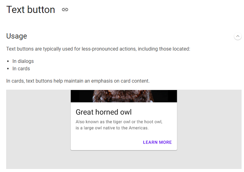
- なるほど、ComposeのTextButton、これはFlutterのFlatButton Widgetですね。
/**
 * Material Design implementation of a
 * [Material Text Button](https://material.io/design/components/buttons.html#text-button).
 *
 * Text buttons are typically used for less-pronounced actions, including those located in cards and
 * dialogs.
 *
 * To make a button clickable, you must provide an onClick. If no onClick is provided, this button
 * will display itself as disabled.
 *
 * The default text style for internal [Text] components will be set to [Typography.button]. Text
 * color will try to match the correlated color for the background color. For example if the
 * background color is set to [ColorPalette.primary] then the text will by default use
 * [ColorPalette.onPrimary].
 *
 * @sample androidx.ui.material.samples.TextButtonSample
 *
 * @param onClick Will be called when the user clicks the button
 * @param modifier Modifier to be applied to the button
 * @param enabled Controls the enabled state of the button. When `false`, this button will not
 * be clickable
 * @param elevation The z-coordinate at which to place this button. This controls the size
 * of the shadow below the button
 * @param shape Defines the button's shape as well as its shadow
 * @param border Border to draw around the button
 * @param backgroundColor The background color. Use [Color.Transparent] to have no color
 * @param contentColor The preferred content color. Will be used by text and iconography
 * @param disabledContentColor The preferred content color used when [enabled] is false
 * @param padding The spacing values to apply internally between the container and the content
 */
@Composable
inline fun TextButton(
    noinline onClick: () -> Unit,
    modifier: Modifier = Modifier,
    enabled: Boolean = true,
    elevation: Dp = 0.dp,
    shape: Shape = MaterialTheme.shapes.small,
    border: Border? = null,
    backgroundColor: Color = Color.Transparent,
    contentColor: Color = MaterialTheme.colors.primary,
    disabledContentColor: Color = Button.defaultDisabledContentColor,
    padding: InnerPadding = TextButton.DefaultInnerPadding,
    noinline text: @Composable () -> Unit
) = Button(
    modifier = modifier,
    onClick = onClick,
    enabled = enabled,
    elevation = elevation,
    disabledElevation = 0.dp,
    shape = shape,
    border = border,
    backgroundColor = backgroundColor,
    disabledBackgroundColor = backgroundColor,
    contentColor = contentColor,
    disabledContentColor = disabledContentColor,
    padding = padding,
    text = text
)
Row
- ComposeのRowはComposable関数です。
- package androidx.ui.layout
- horizontalArrangementはFlutterのMainAxisAlignmentです。
- verticalGravityはFlutterのCrossAxisAlignmentです。
- Arrangementを使ってます。
/**
 * A layout composable that places its children in a horizontal sequence. For a layout composable
 * that places its children in a vertical sequence, see [Column].
 *
 * The layout model is able to assign children widths according to their weights provided
 * using the [RowScope.weight] modifier. If a child is not provided a weight, it will be
 * asked for its preferred width before the sizes of the children with weights are calculated
 * proportionally to their weight based on the remaining available space.
 *
 * When none of its children have weights, a [Row] will be as small as possible to fit its
 * children one next to the other. In order to change the width of the [Row], use the
 * [Modifier.width] modifiers; e.g. to make it fill the available width [Modifier.fillMaxWidth]
 * can be used. If at least one child of a [Row] has a [weight][RowScope.weight], the [Row] will
 * fill the available width, so there is no need for [Modifier.fillMaxWidth]. However, if [Row]'s
 * size should be limited, the [Modifier.width] or [Modifier.size] layout modifiers should be
 * applied.
 *
 * When the size of the [Row] is larger than the sum of its children sizes, a
 * [horizontalArrangement] can be specified to define the positioning of the children inside
 * the [Row]. See [Arrangement] for available positioning behaviors; a custom arrangement can
 * also be defined using the constructor of [Arrangement].
 *
 * Example usage:
 *
 * @sample androidx.ui.layout.samples.SimpleRow
 *
 * @param modifier The modifier to be applied to the Row.
 * @param horizontalArrangement The horizontal arrangement of the layout's children.
 * @param verticalGravity The vertical gravity of the layout's children.
 *
 * @see Column
 */
@Composable
fun Row(
    modifier: Modifier = Modifier,
    horizontalArrangement: Arrangement.Horizontal = Arrangement.Start,
    verticalGravity: Alignment.Vertical = Alignment.Top,
    children: @Composable RowScope.() -> Unit
) {
    RowColumnImpl(
        orientation = LayoutOrientation.Horizontal,
        modifier = modifier,
        arrangement = horizontalArrangement,
        crossAxisAlignment = verticalGravity,
        crossAxisSize = SizeMode.Wrap,
        children = { RowScope.children() }
    )
}
コードを理解する
- DrawerButtonの構成をみた。
- label はText Composable関数で使う。
- actionはTextButtonで使うCallback関数です。
- navigateTo(Screen.Interests)でStateを変えて画面を変化します。
DrawerButton(
            icon = Icons.Filled.ListAlt,
            label = "Interests",
            isSelected = currentScreen == Screen.Interests,
            action = {
                navigateTo(Screen.Interests)
                closeDrawer()
            }
        )
TopAppBar
 topAppBar = {
            TopAppBar(
                title = { Text(text = "Jetnews") },
                navigationIcon = {
                    IconButton(onClick = { scaffoldState.drawerState = DrawerState.Opened }) {
                        Icon(vectorResource(R.drawable.ic_jetnews_logo))
                    }
                }
            )
        },
- FlutterのAppbarとほぼ同じです。
/**
 * A TopAppBar displays information and actions relating to the current screen and is placed at the
 * top of the screen.
 *
 * This TopAppBar has slots for a title, navigation icon, and actions. Use the other TopAppBar
 * overload for a generic TopAppBar with no restriction on content.
 *
 * @sample androidx.ui.material.samples.SimpleTopAppBar
 *
 * @param title The title to be displayed in the center of the TopAppBar
 * @param navigationIcon The navigation icon displayed at the start of the TopAppBar. This should
 * typically be an [IconButton] or [IconToggleButton].
 * @param actions The actions displayed at the end of the TopAppBar. This should typically be
 * [IconButton]s. The default layout here is a [Row], so icons inside will be placed horizontally.
 * @param backgroundColor The background color for the TopAppBar. Use [Color.Transparent] to have
 * no color.
 * @param contentColor The preferred content color provided by this TopAppBar to its children.
 * Defaults to either the matching `onFoo` color for [backgroundColor], or if [backgroundColor]
 * is not a color from the theme, this will keep the same value set above this TopAppBar.
 * @param elevation the elevation of this TopAppBar.
 */
@Composable
fun TopAppBar(
    title: @Composable () -> Unit,
    modifier: Modifier = Modifier,
    navigationIcon: @Composable (() -> Unit)? = null,
    actions: @Composable RowScope.() -> Unit = {},
    backgroundColor: Color = MaterialTheme.colors.primarySurface,
    contentColor: Color = contentColorFor(backgroundColor),
    elevation: Dp = TopAppBarElevation
) {
    AppBar(backgroundColor, contentColor, elevation, RectangleShape, modifier) {
        val emphasisLevels = EmphasisAmbient.current
        if (navigationIcon == null) {
            Spacer(TitleInsetWithoutIcon)
        } else {
            Row(TitleIconModifier, verticalGravity = ContentGravity.CenterVertically) {
                ProvideEmphasis(emphasisLevels.high, navigationIcon)
            }
        }

        Box(Modifier.fillMaxHeight().weight(1f), gravity = ContentGravity.BottomStart) {
            Semantics(container = true) {
                ProvideTextStyle(value = MaterialTheme.typography.h6) {
                    val baselineOffset = with(DensityAmbient.current) { TitleBaselineOffset.toDp() }
                    Row(Modifier.relativePaddingFrom(LastBaseline, after = baselineOffset)) {
                        ProvideEmphasis(emphasisLevels.high, title)
                    }
                }
            }
        }

        ProvideEmphasis(emphasisLevels.medium) {
            Row(
                Modifier.fillMaxHeight(),
                horizontalArrangement = Arrangement.End,
                verticalGravity = ContentGravity.CenterVertically,
                children = actions
            )
        }
    }
}
- navigationIconでDrawerを開けます。
navigationIcon: @Composable (() -> Unit)? = null
- 関数とパラメータをして受け取ります。
- 使う方見ればIconButtonが使われているんですね
- IconButtonはFlutterと同じです。
navigationIcon = {
                    IconButton(onClick = { scaffoldState.drawerState = DrawerState.Opened }) {
                        Icon(vectorResource(R.drawable.ic_jetnews_logo))
                    }
                }
IconButton
- ボタンのサイズはMaterial Designの48dpですね。
- FlutterもIconは24dpでIconButtonWidgetは48dpになっております。
/**
 * IconButton is a clickable icon, used to represent actions. An IconButton has an overall minimum
 * touch target size of 48 x 48dp, to meet accessibility guidelines. [icon] is centered
 * inside the IconButton.
 *
 * This component is typically used inside an App Bar for the navigation icon / actions. See App
 * Bar documentation for samples of this.
 *
 * [icon] should typically be an [androidx.ui.foundation.Icon], using an icon from
 * [androidx.ui.material.icons.Icons]. If using a custom icon, note that the typical size for the
 * internal icon is 24 x 24 dp.
 *
 * @sample androidx.ui.material.samples.IconButtonSample
 *
 * @param onClick the lambda to be invoked when this icon is pressed
 * @param modifier optional [Modifier] for this IconButton
 * @param icon the content (icon) to be drawn inside the IconButton. This is typically an
 * [androidx.ui.foundation.Icon].
 */
@Composable
fun IconButton(
    onClick: () -> Unit,
    modifier: Modifier = Modifier,
    icon: @Composable () -> Unit
) {
    Box(
        modifier = modifier
            .clickable(
                onClick = onClick,
                indication = RippleIndication(bounded = false, radius = RippleRadius)
            )
            .plus(IconButtonSizeModifier),
        gravity = ContentGravity.Center,
        children = icon
    )
}
終わりに
今回はここまでメモします。
つづく。