Reactにおいて、ボタンがクリックされた後もフォーカスされるのが嫌だったので外したかった。 const Button: React.FC = () => { const onClick = (e: React.MouseEvent<HTMLButtonElement, MouseEvent>) => { e.currentTarget.blur(); } return ( <button onClick={onClick}>ボタン</button> ) } これでいけた。 e.target これにはイベントが 発火した DOM要素が入っていて、 e.currentTarget これにはイベントが 発火された DOM要素が入ってるらしい。 (参考:Reactビギナーズガイドをtypescriptで勉強し直してわかったこと③【event.targetの作法】) blurってのはfocusの対義語らしい。
Reactにおいて、ボタンがクリックされた後もフォーカスされるのが嫌だったので外したかった。
const Button: React.FC = () => {
  const onClick = (e: React.MouseEvent<HTMLButtonElement, MouseEvent>) => {
    e.currentTarget.blur();
  }
  return (
    <button onClick={onClick}>ボタン</button>
  )
}
これでいけた。
e.target
これにはイベントが 発火した DOM要素が入っていて、
e.currentTarget
これにはイベントが 発火された DOM要素が入ってるらしい。 (参考:Reactビギナーズガイドをtypescriptで勉強し直してわかったこと③【event.targetの作法】)
blurってのはfocusの対義語らしい。
TL;DR 「2つののフィールドを切り替え可能で、いずれか一つが必須」みたいなやつをyupでやりたかったけど、地味にハマった。 結論としては test を使う thisが必要なのでarrow functionをあきらめる eslint のこのrule をdisableする 実装例 フィールド id / email のどちらかが必須というのをやりたい場合 // イメージが湧く程度の適当なjsx /* Props loginWithId: boolean ... IDとメールアドレスのどちらを表示するかを保持するProps toggleLoginKey: () => void ... IDとメールアドレスのどちらを表示するかを切り替える関数 */ {loginWithId && <p><input type="text" name="id" value="" /></p>} {loginWithId && <p><input type="text" name="email" value="" /></p>} <button onClick={toggleLoginKey}> yup.object().shape({ id: yup .string() // eslint-disable-next-line func-names .test('email', 'ログインIDを入力してください', function(value) { return this.parent.email || value }), email: yup .string() .email('メールアドレス形式で入力してください') // eslint-disable-next-line func-names .test('email', 'メールアドレスを入力してください', function(value) { return this.parent.id || value }), }) 見えなくなったFiledの値はToggleする関数内でemptyにしておく。
「2つののフィールドを切り替え可能で、いずれか一つが必須」みたいなやつをyupでやりたかったけど、地味にハマった。 結論としては
test
フィールド id / email のどちらかが必須というのをやりたい場合
id
email
// イメージが湧く程度の適当なjsx

/*
Props
  loginWithId: boolean        ... IDとメールアドレスのどちらを表示するかを保持するProps
  toggleLoginKey: () => void  ... IDとメールアドレスのどちらを表示するかを切り替える関数
*/

{loginWithId && <p><input type="text" name="id" value="" /></p>}
{loginWithId && <p><input type="text" name="email" value="" /></p>}
<button onClick={toggleLoginKey}>
yup.object().shape({
  id: yup
    .string()
    // eslint-disable-next-line func-names
    .test('email', 'ログインIDを入力してください', function(value) {
      return this.parent.email || value
    }),
  email: yup
    .string()
    .email('メールアドレス形式で入力してください')
    // eslint-disable-next-line func-names
    .test('email', 'メールアドレスを入力してください', function(value) {
      return this.parent.id || value
    }),
})
見えなくなったFiledの値はToggleする関数内でemptyにしておく。
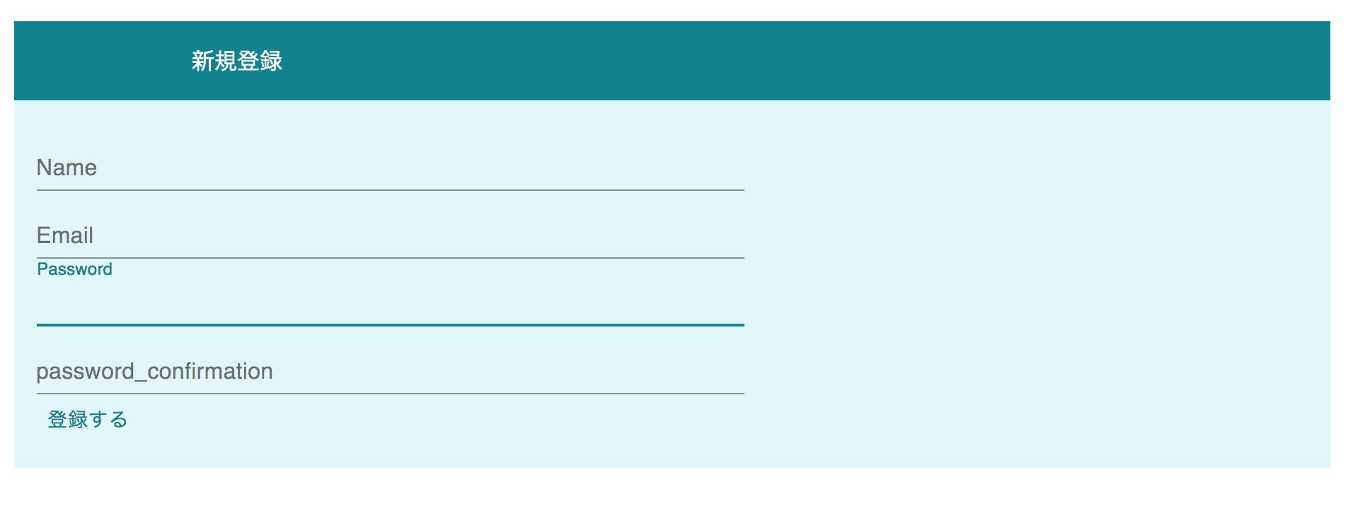
RailsではBootstrapを使うのが手軽だと思いますが、見慣れたデザインで面白くないので、今回は ユーザー登録画面をMaterial-uiのデザインにしてみたいと思います。 準備 ・以下の記事を参考にreact-rails,material-uiのインストールを行ってください。 https://qiita.com/anx/items/a6039f9ccf2bd835194d (既存のRailsアプリにReactを導入する方法) https://qiita.com/anx/items/8bf9855a2118e96dfe5c (react-railsでMaterial-ui) ・ユーザー登録機能を実装しておいてください 実装 まずはSignUpコンポーネント作成します。 $rails g react:component SignUp 次にログイン画面のviewファイルに以下を追記し、SignUpコンポーネントを呼び出します。 /app/views/users/new.html.slim = react_component("SignUp", {csrf_params: request_forgery_protection_token, csrf_token: form_authenticity_token }) Railsのフォームヘルパーは、CSRF(Cross-Site Request Forgeries の略で, ユーザの意図しない動作をさせる攻撃)対策を勝手に行ってくれます。しかし,今回のように、フロント部分をRailsから切り離している場合、CSRF対策を自分で行わなければいけません。ですので、{csrf_params: request_forgery_protection_token, csrf_token: form_authenticity_token }でCSRFトークンをReactコンポーネントに渡す必要があります。 次にSignUpコンポーネントを以下のようにします。form内は、ご自身のフォームによって変更してください *注意(QiitaのシンタックスハイライトがReactに対応していないそうなので、コードのシンタックスがうまく行ってませんが、正常に動作するはずです。) qiita.rb import React from "react" import PropTypes from "prop-types" import Button from '@material-ui/core/Button'; import TextField from '@material-ui/core/TextField'; import Box from '@material-ui/core/Box'; import { createMuiTheme } from '@material-ui/core/styles'; import { ThemeProvider } from '@material-ui/styles'; const theme = createMuiTheme({ palette: { primary: { main: '#00838f' }, // cyan系 secondary: { main: '#e0f7fa' }, // cyan系 }, }); class SignUp extends React.Component { render () { return ( <div> <ThemeProvider theme={theme}> <Box p={2} bgcolor="primary.main" color="primary.contrastText"> 新規登録 </Box> <Box p={2} bgcolor="secondary.main" color="primary.main"> <form action="/users" acceptCharset="UTF-8" method="post"> <input type="hidden" name={this.props.csrf_params} value={this.props.csrf_token} /> <div><TextField id="user_name" type="text" name="user[name]" label="Name" style={{ width: 500 }}/></div> <div><TextField id="user_email" type="email" name="user[email]" label="Email" style={{ width: 500 }}/></div> <div><TextField id="user_password" type="password" name="user[password]" label="Password" style={{ width: 500 }}/></div> <div><TextField id="user_password_confirmation" type="password" name="user[password_confirmation]" label="password_confirmation" style={{ width: 500 }}/></div> <Button color="primary" type="submit" name="commit">登録する</Button> </form> </Box> </ThemeProvider> </div> ); } } export default SignUp 以下の部分で、先ほどのCSRF対策をしています。 <input type="hidden" name={this.props.csrf_params} value={this.props.csrf_token} /> 色の変更は以下の部分をhttps://material-ui.com/customization/color/ を参考に適宜変更してください。 const theme = createMuiTheme({ palette: { primary: { main: '#00838f' }, // cyan系 secondary: { main: '#e0f7fa' }, // cyan系 }, }); 以上で終了です。結果はこのようになります。画像のように、入力箇所にカーソルを合わせると、ボーダーやラベルがアニメーションしてくれます。
RailsではBootstrapを使うのが手軽だと思いますが、見慣れたデザインで面白くないので、今回は ユーザー登録画面をMaterial-uiのデザインにしてみたいと思います。
・以下の記事を参考にreact-rails,material-uiのインストールを行ってください。 https://qiita.com/anx/items/a6039f9ccf2bd835194d (既存のRailsアプリにReactを導入する方法) https://qiita.com/anx/items/8bf9855a2118e96dfe5c (react-railsでMaterial-ui) ・ユーザー登録機能を実装しておいてください
まずはSignUpコンポーネント作成します。
$rails g react:component SignUp
次にログイン画面のviewファイルに以下を追記し、SignUpコンポーネントを呼び出します。
= react_component("SignUp", {csrf_params: request_forgery_protection_token, csrf_token: form_authenticity_token })
Railsのフォームヘルパーは、CSRF(Cross-Site Request Forgeries の略で, ユーザの意図しない動作をさせる攻撃)対策を勝手に行ってくれます。しかし,今回のように、フロント部分をRailsから切り離している場合、CSRF対策を自分で行わなければいけません。ですので、{csrf_params: request_forgery_protection_token, csrf_token: form_authenticity_token }でCSRFトークンをReactコンポーネントに渡す必要があります。
次にSignUpコンポーネントを以下のようにします。form内は、ご自身のフォームによって変更してください *注意(QiitaのシンタックスハイライトがReactに対応していないそうなので、コードのシンタックスがうまく行ってませんが、正常に動作するはずです。)
import React from "react"
import PropTypes from "prop-types"
import Button from '@material-ui/core/Button';
import TextField from '@material-ui/core/TextField';
import Box from '@material-ui/core/Box';
import { createMuiTheme } from '@material-ui/core/styles';
import { ThemeProvider } from '@material-ui/styles';

const theme = createMuiTheme({
  palette: {
    primary: { main: '#00838f' }, // cyan系
    secondary: { main: '#e0f7fa' }, // cyan系
  },
});


class SignUp extends React.Component {
  render () {
    return (

      <div>
        <ThemeProvider theme={theme}>
          <Box p={2} bgcolor="primary.main" color="primary.contrastText">
        新規登録
         </Box>

          <Box p={2} bgcolor="secondary.main" color="primary.main">
            <form action="/users" acceptCharset="UTF-8" method="post">
              <input type="hidden" name={this.props.csrf_params} value={this.props.csrf_token} />
              <div><TextField id="user_name" type="text" name="user[name]" label="Name" style={{ width: 500 }}/></div>
              <div><TextField id="user_email" type="email" name="user[email]" label="Email" style={{ width: 500 }}/></div>
              <div><TextField id="user_password" type="password" name="user[password]" label="Password" style={{ width: 500 }}/></div>
              <div><TextField id="user_password_confirmation" type="password" name="user[password_confirmation]" label="password_confirmation" style={{ width: 500 }}/></div>
              <Button color="primary" type="submit" name="commit">登録する</Button>
            </form>
          </Box>
        </ThemeProvider>
      </div>
    );
  }
}

export default SignUp
以下の部分で、先ほどのCSRF対策をしています。
<input type="hidden" name={this.props.csrf_params} value={this.props.csrf_token} />
色の変更は以下の部分をhttps://material-ui.com/customization/color/ を参考に適宜変更してください。
const theme = createMuiTheme({
  palette: {
    primary: { main: '#00838f' }, // cyan系
    secondary: { main: '#e0f7fa' }, // cyan系
  },
});
以上で終了です。結果はこのようになります。画像のように、入力箇所にカーソルを合わせると、ボーダーやラベルがアニメーションしてくれます。