- 投稿日:2021-01-11T23:17:25+09:00
【初心者でもわかる】CSSの点線や破線(dashed)の間隔を調整する方法
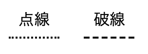
どうも7noteです。破線の間隔を調節する方法
もっとも簡単な点線や破線をCSSで再現する時はこのようにかきますが、
この方法では間隔を調整することができません。style.css/* 点線 */ .dotted { border-bottom: 2px dotted #000; } /* 破線 */ .dashed { border-bottom: 2px dashed #000; }
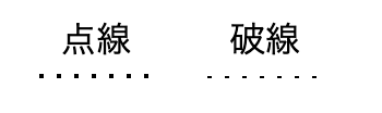
では間隔を調整して点線や破線を書く方法は???
↓↓↓↓↓↓↓↓↓↓
点線や破線の間隔を調整する方法
点線や破線の間隔を調整するには、本来の線を作る
borderではなくbackgroundを使用して再現します。style.css/* 点線 */ .dotted { background-image : linear-gradient(to right, #000, #000 2px, transparent 2px, transparent 8px); /* 幅2の線を作る */ background-size: 8px 2px; /* グラデーションの幅・高さを指定 */ background-position: left bottom; /* 背景の開始位置を指定 */ background-repeat: repeat-x; /* 横向きにのみ繰り返す */ } /* 破線 */ .dashed { background-image : linear-gradient(to right, #000, #000 2px, transparent 2px, transparent 8px); /* 幅2の線を作る */ background-size: 8px 1px; /* グラデーションの幅・高さを指定 */ background-position: left bottom; /* 背景の開始位置を指定 */ background-repeat: repeat-x; /* 横向きにのみ繰り返す */ }
background-imageの数字が横幅になり、background-sizeの2つ目の数字が高さになります。
そのため、・点線を作る時は
background-imageの数字とbackground-sizeの2つ目の数字を同じにします。
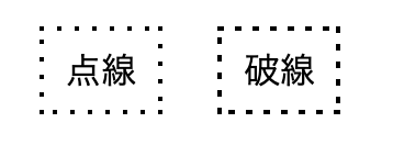
・破線を作る時はbackground-imageの数字の方が大きくなるように調整します4方向全てに点線・破線を作るには4回分書く
style.css/* 点線(4方向) */ .dotted { background-image : linear-gradient(to right, #000, #000 2px, transparent 2px, transparent 8px), /* 上の線 */ linear-gradient(to bottom, #000, #000 2px, transparent 2px, transparent 8px), /* 右の線 */ linear-gradient(to left, #000, #000 2px, transparent 2px, transparent 8px), /* 下の線 */ linear-gradient(to top, #000, #000 2px, transparent 2px, transparent 8px); /* 左の線 */ background-size: 8px 2px, /* 上の線 */ 2px 8px, /* 右の線 */ 8px 2px, /* 下の線 */ 2px 8px; /* 左の線 */ background-position: left top, /* 上の線 */ right top, /* 右の線 */ right bottom, /* 下の線 */ left bottom; /* 左の線 */ background-repeat: repeat-x, /* 上の線 */ repeat-y, /* 右の線 */ repeat-x, /* 下の線 */ repeat-y; /* 左の線 */ } /* 破線(4方向) */ .dashed { background-image : linear-gradient(to right, #000, #000 3px, transparent 3px, transparent 8px), /* 上の線 */ linear-gradient(to bottom, #000, #000 3px, transparent 3px, transparent 8px), /* 右の線 */ linear-gradient(to left, #000, #000 3px, transparent 3px, transparent 8px), /* 下の線 */ linear-gradient(to top, #000, #000 3px, transparent 3px, transparent 8px); /* 左の線 */ background-size: 8px 2px, /* 上の線 */ 2px 8px, /* 右の線 */ 8px 2px, /* 下の線 */ 2px 8px; /* 左の線 */ background-position: left top, /* 上の線 */ right top, /* 右の線 */ right bottom, /* 下の線 */ left bottom; /* 左の線 */ background-repeat: repeat-x, /* 上の線 */ repeat-y, /* 右の線 */ repeat-x, /* 下の線 */ repeat-y; /* 左の線 */ }
ソースが少し長くなりますが、このような方法で4方向ともに線を書くことが可能です。
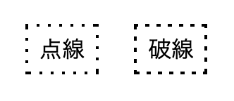
ただし、角の部分が重なって見えてしまう可能性があるのでpxで微調整するか、開始位置(background-position)を数pxずらして対策をしなければならない場合があります。
あまり万能というわけではないので使いどころには注意したほうがよさそうです。微妙にかぶってしまう場合も・・・
まとめ
通常の
borderでは点線や破線はデザインの微調整が難しいので、このような代替策を用意しておくとコーディングの幅が広がっていいですね。
線が1本か2本だけなら、疑似要素に背景を指定して長さなども調整して配置することもできるのでそのような方法をとるのもアリかもしれません。かといってあまり点線や破線にこだわり過ぎても気づく人も少ないとは思うので、作業時間とのバランスを見て
borderで簡略化するか、backgroundで作りこむか決めればいいかなと思います。おそまつ!
~ Qiitaで毎日投稿中!! ~
【初心者向け】WEB制作のちょいテク詰め合わせ
- 投稿日:2021-01-11T21:43:57+09:00
スタバのリワードで限界を狙う〜その2〜
前回記事
前回はMATLABのText Analytics Toolboxを使ってスタバサイトのメニュー一覧ページを行き来しながら値段表を作成し、カスタムを3妻つまでできるという条件下で、最も720円(リワードでもらえるビバレッジの限度額)に近い物は何かを検証しました。
個人的にウェブの仕組みに詳しくなかったのでそういったアプローチをとりましたが、Google Chromeのデベロッパーツールと睨めっこした結果、もう少しマシでカスタムのバリエーションまで考えられるようになりました。
メニューのJSONを見つけた。
スタバのサイトは元になるJSONファイルとJava Scriptによってメニュー表を作成しているらしく、デベロッパーツール で.jsファイルを読んだところ以下のアドレスにメニュー一覧がありました。(載せていいんかなこれ)
中身をmatlabのwebread関数で読み込みます。
以下がjsonのメンバーです
'id'
'product_code'
'parent_product_code'
'product_name'
'web_product_name'
'catchcopy'
'category1_list_path'
'category1_name'
'category2_list_path'
'category2_name'
'price'
'price_from_flg'
'tax_kbn'
'size'
'cup_size'
'volume'
'unit_kbn'
'color'
'hot_cold'
'class'
'district1'
'district2'
'process'
'grind_type'
'keyword'
'flavor'
'well_suited_flavor'
'product_note'
'notification'
'image1'
'image2'
'image3'
'image4'
'image5'
'image6'
'image7'
'image8'
'image9'
'image10'
'image11'
'image12'
'image13'
'image14'
'image1_caption'
'image2_caption'
'image3_caption'
'image4_caption'
'image5_caption'
'image6_caption'
'image7_caption'
'image8_caption'
'image9_caption'
'image10_caption'
'compare_image_number'
'retail_sale_flg'
'os_sale_flg'
'sm_cvs_sale_flg'
'department_sale_flg'
'store_soldout_kbn'
'os_soldout_kbn'
'store_limited_flg'
'area_limited_flg'
'number_limited_flg'
'new_flg'
'recommend_flg'
'sales_day'
'gift_flg'
'chunk_retail_sale_flg'
'chunk_os_sale_flg'
'chunk_sm_cvs_sale_flg'
'chunk_department_sale_flg'
'chunk_store_soldout_kbn'
'chunk_os_soldout_kbn'
'og_image'
'chunk_products' -> この下にサイズ別の値段やIDが格納される
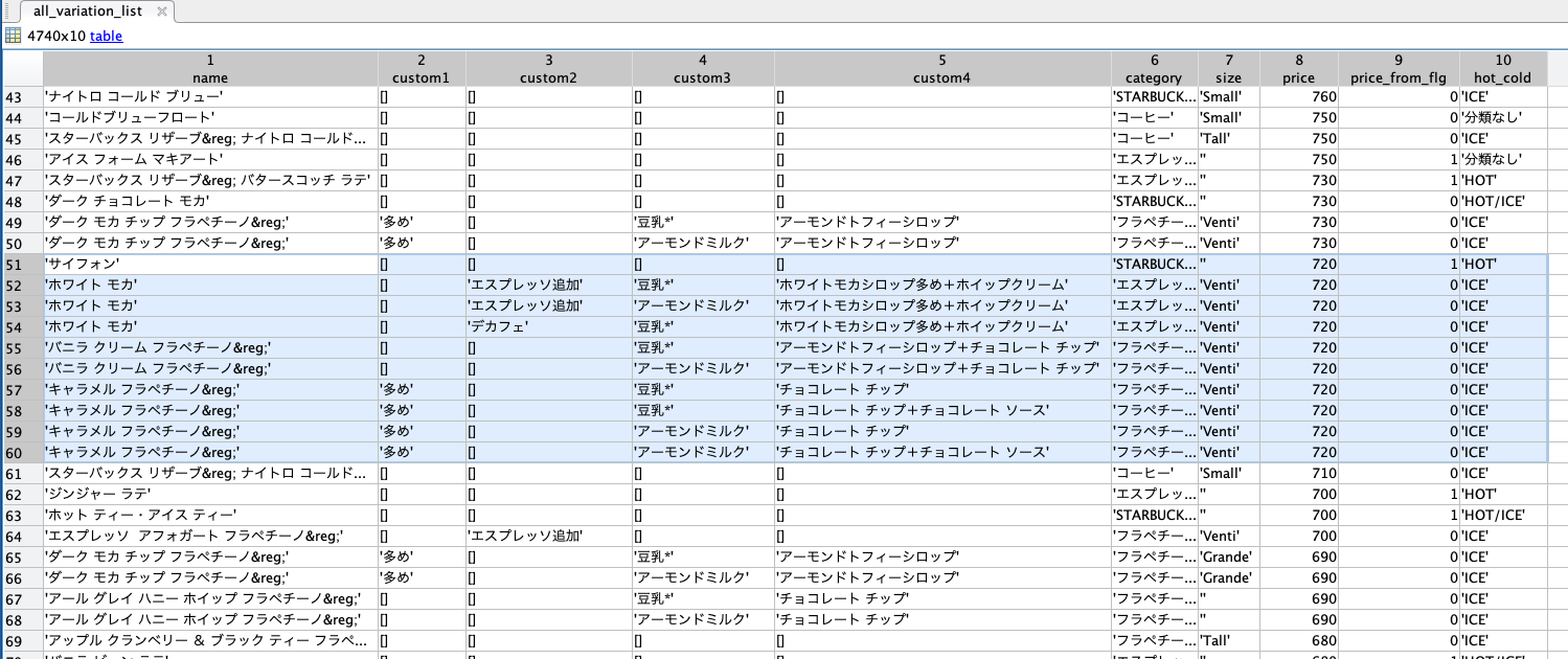
使いそうな物としてはproduct_code,product_name,category2_name,price,price_from_flg,size,chunk_productsです。
- product_code: ビバレッジ固有のurlに付けられる番号。
- product_name: 飲み物の名前
- category2_name: カテゴリ。エスプレッソ、フラペチーノなど。
- price: 基本サイズの時の値段
- price_from_flg: 価格が¥700〜など固定でない時にフラグが立つ。
- size: サイズ。あまり当てにならなかった。
- chunk_products: この下にもツリーが入っている。項目は親と同じでサイズ別の値段などが取れる。
ここまでのコードです。
% メニューのjson
product_list_url = "https://product.starbucks.co.jp/api/category-product-list/beverage/index.json";
product_list_json = webread(product_list_url);

product_list_num = size(product_list_json,1); % リストのサイズ

% 構造体の定義(tableにすりゃよかった)
product_list_extract = struct('code',{},'name',{},'custom1',{},'custom2',{},'custom3',{},'custom4',{},'category',{},'size',{},'price',[],'price_from_flg',[],'hot_cold',[]);

% 各メニューでサイズ別に表を展開する
for idx = 1:product_list_num
    product_tmp = product_list_json(idx,1);

    % サイズが1つのみの時
    if isempty(product_tmp.chunk_products)
        product_list_extract(end+1).code = product_tmp.product_code;
        product_list_extract(end).name = product_tmp.product_name;
        product_list_extract(end).category = product_tmp.category2_name;

        % サイズが固定の時はカップサイズに値が入っていないので0にする
        if isempty(product_tmp.cup_size)
            product_tmp.cup_size = 0;
        end

        % カップサイズの番号を文字列に書き換え
        switch product_tmp.cup_size
            case 1
                product_tmp.cup_size = 'Small';
            case 2
                product_tmp.cup_size = 'Tall';
            case 3
                product_tmp.cup_size = 'Grande';
            case 4
                product_tmp.cup_size = 'Venti';
            otherwise
                product_tmp.cup_size = '';
        end

        % サイズや値段を書き込む
        product_list_extract(end).size = product_tmp.cup_size;
        product_list_extract(end).price = product_tmp.price;
        product_list_extract(end).price_from_flg = product_tmp.price_from_flg;

        % ホットやコールドの種類が固定の時はから配列になっているので0とする
        if isempty(product_tmp.hot_cold)
            product_tmp.hot_cold = 0;
        end

        % ホット、コールドを文字列に変換
        switch product_tmp.hot_cold
            case 1
                product_tmp.hot_cold = 'HOT';
            case 2
                product_tmp.hot_cold = 'ICE';
            case 3
                product_tmp.hot_cold = 'HOT/ICE';
            otherwise
                product_tmp.hot_cold = '分類なし';
        end

        % サイズ書き込み
        product_list_extract(end).hot_cold = product_tmp.hot_cold;

    % サイズが複数ある時
    else
        product_tmp = product_tmp.chunk_products;

        chunk_num = size(product_tmp,1); % バリエーションの数

        % バリエーションの数だけループ
        for idxx = 1:chunk_num

            % どうやらメニュー表に載せない物は値段が-100になっているっぽいので飛ばす。
            if product_tmp(idxx).price == -100
                continue;
            end

            % 以下基本的にバリエーションなしの時と同じことをする
            product_list_extract(end+1).code = product_tmp(idxx).parent_product_code;
            product_list_extract(end).name = product_tmp(idxx).product_name;
            product_list_extract(end).category = product_tmp(idxx).category2_name;

            if isempty(product_tmp(idxx).cup_size)
                product_tmp(idxx).cup_size = 0;
            end

            switch product_tmp(idxx).cup_size
                case 1
                    product_tmp(idxx).cup_size = 'Small';
                case 2
                    product_tmp(idxx).cup_size = 'Tall';
                case 3
                    product_tmp(idxx).cup_size = 'Grande';
                case 4
                    product_tmp(idxx).cup_size = 'Venti';
                otherwise
                    product_tmp(idxx).cup_size = '';
            end

            product_list_extract(end).size = product_tmp(idxx).cup_size;
            product_list_extract(end).price = product_tmp(idxx).price;
            product_list_extract(end).price_from_flg = product_tmp(idxx).price_from_flg;

            if isempty(product_tmp(idxx).hot_cold)
                product_tmp(idxx).hot_cold = 0;
            end

            switch product_tmp(idxx).hot_cold
                case 1
                    product_tmp(idxx).hot_cold = 'HOT';
                case 2
                    product_tmp(idxx).hot_cold = 'ICE';
                case 3
                    product_tmp(idxx).hot_cold = 'HOT/ICE';
                otherwise
                    product_tmp(idxx).hot_cold = '分類なし';
            end

            product_list_extract(end).hot_cold = product_tmp(idxx).hot_cold;
        end
    end

end

product_list_extract_num = size(product_list_extract,2);
カスタマイズのJSONもあった。
デベロッパツールって偉大ですね。各メニューでどういったカスタムが可能であるかもJSONに格納しているみたいです。
このjsonは
'x' + 'product_code' -> hot/cold -> baseItemId, baseItemName
の階層で情報が入っています。最下層にはおすすめカスタムのレイが入っていますが、この2つだけしか使いません。次にbaseItemIdからそのメニューで選びうるカスタム項目を取得します。そのjsonのurlはこのように決まっているようです。
% カスタムの選択肢jsonのurl
customize_url = "https://dyf.starbucks.co.jp/data/base-item/option/" + base_item_id + ".json";
このカスタムリストは、スタバのオンラインでのカスタムお試しサイトで選択できるものです。実際にはチョコチップとホイップ追加を同時に頼めたりするのですが、それをやりだすととんでもないことになるのでサイト上で選択できるもののなかでの最適値を探すことにします。
そして、各カスタム後のjsonファイルも存在し、
custom_identifier_url = "https://dyf.starbucks.co.jp/data/calling/identifer/" + base_item_id + ".json";で、各カスタマイズ後のメニューの詳細をとってくることができます。
それがあるならcustomize_urlいらないじゃんとなるのですが、custom_identifier_urlでとってくると、ミルクのカスタマイズ項目に今は存在しないカスタムが出てきてしまうので、両者とも必要なんです(涙)結局カスタマイズのところのコードは以下のようになりました。
%% カスタムできるメニューたち
custom_list_url = "https://dyf.starbucks.co.jp/data/calling/jan/index.json";
custom_list_json = webread(custom_list_url);
custom_list_fieldnames = fieldnames(custom_list_json); % フィールド名とproduct_codeが対応している

custom_list_num = size(custom_list_fieldnames,1);

custom_product_list = struct('code',{},'name',{},'custom1',{},'custom2',{},'custom3',{},'custom4',{},'category',{},'size',{},'price',[],'price_from_flg',[],'hot_cold',[]);

% カスタムリストをループ
for idx = 1:custom_list_num
    field_name = custom_list_fieldnames{idx};
    code_name = erase(field_name,'x');

    % メニュー表にあるproduct_codeの番号でループ
    for idxx = 1:product_list_extract_num

        % product_codeとカスタムリストの番号が一致したらカスタマイズの組み合わせ計算開始
        if code_name == product_list_extract(idxx).code
            custom_field_tmp = custom_list_json.(field_name);
            hot_cold_name = fieldnames(custom_field_tmp);
            hold_cold_num = size(hot_cold_name,1);

            % ホットorコールド
            for idxxx = 1:hold_cold_num
                base_item_id = custom_field_tmp.(hot_cold_name{idxxx}).baseItemId;

                % カスタムの選択肢jsonのurl
                customize_url = "https://dyf.starbucks.co.jp/data/base-item/option/" +...
                    base_item_id + ".json";
                customize_json = webread(customize_url);

                % 各カスタム項目の選択肢の数
                coffee_custom_num = size(customize_json.coffee,1);
                espresso_custom_num = size(customize_json.espresso,1);
                milk_custom_num = size(customize_json.milk,1);
                topping_custom_num = size(customize_json.toppingsComb,1);

                % カスタム不可能な物はサイズがゼロなので1にしとく
                if coffee_custom_num == 0
                    coffee_custom_num = 1;
                end
                if espresso_custom_num == 0
                    espresso_custom_num = 1;
                end
                if milk_custom_num == 0
                    milk_custom_num = 1;
                end
                if topping_custom_num == 0
                    topping_custom_num = 1;
                end

                % コーヒーカスタムのループ
                for id_coffee = 1:coffee_custom_num

                    add_price1 = 0;

                    if isempty(customize_json.coffee) % カスタム不可能な時
                        coffee_custom_id = '0';
                        custom1 = '';
                    elseif customize_json.coffee(id_coffee).default_flg == '1' % カスタムがデフォルトの時
                        coffee_custom_id = customize_json.coffee(id_coffee).coffeeId;
                        custom1 = '';
                    else
                        coffee_custom_id = customize_json.coffee(id_coffee).coffeeId;
                        custom1 = customize_json.coffee(id_coffee).coffeeName;
                    end
                    % エスプレッソカスタムのループ
                    for id_espresso = 1:espresso_custom_num

                        add_price2 = 0;

                        if isempty(customize_json.espresso)
                            espresso_custom_id = '0';
                            custom2 = '';
                        elseif customize_json.espresso(id_espresso).default_flg == '1'
                            espresso_custom_id = customize_json.espresso(id_espresso).espressoId;
                            custom2 = '';
                        else
                            espresso_custom_id = customize_json.espresso(id_espresso).espressoId;
                            custom2 = customize_json.espresso(id_espresso).espressoName;
                        end
                        % ミルクカスタムのループ
                        for id_milk = 1:milk_custom_num

                            add_price3 = 0;

                            if isempty(customize_json.milk)
                                milk_custom_id = 0;
                                custom3 = '';
                            elseif customize_json.milk(id_milk).default_flg == '1'
                                milk_custom_id = customize_json.milk(id_milk).milkId;
                                custom3 = '';
                            else
                                milk_custom_id = customize_json.milk(id_milk).milkId;
                                custom3 = customize_json.milk(id_milk).milkName;
                            end
                            % トッピングのループ
                            for id_topping = 1:topping_custom_num

                                add_price4 = 0;

                                if isempty(customize_json.toppingsComb)
                                    topping_custom_id = '0';
                                    custom4 = '';
                                elseif customize_json.toppingsComb(id_topping).default_flg == '1'
                                    topping_custom_id = customize_json.toppingsComb(id_topping).toppingsCombId;
                                    custom4 = '';
                                else
                                    topping_custom_id = customize_json.toppingsComb(id_topping).toppingsCombId;
                                    custom4 = customize_json.toppingsComb(id_topping).toppingsCombName;
                                    add_price4 = str2double(extractBetween(customize_json.toppingsComb(id_topping).toppingComments,'¥',')'));
                                end

                                % カスタムなしならcontinue
                                if isempty(custom1) && isempty(custom2) && isempty(custom3) && isempty(custom4)
                                    continue;
                                end

                                custom_identifier_url = "https://dyf.starbucks.co.jp/data/calling/identifer/" + base_item_id + ".json";
                                custom_identifier_json = webread(custom_identifier_url);
                                coffee_field_name = "coffee_" + coffee_custom_id;
                                espresso_field_name = "espresso_" + espresso_custom_id;
                                milk_field_name = "milk_" + milk_custom_id;
                                topping_field_name = "toppingsComb_" + topping_custom_id;

                                custom_identifier = custom_identifier_json.(coffee_field_name).(espresso_field_name).(milk_field_name).(topping_field_name);
                                how_to_order_text = custom_identifier.howToOrder;
                                add_price = 50*count(how_to_order_text,"50");

                                % 格納
                                custom_product_list(end+1).code = product_list_extract(idxx).code;
                                custom_product_list(end).name = product_list_extract(idxx).name;
                                custom_product_list(end).custom1 = custom1;
                                custom_product_list(end).custom2 = custom2;
                                custom_product_list(end).custom3 = custom3;
                                custom_product_list(end).custom4 = custom4;
                                custom_product_list(end).category = product_list_extract(idxx).category;
                                custom_product_list(end).size = product_list_extract(idxx).size;
                                custom_product_list(end).price = product_list_extract(idxx).price + add_price;
                                custom_product_list(end).price_from_flg = product_list_extract(idxx).price_from_flg;

                                switch hot_cold_name{idxxx}
                                    case {'hot','HOT'}
                                        hot_cold_name{idxxx} = 'HOT';
                                    case {'cold','ICE'}
                                        hot_cold_name{idxxx} = 'ICE';
                                    otherwise
                                        hot_cold_name{idxxx} = '分類なし';
                                end

                                custom_product_list(end).hot_cold = hot_cold_name{idxxx};
                            end
                        end
                    end
                end
            end
        end
    end
end
最後に
最後にカスタムなしのメニュー表とカスタムありの表を連結します。
%% 連結
all_variation_list = [product_list_extract, custom_product_list];
all_variation_list = struct2table(all_variation_list);
ind = cellfun(@isempty,all_variation_list.price);
all_variation_list(ind,:) = [];
all_variation_list.price = cell2mat(all_variation_list.price);
all_variation_list = sortrows(all_variation_list,'price','descend');
all_variation_list.code = [];
私は構造体でメニュー表を作ってしまったのでtableに直す作業が入っていますが、最初からtableにしておけばこうはならなかったでしょう。
結果
前回記事より、カップ持参による20円引きを利用すれば720円、利用しなければ700円までがリワードでただになるので、作成した表で確認すると
720円ぴったりのメニュー
- サイフォン(STARBUCKS RESERVE®︎ ROASTERY限定)
- アイス エクストラショット ソイ エクストラシロップ ホワイト モカ with ホイップクリーム Venti®︎
- アイス エクストラショット アーモンド ミルク エクストラシロップ ホワイト モカ with ホイップクリーム Venti®︎
- アイス ディカフェ エクストラシロップ ソイ ホワイト モカ with ホイップクリーム Venti®︎
- ソイ アーモンドトフィー バニラ クリーム フラペチーノ ® with チョコレートチップ Venti®︎
- アーモンド ミルク アーモンドトフィー バニラ クリーム フラペチーノ ® with チョコレートチップ Venti®︎
- エクストラコーヒー ソイ キャラメル フラペチーノ® with チョコレートチップ Venti®︎
- エクストラコーヒー ソイ チョコレート チップ キャラメル フラペチーノ® with チョコレートソース Venti®︎
- エクストラコーヒー アーモンド ミルク キャラメル フラペチーノ® with チョコレートチップ Venti®︎
- エクストラコーヒー アーモンド ミルク チョコレート チップ キャラメル フラペチーノ® with チョコレートソース Venti®︎
700円ぴったりのメニュー
- ジンジャー ラテ(¥700〜)
- ホット ティー・アイス ティー(STARBUCKS RESERVE®︎ ROASTERY限定)
- エクストラショット エスプレッソ アフォガート フラペチーノ® Venti®︎
となります。720円の方がカスタムが豊富なのでカップは持参した方がいいでしょう。
- 投稿日:2021-01-11T21:20:30+09:00
iOS Safariでも下までスクロールするモーダルの作り方
iOS Safariでモーダルを表示した際、作り方によっては画面下部のツールバーが表示されているとモーダルを下までスクロールすることができないことがあります。
おそらくheightのとり方に問題がありそうで、width: 100vw; height: 100vh;で設定しているときに発生しました。
それをtop,right,bottom,leftにすることで解決することができました。コードとしては下記のようになります。
<div class="modal">
  <div class="modal_background"></div>
  <div class="modal_content_wrap">
    <div class="modal_content">モーダル</div>
  </div>
</div>
<style>
.modal {
  position: fixed;
  top: 0;
  right: 0;
  bottom: 0;
  left: 0;
  z-index: 1000;
  overflow: scroll;
}
.modal_background {
  position: fixed;
  top: 0;
  right: 0;
  bottom: 0;
  left: 0;
}
/* モーダルをセンタリングするため */
.modal_content_wrap {
  min-height: 100vh;
  display: flex;
  align-items: center;
  justify-content: center;
}
.modal_content {
  height: 1000px;
}
</style>
ちなみに元の作りは下記のようにしていました。
<style>
.modal {
  width: 100vw;
  height: 100vh;
  position: fixed;
  top: 0;
  left: 0;
  z-index: 1000;
  overflow: scroll;
}
</style>
- 投稿日:2021-01-11T21:06:29+09:00
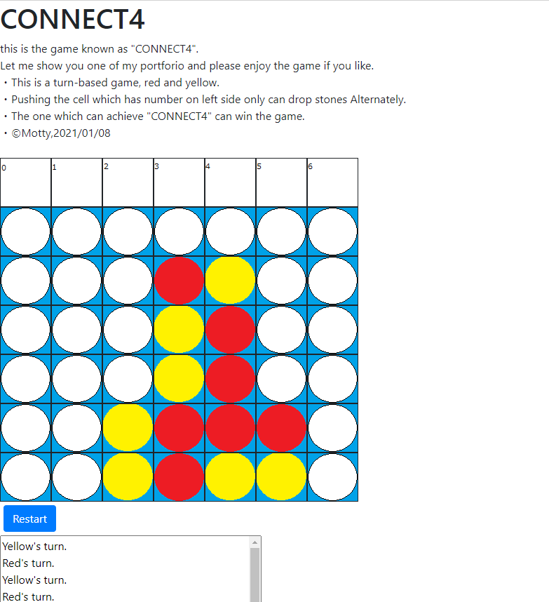
Javascriptで外国で有名なゲーム”CONNECT4”を作ってみた
こんにちは、Mottyです。
今回もJavascriptを使ったテーマでやっていきます。はじめに
Connect4をご存知いらっしゃる方は多いかと思いますが、簡単に申し上げますと四目並べです。
先攻と後攻が交互にボード上に駒を打ち、縦横斜めのいづれかに4目以上並べれば勝ち・・・というシンプルなゲームです。
Javascriptの勉強の題材にはちょうど良いかなと思って、
自分の家にも4目並べがありますのでどなたか一緒に遊びませんか(急なお誘い)開発の準備
・HTML/CSS/Javascript
・Node.js(デバッグ用)
・Bootstrap4(ボタン用)描画ソフトはペイント、
開発環境はVisualStudioCodeで行いました。全部解説すると冗長になるので、作ってみて勉強になった部分だけ載せていきたいと思います。
↓完成版はこんな感じになりました。
盤面の描画
ボードゲーム開発において悩んだのは、盤面をどう扱うか、ということでした。HTMLに直書きしても
よかったのですが、盤面情報を配列に持たせておいてそれを元に画面に描画していく、というような
やり方を行いました。(いわゆるModel-View分離型というやつですかね・・・?)script.jsvar boardarray = [ [0,0,0,0,0,0,0], [0,0,0,0,0,0,0], [0,0,0,0,0,0,0], [0,0,0,0,0,0,0], [0,0,0,0,0,0,0], [0,0,0,0,0,0,0]] function load_board(array) { board.innerHTML = ""; for (let i = 0; i < array.length; i++) { for (let j = 0; j < array[i].length; j++) { if(array[i][j] == 0) { board.appendChild(blank.cloneNode(true)) } else if(array[i][j] == 1) { board.appendChild(red.cloneNode(true)) } else if(array[i][j] == -1) { board.appendChild(yellow.cloneNode(true)) } } board.innerHTML += "<br>"; } }load_board(array)では、先攻を1、後攻を−1としております。
ユーザーの入力を受け取って適宜盤面を更新し、それを読み込むというロジックでやってますね。勝利判定
以下、勝利判定の関数です。ユーザーが石打ちを入力するたびに稼働します。
縦横ななめのいずれかが4つ以上並んでいれば良いので、打った位置から周り4方向(実質は8方向?)確認し、
いずれかの方向において自分と同じ石の数が連続して3つ以上あれば、1(先攻)/-1(後攻)、なければ0を返すfunctionにチェックしてもらってます。[Something went wrong]()
script.jsfunction VictorysNumber(boardarr, Row, Col) //ボードと現在行・現在列を引数として代入 //8方向を見て連続番号を管理する配列に格納していく。 //格納した配列をもとに、勝利かどうかを判定。 //→方向が0番、以降45°左回転するごとに番号を1番加算し、合計7番までの8方向を定義する。 { var continuousNum = [0,0,0,0,0,0,0,0]//1,2,3,4,5,6,7,8番方向 const directionList =[ [0,1],//0番 [-1,1],//1 [-1,0],//2 [-1,-1],//3 [0,-1],//4 [1,-1],//5 [1,0],//6 [1,1]] //7 //スコープははじめ置かれた石と同じ var scopeRow = Row; var scopeColumn = Col; //スコープ開始 for (let i = 0; i < 8; i++) { //textlog.value += "勝利判定関数の開始。ScopeRow="+scopeRow+ "、scopeColumn = " +scopeColumn +"です。\n"; //textlog.value += i+"番方向を見ます。"; while(true) { //与えられた方向への移動操作 scopeRow += directionList[i][0]; scopeColumn += directionList[i][1]; try { if(0 <= scopeRow <= 5 && 0 <= scopeColumn <= 6 && boardarr[scopeRow][scopeColumn] == boardarr[Row][Col]) //起点と今見ている場所が同じであればカウントを増やす { continuousNum[i]++; //textlog.value += i +"番方向に" + continuousNum[i] + "個の連続した石が発見されました。\n"; } else { //textlog.value += i +"番方向には同じ石は見つかりませんでした。\n"; break; //値が同じでなければ(連番でなければ)break } } catch(e) { break; //ボードを超えた値を参照するとエラーが出る。飛び越えてもbreak. } } //スコープを元の位置に戻す。 scopeRow = Row; scopeColumn = Col; } //勝利判定 if( continuousNum[0] + continuousNum[5] == 3 || continuousNum[1] + continuousNum[6] == 3 || continuousNum[2] + continuousNum[7] == 3 || continuousNum[3] + continuousNum[8] == 3 ) { return turn; //勝利者決定 } else { return 0; //勝負がついていない場合は0を返す。 } }※これは以前のExcelで五目並べを作ったときとほぼ同じアルゴリズムを採用しております。
終わりに
やはりJavascriptを少しでもいいから勉強すると、View画面作成も怖じ気づかなくなりますね・・・!
今ならなんでもできそうな気がしますが、きっと気のせいで実は色々と奥が深い分野だと思います()全ソースコードはgithubに載せております。
https://github.com/YukiYamamotty0713/connect4/参考URL
今回は下記の動画を大変参考にさせていただきました。メモ帳を使って1時間でオセロゲームを
仕上げるという凄腕のプログラマーさんの動画です。
・ニコニコ動画・【プログラミング】オセロを1時間で作ってみた【実況解説】
https://www.nicovideo.jp/watch/sm8391299

- 投稿日:2021-01-11T17:49:26+09:00
tableタグの中でflex-boxを使うとborderが重なるのを回避する
現象
flexクラスがついたtdの中身を上下中央の横並べにしようとすると、flexクラスがついたtdのみborderが太くなる
See the Pen table by kena-nk (@kena-nk) on CodePen.
回避策
① tdの中にdivタグを入れて、そこにflexクラスを当てると回避できる
index.html<table> <tr> <td>aaa</td> <td> <div class="flex"> <span class="badge">new</span> <div> <span>aaa</span> </div> </div> </td> <td>aaa</td> </tr> ...省略 </table>② div要素をインライン要素にして回避する
index.html<table> <tr> <td>aaa</td> <td> <span class="badge">new</span> <div style="display: inline"> <span>aaa</span> </div> </td> <td>aaa</td> </tr> ...省略 </table>③ 要素を指定する系で解決する
style.csstable > td > div:nth-of-type(2) { display: inline; }↑の
nth-of-type(2)はdivの2つ目という指定ではなく、表の左から2列目を指している。なぜtdタグに
display:flexを当てるとうまくいかなくなるのか(推測)
tdタグはdisplay: table-cellと同じ役割を担っている。なので、
tdタグにdisplay: flexを当ててしまうと、同じテーブル内にdisplay: table-cellとdisplay: flexが共存してしまう感じになるので、結果うまくいかなくなるのかな〜と推測した。なぜ共存するとおかしくなってしまうのか厳密には分からないので誰か知ってる人いたら教えて欲しい・・・!
追記 (2021/01/12)
@nagtkk さんにコメントをいただきました!
tdに
display: flexを当てるとdisplay: table-cellが自動生成されてしまい、その下にdisplay: flexがくるためborder-collapse: collapseが効かなくなり2重になって見えるようです!
- 投稿日:2021-01-11T16:58:14+09:00
jQueryとCSSでマウスカーソルを良い感じに作る!
最近マウスカーソルがカスタマイズされたイケイケのwebサイトをよく見かけるので、作りました。
ただUIの事を考えると、変にカスタマイズされたカーソルはストレスでしかないのでやりすぎはNGです。作り方
以下のように2つの円形を作って、1つは通常のカーソルの動き、2つは少し遅らせ追従するような動きになるように作りました。
jQueryで座標の取得とクラス追加、cssでカーソルの装飾をしていきます。
HTML
div.cursorの中に2つspanが入っていて、dot1とdot2で別々の動きを作っていく
html<div class="cursor"> <span class="dot1"></span> <span class="dot2"></span> </div>jQuery
- [ $(window).mousemove ]でカーソルのホットスポットが要素内(body)で動いた時の処理
- [ left: e.pageX , top: e.pageY ]で座標を取得
- [ $('a').on('mouseenter', function () { } ] でaタグにホバーしたときに[active]というクラスを追加
jquery$(window).mousemove(function (e) { $('.cursor span').css({ left: e.pageX, top: e.pageY }) }) $('a').on('mouseenter', function () { $('.cursor span').addClass('active'); }) $('a').on('mouseleave', function () { $('.cursor span').removeClass('active'); })CSS
- [cursor: none;]でデフォルトのカーソルを非表示
- [.cursor span { } ]の中で基本的な形(今回だと円形)を作る
- dot1とdot2にそれぞれの形を作る
- [.active]でホバー時の形を作る
css* { cursor: none; } .cursor span { height: 10px; width: 10px; border-radius: 100%; transform: translate(-50%, -50%); position: absolute; z-index: 1; pointer-events: none; } .cursor span.dot1 { background: rgba(98, 77, 112, 0.8); transition: width 0.2s, height 0.2s; } .cursor span.dot1.active { height: 50px; width: 50px; background: rgba(98, 77, 112, 0.3); } .cursor span.dot2 { height: 20px; width: 20px; border: solid 1px #624d70; transition: top 0.2s, left 0.2s, width 0.5s, height 0.5s; transition-timing-function: ease-out; } .cursor span.dot2.active { height: 80px; width: 80px; }2つ目の円形の動きの遅延
円形の1つの動きを少し遅らせて、後を追うような動きにしています。
この動きが遅い円形を作ることでマウスカーソルの良い感じが増します!
動きの作り方は、cssの[ transition: top 0.2s, left 0.2s, width 0.5s, height 0.5s; ]で指定しています。
- 追従の遅延は [ top 0.2s, left 0.2s ]
- 大きさの遅延は [ width 0.5s, height 0.5s ]
それぞれの数字を変えると動きを変えることができます。
transitionについて詳しくは以下
https://developer.mozilla.org/ja/docs/Web/CSS/transitionホバーの動きをCSSだけでなく、 jQueryを絡ませる理由
aタグにホバーしたときに[::hover]ではなく[.addClass('active')]を使っています。
理由リンクだけでなく、画像やテキストにもホバー時の変化をもたせるためにjQueryでクラスを付けています。
(最初は[::hover]でしていましたが、最近jQueryでクラスを付けるようにしました。こっちのほうが都合がいい!)ipadのようにテキスト部分にホバーすると縦棒になるようにカスタマイズ
以下のように特定の指定部分にホバーすると違う形になるようにする。
CSSとjQueryに以下を追加
css.cursor span.dot1.text_active { height: 1.4em; width: 2px; border-radius: 0; } .cursor span.dot2.text_active { display: none; }jquery$('p').on('mouseenter', function () { $('.cursor span').addClass('text_active'); }) $('p').on('mouseleave', function () { $('.cursor span').removeClass('text_active'); })わかりやすくaタグとpタグにホバーすると形が変わるように書きましたが、実際は特定クラスを作っておいて指定する使い方のほうが良いかと思います。
まとめ
少ないコードでwebサイトの印象がガラッと変わるのでおすすめです!
僕はsassの変数を使ってデザインガイドを作っているのでjQueryとCSSを使いましたが、jsだけで作ってプラグイン化してもいいかと思います。
時間があればjsだけで完結するコードも公開します。


- 投稿日:2021-01-11T14:37:08+09:00
AmazonとTwitterの吹き出しコンポーネントの実装方法を調査してみた
吹き出しコンポーネントとは
吹き出しコンポーネントは会話などを表示するために方向を表示する三角のアローとボーダーのある四角いボックスを組み合わせたUIコンポーネントを意味します。英語ではSpeech Balloonと言うそうです。会話のほかに、ボタンの機能説明やメニューの拡張などにも使います。この記事の目的
この記事では吹き出しコンポーネントの実装・拡張しやすいベストプラクティスを探します。
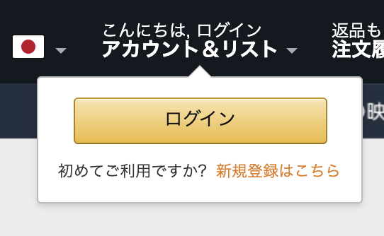
Amazonパターン
Amazonではトップナビゲーションバーのログインボタンをホバーしている間にログインと新規登録を促す吹き出しが出てきます。
吹き出し部分のHTML構造は下のように、
<header>
    <div id="nav-belt">
        <div class="nav-left"></div>
        <div class="nav-fill"></div>
        <div class="nav-right">
            <div id="nav-tools">
                <a class="nav-a nav-a-2 nav-truncate" id="nav-link-accountList">
                    <div class="nav-line-1-container"></div>
                    <span class="nav-line-2 nav-long-width"></span>
                    <span class="nav-line-2 nav-short-width"></span>
                </a>
            </div>
        </div>
    </div>
    <div id="nav-flyout-anchor">
        <div id="nav-signin-tt nav-flyout">
            <div class="nav-arrow">
                <div class="nav-arrow-inner">
            </div>
            <div id="nav-signin-tooltip"></div>
            <div class="nav-flyout-buffer-left"></div>
            <div class="nav-flyout-buffer-right"></div>
            <div class="nav-flyout-buffer-top"></div>
            <div class="nav-flyout-buffer-bottom"></div>
        </div>
    </div>
</header>
なります。
ポイント解説
<div id="nav-belt">はナビバーを指します。そして、吹き出しの部分はnav-flyoutと名付けている。このネーミングから、吹き出しはナビバーに専属していることが分かり、さらにログインボタンの吹き出し以外にもほかのナビバー項目も吹き出しが存在することが推測できます。実際に、ログインボタンの左隣のリージョンアイコンの吹き出しも用意されています。ログインボタンとログインボタンの吹き出しの間は直接なネストではなく、ナビバー全体(
<div id="nav-belt">)の下にナビバー用の吹き出しセクション(<div id="nav-flyout-anchor">)を入れることで、ナビバー項目と吹き出しの上下位置は確定されます。そして、後からに他項目の吹き出しを追加したい時に<div id="nav-flyout-anchor">に新しい<div>を追加するだけで済むようになります。ナビバーの実装をいじる必要がなくなり、拡張性はよくなります。吹き出しコンポーネントの表示は
<div id="nav-signin-tt nav-flyout">に対してdisplay: none;指定の有無によってコントロールしています。吹き出しの左右位置はJSを使って、
<div id="nav-signin-tt nav-flyout" style="left: 120px;">のように動的に設定します。このために吹き出しdivをposition: absolute;にする必要があり、同時にその親コンポーネント<div id="nav-flyout-anchor">はposition: relative;にする必要があります。
style="left: 120px;"の中は数値はElement.getBoundingClientRect()を使ってログインボタンのウインドーに対する位置を取得できます。ウインドーサイズが変わるにつれて、吹き出しの位置も動くとしたいなら、イベントトリガーwindow.resizeを追加するといいでしょう。三角アローはCSSのボータートリックを利用して作られています。上向きのアローならば、
div.arrow-up {
  border-right: 10px solid transparent;
  border-left: 10px solid transparent;
  border-bottom: 10px solid white;
}
によって作れます。
三角アローと吹き出し本体の位置調整は
left: 50%; top: -11px;のように指定しています。当然、三角アローのpositionをabsoluteに指定する必要があります。left: 50%;は三角アローを吹き出しの真ん中に持っていくため、top: -11px;は三角アラーを吹き出しの外に突っ張るようにするための指定です。同じロジックで、三角アラーを下向きにする時はbottomをマイナスの数値に指定すればいいでしょう。Twitterパターン
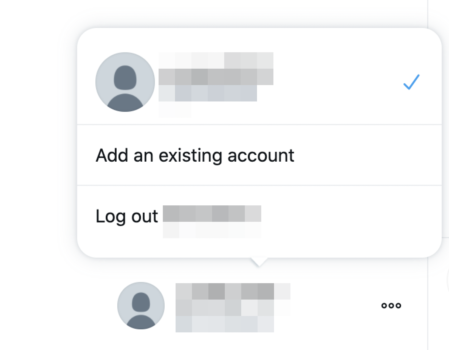
Twitterではログイン後、サードバーの下にある自分のアイコンをクリックした時にアカウントスイッチとログアウトを促す吹き出しが出てきます。
吹き出し部分のHTML構造は下のように、
<div id="layers">
    ...
    <div class="css-idbjc4n r-1xcajam" style="bottom: 79px; left: 21px;">
        <div class="css-idbjc4n">
            <svg class="r-uoibet r-9uutrm r-lrsllp" style="left: calc(138px);"></svg>
            <div class="css-1dbjc4n r-1azx6h r-7mdpej r-1vsu8ta r-ek4qxl r-1dqxon3 r-1ipicw7">
                <div class="css-1dbjc4n r-1w50u8q">
                    <li></li>
                    <div></div>
                    <div></div>
                </div>
            </div>
        </div>
    </div>
</div>
なります。
ポイント解説
Twitterの場合、
scopedスタイルではなく、1種類のスタイルを1クラス名に集約するようにスタイルを定義しています。例えば、上の例に何度も出てきたclass="css-idbjc4n"はFlexboxのスタイルを指定するクラスとなっており、このクラスのスタイルをいじると、クラス名にcss-idbjc4nが入っている全divが影響を受けます。そのため、HTMLのDOMツリーを見る時の可読性は非常に低くなっています。一方的に、スタイル共通化によって、画面全体のスタイルの統一感が向上します。
<div id="layers">で分かるように、Twitterでは吹き出しのために画面全体に新しいレイヤーを追加しています。三行目の
<div class="css-idbjc4n r-1xcajam" style="bottom: 79px; left: 21px;">は吹き出しのルートノードとなっています。positon: fixed;にすることで、画面(Viewport)に対する位置を設定することが可能となります。style="bottom: 79px; left: 21px;"はその位置の指定となります。具体的な数値はAmazonパターンと同様、JSを使って、実際のログインアイコン(上のスクリーンショットの一番下)の位置から計算している可能性が高いでしょう。ただ、画面全体に対して位置を指定しているから、水平位置leftのほかに、垂直位置のbottomも指定しなくてはなりません。吹き出しコンポーネントの表示は、上の吹き出しルートノードの生成と削除によってコントロールしています。実際、ログインボタンをホバーすると、吹き出しのDOMノードは生成されます。
<svg class="r-uoibet r-9uutrm r-lrsllp" style="left: calc(138px);"></svg>は三角アローを指しています。TwitterではSVGで三角を描画しています。SVGで描画した三角はデフォルトで上向きとなっており、三角アローの向き先の調整はtransform: rotate(180deg);によって実現しています。水平位置では
style="left: calc(138px);のように調整していて、138pxという数値はおそらく吹き出しのサイズと三角アローのサイズから計算した値と考えられます。CSSを確認したところ、吹き出しボックスはwidth: 300px;で、三角アローのサイズはwidth: 24px;となっているから、leftからは300/2 - 24/2 = 138pxを移動すれば、三角アローは吹き出しの真ん中に行くでしょう。比較
Amazon コメント 吹き出しコンポーネントの親 <div id="nav-flyout-anchor"><div id="layers">Amazonではナビバー専用の吹き出しのために、ナビバーの下に吹き出しの anchorが置いてある。Twitterでは画面全体に新しいレイヤーを追加。anchorを入れることのメリットは吹き出しとその対象の間の垂直位置は気にしなくて済むこと。吹き出しと吹き出し対象のコンポーネントを一緒に変更する場合は便利だろう。一方で、anchorの範囲以外に吹き出しを追加すると、まずanchorを追加する必要がある。画面全体にレイヤーを追加することで元のコンポーネントと吹き出しは完全に独立となる。よって、各所に吹き出しを追加したり、削除したりすることも容易となるだろう吹き出しコンポーネントの位置 position: absolute;position: fixed;position: fixed;は画面全体(viewport)に対して位置を指定することになる吹き出しコンポーネントの位置指定 style="left: 120px;"style="bottom: 79px; left: 21px;"Twitterパターンは画面全体に対して位置指定となるので、 bottomとleft両方の指定が必要吹き出しコンポーネント中身のレイアウト display: flex;display: flex;吹き出しコンポーネントの表示 display: none;HTML要素の生成と削除 display: none;に設定する場合、レンダリング時に吹き出しなどのサブエレメントも一緒に生成することになるから、処理が重くなる可能性はある。一方、吹き出しコンポーネントが他の機能的コンポーネントから独立していない場合、吹き出しHTML要素の生成と削除する時に影響範囲の把握が難しくなる三角アローの作り方 CSSボーター SVG CSSボーターのトリックはとても賢いと思う 三角アローの位置 position: absolute;position: absolute;三角アローの位置指定 left: 50%; top: -10px;left: calc(138px); bottom: -10px;topとbottomにマイナスの数値を指定することで、実質三角アローを吹き出しの内部に治ることができ、三角アローによって位置がずれるなどの問題を解消 三角アローの向き先 border-topとborder-bottomの設定によるtransform: rotate(180deg);transform本当にいろんな使い方があるなと感心し、もっと活用して行きたい 参考
https://developer.mozilla.org/en-US/docs/Web/API/Element/getBoundingClientRect
https://www.amazon.co.jp/
https://www.twitter.com/

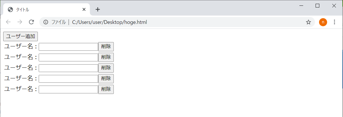
- 投稿日:2021-01-11T13:07:11+09:00
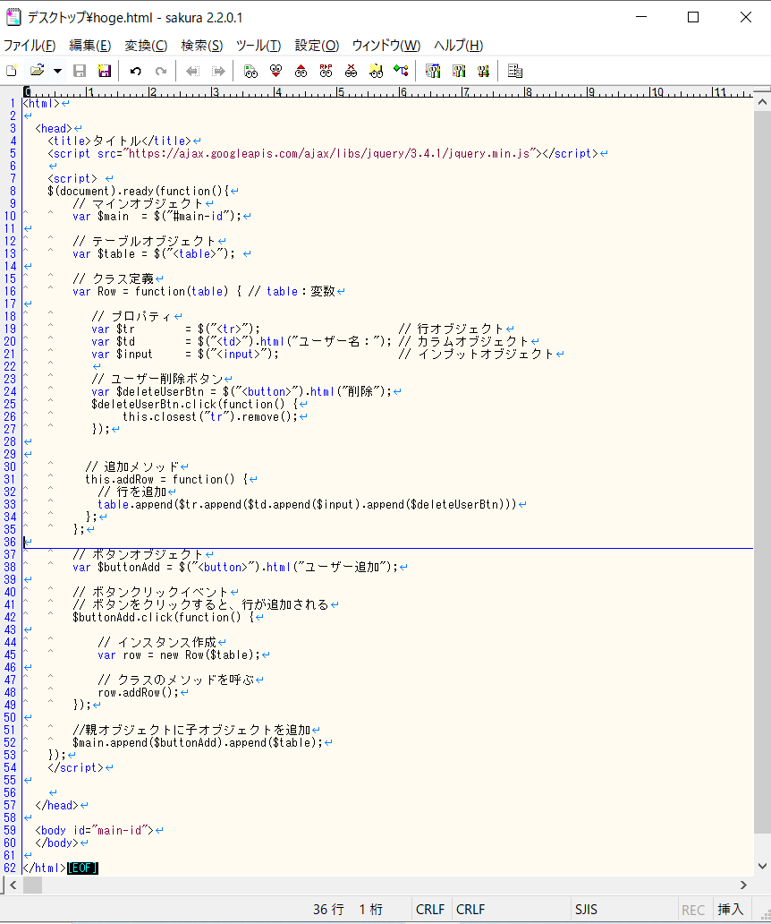
javasript, jquery(ユーザー追加)
初めに
Sakura EditorでJqueryでユーザー追加ページを作成する。
Sakura Editorのダウンロード
https://sourceforge.net/projects/sakura-editor/
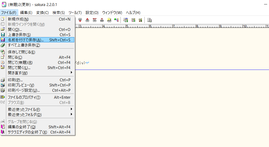
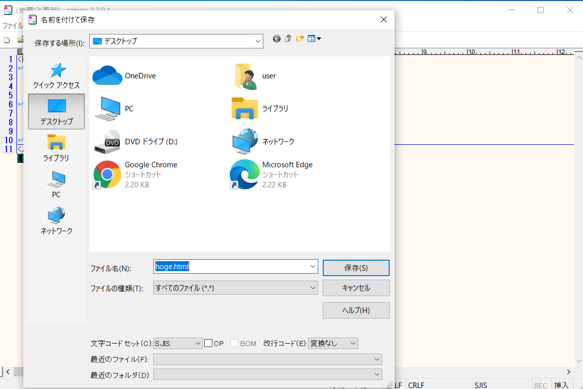
HTMLページを保存する
<html>
  <head>
   <title>タイトル</title>
   <script src="https://ajax.googleapis.com/ajax/libs/jquery/3.4.1/jquery.min.js"></script>
   <script>
    $(document).ready(function(){
        // マインオブジェクト
        var $main  = $("#main-id");

        // テーブルオブジェクト
        var $table = $("<table>");

        // クラス定義
        var Row = function(table) { // table:変数

           // プロパティ
           var $tr        = $("<tr>");                      // 行オブジェクト
           var $td        = $("<td>").html("ユーザー名:"); // カラムオブジェクト
           var $input     = $("<input>");                   // インプットオブジェクト

           // ユーザー削除ボタン
           var $deleteUserBtn = $("<button>").html("削除");
           $deleteUserBtn.click(function() {
                this.closest("tr").remove();
           });

          // 追加メソッド
          this.addRow = function() {
            // 行を追加
            table.append($tr.append($td.append($input).append($deleteUserBtn)))
          };
        };

        // ボタンオブジェクト
        var $buttonAdd = $("<button>").html("ユーザー追加");

        // ボタンクリックイベント
        // ボタンをクリックすると、行が追加される
        $buttonAdd.click(function() {

            // インスタンス作成
            var row = new Row($table);

            // クラスのメソッドを呼ぶ
            row.addRow();
        });

        //親オブジェクトに子オブジェクトを追加
        $main.append($buttonAdd).append($table);
    });
    </script>
  </head>
  <body id="main-id">
  </body>
</html>
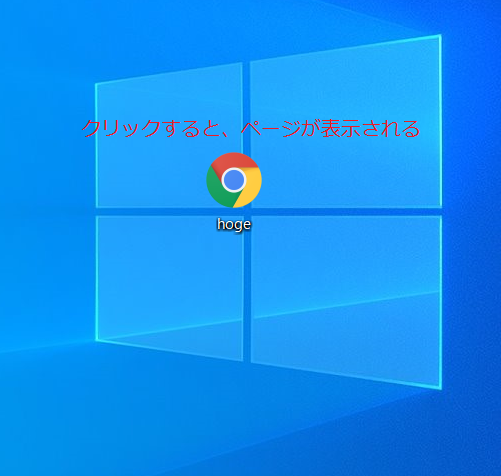
HTMLで保存して、実行する
以上
- 投稿日:2021-01-11T07:51:01+09:00
JavaScriptで押したボタンの文字を変更する方法
JavaScript初心者のメモとして「JavaScriptで押したボタンの文字を変更する方法」を残します。
様々な場所で使用されているボタンを押したらボタンの文字が変化する方法をメモしておきます。基本的に記載してあるコードをそのままコピーすればパソコンで実装できるように全て省略なしでコードを書いています。ボタンを押して文字を変更する方法
ボタンを押して文字を変更するHTMLです。
クリックするボタンを作ります。
ボタンにはid="btnをつけてJavaScriptで取得できるようにしておきます。hello.html<!DOCTYPE html> <html lang="ja"> <head> <meta charset="utf-8"> <title>ToDoリスト</title> <link rel="stylesheet" href="css/style.css"> </head> <body> //注目部分 <button id="btn">変化</button> // <script src="js/main.js"></script> </body> </html>次にJavaScript全体のコードです。
main.js'use strict' { const btn = document.getElementById('btn'); btn.addEventListener('click', () => { btn.textContent = '押されました'; }) }btnのidを取得して操作ができるようにしておきます。
const btn = document.getElementById('btn');addEventListenerでクリックした際にどうしたいかを指定します。
今回はボタンを押したらボタンの文字が変わるように設定します。
textContentを使用し中のテキストを変更します。btn.addEventListener('click', () => { btn.textContent = '押されました';以上がボタンを押した際にボタンの文字を変更する方法です。
これ以外にボタンを押したら、他の箇所の文字を変更したりすることも可能です。
それは改めてメモしたいと思います。最後までお読みいただきありがとうございました。