練習 まずは書き出し方法の整理のみ。 今後実施予定 自己紹介 始めた動機 ロードマップ
まずは書き出し方法の整理のみ。
今後実施予定
メディアクエリの使い方 個人アプリでレスポンシブ対応が必要だったので、その使い方を記事にまとめました。 index.blade.php <div class = "content"> @foreach($posts as $post) <img src="/storage/{{$post->image}}" class="image" width=293px height=293px> @endforeach </div> index.css @media (max-width: 1420px) { .content { margin: 90px 218px 0; } } @media (max-width: 1420px) { .image { width: 280px; height: 280px; } } @media (max-width: 1340px) { .content { margin: 90px 200px 0; } } @media (max-width: 1340px) { .image { width: 260px; height: 260px; } } @media (max-width: 1260px) { .content { margin: 90px 180px 0; } } @media (max-width: 1260px) { .image { width: 240px; height: 240px; } } こんな感じで要素の幅によって中身のサイズを調整してあげる。 検証機能を使えば、幅が簡単にわかるので、それを見ながら調整していけば、 自然にビューのレスポンシブができるようになります!
個人アプリでレスポンシブ対応が必要だったので、その使い方を記事にまとめました。
<div class = "content">
    @foreach($posts as $post)
      <img src="/storage/{{$post->image}}" class="image" width=293px height=293px>
    @endforeach
  </div>
@media (max-width: 1420px) {
  .content {
    margin: 90px 218px 0;
  }
 }

 @media (max-width: 1420px) {
  .image {
    width: 280px;
    height: 280px;
  }
 }

 @media (max-width: 1340px) {
  .content {
    margin: 90px 200px 0;
  }
 }

 @media (max-width: 1340px) {
  .image {
    width: 260px;
    height: 260px;
  }
 }

 @media (max-width: 1260px) {
  .content {
    margin: 90px 180px 0;
  }
 }

 @media (max-width: 1260px) {
  .image {
    width: 240px;
    height: 240px;
  }
 }
こんな感じで要素の幅によって中身のサイズを調整してあげる。 検証機能を使えば、幅が簡単にわかるので、それを見ながら調整していけば、 自然にビューのレスポンシブができるようになります!
リセットCSSには、 Eric Meyer’s “Reset CSS” 2.0 HTML5 Doctor Reset CSS Yahoo! (YUI 3) Reset CSS Normalize.css Reboot.css ress などいくつか既存のものがありますが、最低限リセットかけたい時は下記を使っています。 @charset "UTF-8"; html, body, h1, h2, p, ul, li { margin: 0; padding: 0; line-height: 1.0; } ul { list-style: none; } a { text-decoration: none; color: inherit; } img { border: none; vertical-align: bottom; vertical-align:bottom; max-width: 100%; } html { font-size: 62.5%; } body { background: #fff; color: #333; font-size: 1.6rem; font-family:"游ゴシック",YuGothic,"Hiragino Kaku Gothic ProN",Meiryo, sans-serif; } 色やフォントサイズは例です。 margin,padding,line-heightの余白リセットは、使用する要素にのみ当てています。デザインによって使用する要素が増えたら適時追加します。 html, body, h1, h2, h3, h4, p, ul, li, dl, dt, dd { margin: 0; padding: 0; line-height: 1.0; } table使用時 table { border-collapse: collapse; border-spacing: 0; } button・input・textarea使用時 input, button, select, textarea { appearance: none; background: transparent; border: none; border-radius: 0; font: inherit; outline: none; } textarea { resize: vertical; }
リセットCSSには、
などいくつか既存のものがありますが、最低限リセットかけたい時は下記を使っています。
@charset "UTF-8";

html,
body,
h1,
h2,
p,
ul,
li {
  margin: 0;
  padding: 0;
  line-height: 1.0;
}

ul {
  list-style: none;
}

a {
  text-decoration: none;
  color: inherit;
}

img {
  border: none;
  vertical-align: bottom;
  vertical-align:bottom;
  max-width: 100%;
}

html {
  font-size: 62.5%;
}

body {
  background: #fff;
  color: #333;
  font-size: 1.6rem;
  font-family:"游ゴシック",YuGothic,"Hiragino Kaku Gothic ProN",Meiryo, sans-serif;
}
色やフォントサイズは例です。 margin,padding,line-heightの余白リセットは、使用する要素にのみ当てています。デザインによって使用する要素が増えたら適時追加します。
margin,padding,line-height
html,
body,
h1,
h2,
h3,
h4,
p,
ul,
li,
dl,
dt,
dd {
  margin: 0;
  padding: 0;
  line-height: 1.0;
}
table {
  border-collapse: collapse;
  border-spacing: 0;
}
input,
button,
select,
textarea {
  appearance: none;
  background: transparent;
  border: none;
  border-radius: 0;
  font: inherit;
  outline: none;
}

textarea {
  resize: vertical;
}
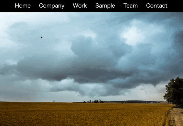
ナビゲーションバーをクリックした箇所にスライドさせてグラデーションをかける ■ポイント ・CSSでグラデーションの処理(linear-gradientを使用) ・JavaScriptのdocument.querySelectorで要素を取得 ・offsetLeftでクリックした対象要素の左からの幅をpx単位で(左)へ移動させる ・offsetWidthでクリックした対象要素のWidth(幅)を決定 (説明がわかりずらいかもしれません・・・検証ツールで幅の変化等を見て頂くとわかりやすいです) offsetLeftの説明はこちらのサイト様を参考にいたしました(わかりやすかった、ありがとうございます) https://syncer.jp/javascript-reference/element/offsetleft 念の為こちらも載せときます↓ https://developer.mozilla.org/en-US/docs/Web/API/HTMLElement/offsetLeft ・addEventListenerでクリックされた場所に反応するように指定 ・そしてトップバーだけじゃ寂しいのでビデオ背景載せてます ■出来たサイトの動き ■コード HTML <html lang="ja"> <head> <meta charset="UTF-8"> <title>グラデーションナビバー</title> <link rel="stylesheet" href="30_8.css"> </head> <body> <div class="nav-top"> <nav> <div id="marker"></div> <a href="#">Home</a> <a href="#">Company</a> <a href="#">Work</a> <a href="#">Sample</a> <a href="#">Team</a> <a href="#">Contact</a> </nav> </div> <script type="text/javascript"> const marker = document.querySelector('#marker'); const item = document.querySelectorAll('nav a'); function indicator(e){ marker.style.left = e.offsetLeft+"px"; marker.style.width = e.offsetWidth+"px"; } item.forEach(link => { link.addEventListener('click', (e)=>{ indicator(e.target); }) }) </script> <video src="goomalling-storm.mp4" loop="" autoplay="" muted="" width="100%" class="bgv"></video> </body> </html> CSS * { margin: 0; padding: 0; box-sizing: border-box; } .nav-top { display: flex; justify-content: center; background-color:black; } nav { position: relative; display: flex; } nav a { position: relative; margin: 10px 20px; padding: 5px; font-size: 2em; color: white; text-decoration: none; } nav #marker { position: absolute; left: 0; height: 100%; width: 0; opacity: 0.5; background: linear-gradient( black, rgb(128, 0, 113), blue, black); bottom: 0px; transition: 0.5s; border-radius: 4px; } ■苦労した点 ・querySelectorとgetElementByIdの使い分け ■疑問点とやりたかったこと ・レスポンシブ最適化までいけませんでした。 ・レスポンシブ最適化のため、少しいじりましたが、今の知識レベルでは時間がかかりそうだったため、タイミングを改めて実装してみようと思います。 以上となります。 ここは違う、ここはこうしたほうが良いかも?といったものございましたらご指摘いただけますと幸いです。 最後までみていただき、ありがとうございます。
■ポイント ・CSSでグラデーションの処理(linear-gradientを使用) ・JavaScriptのdocument.querySelectorで要素を取得 ・offsetLeftでクリックした対象要素の左からの幅をpx単位で(左)へ移動させる ・offsetWidthでクリックした対象要素のWidth(幅)を決定 (説明がわかりずらいかもしれません・・・検証ツールで幅の変化等を見て頂くとわかりやすいです) offsetLeftの説明はこちらのサイト様を参考にいたしました(わかりやすかった、ありがとうございます) https://syncer.jp/javascript-reference/element/offsetleft 念の為こちらも載せときます↓ https://developer.mozilla.org/en-US/docs/Web/API/HTMLElement/offsetLeft ・addEventListenerでクリックされた場所に反応するように指定 ・そしてトップバーだけじゃ寂しいのでビデオ背景載せてます
■出来たサイトの動き
■コード
HTML
<html lang="ja">
<head>
    <meta charset="UTF-8">
    <title>グラデーションナビバー</title>
    <link rel="stylesheet" href="30_8.css">
</head>
<body>
    <div class="nav-top">
        <nav>
            <div id="marker"></div>
            <a href="#">Home</a>
            <a href="#">Company</a>
            <a href="#">Work</a>
            <a href="#">Sample</a>
            <a href="#">Team</a>
            <a href="#">Contact</a>
        </nav>
    </div>
    <script type="text/javascript">
        const marker = document.querySelector('#marker');
        const item = document.querySelectorAll('nav a');

        function indicator(e){
            marker.style.left = e.offsetLeft+"px";
            marker.style.width = e.offsetWidth+"px";
        }

        item.forEach(link => {
            link.addEventListener('click', (e)=>{
                indicator(e.target);
            })
        })
    </script>

<video src="goomalling-storm.mp4" loop="" autoplay="" muted=""  width="100%" class="bgv"></video>
</body>
</html>
CSS
*
{
    margin: 0;
    padding: 0;
    box-sizing: border-box;
}
.nav-top
{
    display: flex;
    justify-content: center;
    background-color:black;
}
nav
{
    position: relative;
    display: flex;
}
nav a
{
    position: relative;
    margin: 10px 20px;
    padding: 5px;
    font-size: 2em;
    color: white;
    text-decoration: none;
}
nav #marker
{
    position: absolute;
    left: 0;
    height: 100%;
    width: 0;
    opacity: 0.5;
    background: linear-gradient(
    black,
    rgb(128, 0, 113),
    blue,
    black);
    bottom: 0px;
    transition: 0.5s;
    border-radius: 4px;
}
■苦労した点 ・querySelectorとgetElementByIdの使い分け
■疑問点とやりたかったこと ・レスポンシブ最適化までいけませんでした。 ・レスポンシブ最適化のため、少しいじりましたが、今の知識レベルでは時間がかかりそうだったため、タイミングを改めて実装してみようと思います。
以上となります。
ここは違う、ここはこうしたほうが良いかも?といったものございましたらご指摘いただけますと幸いです。 最後までみていただき、ありがとうございます。
/* ナビゲーションに関するコード*/ @media (min-width: 768px) { .nav-item { color:#CCCCCC; border-right: 1px solid #999999; } .nav-item:last-child { border-right:none } } .nav-link { color:#333333; } /body部分のコード/ body { padding:100px 0px 0px 0px; font-size:14px; } h2 { color: #664433; border-bottom: solid 2px #D3C9C5; padding-bottom: 5px; padding-left: 21px; margin-bottom: 15px; font-size: 18px; background-image: url(icon.png); background-size: 16px 16px; background-repeat: no-repeat; line-height: 1.0; } h3 { color: #664433; font-size:16px; } p { font-size:14px; } .indent { text-indent:1em; } .col-lg-3 { padding:0 auto; } .col-lg-8 { padding:0 auto; } @media (max-width: 767px) { .toggler-icon { margin-top: -44px; } } @media (min-width: 992px) { a.list-group-item { color: #333333; border: none; border-top:dashed 1px #CCCCCC; background-image: url(arrow.png); background-size: 6px 10px; background-repeat: no-repeat; background-position:0% 50%; } a.list-group-item:first-child { border-top: none; } } /* フッターに関する箇所*/ .fotter-contents { margin:30px 0px 10px 0px; padding:10px; border-top:solid 1px #CCCCCC; }
/* ナビゲーションに関するコード*/
@media (min-width: 768px) { .nav-item { color:#CCCCCC; border-right: 1px solid #999999; } .nav-item:last-child { border-right:none } }
.nav-link { color:#333333; }
/body部分のコード/ body { padding:100px 0px 0px 0px; font-size:14px; }
h2 { color: #664433; border-bottom: solid 2px #D3C9C5; padding-bottom: 5px; padding-left: 21px; margin-bottom: 15px; font-size: 18px; background-image: url(icon.png); background-size: 16px 16px; background-repeat: no-repeat; line-height: 1.0; }
h3 { color: #664433; font-size:16px; }
p { font-size:14px; }
.indent { text-indent:1em; }
.col-lg-3 { padding:0 auto; }
.col-lg-8 { padding:0 auto; }
@media (max-width: 767px) { .toggler-icon { margin-top: -44px; } }
@media (min-width: 992px) { a.list-group-item { color: #333333; border: none; border-top:dashed 1px #CCCCCC; background-image: url(arrow.png); background-size: 6px 10px; background-repeat: no-repeat; background-position:0% 50%; } a.list-group-item:first-child { border-top: none; } }
/* フッターに関する箇所*/
.fotter-contents { margin:30px 0px 10px 0px; padding:10px; border-top:solid 1px #CCCCCC; }
html要素の基準フォントサイズ取得 WEBサイトのレスポンシブル対応などで、html要素の基準フォントサイズが知りたくなったときにそれを取得することがあったのでメモ。 let root = document.documentElement; //htmlのルート要素を取得 let style = window.getComputedStyle(root).getPropertyValue('font-size'); //ルート要素のcssプロパティを全て取得し、その中からフォントサイズを取得 let stFontSize = parseFloat(style); //float型の数値に変換 window.getComputedStyleでcssプロパティを取得 let style = window.getComputedStyle(root).getPropertyValue('font-size'); この部分がポイントで、 window.getComputedStyle()の引数に入れたelementのcssプロパティを全て返してくれます。 https://developer.mozilla.org/ja/docs/Web/API/Window/getComputedStyle なので、基準フォントサイズに限らず、引数を変えれば好きなelementのcssプロパティを取得出来ます。
WEBサイトのレスポンシブル対応などで、html要素の基準フォントサイズが知りたくなったときにそれを取得することがあったのでメモ。
let root = document.documentElement; //htmlのルート要素を取得
let style = window.getComputedStyle(root).getPropertyValue('font-size'); //ルート要素のcssプロパティを全て取得し、その中からフォントサイズを取得
let stFontSize = parseFloat(style); //float型の数値に変換
let style = window.getComputedStyle(root).getPropertyValue('font-size');
この部分がポイントで、 window.getComputedStyle()の引数に入れたelementのcssプロパティを全て返してくれます。 https://developer.mozilla.org/ja/docs/Web/API/Window/getComputedStyle
なので、基準フォントサイズに限らず、引数を変えれば好きなelementのcssプロパティを取得出来ます。
100日チャレンジの353日目 twitterの100日チャレンジ#タグ、#100DaysOfCode実施中です。 すでに100日超えましたが、継続。 100日チャレンジは、ぱぺまぺの中ではプログラミングに限らず継続学習のために使っています。 353日目は、 おはようございます昨日1日でやったこと⇩●ブログ1記事作成●プログラミング学習353日目 2.0h・ポートフォリオ一部修正モヤモヤがあってあんまり集中できませんでしたあと、寝落ちしました#早起きチャレンジ#100DaysOfCode— ぱぺまぺ@社畜✕投資✕ブロガー (@ppmp65) June 22, 2020
twitterの100日チャレンジ#タグ、#100DaysOfCode実施中です。 すでに100日超えましたが、継続。 100日チャレンジは、ぱぺまぺの中ではプログラミングに限らず継続学習のために使っています。 353日目は、
おはようございます昨日1日でやったこと⇩●ブログ1記事作成●プログラミング学習353日目 2.0h・ポートフォリオ一部修正モヤモヤがあってあんまり集中できませんでしたあと、寝落ちしました#早起きチャレンジ#100DaysOfCode— ぱぺまぺ@社畜✕投資✕ブロガー (@ppmp65) June 22, 2020
おはようございます昨日1日でやったこと⇩●ブログ1記事作成●プログラミング学習353日目 2.0h・ポートフォリオ一部修正モヤモヤがあってあんまり集中できませんでしたあと、寝落ちしました#早起きチャレンジ#100DaysOfCode