- 投稿日:2020-07-26T21:05:05+09:00
新卒プログラマの学習ログ 〜 其の一 〜
本記事の目的
基本的には自分用の学習ログとして投稿していきます。
そのため、誤った解釈や方法をとっている可能性があることは否めません。
ご指摘いただければ修正し、今後の学びで気づくことがあれば随時加筆していきます。投稿者の背景
今年度より外資系IT企業で新卒エンジニアとしてのキャリアをスタートしました。
With Covid-19で新卒入社から完全リモート勤務という、 この状況下でプログラマとして成長をしていけるように色んなことを模索しています。
大学でもプログラミングは学んできましたが、実務経験は皆無なのでまだまだわからないことだらけです。
業務に関わる内容や取り組みはもちろんここに書くことはできませんが、自学的に取り組んだことを今後書き留めて行きたいと思います。
Android アプリ開発
アンドロイドでアプリを開発するのであれば、Android StudioはIDEとして優秀なツールです。
その基礎構築としてGoogleが提供しているCodelabsは非常に有効な学習ツールとなるでしょう。
(https://codelabs.developers.google.com/)そのため本記事においてもCodelabsにあるAndroid Studioによる、基礎構築講座を通して学習を勧めていきます。
(https://codelabs.developers.google.com/android-kotlin-fundamentals/)内容は全文英語となっていますが、図も多く使用して説明があるため、特に詰まることなく進めることができると思います。
環境
- Mac OS Catalina
- Android Studio 4.0.1
環境構築はこのサイトを参考にしてすんなりできました。
(https://akira-watson.com/android/adt-mac.html)Hello Worldから始めよう!
やはりプログラミングで何か始めるならこれからですかね。
Codelabs
Android Kotlin Fundamentals 01.1: Get started
の手順に従って進めれば簡単に表示することができました。初学者から一人前まで、、
ここでは一人前のプログラマの定義を
「おおよそ自力で様々なツールを活用しながら、ある程度思い通りの実装ができること」
とします。また、人生においてプログラミングに向き合う時間として、現時点で2000時間取り組めればある程度の基盤が備わると仮定しています。
(言語やツールに依存しない思考法や情報収集能力)プログラミングは大学で学んで来ましたが、特に根詰めてやってきていないので、ノーカウントとして取り組みます。
現在までの研修を含めて
およそ320時間
どんどん更新していきます。これまで取り組んだ内容
C言語
- 基礎的な文法理解
- Atmel Studio を使用した組み込み開発
- データシートから複数のデバイスの組み込み機器の実装
- I2C通信によるデバイス制御
Java
- 基礎的な文法理解
- オブジェクト指向
Kotlin
- 基礎的な文法理解
- Android Studioによるアプリ開発
- 投稿日:2020-07-26T13:27:40+09:00
Android CameraX+ML Kitで顔検出
はじめに
この記事ではCameraXの画像解析ユースケースとML kitの顔検出APIを連携した技術ついて解説します。
この記事を読むと、画像解析によって検出した顔の位置情報をもとに、どのようにして画面に顔枠を表示したらよいか理解できるようになります。
顔枠をオーバーレイ(後述)に出力する仕様についてはML Kitのサンプルコードに基に調査した内容となっています。
CameraX 画像解析ユースケースとは
画像解析ユースケースを使用すると、カメラをファインダーから覗いているときに、顔を検出したり、物(ヤカンや鍋とか)、バーコードなど検出できるようになります。
どのようにして画像解析が行われるか?について解説します。
まず、ファインダーに映ってる映像をもとに次々と画像を作って、画像アナライザーに渡します。
さて、画像アナライザーって何者なんでしょうか?
画像アナライザーってのは、受け取った画像を分析して、いろいろなお役立ち情報を教えてくれる良い人です。
画像アナライザーには得意分野を持ついろいろなアナライザーがいます。
たとえば、顔検出が得意なアナライザーとか、バーコードスキャンが得意なアナライザーとか。
このアナライザーが、受け取った画像を丹念に調べまして、「この画像の中の右上の方に顔がありましたよ!位置はここらへんです。」とか教えてくれます。
このようにして画像解析が行われます。
そして僕たち開発者はアナライザーから受け取った情報をもとに、スマホの画面に「顔はここだよ~。」ってグリーンの枠で囲って表示したりします。
詳細はGoogle公式ページをご確認ください。
ML Kitとは
ML KitとはGoogleのモバイル向け機械学習APIです。
以下のようなことができます。
Vision API
- 顔の検出
- バーコードスキャン
- オブジェクト、場所、活動、動物種、製品などの識別
- テキスト認識
- オブジェクトの検出と追跡
Natural Language API
- 言語の識別
- デバイス上のテキスト翻訳
- テキスト会話で返信提案を生成
ML Kit公式サイトにはCameraXとML Kitを連携したサンプルもあるのでよかったら見てみてください。
顔検出アナライザーの実装
顔検出アナライザーの実装例です。
ImageAnalysis.Analyzerを実装します。
FaceDetectorクラスがML Kitの顔検出APIです。


- 投稿日:2020-07-26T11:56:24+09:00
ちょっと凝ったローディングダイアログ作った
作ったもの
android:indeterminateTint="@color/teal_200"だと以下のようにちょっと白く欠けたようになるので、白い部分が消えるようにしてみた。
コード
LoadingDialogFragment
package com.example.sampleapp.ui

import android.app.Dialog
import android.os.Bundle
import androidx.appcompat.app.AppCompatDialogFragment
import com.example.sampleapp.R

class LoadingDialogFragment : AppCompatDialogFragment() {

    companion object {

        const val TAG = "LoadingDialogFragment"

        fun newInstance(): LoadingDialogFragment {

            val fragment = LoadingDialogFragment()
            fragment.arguments = Bundle().apply {

            }
            return fragment
        }
    }

    override fun onCreateDialog(savedInstanceState: Bundle?): Dialog {
/*
        return activity?.let {
            val builder = AlertDialog.Builder(it)
            builder.setView(R.layout.gradient_loading_dialog)
            val dialog = builder.create()
            return dialog
        } ?: throw IllegalStateException("Activity cannot be null")
*/
        // 本当は上記コードの方が推奨されるけど、ダイアログの背景がちょうどいい大きさにならず下記コードで実装...
        val dialog = Dialog(requireContext())
        dialog.setContentView(R.layout.gradient_loading_dialog)
        return dialog
    }

}
layoutのxml
<?xml version="1.0" encoding="utf-8"?>
<androidx.constraintlayout.widget.ConstraintLayout
    xmlns:android="http://schemas.android.com/apk/res/android"
    xmlns:app="http://schemas.android.com/apk/res-auto"
    xmlns:tools="http://schemas.android.com/tools"
    android:background="@android:color/transparent"
    android:layout_width="wrap_content"
    android:layout_height="wrap_content">
    <!-- サイズは適当 -->
    <ProgressBar
        android:id="@+id/progressBar"
        style="@style/Widget.AppCompat.ProgressBar"
        android:background="@android:color/transparent"
        android:indeterminate="true"
        android:indeterminateDrawable="@drawable/loading_dialog_drawable"
        android:layout_width="60dp"
        android:layout_height="60dp"
        android:layout_margin="16dp"
        app:layout_constraintBottom_toBottomOf="parent"
        app:layout_constraintEnd_toEndOf="parent"
        app:layout_constraintStart_toStartOf="parent"
        app:layout_constraintTop_toTopOf="parent" />
</androidx.constraintlayout.widget.ConstraintLayout>
回転画像のdrawable
<?xml version="1.0" encoding="utf-8"?>
<rotate xmlns:android="http://schemas.android.com/apk/res/android"
    android:fromDegrees="0"
    android:toDegrees="1000" >

    <shape
        android:innerRadius="20dp"
        android:shape="ring"
        android:thickness="4dp"
        android:useLevel="false" >

        <size android:width="60dp" android:height="60dp" />

        <gradient
            android:endColor="#d3d3d3"
            android:startColor="@color/teal_200"
            android:type="sweep"
            android:useLevel="false" />
    </shape>

</rotate>
まとめ
ローディングダイアログはデザインをある程度デザイナーさんが用意してくれたケースが多かったのですが、
今回標準にちょっとアレンジしたものを作ることがあったので備忘録に残します。GithubにUPされているライブラリ使えるといいかもしれませんが、
コード量がちょっとだったので(ライブラリ使うと逆に微調整効かなくなりそうだったので)自作しました。ベースにしたサイトがあったけどリンク失念....


- 投稿日:2020-07-26T11:51:48+09:00
Android: layout_marginHorizontal と paddingHorizontal は積極的に使おう
結論
Android XML のレイアウトで左右に同じサイズの margin, padding を設定するときには、個別にパラメーターを設定するのではなく
layout_marginHorizontalpaddingHorizontalを使いましょう。<FrameLayout android:layout_width="match_parent" android:layout_height="wrap_content" android:paddingHorizontal="16dp"> ... </FrameLayout>
android:paddingHorizontal="16dp"はandroid:paddingLeft="16dp"とandroid:paddingRight="16dp"を指定したものと同じ意味となります。上下の margin, padding の場合は
layout_marginVerticalpaddingVerticalを使います。~Horizontal, ~Vertical は Android 8 未満でも使える
これらは Android 8 からサポートされた機能ですが、通常通りビルドするだけで Anrdoid 8 未満でも動作します。
Unified layout margins and padding
AAPT2 2.16 により、 ~Horizontal 要素が ~Left ~Right、 ~Vertical 要素が ~Top ~Bottom へ変換されるため、 Android 8 未満を含めたすべての Android バージョンで利用することができます。
Versioning of XML files is more intelligent, using a small set of rules to degrade specific newer attributes to backwards compatible versions of them. Ex: android:paddingHorizontal degrades to android:paddingLeft and android:paddingRight.
最新のビルド環境を使っていれば AAPT2 は上記に対応していると思います。 AAPT2 は Android SDK Build-Tools に含まれるため、最新の Build-Tools を使いましょう。
要素一覧
margin, padding それぞれ Horizontal と Vertical があります。
android:layout_marginHorizontal
Specifies extra space on the left and right sides of this view. Specifying layout_marginHorizontal is equivalent to specifying layout_marginLeft and layout_marginRight.
Specifies extra space on the top and bottom sides of this view. Specifying layout_marginVertical is equivalent to specifying layout_marginTop and layout_marginBottom with that same value.
Sets the padding, in pixels, of the left and right edges;
Sets the padding, in pixels, of the top and bottom edges;
- 投稿日:2020-07-26T09:03:44+09:00
Maven Publish PluginでAndroid Libraryのソースコードを公開する
概要
Maven Publish Plugin で Android Library のソースコードを添付する方法です。
build.gradle.kts(差分のみ)
以下、既に Maven Publish Plugin を利用している場合向けの、差分のみを示したコードです。
※ 各値は自身の環境に合わせてくださいbuild.gradle.ktstasks { val androidSourcesJar by creating(Jar::class) { archiveClassifier.set("sources") from(android.sourceSets["main"].java.srcDirs) } } afterEvaluate { publishing { publications { create<MavenPublication>("maven") { artifact(tasks["androidSourcesJar"]) } } } }build.gradle.kts
build.gradle.kts の全体像のサンプルです。
plugins {
    id("com.android.library")
    kotlin("android")
    id("kotlin-android-extensions")
    kotlin("kapt")
    `maven-publish`
}

android {
    compileSdkVersion(29)

    defaultConfig {
        minSdkVersion(23)
        targetSdkVersion(29)
        versionCode = 1
        versionName = "1.0"
        consumerProguardFiles("consumer-rules.pro")
    }

    buildTypes {
        getByName("release") {
            isMinifyEnabled = false
            proguardFiles(getDefaultProguardFile("proguard-android-optimize.txt"), "proguard-rules.pro")
        }
    }

    buildFeatures {
        dataBinding = true
    }

    kotlinOptions {
        jvmTarget = "1.8"
    }
}

tasks {
    val androidSourcesJar by creating(Jar::class) {
        archiveClassifier.set("sources")
        from(android.sourceSets["main"].java.srcDirs)
    }
}

dependencies {
    implementation(project(":kotlin"))
    implementation("androidx.constraintlayout:constraintlayout:1.1.3")
}

afterEvaluate {
    publishing {
        publications {
            create<MavenPublication>("maven") {
                from(components["release"])
                artifact(tasks["androidSourcesJar"])
                groupId = "com.example"
                artifactId = "lib-android"
                version = "0.0.1-SNAPSHOT"
            }
        }
    }
}
実行
./gradlew publishMavenPublicationToMavenLocal
- 投稿日:2020-07-26T03:58:15+09:00
ConstraintLayout入門その2 - センタリング、あるいはbias
ConstraintLayoutを使用するための設定については、前回記事をご覧ください。
ConstraintLayoutのセンタリング
FrameLayoutの子Viewを親Viewの中央に置くときは
android:layout_gravityにcenter_horizontal,center_verticalなどの値を設定します。RelativeLayoutの子Viewを親Viewの中央に置くときはandroid:layout_centerHorizontal,android:layout_centerVerticalなどの値を"true"に設定します。
これらに対し、ConstraintLayoutでのセンタリングは、「Viewの上下端もしくは左右端を同時に制約する」、という、いささか手間のかかる方式を用います。activity_main.xml<androidx.constraintlayout.widget.ConstraintLayout xmlns:android="http://schemas.android.com/apk/res/android" xmlns:app="http://schemas.android.com/apk/res-auto" xmlns:tools="http://schemas.android.com/tools" android:layout_width="match_parent" android:layout_height="match_parent" tools:context=".MainActivity"> <ImageView android:id="@+id/viewControlled" android:layout_width="wrap_content" android:layout_height="wrap_content" app:layout_constraintTop_toTopOf="parent" app:layout_constraintBottom_toBottomOf="parent" app:layout_constraintVertical_bias="0.15" app:layout_constraintStart_toStartOf="parent" app:layout_constraintEnd_toEndOf="parent" app:layout_constraintHorizontal_bias="0.6" android:background="@color/colorAccent" android:src="@drawable/ic_launcher_foreground" /> ... </androidx.constraintlayout.widget.ConstraintLayout>表示結果
上記XMLは以下のように表示されます。
app:layout_constraintTop_toTopOf,app:layout_constraintBottom_toBottomOfに"parent"を設定し、上下端が親Viewに制約されるようにします。これは素直に読むと、子Viewが親Viewと同じ高さに引き伸ばされそうにも思えますが、ここではandroid:layout_heightが"wrap_content"となっていることから、ImageViewは伸びません。伸びない代わりに、ImageViewは上からも下からも引っ張られ、バランスの取れた位置に設定されます。このバランスを決定するのがapp:layout_constraintVertical_biasの値です。bias
app:layout_constraintVertical_biasには0から1までの値を小数で設定できます。省略することもでき、省略されたときのデフォルト値は0.5となります。0.5に設定した場合、垂直方向の位置はちょうど中央に設定され、FrameLayoutやRelativeLayoutで行うセンタリングと同じ結果になります。ConstraintLayoutでは、biasの設定を加えることにより、FrameLayoutやRelativeLayoutよりも柔軟な位置取りを可能にしています。
app:layout_constraintVertical_biasが0のときは上端の制約に張りつきます(下端の制約を省略したのと同じ結果になります)。app:layout_constraintVertical_biasが1のときは下端の制約に張りつきます(上端の制約を省略したのと同じ結果になります)。
0と1の間の値を設定すれば、これらの中間の位置取りを行えます。ほぼ同様に、水平方向の位置取りは
app:layout_constraintHorizontal_biasで設定し、省略ないし0.5を設定すれば水平方向のセンタリングが行えます。app:layout_constraintHorizontal_biasが0のときは 'Left' もしくは 'Start' に設定した制約に張りつき、1のときは 'Right' もしくは 'End' に設定した制約に張りつきます。0と1の間の値を設定すれば、中間の位置取りを行えます。right to leftレイアウト
activity_main.xml のConstraintLayoutで
android:layoutDirection="rtl"の設定を加えると、right to leftレイアウトに変わって左右が反転しますが、上下左右の空白部分については今回のコードは対応が甘いので少し表示が崩れます。サンプルコード
biasの仕様にあまり興味がない開発者には、ひとまずConstraintLayoutでセンタリングを行う要領をつかんでいただければ充分です。ConstraintLayoutは多機能かつ複雑ですので、一気に使い方をマスターしようとするよりも、少しずつ習得して使える場面を徐々に増やしていくことをお勧めします。
今回のサンプルコードは以下のリポジトリにあります。
https://github.com/csayamada/ConstraintLayout2サンプルコードでは、 activity_main.xml にて
app:layout_constraintVertical_bias,app:layout_constraintHorizontal_biasの値を変更してビルドしアプリを実行すると、表示結果の上下左右の空白のスケールと比率が自動的に表示されるようになっています。表示結果から、biasの値が上と下の空白の比率、および左と右の空白の比率を決定していることがわかります。柔軟性
上下端、左右端の制約には
"parent"のほかに他の子ViewのIDを指定することができ、従来の親View内のセンタリング以上の表現、たとえば複数の子Viewと位置を合わせたり、biasの設定との組み合わせるなどといった、RelativeLayoutなどよりも柔軟な位置取りが行えます。
制約にはapp:layout_constraintTop_toBottomOf,app:layout_constraintStart_toEndOfなどを使うこともでき、LinearLayoutのネストなどを行わずに子Viewを整列させたりできます。参考文献
Constraintlayout | Android デベロッパー | Android Developers
ConstraintLayout | Android Developers
Understanding VectorDrawable pathData commands in Android

- 投稿日:2020-07-26T00:12:30+09:00
TabLayoutのインジケーターをカスタマイズする
Material ComponentsにはTabLayoutというものがあり、ViewPagerなどと組み合わせてタブ切り替えのUIを提供します。
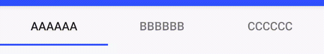
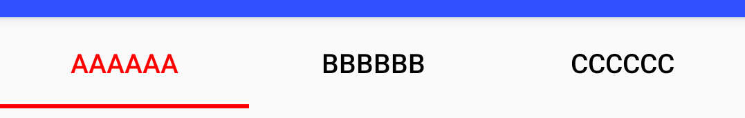
標準的な見た目は以下のようになっています。
このように、標準では選択されているタブを示すインジケーターがアンダーラインで表示され、選択した場所へアニメーションを伴って移動します。
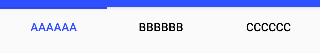
一方、iOS版のGoogleMapではタブがこんな動作をしています。(Android版はアニメーションしない)
これの実装がどうなっているのか、iOSに詳しくないこともあって分かりませんが、Segmented Controlが似た動きをしていますね。
複数の選択肢があって、それを選択するとそこにボタン状の背景がアニメーションで移動する。というUIですね。
これをAndroidで実装するのは難しいと思うのですが、TabLayoutでどこまで頑張れるのか調べたのでまとめます。
※このUI/UXがAndroid的にいいか悪いかは置いておきます。
タブの中身の工夫
いきなりインジケーターから外れますが、タブの中身をカスタマイズすることで選択されているタブを示す表示ができます。
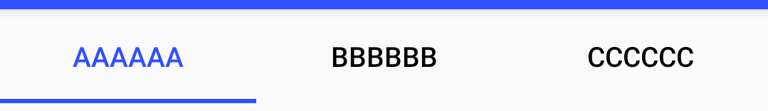
テキストの色
XMLからなら
app:tabTextColorで選択されていないタブのテキストの色を、app:tabSelectedTextColorで選択されたタブのテキストの色を指定することができます。コードからならvoid setTabTextColors(int normalColor, int selectedColor)か、void setTabTextColors(@Nullable ColorStateList textColor)で2色を指定します。<com.google.android.material.tabs.TabLayout android:id="@+id/tabs" android:layout_width="match_parent" android:layout_height="wrap_content" app:tabSelectedTextColor="@color/colorPrimary" app:tabTextColor="@color/black" />
アイコンの色
アイコンを設定している場合は、XMLから
app:tabIconTint、コードからはvoid setTabIconTint(@Nullable ColorStateList iconTint)かvoid setTabIconTintResource(@ColorRes int iconTintResourceId)で指定できます。fg_tab<selector xmlns:android="http://schemas.android.com/apk/res/android"> <item android:color="@color/colorPrimary" android:state_selected="true"/> <item android:color="@color/black" android:state_selected="false"/> </selector><com.google.android.material.tabs.TabLayout android:id="@+id/tabs" android:layout_width="match_parent" android:layout_height="wrap_content" app:tabSelectedTextColor="@color/colorPrimary" app:tabTextColor="@color/black" app:tabIconTint="@color/fg_tab" />
背景の指定
XMLから
app:tabBackgroundでタブの背景色を指定することができます。コードから設定する手段はなさそう?
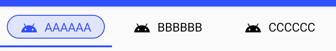
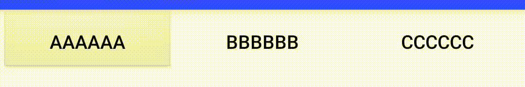
CustomViewの場合
CustomViewを表示させている場合、当然ながら前述の
setTabTextColorsやsetITabIconTintは使えませんが、選択されているタブはselected状態なのでStateListを使って選択状態に応じて表示を変えることができます。っとその前に、CustomViewを使う場合、あらかじめ設定されているパディングに注意する必要があります。CustomViewに背景を設定してみると以下のようにタブの間に結構広めのパディングがあります。
このパディングを除去するためには、
app:tabPaddingStartapp:tabPaddingEndを指定します。app:tabPaddingではパディングが残るので注意<com.google.android.material.tabs.TabLayout android:id="@+id/tabs" android:layout_width="match_parent" android:layout_height="wrap_content" app:tabPaddingStart="0dp" app:tabPaddingEnd="0dp" />その上で、カスタムViewの背景を指定するとそれっぽい表示ができたりします。
<selector xmlns:android="http://schemas.android.com/apk/res/android">
    <item android:state_selected="true">
        <shape android:shape="rectangle">
            <corners android:radius="20dp"/>
            <solid android:color="#20304FFE"/>
            <stroke android:color="#304FFE" android:width="1dp"/>
        </shape>
    </item>
    <item>
        <shape android:shape="rectangle"/>
    </item>
</selector>
ただし、背景はアニメーションしてくれません。
またこの場合、アンダーラインのインジケーターが邪魔ですね。後述するようにインジケーターはDrawableとして指定できるので、nullを渡すなどすれば消すことができます。<com.google.android.material.tabs.TabLayout android:id="@+id/tabs" android:layout_width="match_parent" android:layout_height="wrap_content" app:tabPaddingStart="0dp" app:tabPaddingEnd="0dp" app:tabIndicator="@null" />インジケーターのカスタイマイズ
色
インジケーターの色は特に指定しなければ
colorAccentの色になります。
変更したい場合は、XMLでapp:tabIndicatorColor、コードからはvoid setSelectedTabIndicatorColor(@ColorInt int color)で変更することができます。
表示位置
XMLから
app:tabIndicatorGravity、コードからvoid setSelectedTabIndicatorGravity(@TabIndicatorGravity int indicatorGravity)でインジケーターの表示位置を変更することができます。
取り得る値は、xmlの場合、bottom/center/top/stretch、コードからはTabLayoutの定数INDICATOR_GRAVITY_BOTTOM/INDICATOR_GRAVITY_CENTER/INDICATOR_GRAVITY_TOP/INDICATOR_GRAVITY_STRETCHを指定することができます。
通常はbottomですね。center:打ち消し線みたいになっちゃってます
top:上付き
stretch:塗りつぶしになってしまうのでテキストの色を変えています
高さ
XMLから
app:tabIndicatorHeight、コードからvoid setSelectedTabIndicatorHeight(int height)でインジケーターの高さ(太さ)を指定できます。デフォルトは2dpのようです。ただしDeprecatedです。drawableを指定することができるので、変更したい場合は形状含めてそちらで指定すべきと言うことのようです。
形状
XMLから
app:tabIndicator、コードからvoid setSelectedTabIndicator(@DrawableRes int tabSelectedIndicatorResourceId)もしくはvoid setSelectedTabIndicator(@Nullable Drawable tabSelectedIndicator)で、indicatorとして表示する形状を指定することができます。
表示する大きさ(高さ)は(Gravityがstretch以外の場合)DrawableのintrinsicHeightが使われますので、Drawableを作る時に注意してください、GradientDrawableはsizeタグがない場合、intrinsicHeightが0になってしまうので表示されません。IndicatorHeightで指定することもできますが、こちらはDeprecatedです。
Drawableはあくまで形状を指定するのみで、描画する色はIndicatorColorが使われます。不透明度はだけは残りますが、色の情報は失われます。Drawableの色をどんなに頑張って指定しても反映されないので注意しましょう。こんなGradientDrawableを定義すると、少し丸みを帯びたIndicatorにすることができます。(色は関係ないので黒を指定しています)
<shape
    xmlns:android="http://schemas.android.com/apk/res/android"
    android:shape="rectangle">
    <solid android:color="@color/black"/>
    <corners android:topLeftRadius="4dp" android:topRightRadius="4dp"/>
    <size android:height="4dp"/>
</shape>
形状+stretch
tabIndicatorGravityをstretchするとタブの大きさでindicatorが表示されます。これを利用してボタン形状を表示させることができます。
タブの大きさいっぱいに表示されてしまうのでlayer-listで囲んで周囲のマージンを設定します。
<layer-list xmlns:android="http://schemas.android.com/apk/res/android">
    <item android:bottom="8dp" android:left="8dp" android:right="8dp" android:top="8dp">
        <shape android:shape="rectangle">
            <solid android:color="#20000000" />
            <stroke android:width="1dp" android:color="#000000" />
            <corners android:radius="20dp" />
        </shape>
    </item>
</layer-list>
<com.google.android.material.tabs.TabLayout android:id="@+id/tabs" android:layout_width="match_parent" android:layout_height="wrap_content" app:tabSelectedTextColor="@color/colorPrimary" app:tabTextColor="@color/black" app:tabIndicator="@drawable/indicator" app:tabIndicatorGravity="stretch" />
これでそれっぽく表示させることができました。
背景も併せてカスタマイズすると、スライドスイッチ風の表示もできますね。ドロップシャドウが使えないのがちょっと残念です。またスイッチ風にする場合、マージンを詰めて角丸部分をオーバーラップさせたいところですがそれも無理ですね。
その他
リップル指定
XMLから
app:tabRippleColor、コードからvoid setTabRippleColor(@Nullable ColorStateList color)でタブをタップしたときのリップルエフェクトの色を指定することができます。<com.google.android.material.tabs.TabLayout android:id="@+id/tabs" android:layout_width="match_parent" android:layout_height="wrap_content" app:tabSelectedTextColor="@color/colorPrimary" app:tabTextColor="@color/black" app:tabIndicator="@drawable/indicator" app:tabIndicatorGravity="stretch" app:tabRippleColor="#10304FFE" />
もう一歩
さて、大分当初の目的は達成できたような気がしないでもないのですが、
app:tabIndicatorで指定できるdrawableは形状(+透過率)しか反映されず、app:tabIndicatorColorで塗りつぶされてしまうため、単色しか使うことができないですね。これが任意のDrawableを指定できるようになれば……ということでインジケータの描画がどのように行われるか、実装を調べてみます。TabLayout.javaDrawable selectedIndicator; selectedIndicator = DrawableCompat.wrap( tabSelectedIndicator != null ? tabSelectedIndicator : defaultSelectionIndicator); selectedIndicator.setBounds(indicatorLeft, indicatorTop, indicatorRight, indicatorBottom); if (selectedIndicatorPaint != null) { if (VERSION.SDK_INT == VERSION_CODES.LOLLIPOP) { // Drawable doesn't implement setTint in API 21 selectedIndicator.setColorFilter( selectedIndicatorPaint.getColor(), PorterDuff.Mode.SRC_IN); } else { DrawableCompat.setTint(selectedIndicator, selectedIndicatorPaint.getColor()); } } selectedIndicator.draw(canvas);
setColorFilterもしくはsetTintで描画色が上書きされてしまっていますね。(selectedIndicatorPaintがnullなら設定されなさそうですが、selectedIndicatorPaintはNonNullです)DrawableCompat.wrapを挟んでいるのもめんどくさそうです。DrawableCompat.wrapの実装は以下のようになっています。DrawableCompat.javapublic static Drawable wrap(@NonNull Drawable drawable) { if (Build.VERSION.SDK_INT >= 23) { return drawable; } else if (Build.VERSION.SDK_INT >= 21) { if (!(drawable instanceof TintAwareDrawable)) { return new WrappedDrawableApi21(drawable); } return drawable; } else { if (!(drawable instanceof TintAwareDrawable)) { return new WrappedDrawableApi14(drawable); } return drawable; } }TintAwareDrawableであればそのまま使われる……ということで、TintAwareDrawableを実装してTintを無視するDrawableWrapperを作ってやればいいんじゃないか?ってことでやってみました。
最低限使われているメソッドだけ実装すればいいのでここまでやる必要は無いでしょうが、WrappedDrawableApi21を参考に実装します。class TintDisabledDrawableWrapper( private val wrappedDrawable: Drawable ) : Drawable(), TintAwareDrawable { override fun getDirtyBounds(): Rect = wrappedDrawable.dirtyBounds override fun jumpToCurrentState() = wrappedDrawable.jumpToCurrentState() override fun draw(canvas: Canvas) = wrappedDrawable.draw(canvas) override fun getChangingConfigurations(): Int = wrappedDrawable.changingConfigurations override fun isStateful(): Boolean = wrappedDrawable.isStateful override fun setState(stateSet: IntArray): Boolean = wrappedDrawable.setState(stateSet) override fun getState(): IntArray = wrappedDrawable.state override fun getCurrent(): Drawable = wrappedDrawable.current override fun getOpacity(): Int = wrappedDrawable.opacity override fun getTransparentRegion(): Region? = wrappedDrawable.transparentRegion override fun getIntrinsicWidth(): Int = wrappedDrawable.intrinsicWidth override fun getIntrinsicHeight(): Int = wrappedDrawable.intrinsicHeight override fun getMinimumWidth(): Int = wrappedDrawable.minimumWidth override fun getMinimumHeight(): Int = wrappedDrawable.minimumHeight override fun getPadding(padding: Rect): Boolean = wrappedDrawable.getPadding(padding) override fun isAutoMirrored(): Boolean = wrappedDrawable.isAutoMirrored override fun getConstantState(): ConstantState? = null override fun mutate(): Drawable = wrappedDrawable.mutate() override fun onLevelChange(level: Int): Boolean = wrappedDrawable.setLevel(level) override fun setTint(tint: Int) = Unit override fun setTintList(tint: ColorStateList?) = Unit override fun setTintMode(tintMode: PorterDuff.Mode?) = Unit override fun setHotspot(x: Float, y: Float) { wrappedDrawable.setHotspot(x, y) } override fun setHotspotBounds(left: Int, top: Int, right: Int, bottom: Int) { wrappedDrawable.setHotspotBounds(left, top, right, bottom) } override fun getOutline(outline: Outline) { wrappedDrawable.getOutline(outline) } override fun onBoundsChange(bounds: Rect) { wrappedDrawable.bounds = bounds } override fun setChangingConfigurations(configs: Int) { wrappedDrawable.changingConfigurations = configs } override fun setDither(dither: Boolean) { wrappedDrawable.setDither(dither) } override fun setFilterBitmap(filter: Boolean) { wrappedDrawable.isFilterBitmap = filter } override fun setAlpha(alpha: Int) { wrappedDrawable.alpha = alpha } override fun setColorFilter(cf: ColorFilter?) { wrappedDrawable.colorFilter = cf } override fun setAutoMirrored(mirrored: Boolean) { wrappedDrawable.isAutoMirrored = mirrored } override fun setVisible(visible: Boolean, restart: Boolean): Boolean = wrappedDrawable.setVisible(visible, restart) }これにDrawableを包んで指定します。
tabs.setSelectedTabIndicator(TintDisabledDrawableWrapper(getDrawable(R.drawable.indicator)!!))indicatorは適当に2色使ってみます
<?xml version="1.0" encoding="utf-8"?>
<layer-list xmlns:android="http://schemas.android.com/apk/res/android">
    <item android:bottom="8dp" android:left="8dp" android:right="8dp" android:top="8dp">
        <shape android:shape="rectangle">
            <solid android:color="#50ffff00" />
            <stroke android:width="1dp" android:color="#0000ff" />
            <corners android:radius="20dp" />
        </shape>
    </item>
</layer-list>
これで、Drawableの色を直接描画させてやることができました。
標準ボタンの背景(画像)でもいけます。
ただし、これはTabLayoutの実装を調べてその裏をつくような細工な訳なので、TabLayoutの実装が変わったりすると使えなくなるなどの問題が起こる可能性があります。ちょっとこれを本番アプリに実装しようとは思えないですね。。。
まとめ
以上、TabLayoutのインジケーターをカスタマイズする方法を紹介しました。
あらかじめ用意されている機能だけでも想像以上にいろいろと変更することができるんですね。