- 投稿日:2020-07-02T23:03:07+09:00
模写コーディング その2 FaceBook ログイン画面
模写コーディング
模写するサイト
FaceBook ログイン画面
https://www.facebook.com/作成時間
その1:3時間
その2:5時間半
計:8時間半環境構築
・Google Chrome(ブラウザ)
・Visual Studio Code(コードエディター)模写する上でのルール(引用)
1.文字のコピペはOK
2.フォントの種類は何でもOK
3.少しのズレはOK
4.背景画像も入れる
5.角丸やフォントの大きさも近いものにする
6.レスポンシブデザインにも対応するhttps://codelearn.jp/articles/mosya#1HTMLCSS
進捗
途中で形にはなっていたのが、
細かいところのレイアウトが違っていて
(特にpaddingやmargin)
中々妥協できずに時間がかかってしまった。今回の模写を通して
marginの相殺の理解が浅かった。
marginは計算しながらつけるようにしていく。
marginやpaddingが、どの値がより正確かを探すのにも、デベロッパツールは重要であることを知った。画像からカラーコードを算出してくれる以下のサイトはとても便利
模写したいサイトをスクショしてサイト内に貼り付けるだけ。
https://lab.syncer.jp/Tool/Image-Color-Picker/次回
まだ、細かいところのスタイルが当てきれてないので、そこから始める
(cursorや元サイトでリンクになっている部分)Javascriptを使って、新しいアカウントを作成をクリックした際に、モーダルウィンドウとしてアカウント作成画面を表示する。
(positionやtranslateについてドットインストールで復習しながら)必須入力事項のエラーの出し方と正規表現のインプットをする。
レスポンシブデザインへの対応は後回し。
以上もっとスムーズにコードを書けるようになりたい。。。

- 投稿日:2020-07-02T22:51:17+09:00
TechAcademyが無料公開している「HTML・CSS入門講座」を受講する~CSS第7回~
アジェンダ
- 背景を表示する
- 背景の表示方法を指定する
- 実践
背景を表示する
background-color
背景の色を指定する。指定方法は以下の通り
background-color: 色;値は色(rgb()、16進数、色名)を指定する。
background-image
背景の画像を指定する。指定方法は以下の通り。
background-image: url;urlはurl()を用いて指定する。
背景の表示方法を指定する
background-repeat
背景の繰り返し表示を指定する。指定方法は以下の通り。
background-repeat: 値;値は単語で指定する。単語は以下のようなものがある。
- no-repeat
- 繰り返さない
- repeat
- 縦横両方繰り返す
- repeat-x
- 横方向のみ繰り返す
- repeat-y
- 縦方向のみ繰り返す
background-position
背景の表示開始位置を指定する。指定方法は以下の通り。
background-position: 横位置 縦位置;位置は単語、数値のどちらでも指定できる。
単語は以下のようなものがある。
- center
- 中央から表示する
- right
- 右端から表示する
- left
- 左端から表示する
- top
- 上端から表示する
- bottom
- 下端から表示する
数値は、要素の左上を基準として、指定した位置に表示される。
background-attachiment
画面をスクロールした際の背景の動きを指定する。指定方法は以下の通り。
background-attachiment: 値;値は単語で指定する。単語は以下のようなものがある。
- fixed
- 背景を固定し、スクロールしても動かない
- scroll
- スクロールに合わせて背景もスクロールする
- loacl
- その要素にあわせて移動、スクロールする
background-size
背景のサイズを指定する。指定方法は以下の通り。
background-size: 値;値は単語で指定する。単語は以下のようなものがある。
- contain
- 縦横比を維持した状態で、画像全体が背景領域に収まるように拡大縮小して表示する
- cover
- 縦横比を維持した状態で、背景領域を覆うように拡大縮小して表示する
background-clip
背景をどの領域まで表示するかを指定する。指定方法は以下の通り。
background-clip: 値;値は単語で指定する。単語は以下のようなものがある。
- border-box
- ボーダー領域まで表示させる
- padding-box
- パディング領域まで表示させる
- content-box
- コンテント領域まで表示させる
実践
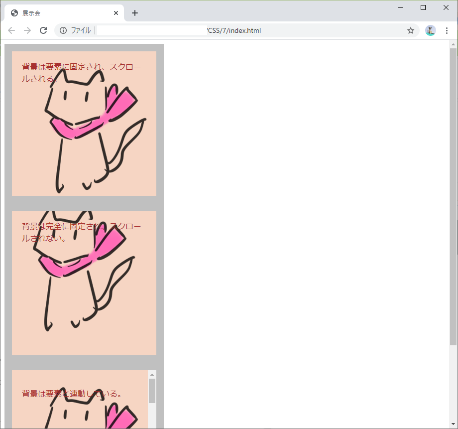
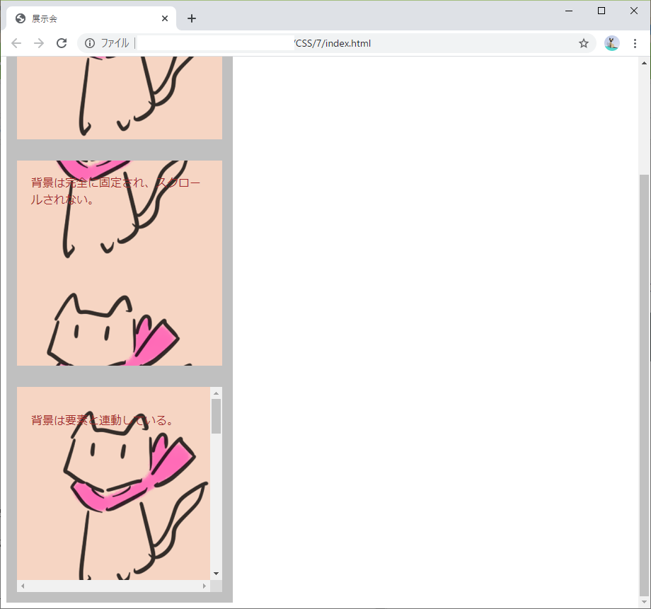
上記内容を用いて、以下のindex.htmlとstyle.cssを作成した。
index.html<!DOCTYPE html> <html lang="ja"> <head> <meta charset="UTF-8"> <link type="text/css" rel="stylesheet" href="./style.css"> <title>展示会</title> </head> <body> <div class="no-repeat">背景は要素に固定され、スクロールされる。</div> <div class="fixed">背景は完全に固定され、スクロールされない。</div> <div class="local"> <p> 背景は要素と連動している。 <br><br><br><br><br><br><br><br><br><br><br><br><br><br><br><br><br><br><br><br><br><br><br><br><br><br> <br><br><br><br><br><br><br><br><br><br><br><br><br><br><br><br><br><br><br><br><br><br><br><br><br><br> </p> </div> </body> </html>style.cssdiv { width: 250px; height: 250px; padding: 20px; border-style: solid; border-width: 15px; border-color: silver; background-image: url('./SKMT.png'); color: brown; } .no-repeat { background-repeat: no-repeat; } .fixed { background-repeat: repeat; background-attachment: fixed; } .local { background-repeat: repeat-y; background-attachment: local; overflow: scroll; }これをWebブラウザに表示させるとこんな感じ。
ブラウザ全体をスクロールしたところ、上と下の背景はスクロールされたが、真ん中の背景はスクロールされない。
下のボックスをスクロールしたところ、背景がスクロールされた。
イマイチ画像ではわかりにくい。
おわりに
今回は背景に関する内容だった。
背景をどのように表示させるかは、現代のおしゃれなWebページにおいてはとても重要だ・・・。次回 >> ☆まだ☆
参考

- 投稿日:2020-07-02T21:08:46+09:00
【初心者でもわかる】横並びにする3つの方法を、ナイフとフォークでやってみる
どうも、7noteです。今回は要素を横並びにする3つの方法を説明。高級レストランのように綺麗にナイフとフォークを並べましょう。
高級レストランとか、人生でまだいったことないけど、何となくナイフとフォークがナプキンの上にキレイに並んでるイメージがある。
いつか高級レストランでプロポーズを・・・なんちゃって。完成図
早速、まずは基本から!画像を並べる方法。
①材料はこちら(1人前)
ファイル CSSプロパティ 意味 index.html knife.png ナイフの画像 folk.png フォークの画像 ①作り方
- index.htmlにナイフとフォークの画像を用意するだけ!
1.index.htmlにナイフとフォークの画像を用意するだけ!
index.html<div class="napkin"> <img src="knife.png" alt="ナイフ"> <img src="folk.png" alt="フォーク"> </div>次は、flexboxで左右に並べる方法
②材料はこちら(1人前)
ファイル CSSプロパティ 意味 index.html style.css display: flex; 要素を横並びにする knife.png ナイフの画像 folk.png フォークの画像 ②作り方
- index.htmlにナイフとフォークの画像を用意(ブロック要素で囲む)!
- flexboxで要素を横並びにする
1.index.htmlにナイフとフォークの画像を用意(ブロック要素で囲む)!
index.html<div class="napkin"> <div><img src="knife.png" alt="ナイフ"></div> <div><img src="folk.png" alt="フォーク"></div> </div>2. flexboxで要素を横並びにする
style.css.napkin { display: flex; }次は、floatで左右に並べる方法
③材料はこちら(1人前)
ファイル CSSプロパティ 意味 index.html style.css float: ~~; 要素を浮かせて横並びにする knife.png ナイフの画像 folk.png フォークの画像 ③作り方
- index.htmlにナイフとフォークの画像を用意(ブロック要素で囲む)!
- floatで要素を横並びにする
1.index.htmlにナイフとフォークの画像を用意(ブロック要素で囲む)!
index.html<div class="napkin"> <div><img src="knife.png" alt="ナイフ"></div> <div><img src="folk.png" alt="フォーク"></div> </div>2. floatで要素を横並びにする
style.css.napkin div { float: left; }解説・作り方のコツ
- 今回の形であれば、①の作り方で十分かなと思います。ただ、配置などを調整することが考えられるのでその場合は②のflexboxなどがいいかなと思います。
- ③float使ってますが、本当はcleafixなどをいれた方がいいのですが、今回は省略。cleafixはまた改めて解説入れたいなぁ。
まとめ
やっぱりflexbox最強。
素材データ配布
真似して作りたい人はこの画像をダウンロードして使ってね!
おそまつ!
(コメント・質問・ソースの指摘等なんでもウェルカムです!初心者の方でも気軽に質問ください!)


- 投稿日:2020-07-02T20:07:41+09:00
初心者によるプログラミング学習ログ 358日目
100日チャレンジの358日目
twitterの100日チャレンジ#タグ、#100DaysOfCode実施中です。
すでに100日超えましたが、継続。
100日チャレンジは、ぱぺまぺの中ではプログラミングに限らず継続学習のために使っています。
358日目は、
昨日の作業・やったこと⇩
— ぱぺまぺ@社畜✕投資✕ブロガー (@ppmp65) July 1, 2020
●ブログ1記事作成
●kindle読書 20分ぐらい
●プログラミング学習358日目 2.0h
・架空LP pc版作成(@ririru_123) 2.0h#早起きチャレンジ #100DaysOfCode #駆け出しエンジニアと繋がりたい
- 投稿日:2020-07-02T19:24:41+09:00
ある条件に一致した時だけCSSで枠線を表示するにはoutlineを使うのがよさそう
ボタンにフォーカスしたときだけ枠線を表示したい状況があり、
意気揚々と以下のような CSS を書いたところ、
フォーカスしたときに枠線は表示されるものの、
同時にボタンの表示位置がずれるという残念な結果になった。#target-button:focus { border: solid 5px red; }どうやら
borderは枠線を表示するスペースを必要とするため、
常に枠線を表示するような場合には良いが、
フォーカスやホバーしたときにだけ枠線を表示する場合には向かない模様。似たようなプロパティで
outlineはスペースを取らずに枠線を表示できるため、
こちらを使用したら上手くできた。
フォーカスやホバーなど、特定の条件に一致した時だけ枠線を表示するならoutlineを使うのがよさそう。ただし、
outlineでは 上だけ表示 や 下だけ表示 といったことができないようなので、
そういったことがやりたい場合はまた他の方法を探す必要がありそう。。。
以下、ホバーしたときだけ枠線を表示するサンプル。
BUTTON1 がborder、BUTTON2 はoutlineで枠線を表示しています。See the Pen css_border_outline by jz4o (@jz4o) on CodePen.
- 投稿日:2020-07-02T17:38:04+09:00
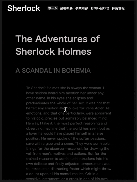
スクロール率表示とおしゃれなスクロールバーを実装 9日目【WEBサイトを作る30日チャレンジ】
スクロール率をJavaScriptで、なるべくレスポンシブに実装
■ポイント
・通常スクロールバーの装飾に使用する::-webkit-scrollbarのwidthを0にし、非表示にする
・スクロールバーを非表示にしたところに、position: fixedさせた要素をおいて、そこにスクロールバーを表示させる
・keyframeを使用し、10秒で色のグラデーションを変化させます
・スクロール率については、JavaScriptで要素を取得後、heightを計算しています
・レスポンシブにみえるよう、JavaScriptでスクロール率が100%になったら、ナビゲーションバーを非表示にして、フッターをそのまま表示させてます。
・シャーロックホームズの小説は著作権が切れたものをコピペしています(何かカッコよさげですよね)
・PCのみ、メニューバーを固定表示(常時表示)
・スマホ・タブレットサイズの場合、少し文字とpaddingの値を小さく設定
・(ハンバーガーメニューにしようかと思ったのですが、途中で変えました・・・記述残ってスミマセン)難しかった
①今回レスポンシブにすごく意識していましたが、何に着目して書けばいいのか?すごく悩みました。
②レスポンシブ化する際、mediaクエリを使用しましたが、スマホ仕様のサイズになった際、文字が消えて迷走していました。解決
①色々な方法がある中で、responsively を導入しました。
→これ導入して正解でした。PC、スマホ、タブレットそれぞれのの大きさごとにほぼ一度で状態確認ができます。メチャメチャ便利です。しかも無料とかありがたすぎです。まだ使いこなせていないですが、一度に複数端末の仕様を確認できますし、逆に言うと最低限どれくらいの対応で違和感がない状態までもっていけるのかがわかるので、これから重宝して使いたいなと思います。
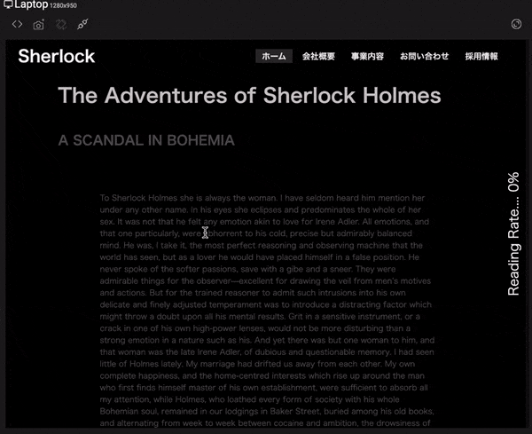
②背景色が邪魔してたとは知らず・・・迷走してましたが、background-colorをtransparentにすることで解決しました。完成したWEBサイト
PC版
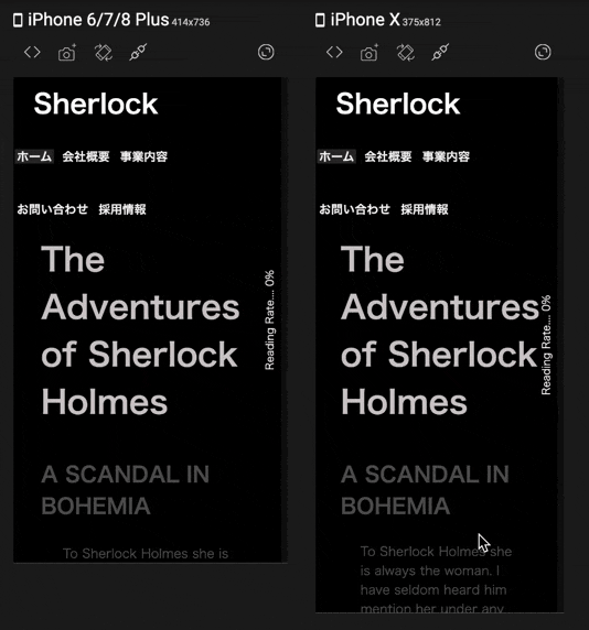
スマホ・タブレットサイズ版(iphoneは時間足りず最後までスクロールできず。。。)
HTML
<html lang="ja">
<head>
    <meta charset="UTF-8">
    <title>シャーロック・ホームズ小説サイト</title>
    <meta name="viewport" content="width=device-width, initial-scale=1.0">
    <link rel="stylesheet" href="30_9.css">
  </head>
  <body>
    <div id="progressbar"></div>
    <div id="scrollPath"></div>
    <div id="percent"></div>
    <nav id="nav-drawer">
      <input type="checkbox" id="check" id="nav-input">
      <label for="check" class="checkbtn open"></label>
      <label for="check" class="checkbtn close"></label>
      <label class="logo"><a href="#" class="logo">Sherlock</a></label>
      <ul>
        <li><a class="active" href="#">ホーム</a></li>
        <li><a href="#">会社概要</a></li>
        <li><a href="#">事業内容</a></li>
        <li><a href="#">お問い合わせ</a></li>
        <li><a href="#">採用情報</a></li>
      </ul>
    </nav>
    <section>
      <h1>The Adventures of Sherlock Holmes</h1>
      <h2>A SCANDAL IN BOHEMIA</h2>
      <p>
        To Sherlock Holmes she is always the woman. I have seldom heard him mention her under any other name. In his eyes she eclipses and predominates the whole of her sex. It was not that he felt any emotion akin to love for Irene Adler. All emotions, and that one particularly, were abhorrent to his cold, precise but admirably balanced mind. He was, I take it, the most perfect reasoning and observing machine that the world has seen, but as a lover he would have placed himself in a false position. He never spoke of the softer passions, save with a gibe and a sneer. They were admirable things for the observer—excellent for drawing the veil from men’s motives and actions. But for the trained reasoner to admit such intrusions into his own delicate and finely adjusted temperament was to introduce a distracting factor which might throw a doubt upon all his mental results. Grit in a sensitive instrument, or a crack in one of his own high-power lenses, would not be more disturbing than a strong emotion in a nature such as his. And yet there was but one woman to him, and that woman was the late Irene Adler, of dubious and questionable memory.

        I had seen little of Holmes lately. My marriage had drifted us away from each other. My own complete happiness, and the home-centred interests which rise up around the man who first finds himself master of his own establishment, were sufficient to absorb all my attention, while Holmes, who loathed every form of society with his whole Bohemian soul, remained in our lodgings in Baker Street, buried among his old books, and alternating from week to week between cocaine and ambition, the drowsiness of the drug, and the fierce energy of his own keen nature. He was still, as ever, deeply attracted by the study of crime, and occupied his immense faculties and extraordinary powers of observation in following out those clues, and clearing up those mysteries which had been abandoned as hopeless by the official police. From time to time I heard some vague account of his doings: of his summons to Odessa in the case of the Trepoff murder, of his clearing up of the singular tragedy of the Atkinson brothers at Trincomalee, and finally of the mission which he had accomplished so delicately and successfully for the reigning family of Holland. Beyond these signs of his activity, however, which I merely shared with all the readers of the daily press, I knew little of my former friend and companion.

        One night—it was on the twentieth of March, 1888—I was returning from a journey to a patient (for I had now returned to civil practice), when my way led me through Baker Street. As I passed the well-remembered door, which must always be associated in my mind with my wooing, and with the dark incidents of the Study in Scarlet, I was seized with a keen desire to see Holmes again, and to know how he was employing his extraordinary powers. His rooms were brilliantly lit, and, even as I looked up, I saw his tall, spare figure pass twice in a dark silhouette against the blind. He was pacing the room swiftly, eagerly, with his head sunk upon his chest and his hands clasped behind him. To me, who knew his every mood and habit, his attitude and manner told their own story. He was at work again. He had risen out of his drug-created dreams and was hot upon the scent of some new problem. I rang the bell and was shown up to the chamber which had formerly been in part my own.

        His manner was not effusive. It seldom was; but he was glad, I think, to see me. With hardly a word spoken, but with a kindly eye, he waved me to an armchair, threw across his case of cigars, and indicated a spirit case and a gasogene in the corner. Then he stood before the fire and looked me over in his singular introspective fashion.

        “Wedlock suits you,” he remarked. “I think, Watson, that you have put on seven and a half pounds since I saw you.”

        “Seven!” I answered.

        “Indeed, I should have thought a little more. Just a trifle more, I fancy, Watson. And in practice again, I observe. You did not tell me that you intended to go into harness.”

        “Then, how do you know?”

        “I see it, I deduce it. How do I know that you have been getting yourself very wet lately, and that you have a most clumsy and careless servant girl?”

        “My dear Holmes,” said I, “this is too much. You would certainly have been burned, had you lived a few centuries ago. It is true that I had a country walk on Thursday and came home in a dreadful mess, but as I have changed my clothes I can’t imagine how you deduce it. As to Mary Jane, she is incorrigible, and my wife has given her notice, but there, again, I fail to see how you work it out.”

        He chuckled to himself and rubbed his long, nervous hands together.

        “It is simplicity itself,” said he; “my eyes tell me that on the inside of your left shoe, just where the firelight strikes it, the leather is scored by six almost parallel cuts. Obviously they have been caused by someone who has very carelessly scraped round the edges of the sole in order to remove crusted mud from it. Hence, you see, my double deduction that you had been out in vile weather, and that you had a particularly malignant boot-slitting specimen of the London slavey. As to your practice, if a gentleman walks into my rooms smelling of iodoform, with a black mark of nitrate of silver upon his right forefinger, and a bulge on the right side of his top-hat to show where he has secreted his stethoscope, I must be dull, indeed, if I do not pronounce him to be an active member of the medical profession.”

        I could not help laughing at the ease with which he explained his process of deduction. “When I hear you give your reasons,” I remarked, “the thing always appears to me to be so ridiculously simple that I could easily do it myself, though at each successive instance of your reasoning I am baffled until you explain your process. And yet I believe that my eyes are as good as yours.”

        “Quite so,” he answered, lighting a cigarette, and throwing himself down into an armchair. “You see, but you do not observe. The distinction is clear. For example, you have frequently seen the steps which lead up from the hall to this room.”

        “Frequently.”

        “How often?”

        “Well, some hundreds of times.”

        “Then how many are there?”

        “How many? I don’t know.”

        “Quite so! You have not observed. And yet you have seen. That is just my point. Now, I know that there are seventeen steps, because I have both seen and observed. By the way, since you are interested in these little problems, and since you are good enough to chronicle one or two of my trifling experiences, you may be interested in this.” He threw over a sheet of thick, pink-tinted notepaper which had been lying open upon the table. “It came by the last post,” said he. “Read it aloud.”

        The note was undated, and without either signature or address.

        “There will call upon you to-night, at a quarter to eight o’clock,” it said, “a gentleman who desires to consult you upon a matter of the very deepest moment. Your recent services to one of the royal houses of Europe have shown that you are one who may safely be trusted with matters which are of an importance which can hardly be exaggerated. This account of you we have from all quarters received. Be in your chamber then at that hour, and do not take it amiss if your visitor wear a mask.”

        “This is indeed a mystery,” I remarked. “What do you imagine that it means?”

        “I have no data yet. It is a capital mistake to theorise before one has data. Insensibly one begins to twist facts to suit theories, instead of theories to suit facts. But the note itself. What do you deduce from it?”

        I carefully examined the writing, and the paper upon which it was written.

        “The man who wrote it was presumably well to do,” I remarked, endeavouring to imitate my companion’s processes. “Such paper could not be bought under half a crown a packet. It is peculiarly strong and stiff.”

        “Peculiar—that is the very word,” said Holmes. “It is not an English paper at all. Hold it up to the light.”

        I did so, and saw a large “E” with a small “g,” a “P,” and a large “G” with a small “t” woven into the texture of the paper.

        “What do you make of that?” asked Holmes.

        “The name of the maker, no doubt; or his monogram, rather.”

        “Not at all. The ‘G’ with the small ‘t’ stands for ‘Gesellschaft,’ which is the German for ‘Company.’ It is a customary contraction like our ‘Co.’ ‘P,’ of course, stands for ‘Papier.’ Now for the ‘Eg.’ Let us glance at our Continental Gazetteer.” He took down a heavy brown volume from his shelves. “Eglow, Eglonitz—here we are, Egria. It is in a German-speaking country—in Bohemia, not far from Carlsbad. ‘Remarkable as being the scene of the death of Wallenstein, and for its numerous glass-factories and paper-mills.’ Ha, ha, my boy, what do you make of that?” His eyes sparkled, and he sent up a great blue triumphant cloud from his cigarette.

        “The paper was made in Bohemia,” I said.

        “Precisely. And the man who wrote the note is a German. Do you note the peculiar construction of the sentence—‘This account of you we have from all quarters received.’ A Frenchman or Russian could not have written that. It is the German who is so uncourteous to his verbs. It only remains, therefore, to discover what is wanted by this German who writes upon Bohemian paper and prefers wearing a mask to showing his face. And here he comes, if I am not mistaken, to resolve all our doubts.”

        As he spoke there was the sharp sound of horses’ hoofs and grating wheels against the curb, followed by a sharp pull at the bell. Holmes whistled.

        “A pair, by the sound,” said he. “Yes,” he continued, glancing out of the window. “A nice little brougham and a pair of beauties. A hundred and fifty guineas apiece. There’s money in this case, Watson, if there is nothing else.”

        “I think that I had better go, Holmes.”

        “Not a bit, Doctor. Stay where you are. I am lost without my Boswell. And this promises to be interesting. It would be a pity to miss it.”

        “But your client—”

        “Never mind him. I may want your help, and so may he. Here he comes. Sit down in that armchair, Doctor, and give us your best attention.”

        A slow and heavy step, which had been heard upon the stairs and in the passage, paused immediately outside the door. Then there was a loud and authoritative tap.

        “Come in!” said Holmes.

        A man entered who could hardly have been less than six feet six inches in height, with the chest and limbs of a Hercules. His dress was rich with a richness which would, in England, be looked upon as akin to bad taste. Heavy bands of astrakhan were slashed across the sleeves and fronts of his double-breasted coat, while the deep blue cloak which was thrown over his shoulders was lined with flame-coloured silk and secured at the neck with a brooch which consisted of a single flaming beryl. Boots which extended halfway up his calves, and which were trimmed at the tops with rich brown fur, completed the impression of barbaric opulence which was suggested by his whole appearance. He carried a broad-brimmed hat in his hand, while he wore across the upper part of his face, extending down past the cheekbones, a black vizard mask, which he had apparently adjusted that very moment, for his hand was still raised to it as he entered. From the lower part of the face he appeared to be a man of strong character, with a thick, hanging lip, and a long, straight chin suggestive of resolution pushed to the length of obstinacy.

        “You had my note?” he asked with a deep harsh voice and a strongly marked German accent. “I told you that I would call.” He looked from one to the other of us, as if uncertain which to address.

        “Pray take a seat,” said Holmes. “This is my friend and colleague, Dr. Watson, who is occasionally good enough to help me in my cases. Whom have I the honour to address?”

        “You may address me as the Count Von Kramm, a Bohemian nobleman. I understand that this gentleman, your friend, is a man of honour and discretion, whom I may trust with a matter of the most extreme importance. If not, I should much prefer to communicate with you alone.”

        I rose to go, but Holmes caught me by the wrist and pushed me back into my chair. “It is both, or none,” said he. “You may say before this gentleman anything which you may say to me.”

        The Count shrugged his broad shoulders. “Then I must begin,” said he, “by binding you both to absolute secrecy for two years; at the end of that time the matter will be of no importance. At present it is not too much to say that it is of such weight it may have an influence upon European history.”

        “I promise,” said Holmes.

        “And I.”

        “You will excuse this mask,” continued our strange visitor. “The august person who employs me wishes his agent to be unknown to you, and I may confess at once that the title by which I have just called myself is not exactly my own.”

        “I was aware of it,” said Holmes dryly.

        “The circumstances are of great delicacy, and every precaution has to be taken to quench what might grow to be an immense scandal and seriously compromise one of the reigning families of Europe. To speak plainly, the matter implicates the great House of Ormstein, hereditary kings of Bohemia.”

        “I was also aware of that,” murmured Holmes, settling himself down in his armchair and closing his eyes.

        Our visitor glanced with some apparent surprise at the languid, lounging figure of the man who had been no doubt depicted to him as the most incisive reasoner and most energetic agent in Europe. Holmes slowly reopened his eyes and looked impatiently at his gigantic client.

        “If your Majesty would condescend to state your case,” he remarked, “I should be better able to advise you.”

        The man sprang from his chair and paced up and down the room in uncontrollable agitation. Then, with a gesture of desperation, he tore the mask from his face and hurled it upon the ground. “You are right,” he cried; “I am the King. Why should I attempt to conceal it?”

        “Why, indeed?” murmured Holmes. “Your Majesty had not spoken before I was aware that I was addressing Wilhelm Gottsreich Sigismond von Ormstein, Grand Duke of Cassel-Felstein, and hereditary King of Bohemia.”

        “But you can understand,” said our strange visitor, sitting down once more and passing his hand over his high white forehead, “you can understand that I am not accustomed to doing such business in my own person. Yet the matter was so delicate that I could not confide it to an agent without putting myself in his power. I have come incognito from Prague for the purpose of consulting you.”

        “Then, pray consult,” said Holmes, shutting his eyes once more.

        “The facts are briefly these: Some five years ago, during a lengthy visit to Warsaw, I made the acquaintance of the well-known adventuress, Irene Adler. The name is no doubt familiar to you.”

        “Kindly look her up in my index, Doctor,” murmured Holmes without opening his eyes. For many years he had adopted a system of docketing all paragraphs concerning men and things, so that it was difficult to name a subject or a person on which he could not at once furnish information. In this case I found her biography sandwiched in between that of a Hebrew rabbi and that of a staff-commander who had written a monograph upon the deep-sea fishes.

        “Let me see!” said Holmes. “Hum! Born in New Jersey in the year 1858. Contralto—hum! La Scala, hum! Prima donna Imperial Opera of Warsaw—yes! Retired from operatic stage—ha! Living in London—quite so! Your Majesty, as I understand, became entangled with this young person, wrote her some compromising letters, and is now desirous of getting those letters back.”

        “Precisely so. But how—”

        “Was there a secret marriage?”

        “None.”

        “No legal papers or certificates?”

        “None.”

        “Then I fail to follow your Majesty. If this young person should produce her letters for blackmailing or other purposes, how is she to prove their authenticity?”

        “There is the writing.”

        “Pooh, pooh! Forgery.”

        “My private note-paper.”

        “Stolen.”

        “My own seal.”

        “Imitated.”

        “My photograph.”

        “Bought.”

        “We were both in the photograph.”

        “Oh, dear! That is very bad! Your Majesty has indeed committed an indiscretion.”

        “I was mad—insane.”

        “You have compromised yourself seriously.”

        “I was only Crown Prince then. I was young. I am but thirty now.”

        “It must be recovered.”

        “We have tried and failed.”

        “Your Majesty must pay. It must be bought.”

        “She will not sell.”

        “Stolen, then.”

        “Five attempts have been made. Twice burglars in my pay ransacked her house. Once we diverted her luggage when she travelled. Twice she has been waylaid. There has been no result.”

        “No sign of it?”

        “Absolutely none.”

        Holmes laughed. “It is quite a pretty little problem,” said he.

        “But a very serious one to me,” returned the King reproachfully.

        “Very, indeed. And what does she propose to do with the photograph?”

        “To ruin me.”

        “But how?”

        “I am about to be married.”

        “So I have heard.”

        “To Clotilde Lothman von Saxe-Meningen, second daughter of the King of Scandinavia. You may know the strict principles of her family. She is herself the very soul of delicacy. A shadow of a doubt as to my conduct would bring the matter to an end.”

        “And Irene Adler?”

        “Threatens to send them the photograph. And she will do it. I know that she will do it. You do not know her, but she has a soul of steel. She has the face of the most beautiful of women, and the mind of the most resolute of men. Rather than I should marry another woman, there are no lengths to which she would not go—none.”

        “You are sure that she has not sent it yet?”

        “I am sure.”

        “And why?”

        “Because she has said that she would send it on the day when the betrothal was publicly proclaimed. That will be next Monday.”

        “Oh, then we have three days yet,” said Holmes with a yawn. “That is very fortunate, as I have one or two matters of importance to look into just at present. Your Majesty will, of course, stay in London for the present?”

        “Certainly. You will find me at the Langham under the name of the Count Von Kramm.”

        “Then I shall drop you a line to let you know how we progress.”

        “Pray do so. I shall be all anxiety.”

        “Then, as to money?”

        “You have carte blanche.”

        “Absolutely?”

        “I tell you that I would give one of the provinces of my kingdom to have that photograph.”

        “And for present expenses?”

        The King took a heavy chamois leather bag from under his cloak and laid it on the table.

        “There are three hundred pounds in gold and seven hundred in notes,” he said.

        Holmes scribbled a receipt upon a sheet of his note-book and handed it to him.

        “And Mademoiselle’s address?” he asked.

        “Is Briony Lodge, Serpentine Avenue, St. John’s Wood.”

        Holmes took a note of it. “One other question,” said he. “Was the photograph a cabinet?”

        “It was.”

        “Then, good-night, your Majesty, and I trust that we shall soon have some good news for you. And good-night, Watson,” he added, as the wheels of the royal brougham rolled down the street. “If you will be good enough to call to-morrow afternoon at three o’clock I should like to chat this little matter over with you.”</p>
    </section>

    <footer>
      <div class ="footer">
        <ul>
          <li><a href="#">ホーム</a></li>
          <li><a href="#">会社概要</a></li>
          <li><a href="#">事業内容</a></li>
          <li><a href="#">お問い合わせ</a></li>
          <li><a href="#">採用情報</a></li>
        </ul>
      </div>
    </footer>

    <script type="text/javascript">
      const percent = document.getElementById('percent');
      const progressbar = document.getElementById("progressbar");
      const totalHeight = document.body.scrollHeight - window.innerHeight;
      window.onscroll = function() {
        const progress = (window.pageYOffset / totalHeight) * 100;
        progressbar.style.height= progress + "%";
        percent.innerHTML = "Reading Rate....  " + Math.round(progress) + "%";
        // 一番下にきたらナビゲーションバーを消す
        const navbar = document.getElementById('nav-drawer');
        if (progress === 100){
          navbar.style.display ='none';
        };
        if (progress !== 100) {
          navbar.style.display ='block';
        }
      }
    </script>
  </body>
  </html>
CSS
*
{
    margin: 0;
    padding: 0;
}
body
{
    width: 100%;
    background: #000;
    font-family: 'Noto Sans JP', sans-serif;
}
nav{
    background-color: black;
    width: 100%;
    top:0;
}
#check,
#nav-input{
    display: none;
}
.checkbtn{
    font-size: 30px;
    color: white;
    float: right;
    line-height: 80px;
    margin-right: 40px;
    cursor: pointer;
    display: none;
  }
label.logo a{
    color: white;
    font-size: 40px;
    line-height: 80px;
    font-weight: 600;
    text-decoration: none;
    margin-left:30px;
  }
nav ul{
    float: right;
    margin-right: 60px;
}
nav ul li{
    display: inline-block;
    line-height: 80px;
    margin: 0 2px;
}
nav ul li a{
    color: #f2f2f2;
    text-decoration: none;
    font-weight: 600;
    font-size: 20px;
    padding: 7px 15px;
    text-transform: uppercase;
    text-decoration: none;
}
a.active,a:hover{
    background: rgb(46, 42, 42);
    transition: .5s;
  }


section
{
    margin: 0 10%;
}
section h1
{
    margin-top: 100px;
    font-size: 3em;
    color: rgb(206, 200, 200);
}
section h2
{
    margin-top: 50px;
    font-size: 2em;
    color: #555;
}
section p
{
    font-size: 1.2em;
    color: #555;
    padding: 10%;
}


::-webkit-scrollbar
{
    width: 0;
}
#scrollPath
{
    position: fixed;
    top: 0;
    right: 0;
    width: 10px;
    height: 100%;
    background: rgba(255,255,255,0.05);
}
#progressbar{
    position: fixed;
    top: 0;
    right: 0;
    width: 10px;
    background: linear-gradient(to top, #008aff,#00ffe7);
    animation: animate 10s linear infinite;
}

@keyframes animate
{
    0%
    {
        filter: hue-rotate(0deg);
        top: 0; right: 0;
    }
    50%
    {
        filter: hue-rotate(360deg);
        background: linear-gradient(to top, pink,yellow);
    }
    100%
    {
        filter: hue-rotate(0deg);
        top: 0; right: 0;
    }
}
#progressbar:before
{
    content: '';
    position: absolute;
    top: 0;
    left: 0;
    width: 100%;
    height: 100%;
    background: linear-gradient(to top, #008aff,#00ffe7);
    filter: blur(10px);
}
#progressbar:after
{
    content: '';
    position: absolute;
    top: 0;
    left: 0;
    width: 100%;
    height: 100%;
    background: linear-gradient(to top, #008aff,#00ffe7);
    filter: blur(30px);
}

#percent
{
    position: fixed;
    top: 50%;
    right: 15px;
    transform: translateY(-50%) rotateX(180deg) rotateY(180deg);
    color: #fff;
    font-size: 2em;
    writing-mode: vertical-rl;
    text-orientation: sideways-right;
}
/*フッターエリア */
.footer{
    width: 980px;
    text-align: center;
}

.footer ul{
    float: right;
    margin-right: 60px;
}
.footer ul li{
    display: inline-block;
    line-height: 80px;
    margin: 0 2px;
}
.footer ul li a{
    color: #f2f2f2;
    text-decoration: none;
    font-weight: 600;
    font-size: 20px;
    padding: 7px 15px;
    text-transform: uppercase;
    text-decoration: none;
}

@media screen and (max-width:1024px) {

    nav{
        position: static;
        }
    .footer{
        width: 100%;
        text-align: center;
    }
    li{
        line-height: 20px;
        font-size: 10px;
    }
    nav ul li a{
        font-size: 18px;
        padding: 2px 3px;
    }
    #percent{
        font-size: 1em;
    }
}

@media screen and (min-width:800px) {

    nav{
        position: fixed;
        background-color: transparent;
    }
}
本当はpタグ内の小説の文章を折り畳めればよかったのですが、どうやればいいのかわからず、、、
時間切れでそのままにしています。ながーくなってしまい見にくいかもしれません。今回は以上となります。
ここは間違っている、ここはこうしたほうが良いかも?等々ございましたらご指摘いただけますと幸いです。最後までみていただきありがとうございます。
- 投稿日:2020-07-02T16:43:03+09:00
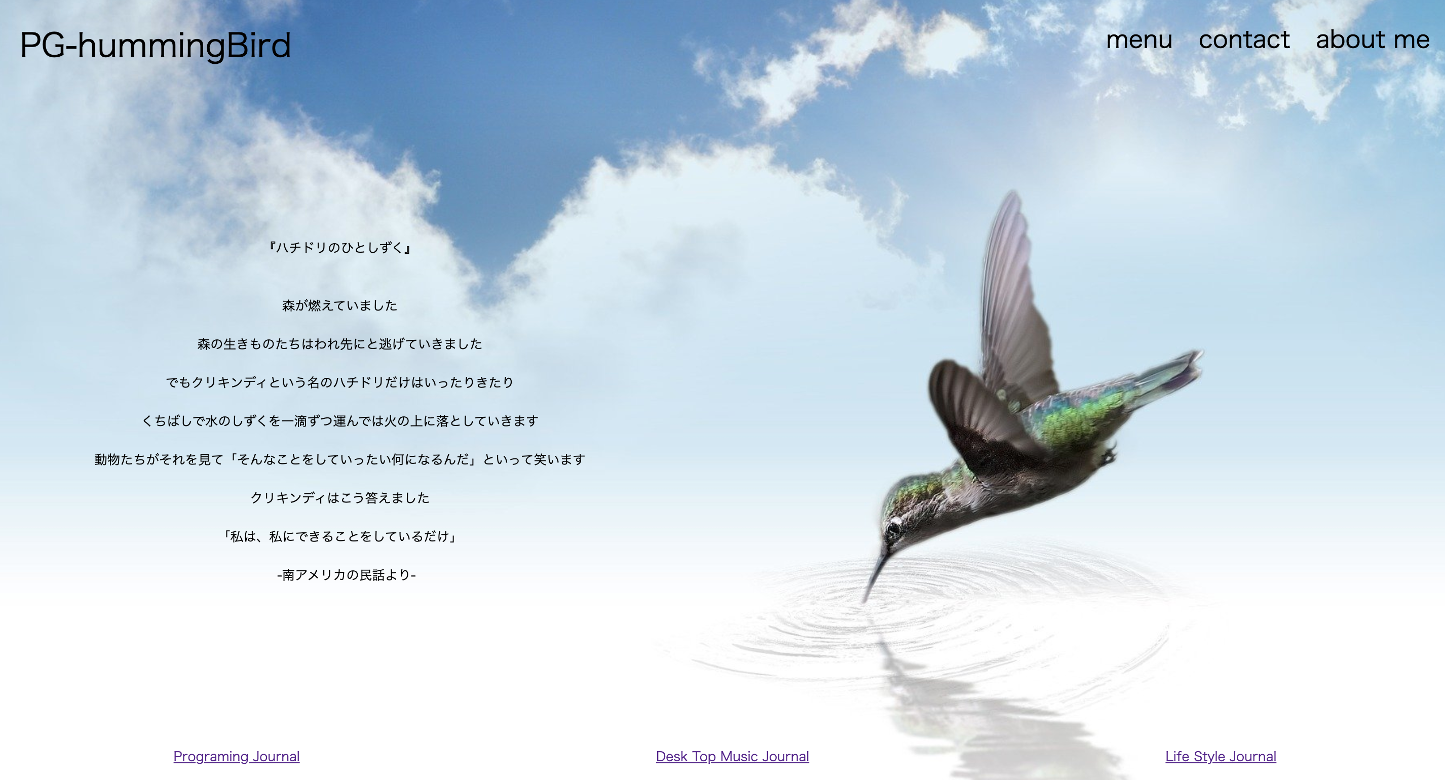
背景画像を左右反転させたい。 transform: scale() ;を使おう
フロント実装の練習アウトプット。
まずはこんな画面を作ってみました。
HTMLコード
<div class="backImage">
    <div class="header">
      <div class="title">PG-hummingBird</div>
      <ul class="topList">
        <li class="btn"><a href="#">menu</a></li>
        <li class="btn"><a href="#">contact</a></li>
        <li class="btn"><a href="#">about me</a></li>
      </ul>
    </div>
    <div class="text">
      テキスト部分省略
    </div>
    <ul class="underList">
      <li class="btnBtm"><a href="#">Programing Journal</a></li>
      <li class="btnBtm"><a href="#">Desk Top Music Journal</a></li>
      <li class="btnBtm"><a href="#">Life Style Journal</a></li>
    </ul>
  </div>
cssバックイメージのクラスと設定(一部抜粋)
.backImage{
   width: 100vw;
    height: 1000px;
    background-image: url("hogehogehoge");
}
ブログのトップページを想定した画面です。
個人的には画像を反転させて、テキストを右にずらしたい・・・・・・。
調べたところ、こんなコードがあるらしい。.class{ transform: scale(水平軸,垂直軸); } ****** scale(1, 1); この状態がデフォルト。変化はありません。 scale(1, -1) これで上下反転 scale(-1, 1) これで左右反転。今回のお目当て。 scale(-1, -1) これで上下左右反転。もう何がなんだか・・・。そしてこちらが左右反転結果の画面
文字も反転してしまったぞ・・・。
テキストやボタンクラスにもtransformを使えばいいのではということで以下を追加。
.header{
  height: 10vh;
  width: 100vw;
  display: flex;
  transform: scale(-1, 1);
}

.text{
  width: 650px;
  transform: scale(-1, 1);
  margin-top: 200px;
  margin-left: 100px;
  text-align: center;
}

.underList{
  width: 100vw;
  list-style: none;
  display: flex;
  margin-top: 200px;
  justify-content: space-around;
  transform: scale(-1, 1);
}
結果、、、
思い通りのフロントになりました!!


- 投稿日:2020-07-02T16:09:10+09:00
【コピペOK】hoverしたら動き出すCSSボタンアニメーション46選
コピペだけで作れるボタンアニメーションを46個を紹介いたします。
box-shadow, filter, transformなどをふんだんに使っており、transitionで滑らかな動きが表されています
コードには説明もわかりやすく書いてあるのでかなり参考になります
Webデザイン初心者の方はもちろんですが、バックエンドエンジニアの方にもとても助かる内容になっています
CSSボタンアニメーション46選
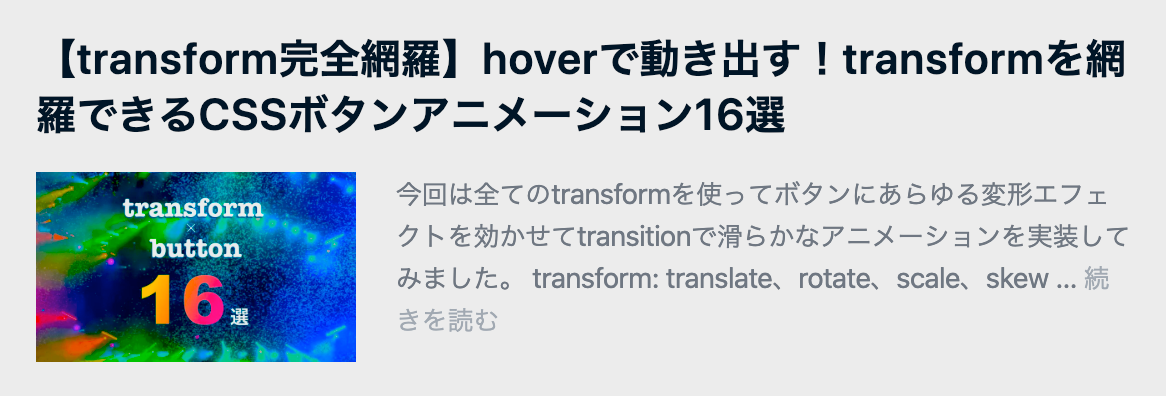
1. transformを使いこなすボタンアニメーション16選
transformを使ってボタンを変形し、WebサイトやWebアプリケーションで使えるボタンエフェクトとなっています
transformを全種類使っていてわかりやすく説明もされているのでかなり重宝します
↓参考記事は下の記事です↓
2. transitionを使いこなすボタンアニメーション9選
transitionを使ってボタンにアニメーションを効かせおり、WebサイトやWebアプリケーションで使えるボタンエフェクトとなっています
box-shadowやborder-radiusをエフェクトで使用して見た目のデザインもいい感じです
↓参考記事は下の記事です↓
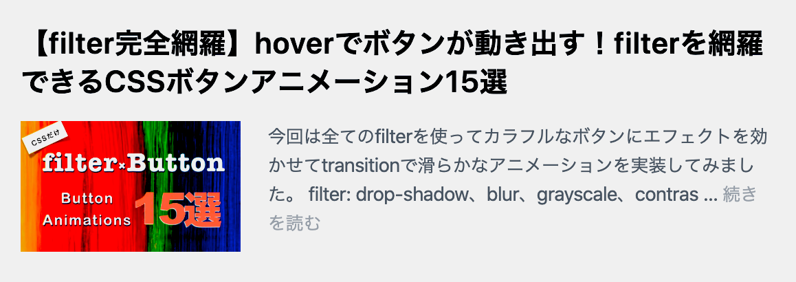
3. filterが網羅できるCSSボタンアニメーション15選
filterを使ってボタンにエフェクトを効かせおり、特にデザインの見た目をカッコよくしたい場合に非常に使えます
filterエフェクトを全種類使っているので永久保存版としても重宝できそうなまとめ記事になっています
勉強にもフロント開発でも役立つと思います
↓参考記事は下の記事です↓
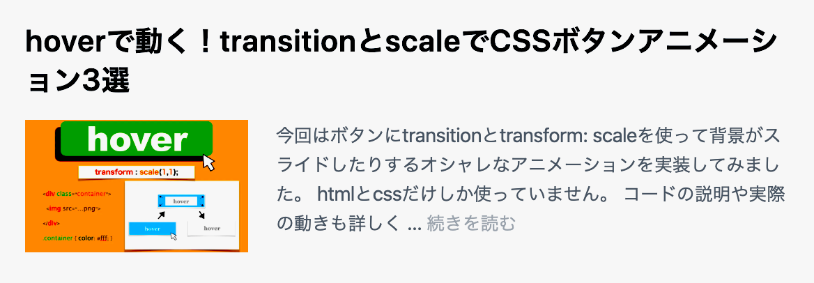
4. scaleでオシャレなCSSボタンアニメーション3選
transform:scaleを使ってボタンにエフェクトを効かせおり、オシャレでかっこいいボタンになっています
ボタンの背景が滑らかにスライドしたり、フワッと出てきたりするのでみているだけで面白いです
↓参考記事は下の記事です↓
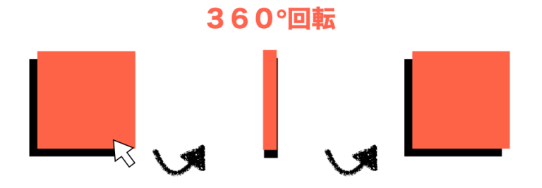
5. ボタンでつくる回転アニメーション9選
transitionを使ってボタンが自然に回転します
ボタンが回転するって純粋に興味ありませんか?
回転扉みたいに動くんです
↓参考記事は下の記事です↓


- 投稿日:2020-07-02T10:16:46+09:00
複数の背景画像をCSSで設置する
はじめに
こんな相談を受けました
- canvasの背景に設置した画像が重すぎて困っている.
- バックエンド側で軽量化したり画像形式を変えてみたが一長一短.
- 分割したらどうかとおもうが、可能?
backgroundbackground-***は複数設定出来たと思ったのですが、うろ覚えだったので備忘をかねて投稿します。実装
基本的には
,区切りで複数設定できます。
最後に;を忘れずに。cssbackground-image: url("http://placehold.jp/56c7c7/ffffff/200x100.png?text=1"), url("http://placehold.jp/22a31d/ffffff/200x100.png?text=2"), url("http://placehold.jp/75b4d9/ffffff/200x100.png?text=3");画像は重なるように表示されます。
その際、一番最初に指定した設定(画像path)が一番上(手前)に表示されます。画像のサイズ(縦/横)によっては、画像が重なって見えない場合があるので、
必要に応じてbackground-positionを設定すると良いかと思います。cssbackground-position: left 0px top 0px, left 0px top 100px, left 0px top 200px;表示されない時のチェック事項
- 記述や画像のpathは正しい?
- カンマある?
- 画像が重なっていない?
- 繰り返しとかされていない?
*1度、設定した画像を1つにしてみるとわかりやすいです。
実装例
See the Pen Multiple_background_settings by H.N (@H_Naito) on CodePen.
この例の実装ポイント
- こちらの実装ではJavaScriptで出力してます。
- 背景画像の共通設定は
backgroundプロパティで設定し、個別の設定をbackground-***で部分的に上書きしています。参考
background-image
https://developer.mozilla.org/ja/docs/Web/CSS/background-image
- 投稿日:2020-07-02T03:15:05+09:00
Qiitaをユニバーサルデザイン化したいから簡単な拡張機能を作ろうとした時に得た知見
はじめに
Qiitaって色が一様で見にくいと思ったことはありませんか?
私は親の遺伝で遠視がきつく、背景色と似た色の文字を見ようとするとピントを合わせるのに目を酷使して疲れます。
これは自分に限った話ではなく、例えば色盲の方なら色の区別がつきにくかったりします。
そのため、Web開発をする際はユニバーサルデザインに気を付けようという心がけがあります。
しかし、Qiitaには色の変換ならまだしも、文字の大きさを変更することすら出来ません。
ここで、拡張機能を作った時に得た知見を記そうと思います。あまりデザインセンスには自信が無いということをまず言っておきます..
作ろうとした際に思ったこと
リンクが見にくい
問題例
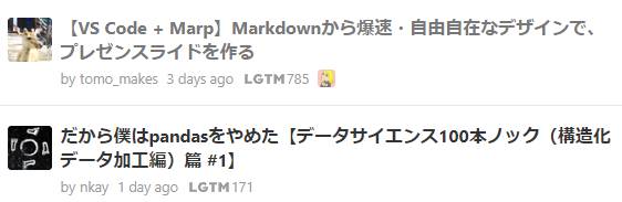
例えばこの最初のページ。普通に見る分には全然問題ありません。
しかしながら...
この二つのリンク。記事を見たリンクは灰色に、見ていないリンクは黒色で表示しています。
確かにデザイン的には合っているのかもしれませんが、遠目で見ると違いがわかりにくいです。検索した場合のリンクは、青と紫という初期色になっています。
これはただただデザインを優先したのか、一貫性が無いのかわかりませんが分かりやすい色で統一するのがよさそうです。解決例
例で、記事を見たリンクを深緑で表示してみます。
個人的にはこちらの方が数倍見やすいです。(個人差あり)
しかしながら違う色の方が見やすい場合があります。これは拡張機能で補うことは出来ますが、スマホ等では出来ません。
これはQiita側でテーマ的なものを開発してもらうのを待つしかありません。(緑主体なのはわかっていますが...)
せめて暗めのテーマが欲しいのは私だけでしょうか。誰が書いたかわかりにくい
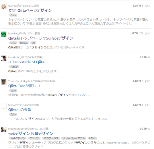
問題例
これも最初のページなのですが
拡大したらそうでもないかもしれませんが、byとユーザーネームが引っ付いて見えます。
また、一列全て色が同じです。解決例
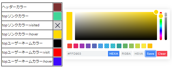
ユーザーネームの色を変え、Qiitaお気に入りのLGTMの色をテーマカラーにしました。こうすると何日前かがわかりにくいので何かしらイイ感じに色をつけていきたいですね。簡単に拡張機能を作ってみた
サクッと上記の問題を解決するような拡張機能を作りました。chrome限定です。
本当にわずかですが、ここで色を変えることが出来ます。
GitHubにもあげておきますので誰か完成までもっていってほしいな。作っていて思ったこと
chromeの拡張機能は少ししか触ったことが無いのですが、ページのcssを動的に変えようとすると凄く大変です。
ましてやQiitaではclass名で取得することが難しく、今後デザイン変更された時にclass名が変更されるとまた一から変えるはめになります。
それはとても大変なので、Qiita様が直々にユニバーサルデザイン化して頂く必要があります。
緑が基調なのはよーくわかっております。しかしながらユニバーサルデザイン化をして頂きたい所存でございます。と、いったことが思ったことです。色変更だけでも大変なんじゃ...
まとめ
Qiitaを便利にするには機能追加もいいのですが、元を見やすくしてみるのもありだと思って考えました。
フロントエンドを主にしているので、ユニバーサルデザインは人よりかは重要視しています。(自分もその一部だからね)
万人に便利かと言われると微妙ですが、一部の人はすごく便利になると思うので是非とも公式で開発を進めてほしいです。

- 投稿日:2020-07-02T01:24:58+09:00
CSSで背景を2色使う方法
プログラミングの勉強日記
2020年7月2日 Progate Lv.148
ポートフォリオ作成中
背景で2色使う方法を調べたが、この方法を用いることでグラデーションもできる。目標物
下のように背景の色を2色使いたい。
コード
CSSの
backgrouundプロパティにlinear-gradientを指定することでできる。この方法を用いることで、グラデーションも作成できる。
background:linear-gradient(色を変える方向,色 位置,色 位置,...);で指定する。色を変える方向は以下のキーワードまたは角度を指定する。
キーワード 角度 グラデーションの向き to top 0deg 下から上 to right 90deg 左から右 to bottom 180deg 上から下 to left 270deg 右から左 /* 左から50%まで青、右から50%まで赤 */ background:linear-gradient(to right,blue 0%,blue 50%,red 50%,red 100%); /* 青から赤のグラデーション */ background:linear-gradient(to right, blue 0%, red 100%);
位置は「最初の色」から「次の色」のグラデーションのパーセンテージを表している。
上の例で1つ目の例では、0%から50%までは青から青のグラデーション(=ずっと青)を、50%から100%までは赤から赤のグラデーション(=ずっと赤)を表している。
なので、2つ目の例では、0~100%まで青から赤のグラデーションを表している。角度を変えると下のように斜めで色を区切ることもできる。
background: linear-gradient(45deg, blue 0%, blue 50%, red 50%, red 100%);
サンプルコード
目標物になるようにするには以下のコードを利用した。
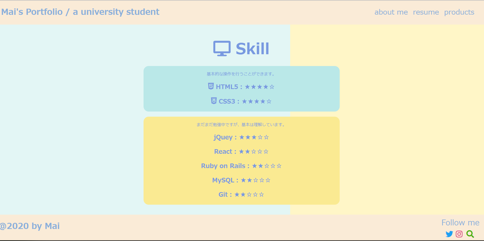
CSSファイル.skill{ background:linear-gradient(to right,rgb(227, 246, 245) 0%,rgb(227, 246, 245) 60%,rgb(255, 246, 199) 60%,rgb(255, 246, 199) 100%); }


- 投稿日:2020-07-02T00:38:34+09:00
【コピペOK】hoverしたら動き出すCSSボタンアニメーション30選
コピペだけで作れるボタンアニメーションを30個を紹介いたします。
box-shadow, filter, transformなどをふんだんに使っており、transitionで滑らかな動きが表されています
コードには説明もわかりやすく書いてあるのでかなり参考になります
Webデザイン初心者の方はもちろんですが、バックエンドエンジニアの方にもとても助かる内容になっています
CSSボタンアニメーション30選
1. transitionを使いこなすボタンアニメーション9選
transitionを使ってボタンにアニメーションを効かせおり、WebサイトやWebアプリケーションで使えるボタンエフェクトとなっています
box-shadowやborder-radiusをエフェクトで使用して見た目のデザインもいい感じです
↓参考記事は下の記事です↓
2. filterが網羅できるCSSボタンアニメーション15選
filterを使ってボタンにエフェクトを効かせおり、特にデザインの見た目をカッコよくしたい場合に非常に使えます
filterエフェクトを全種類使っているので永久保存版としても重宝できそうなまとめ記事になっています
勉強にもフロント開発でも役立つと思います
↓参考記事は下の記事です↓
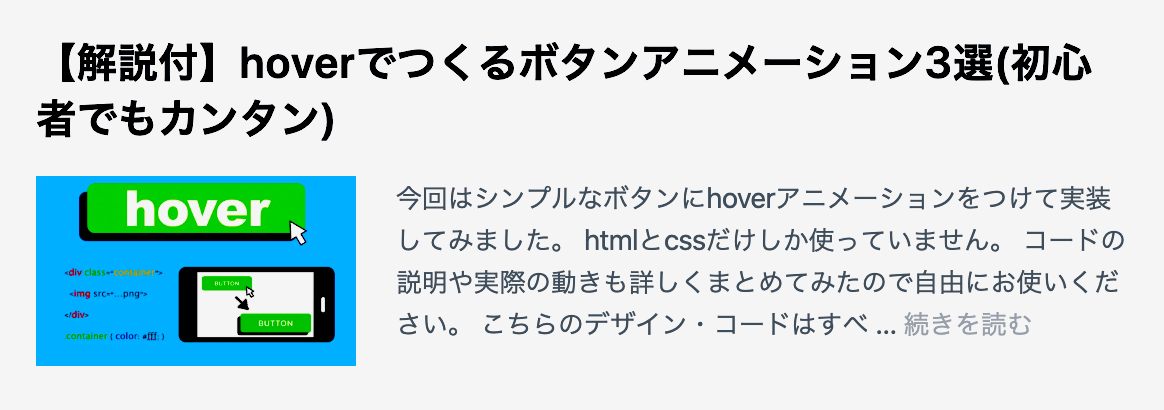
3. scaleでオシャレなCSSボタンアニメーション3選
transform:scaleを使ってボタンにエフェクトを効かせおり、オシャレでかっこいいボタンになっています
ボタンの背景が滑らかにスライドしたり、フワッと出てきたりするのでみているだけで面白いです
↓参考記事は下の記事です↓
4. ボタンでつくる回転アニメーション9選
transitionを使ってボタンが自然に回転します
ボタンが回転するって純粋に興味ありませんか?
回転扉みたいに動くんです
↓参考記事は下の記事です↓

- 投稿日:2020-07-02T00:18:56+09:00
【初心者向け】1pxのズレもなくコーディングするための便利ツール
どうも、7noteです。今回は必ずいれてほしいgoogleの拡張機能を紹介
デザイナーからデザインが上がってきた時、1pxのズレもなくコーディングするのがコーダーやフロントエンジニアの仕事です。ですがコーディングしているうちに、、、
「あれ、なんかデザインと違う」
「ここってこんなんだっけ」
「測ったのになんかが違う」わかります!!!
ちゃんと測ってやってるのになんかずれるんですよね。まだデザインからのコーディングを経験していない人もこの記事を読んでいると思いますが、初めて模写コーディングをしたら、、、、わかるようになります。
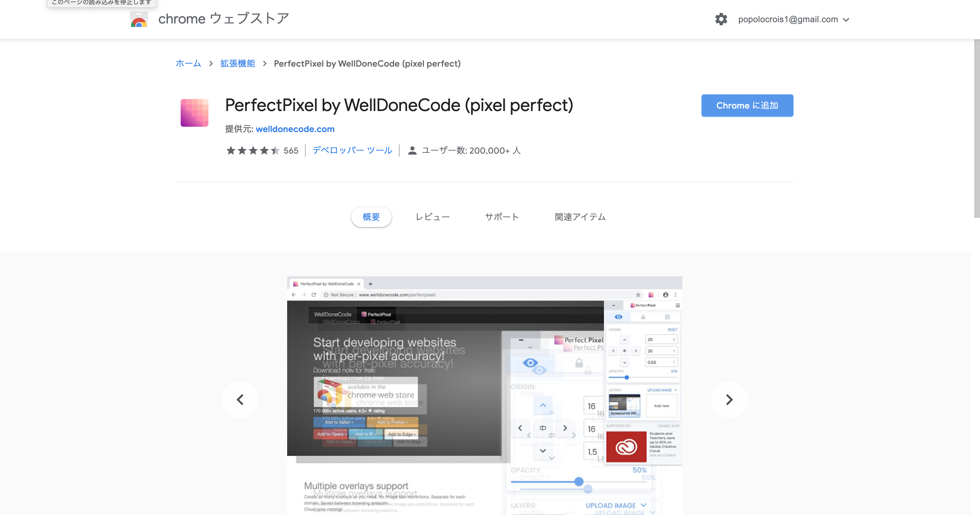
1pxのズレなくチェックできるgoogle拡張機能「perfect pixel」
何ができるの?
1. ブラウザ上に画像(デザインデータ)を重ねられる
2. 画像データの透明度や表示位置を自由に変えられる。
3. 2の設定をロックできるので、ページスクロールしながら上から下まで全部チェックできる。
4. 開発者ツールで微調整しながらズレを直すことができる。(重要!!!)
開発者ツールで直しながら1pxずつ調整ができるので、本当に便利!
ざっくり作るだけならいらない拡張機能ですが、一般の人が見るホームページなどを作成する場合はデザイナーは完璧なデザインを作成します。1px1pxこだわって作っています。
それに答えられず適当にそれっぽいコーディングをするだけなら素人でもできますが、プロとしていかに完璧なコーディングができるかはとても重要なことです。使ってみた感想
正直に述べるとこんなの欲しかった!というツールです。
もしまだインストールしてないなら絶対に使って欲しい。ただ導入しはじめはなれなくて、普段よりも1.5倍くらい時間がかかるかもしれません。
しかし使わずにコーディングして、後からやり直しなどになる可能性や時間を考えると、絶対に導入した方がいいですし、
コーディングの完成品を納品する時にもキッチリやってくれるなと評価や信頼を得ることができます!無料のツールで評価や信頼、技術が上がるのなら絶対にいれたいツールです!
おしまい。
- 投稿日:2020-07-02T00:16:02+09:00
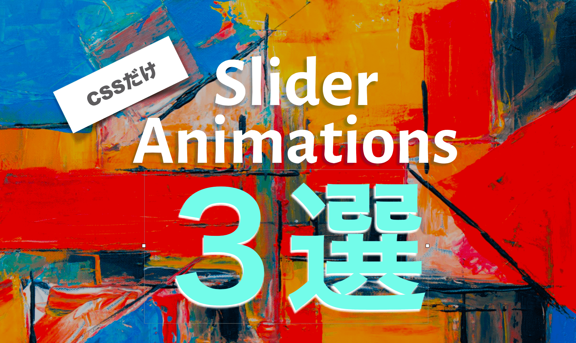
【コピペOK】CSSだけで作る!画像アニメーション49選(まとめ記事)
こちらの記事に記載のデザイン・コードは全て自由に使っていただいて大丈夫です(筆者が作成したため)
プロジェクトに取り込んでより充実したデザインにしてもらえれば○
*動きだけ確認したい初学者の方はJSFiddle使ってみるといいですよ
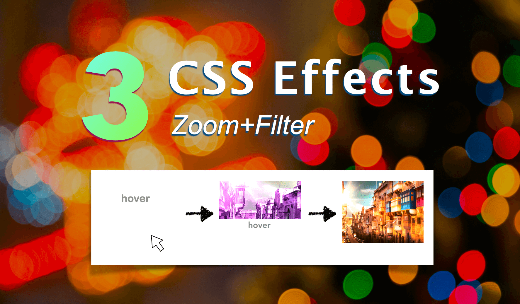
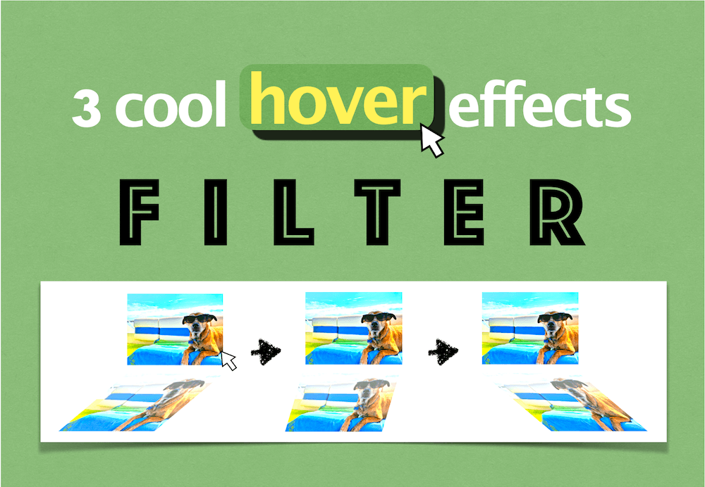
1. hoverで画像が拡大(ズーム)するCSSアニメーション3選(+filterエフェクト)
2. box-shadowとhoverで3D画像に動きをつけるCSSアニメーション3選!
3. hoverとtransitionでオシャレなCSS画像エフェクト4選!(背景がスっと表示される)
4. CSSだけ!hoverとtransitionで作る動的画像エフェクト4選(コピペOK)
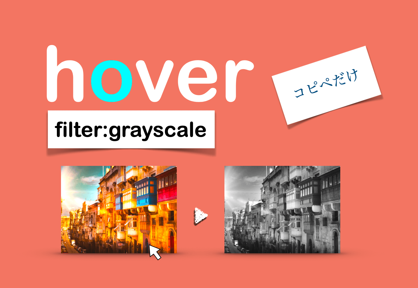
5. hoverとfilter:grayscaleで白黒に切り替え!CSS画像エフェクト3選
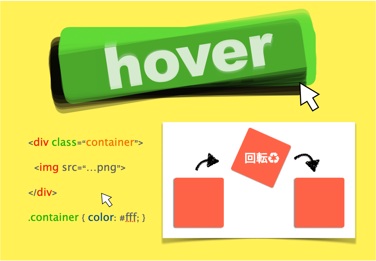
6. hoverとtransformで画像が回転するCSSアニメーション3選【3分で作れる!】
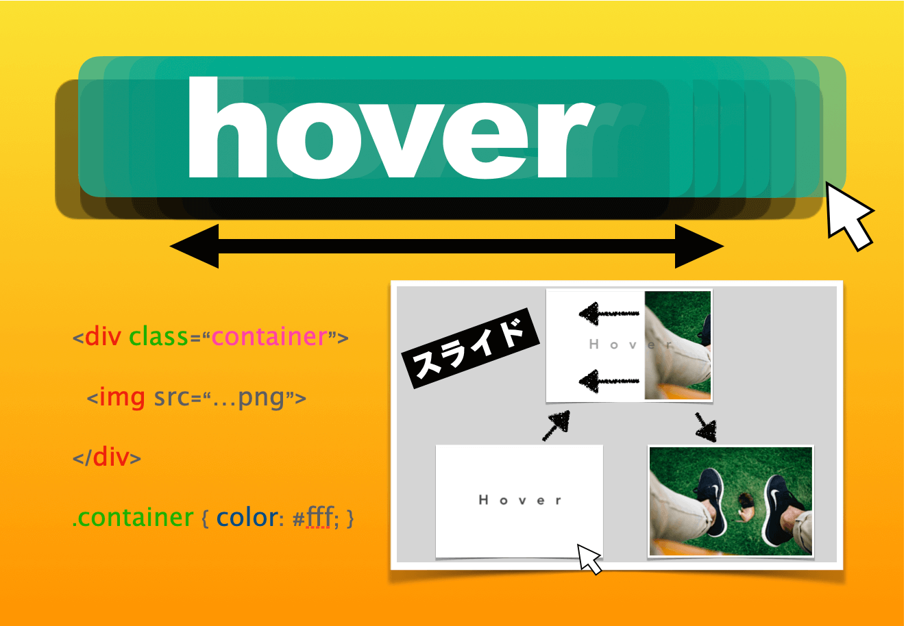
7. hoverで画像がスライド!margin-leftとscaleでCSSアニメーション3選
[
](https://www.twinzlabo.com/css-animation-hover-slide-transition/)
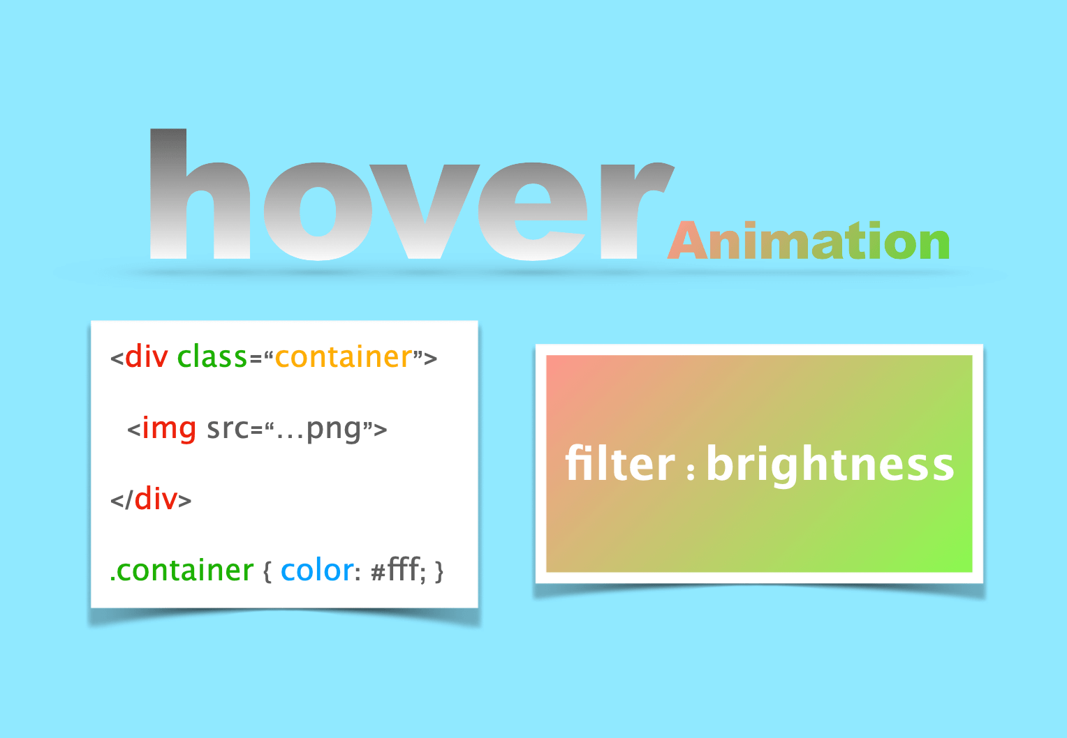
8. hoverとfilter:brightnessで明るさ調節!CSS画像エフェクト3選
9. overflow: hiddenで美しい!CSSアニメーション3選(画像一覧)
10. 【CSSだけ】filterとopacityで洗練されたスライダーアニメーション3選
11. hoverで画像が鏡みたいに反射!position:absoluteとfilter多用でCSSアニメーション3選
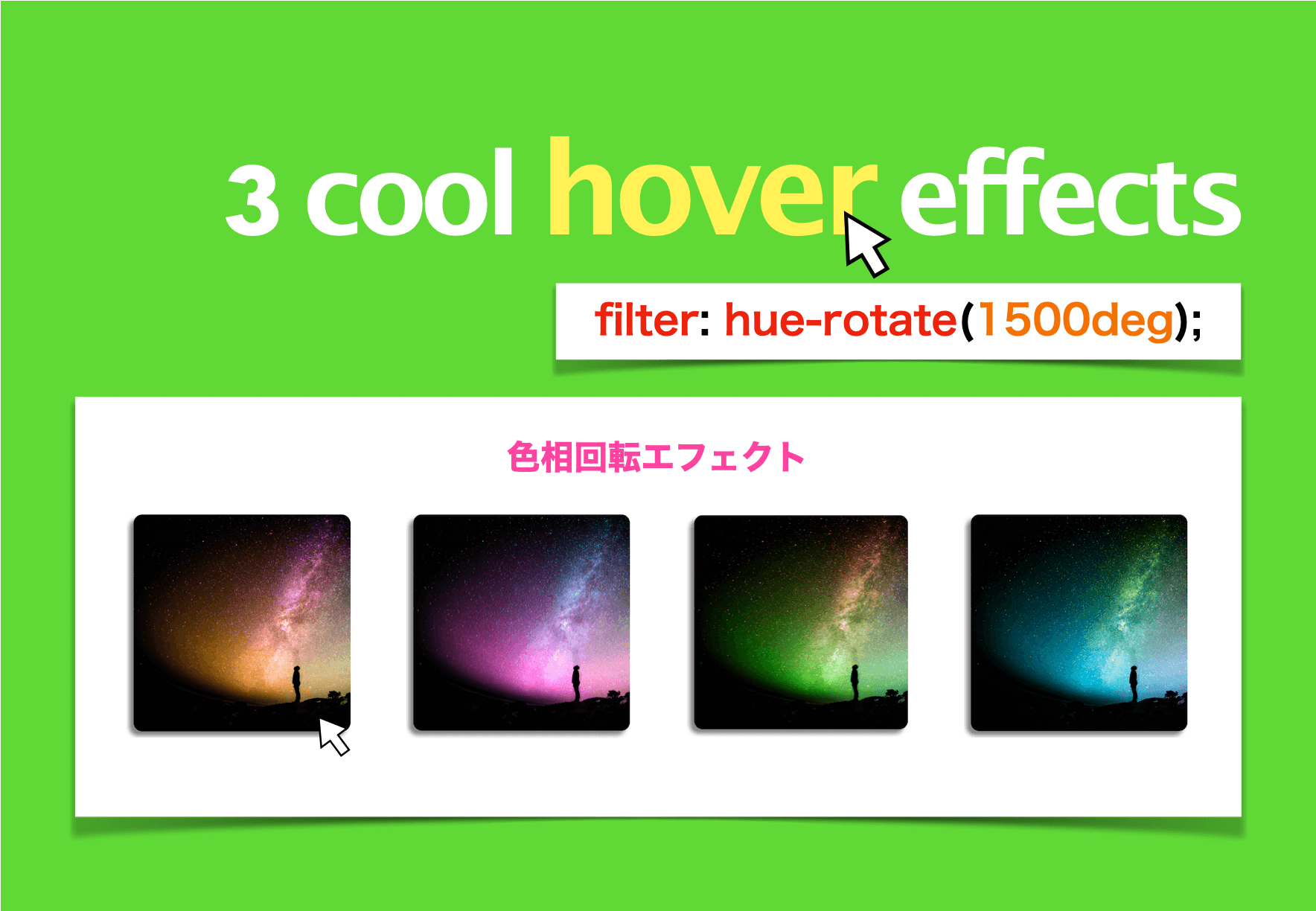
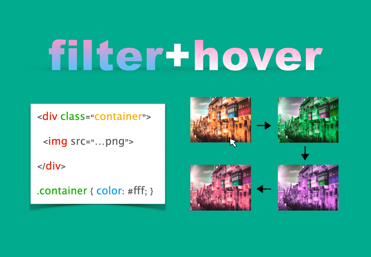
12. hoverで画像の色が暴れ出す!filter: hue-rotateとtransitionでCSSエフェクト3選
[
](https://www.twinzlabo.com/css-effects-hover-filter-hue-rotate/)
13. transitionとfilterで美しく変化するCSS画像エフェクト5選(基礎から応用まで)
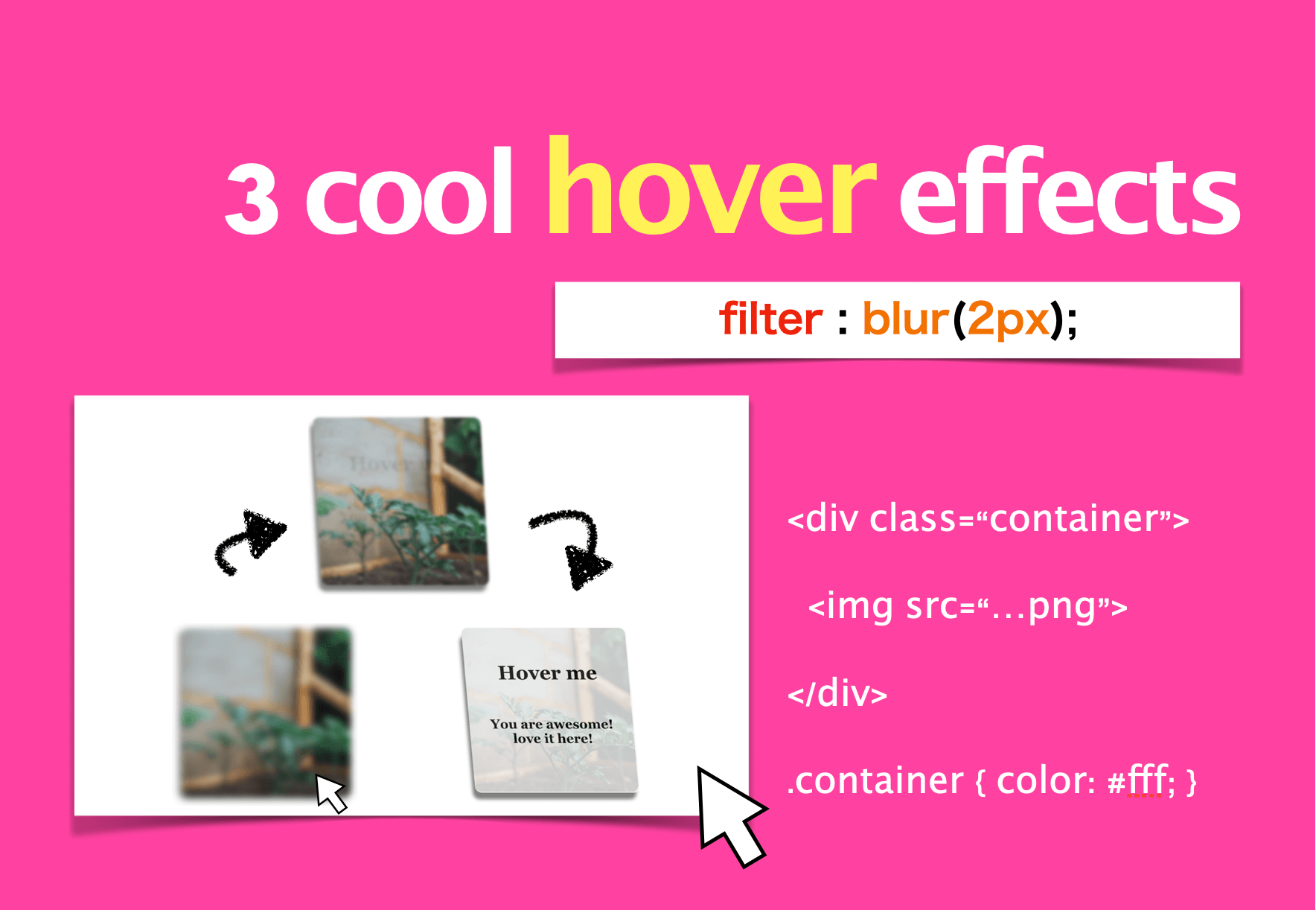
14. hoverでぼかし画像が動き出す!filter:blurとtransitionでCSSエフェクト3選
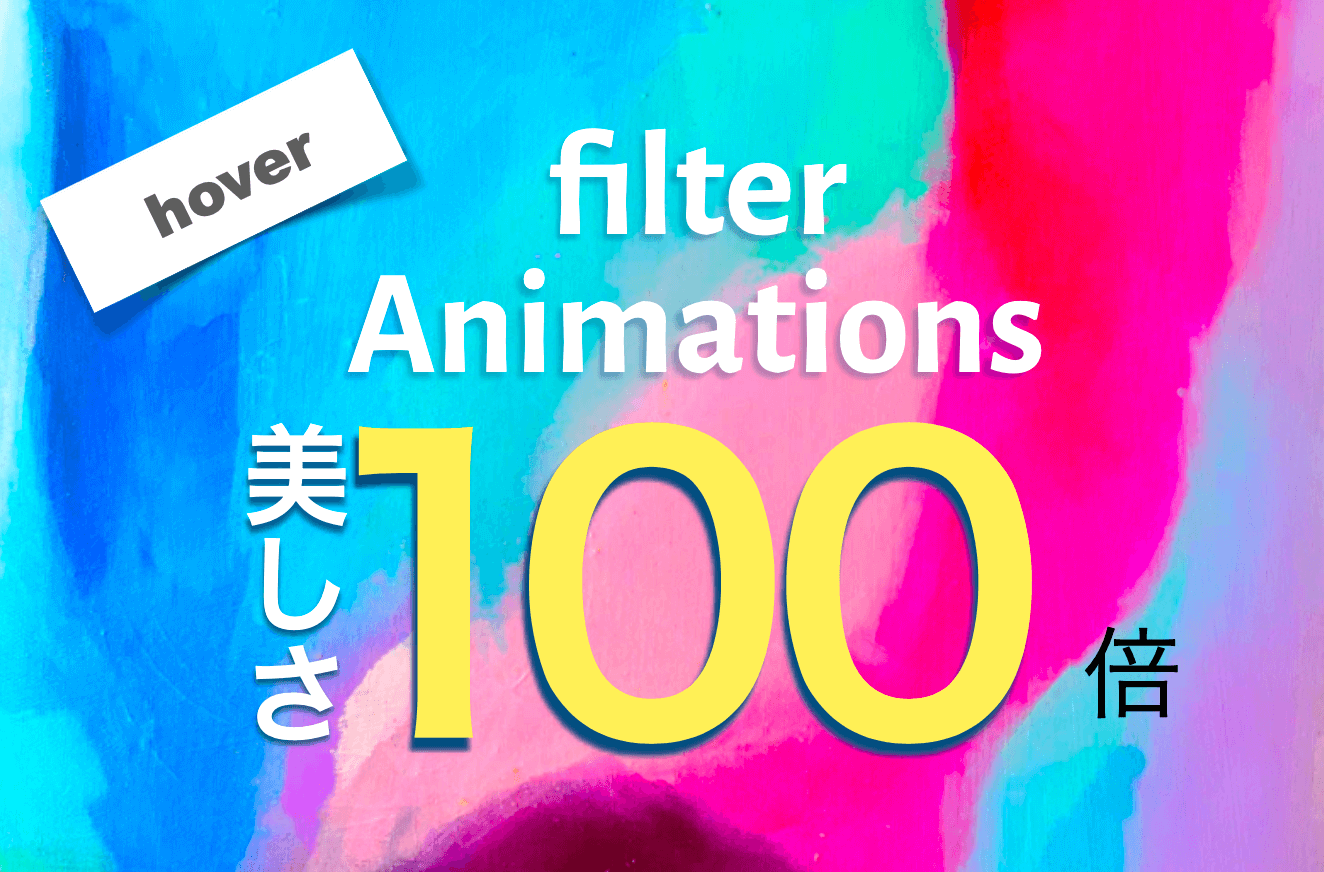
15. 【filterプロパティ】hoverすると美しさ100倍!CSS画像エフェクト3選
いかがでしたでしょうか?
お役に立てたら嬉しいです。最後に注意書きとして
コメント欄に心ないコメントを投稿する方がまれにいますが迷惑なので問答無用で速攻ブロックします。

- 投稿日:2020-07-02T00:16:02+09:00
現役フロントエンドエンジニアがガチでおすすめ!画像アニメーション49選
こちらの記事に記載のデザイン・コードは全て自由に使っていただいて大丈夫です(筆者が作成したため)
プロジェクトに取り込んでより充実したデザインにしてもらえれば○
*動きだけ確認したい初学者の方はJSFiddle使ってみるといいですよ
1. hoverで画像が拡大(ズーム)するCSSアニメーション3選(+filterエフェクト)
2. box-shadowとhoverで3D画像に動きをつけるCSSアニメーション3選!
3. hoverとtransitionでオシャレなCSS画像エフェクト4選!(背景がスっと表示される)
4. CSSだけ!hoverとtransitionで作る動的画像エフェクト4選(コピペOK)
5. hoverとfilter:grayscaleで白黒に切り替え!CSS画像エフェクト3選
6. hoverとtransformで画像が回転するCSSアニメーション3選【3分で作れる!】
7. hoverで画像がスライド!margin-leftとscaleでCSSアニメーション3選
[
](https://www.twinzlabo.com/css-animation-hover-slide-transition/)
8. hoverとfilter:brightnessで明るさ調節!CSS画像エフェクト3選
9. overflow: hiddenで美しい!CSSアニメーション3選(画像一覧)
10. 【CSSだけ】filterとopacityで洗練されたスライダーアニメーション3選
11. hoverで画像が鏡みたいに反射!position:absoluteとfilter多用でCSSアニメーション3選
12. hoverで画像の色が暴れ出す!filter: hue-rotateとtransitionでCSSエフェクト3選
[
](https://www.twinzlabo.com/css-effects-hover-filter-hue-rotate/)
13. transitionとfilterで美しく変化するCSS画像エフェクト5選(基礎から応用まで)
14. hoverでぼかし画像が動き出す!filter:blurとtransitionでCSSエフェクト3選
15. 【filterプロパティ】hoverすると美しさ100倍!CSS画像エフェクト3選
いかがでしたでしょうか?
お役に立てたら嬉しいです。最後に注意書きとして
コメント欄に心ないコメントを投稿する方がまれにいますが迷惑なので問答無用で速攻ブロックします。