- 投稿日:2020-09-16T15:51:04+09:00
【初心者でもわかる】CSSだけで6角形を作る方法
どうも7noteです。あまり使う機会は少ないかもですが、CSSだけで6角形の作り方について
CSSだけで6角形を作ります。6角形は英語でヘキサゴン!
8角形も似たような方法で作ったのでよければ見てってください。
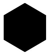
cssだけで6角形を作る
index.html<div class="hexagon"> <div class="hexagon_frame"></div> </div>style.css.hexagon { width: 69px; height: 80px; background: #000; /* 6角形の色 */ position: relative; } .hexagon::before { content: ''; width: 0; height: 0; border-top: 10px solid #fff; border-left: 17px solid #fff; border-bottom: 10px solid transparent; border-right: 17px solid transparent; position: absolute; top: 0; left: 0; } .hexagon::after { content: ''; width: 0; height: 0; border-top: 10px solid #fff; border-left: 17px solid transparent; border-bottom: 10px solid transparent; border-right: 17px solid #fff; position: absolute; top: 0; right: 0; } .hexagon_frame::before { content: ''; width: 0; height: 0; border-top: 10px solid transparent; border-left: 17px solid #fff; border-bottom: 10px solid #fff; border-right: 17px solid transparent; position: absolute; bottom: 0; left: 0; } .hexagon_frame::after { content: ''; width: 0; height: 0; border-top: 10px solid transparent; border-left: 17px solid transparent; border-bottom: 10px solid #fff; border-right: 17px solid #fff; position: absolute; bottom: 0; right: 0; }結果
この方法でハニカム構造にするにはちょっとしんどいかも。できなくはないが・・・
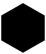
もう一つ疑似要素を使った方法
index.html<div class="hexagon"></div>style.css.hexagon { width: 70px; height: 40px; background: #000; position: relative; } .hexagon::before { content: ''; width: 0; height: 0; border-top: 0 solid transparent; border-left: 35px solid transparent; border-bottom: 20px solid #000; border-right: 35px solid transparent; position: absolute; top: -20px; left: 0; } .hexagon::after { content: ''; width: 0; height: 0; border-top: 20px solid #000; border-left: 35px solid transparent; border-bottom: 0 solid transparent; border-right: 35px solid transparent; position: absolute; bottom: -20px; left: 0; }結果
まとめ
どちらの方法も擬似要素を使った方法です。
1つ目の方法は、背景と同じ色の三角形で削り取って6角形に見せかけている方法。
2つ目の方法は、逆に四角形に三角形を2つ上下に重ね、6角形に見せかけている方法。どちらもだいたい6角形に見えるだけで、数値的には正6角形ではありませんが、WEBで使用する分にはさほど問題ないと思います。
おまけ
2つ目の方法でハニカム構造を作ってみた。
画像
index.html<ul> <li> <div class="hexagon"></div><div class="hexagon"></div><div class="hexagon"></div><div class="hexagon"></div><div class="hexagon"></div><div class="hexagon"></div> </li> <li> <div class="hexagon"></div><div class="hexagon"></div><div class="hexagon"></div><div class="hexagon"></div><div class="hexagon"></div><div class="hexagon"></div> </li> <li> <div class="hexagon"></div><div class="hexagon"></div><div class="hexagon"></div><div class="hexagon"></div><div class="hexagon"></div><div class="hexagon"></div> </li> </ul>style.cssul li { margin-bottom: 15px; list-style: none; } ul li:nth-child(odd) { margin-left: -36px; } .hexagon { width: 70px; height: 40px; background: #000; position: relative; margin-right: 2px; display: inline-block; /* 追記 */ } .hexagon::before { content: ''; width: 0; height: 0; border-top: 0 solid transparent; border-left: 35px solid transparent; border-bottom: 20px solid #000; border-right: 35px solid transparent; position: absolute; top: -20px; left: 0; } .hexagon::after { content: ''; width: 0; height: 0; border-top: 20px solid #000; border-left: 35px solid transparent; border-bottom: 0 solid transparent; border-right: 35px solid transparent; position: absolute; bottom: -20px; left: 0; }おそまつ!
~ Qiitaで毎日投稿中!! ~
【初心者向け】HTML・CSSのちょいテク詰め合わせ
[参考]
https://spyweb.media/2017/12/21/css-responsive-hexagon/
https://qiita.com/cotolier_risa/items/96992b5e2561dc8cbaa3
- 投稿日:2020-09-16T00:15:36+09:00
Emmetでよく使うもの
EmmetでHTMLを記述
!・・・HTMLのひな形が作れる<!DOCTYPE html> <html lang="en"> <head> <meta charset="UTF-8"> <meta name="viewport" content="width=device-width, initial-scale=1.0"> <meta http-equiv="X-UA-Compatible" content="ie=edge"> <title>Document</title> </head> <body> </body> </html>
.classname・・・クラス付きの要素が作れる<div class="classname"></div>
#idname・・・ID付きの要素が作れる<div id="idname"></div>
ul>li*2>a・・・リンク付きリスト<ul> <li><a href=""></a></li> <li><a href=""></a></li> </ul>
table>tr*2>th+td・・・テーブル(表)をつくる<table> <tr> <th></th> <td></td> </tr> <tr> <th></th> <td></td> </tr> </table>
dl>(dt+dd)*2・・・説明リスト<dl> <dt></dt> <dd></dd> <dt></dt> <dd></dd> </dl>EmmetでCSSを記述
ショートハンド 展開後 dib display: inline-block; bg#fff background: #fff; c#fff color: #fff; fz32 font-size: 32px; w50 width: 50px; maw640 max-width: 640px; miw50% min-width: 50%; pl10 padding-left: 10px; mb1e margin-bottom: 1em; m0-auto20 margin: 0 auto 20px; p5-10-5-10 padding: 5px 10px 5px 10px; bd(+) ※1 border: 1px solid #000; bsh0-0-3-0#000 box-shadow: 0 0 3px 0 #000; bdrs5 border-radius: 5px; bds:n border-style: none; bdsp0 border-spacing: 0; bdcl:c border-collapse:collapse; psr position: relative; psa position: absolute; ta:c text-align: center; trf:sc transform: scale(x, y); trs transition: prop time; ※1
VScodeでは、bdは+がいらないっぽい