- 投稿日:2020-02-05T23:36:44+09:00
Android端末1つでDiscordBotを作成し動作させる
「DiscordBotを作ってみたい、だけどPCを持っていない」という人向けにAndroid端末1つでDiscordBotを作って実際に動作させるまでの方法を紹介します。
なるべく初心者向けに説明していますが、Pythonやdiscord.py, Linuxコマンド, Vimコマンドなどの詳しい説明は省略しています。動作環境
- Android 9
- Termux 0.90
- Python 3.8.1
- discord.py 1.3.1
1. Termuxのインストール
TermuxはGoogle Playストアからインストールできます。
https://play.google.com/store/apps/details?id=com.termuxTermuxとはroot化不要でLinux環境を用意することができるエミュレータです。
ここではPythonとVimを使ってDiscordBotを書く方法を説明します。2. Termuxでの準備
まずターミナルで以下のコマンドを実行し、aptの更新とPython, Vimのインストールを行います。($はコマンドラインであることを表すもので入力は不要です)
$ apt update
$ apt upgrade
$ apt install python
$ apt install vim
次にPythonで簡単にDiscordBotを動かすことができるdiscord.pyというライブラリをインストールします。
$ pip install discord.py※もしインストールが上手くいかない場合は
pip install yarlで先にyarlをインストールしておくことで解決する場合があります。次に実行するPythonファイルを置くディレクトリを作り、移動します。
※{}で囲まれた部分は説明してる内容で置き換えてください$ mkdir {好きなディレクトリ名} $ cd {上で作ったディレクトリ名}3. Pythonファイルの作成
$ vim {好きなファイル名}.py上のコマンドを実行すると新規ファイルがVimが開かれるので、キーボードで
iと入力し、INSERTモードにします。
ここで下のコードをコピペしてください。(後述のサイトにあるものを一部改変し拝借させていただきました)import discord client = discord.Client() @client.event async def on_ready(): print('Logged in as') print(client.user.name) print(client.user.id) print('------') @client.event async def on_message(message): # 送り主がBotだった場合反応したくないので if message.author.bot: return # 「おはよう」で始まるか調べる if message.content.startswith("おはよう"): # メッセージを書きます m = "おはようございます" + message.author.name + "さん!" # メッセージが送られてきたチャンネルへメッセージを送ります await message.channel.send(m) client.run("token")4. Botアカウントを作成する
Chromeなどのブラウザで「https://qiita.com/PinappleHunter/items/af4ccdbb04727437477f 」のサイトのサイトを開き、「Bot用のトークンを手に入れる」の項に従ってBotアカウントを作成して使用したいサーバーにBotを追加しておきます。
ここで「後で使います」と言われているトークンをコピーしておいてください。
※このトークンはBotを動かすためのパスワードのようなものなので扱いには十分気を付けてください。5. Pythonファイルを実行する
Termuxを開き、
cliant.run("token")のtokenの部分に、先程コピーしてきたトークンをペーストし、ESC→:wqでファイルを保存しVimを閉じます。下のコマンドでPythonファイルを実行します。
$ python {先程作成したファイル名}.pyこれで
Logged in as...のように表示されればBotが動作していることになります。Botを追加したサーバーで
おはようなどを送信して返答が来るか試してみてください。
終了したいときはTermuxを終了すればBotも動かなくなります。もしBotを常時動かしたい場合は、Herokuなどを利用することでできます。
ちなみにTermuxではGitも使えるので、AndroidのみでHerokuにデプロイすることも可能です。参考サイト
Pythonで簡単なDiscord Botの作り方
Android端末上でDiscordのbotを動かす(Termux)
AndroidでTermuxを使いroot化なしでLinux環境を作る!
- 投稿日:2020-02-05T22:36:47+09:00
Android-Codelabs-2.3: ConstraintLayoutの使い方②
2019年にGoogleから,Web上でAndroidを学べるコースが提供されました.(Android Kotlin Fundamentals Course)
この記事では,そのコースを実際にやってみてアウトプットしてみるといった内容です.
何かツッコミなどあれば編集リクエストかコメントかTwitterでいただければ修正いたします今回学ぶこと
・BaseLine Constraintの使い方
・ボタンのチェーンの使い方目指す成果物
ここでは前回に引き続き,ConstraintLayoutの使い方②をやっていきます.
前回やったConstraintLayoutの使い方①をみていない方は,ここからソースコードをダウンロードしてください.さて前回使ったアプリに,新たな制約を加えてこのようなものを作っていきましょう.
ステップ
1. BaseLine Constraintを追加する
BaseLine Constraintというのは,ビューのテキストのベースラインにそろえることを言います.
特にフォントサイズが異なる場合に有効です.
コードは次のように書きます.
<Button
   android:id="@+id/buttonB"
   ...
   android:text="B"
   app:layout_constraintBaseline_toBaselineOf="@+id/buttonA" />
次に,ユーザーにアプリの使用方法を知らせるために,2つの
TextViewを追加します.
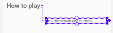
1つはラベル用で,もう1つは指示情報用です.まずラベル用のTextViewの属性はこのようにします.
<TextView
    android:layout_width="wrap_content"
    android:layout_height="wrap_content"
    android:text="@string/label_text"
    app:layout_constraintTop_toBottomOf="@id/box_two_text"
    app:layout_constraintStart_toStartOf="parent"
    android:layout_margin="16dp"
    android:textSize="24sp"
    android:textStyle="bold"/>
もう一つの指示情報用のTextViewは,このようにします.
<TextView
    android:id="@+id/info_text"
    android:layout_width="0dp"
    android:layout_height="wrap_content"
    android:layout_margin="16dp"
    android:text="@string/tap_the_boxes_and_buttons"
しかしこのままだと制約がないのでエラーが起こります.
まず右端と左端の制約をこのように定義します.
app:layout_constraintEnd_toEndOf="parent"
app:layout_constraintStart_toEndOf="@id/label_text"
次に先程の,2つの
TextViewのベースラインを揃えていきます.
レイアウトエディターで2つのビューを選択して,cntr+クリックでダイアログが表示されます.
constrain>infotext>to baseline of labeltextをクリックするとつけることができます.アプリを実行するとこのようになります.
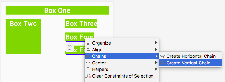
2. ボタンのチェーンを追加します
ここでは3つの
Buttonビューを追加し,それらをチェーンを使って連結していきます.まず3つの
Buttonビューを追加してください.
属性はこのようになります.
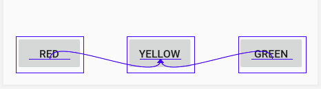
activity_main.xml<Button android:id="@+id/red_button" android:layout_width="wrap_content" android:layout_height="wrap_content" android:text="@string/button_red” /> <Button android:id="@+id/yellow_button" android:layout_width="wrap_content" android:layout_height="wrap_content" android:text="@string/button_yellow” /> <Button android:id="@+id/green_button" android:layout_width="wrap_content" android:layout_height="wrap_content" android:text="@string/button_green” />string.xml<string name="button_red">RED</string> <string name="button_yellow">YELLOW</string> <string name="button_green">GREEN</string>次にボタンを互いにそろえたいので,ベースラインの制約をつけます.
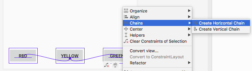
次に3つのボタンを,水平にチェーンの制約をつけます.
Chains>Crate Horizontal Chainsをクリックします.
最終的なコードはこのようになります.
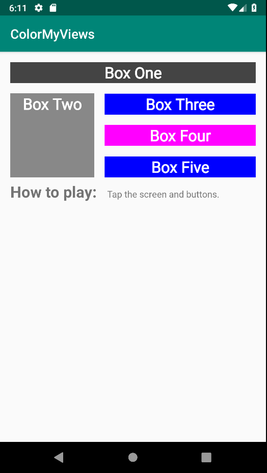
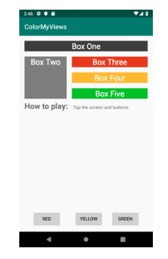
<Button
    android:id="@+id/red_button"
    android:layout_width="wrap_content"
    android:layout_height="wrap_content"
    android:layout_marginStart="16dp"
    android:layout_marginBottom="16dp"
    android:text="@string/button_red"
    app:layout_constraintBottom_toBottomOf="parent"
    app:layout_constraintEnd_toStartOf="@+id/yellow_button"
    app:layout_constraintHorizontal_bias="0.5"
    app:layout_constraintStart_toStartOf="parent" />

<Button
    android:id="@+id/yellow_button"
    android:layout_width="wrap_content"
    android:layout_height="wrap_content"
    android:layout_marginBottom="32dp"
    android:text="@string/button_yellow"
    app:layout_constraintBaseline_toBaselineOf="@+id/red_button"
    app:layout_constraintBottom_toBottomOf="parent"
    app:layout_constraintEnd_toStartOf="@+id/green_button"
    app:layout_constraintHorizontal_bias="0.5"
    app:layout_constraintStart_toEndOf="@+id/red_button" />

<Button
    android:id="@+id/green_button"
    android:layout_width="wrap_content"
    android:layout_height="wrap_content"
    android:layout_marginEnd="16dp"
    android:layout_marginBottom="32dp"
    android:text="@string/button_green"
    app:layout_constraintBaseline_toBaselineOf="@+id/red_button"
    app:layout_constraintBottom_toBottomOf="parent"
    app:layout_constraintEnd_toEndOf="parent"
    app:layout_constraintHorizontal_bias="0.5"
    app:layout_constraintStart_toEndOf="@+id/yellow_button" />
3. Buttonにクリックハンドラーを追加する
ここでは各
Buttonビューに,クリックハンドラーを追加していきます.
クリックハンドラーはTextViewの色を変化させるように実装します.まず,
res>values>colors.xmlファイルに次の色を追加します.colors.xml<color name="my_green">#12C700</color> <color name="my_red">#E54304</color> <color name="my_yellow">#FFC107</color>次に,MainActivityでButtonのビューを取得します.
val redButton = findViewById<TextView>(R.id.red_button)
val greenButton = findViewById<TextView>(R.id.green_button)
val yellowButton = findViewById<TextView>(R.id.yellow_button)
リストに値を追加します.
listOf(boxOneText, boxTwoText, boxThreeText,boxFourText, boxFiveText, rootConstraintLayout,
redButton, greenButton, yellowButton)
テキストビューの色を変更するコードを入れます.
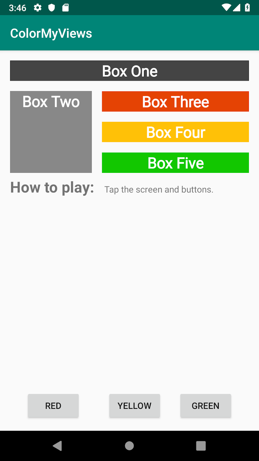
R.id.red_button -> box_three_text.setBackgroundResource(R.color.my_red)
R.id.yellow_button -> box_four_text.setBackgroundResource(R.color.my_yellow)
R.id.green_button -> box_five_text.setBackgroundResource(R.color.my_green)
アプリを実行するとこのようになります.
まとめ
・チェーンは,ビュー同士を互いに連結させて,双方向の制約を持たせるもの
・BaseLine Constraintは,ビューのベースラインを他のベースラインにそろえるもので,フォントサイズが違う場合に有効宿題
・アプリからテキストとボタンを削除し、レイアウト全体をカラーボックス(TextViewビュー)で埋めてみてください
クイズ
1問目
次の制約タイプのうち、コンテンツに合わせて必要なだけビューを展開する制約タイプはどれですか?・Wrap content
・Match constraint
・Fixed constraint
・Baseline constraintクイズの正解
1問目 Wrap content
参考資料
言葉の定義
・BaseLine Constraint
ビューのベースラインを他のベースラインにそろえるもので,フォントサイズが違う場合に有効CodeLabs by Google
https://codelabs.developers.google.com/android-kotlin-fundamentals/


- 投稿日:2020-02-05T22:36:47+09:00
【編集中】Android-Codelabs-2.3: ConstraintLayoutの使い方②
【編集中】
- 投稿日:2020-02-05T22:36:47+09:00
【Android-Codelabs】8/36 〜 ConstraintLayoutの使い方② 〜
2019年にGoogleから,Web上でAndroidを学べるコースが提供されました.(Android Kotlin Fundamentals Course)
この記事では,そのコースを実際にやってみてアウトプットしてみるといった内容です.
何かツッコミなどあれば編集リクエストかコメントかTwitterでいただければ修正いたします今回学ぶこと
・BaseLine Constraintの使い方
・ボタンのチェーンの使い方目指す成果物
ここでは前回に引き続き,ConstraintLayoutの使い方②をやっていきます.
前回やったConstraintLayoutの使い方①をみていない方は,ここからソースコードをダウンロードしてください.さて前回使ったアプリに,新たな制約を加えてこのようなものを作っていきましょう.
ステップ
1. BaseLine Constraintを追加する
BaseLine Constraintというのは,ビューのテキストのベースラインにそろえることを言います.
特にフォントサイズが異なる場合に有効です.
コードは次のように書きます.
<Button
   android:id="@+id/buttonB"
   ...
   android:text="B"
   app:layout_constraintBaseline_toBaselineOf="@+id/buttonA" />
次に,ユーザーにアプリの使用方法を知らせるために,2つの
TextViewを追加します.
1つはラベル用で,もう1つは指示情報用です.まずラベル用のTextViewの属性はこのようにします.
<TextView
    android:layout_width="wrap_content"
    android:layout_height="wrap_content"
    android:text="@string/label_text"
    app:layout_constraintTop_toBottomOf="@id/box_two_text"
    app:layout_constraintStart_toStartOf="parent"
    android:layout_margin="16dp"
    android:textSize="24sp"
    android:textStyle="bold"/>
もう一つの指示情報用のTextViewは,このようにします.
<TextView
    android:id="@+id/info_text"
    android:layout_width="0dp"
    android:layout_height="wrap_content"
    android:layout_margin="16dp"
    android:text="@string/tap_the_boxes_and_buttons"
しかしこのままだと制約がないのでエラーが起こります.
まず右端と左端の制約をこのように定義します.
app:layout_constraintEnd_toEndOf="parent"
app:layout_constraintStart_toEndOf="@id/label_text"
次に先程の,2つの
TextViewのベースラインを揃えていきます.
レイアウトエディターで2つのビューを選択して,cntr+クリックでダイアログが表示されます.
constrain>infotext>to baseline of labeltextをクリックするとつけることができます.アプリを実行するとこのようになります.
2. ボタンのチェーンを追加します
ここでは3つの
Buttonビューを追加し,それらをチェーンを使って連結していきます.まず3つの
Buttonビューを追加してください.
属性はこのようになります.
activity_main.xml<Button android:id="@+id/red_button" android:layout_width="wrap_content" android:layout_height="wrap_content" android:text="@string/button_red” /> <Button android:id="@+id/yellow_button" android:layout_width="wrap_content" android:layout_height="wrap_content" android:text="@string/button_yellow” /> <Button android:id="@+id/green_button" android:layout_width="wrap_content" android:layout_height="wrap_content" android:text="@string/button_green” />string.xml<string name="button_red">RED</string> <string name="button_yellow">YELLOW</string> <string name="button_green">GREEN</string>次にボタンを互いにそろえたいので,ベースラインの制約をつけます.
次に3つのボタンを,水平にチェーンの制約をつけます.
Chains>Crate Horizontal Chainsをクリックします.
最終的なコードはこのようになります.
<Button
    android:id="@+id/red_button"
    android:layout_width="wrap_content"
    android:layout_height="wrap_content"
    android:layout_marginStart="16dp"
    android:layout_marginBottom="16dp"
    android:text="@string/button_red"
    app:layout_constraintBottom_toBottomOf="parent"
    app:layout_constraintEnd_toStartOf="@+id/yellow_button"
    app:layout_constraintHorizontal_bias="0.5"
    app:layout_constraintStart_toStartOf="parent" />

<Button
    android:id="@+id/yellow_button"
    android:layout_width="wrap_content"
    android:layout_height="wrap_content"
    android:layout_marginBottom="32dp"
    android:text="@string/button_yellow"
    app:layout_constraintBaseline_toBaselineOf="@+id/red_button"
    app:layout_constraintBottom_toBottomOf="parent"
    app:layout_constraintEnd_toStartOf="@+id/green_button"
    app:layout_constraintHorizontal_bias="0.5"
    app:layout_constraintStart_toEndOf="@+id/red_button" />

<Button
    android:id="@+id/green_button"
    android:layout_width="wrap_content"
    android:layout_height="wrap_content"
    android:layout_marginEnd="16dp"
    android:layout_marginBottom="32dp"
    android:text="@string/button_green"
    app:layout_constraintBaseline_toBaselineOf="@+id/red_button"
    app:layout_constraintBottom_toBottomOf="parent"
    app:layout_constraintEnd_toEndOf="parent"
    app:layout_constraintHorizontal_bias="0.5"
    app:layout_constraintStart_toEndOf="@+id/yellow_button" />
3. Buttonにクリックハンドラーを追加する
ここでは各
Buttonビューに,クリックハンドラーを追加していきます.
クリックハンドラーはTextViewの色を変化させるように実装します.まず,
res>values>colors.xmlファイルに次の色を追加します.colors.xml<color name="my_green">#12C700</color> <color name="my_red">#E54304</color> <color name="my_yellow">#FFC107</color>次に,MainActivityでButtonのビューを取得します.
val redButton = findViewById<TextView>(R.id.red_button)
val greenButton = findViewById<TextView>(R.id.green_button)
val yellowButton = findViewById<TextView>(R.id.yellow_button)
リストに値を追加します.
listOf(boxOneText, boxTwoText, boxThreeText,boxFourText, boxFiveText, rootConstraintLayout,
redButton, greenButton, yellowButton)
テキストビューの色を変更するコードを入れます.
R.id.red_button -> box_three_text.setBackgroundResource(R.color.my_red)
R.id.yellow_button -> box_four_text.setBackgroundResource(R.color.my_yellow)
R.id.green_button -> box_five_text.setBackgroundResource(R.color.my_green)
アプリを実行するとこのようになります.
まとめ
・チェーンは,ビュー同士を互いに連結させて,双方向の制約を持たせるもの
・BaseLine Constraintは,ビューのベースラインを他のベースラインにそろえるもので,フォントサイズが違う場合に有効宿題
・アプリからテキストとボタンを削除し、レイアウト全体をカラーボックス(TextViewビュー)で埋めてみてください
クイズ
1問目
次の制約タイプのうち、コンテンツに合わせて必要なだけビューを展開する制約タイプはどれですか?・Wrap content
・Match constraint
・Fixed constraint
・Baseline constraintクイズの正解
1問目 Wrap content
参考資料
言葉の定義
・BaseLine Constraint
ビューのベースラインを他のベースラインにそろえるもので,フォントサイズが違う場合に有効CodeLabs by Google
https://codelabs.developers.google.com/android-kotlin-fundamentals/
- 投稿日:2020-02-05T22:09:03+09:00
Android-Codelabs-2.3: ConstraintLayoutの使い方①
2019年にGoogleから,Web上でAndroidを学べるコースが提供されました.(Android Kotlin Fundamentals Course)
この記事では,そのコースを実際にやってみてアウトプットしてみるといった内容です.
何かツッコミなどあれば編集リクエストかコメントかTwitterでいただければ修正いたします今回学ぶこと
・ViewGroupの一つである,ConstraintLayoutの使い方
・ConstraintLayoutのメリット目指す成果物
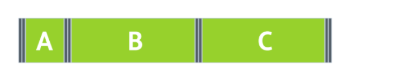
ここでは,,タップすると色が変わるクリック可能なテキストビューとボタンビューで構成されています.
それらのレイアウトをViewGroupである,ConstraintLayoutを使っていきます.
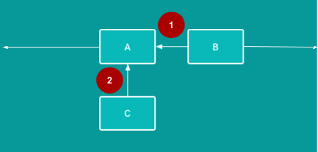
ConstaraintLayoutとは
ViewGroupの一つで,子ビューを柔軟な方法で配置やサイズ変更をできるようにするものです.
制約(Constaraint)をつけて,複雑なレイアウトを作ることができます.制約(Constaraint)とは
制約とは,2つのUI要素間の接続や整列を行うことです.
必ず親レイアウトか別のビューに,1つの水平方向の制約と1つの垂直方向の制約をつけなくてはいけません.
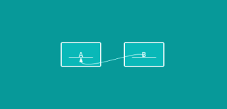
①水平方向の制約:BはAの右側に整列されるように制約されます(完成したアプリでは、Bはこの水平方向の制約に加えて少なくとも1つの垂直方向の制約を必要)
②垂直方向の制約:CはAを下に整列されるように制約されます(完成したアプリでは、Cはこの垂直方向の制約に加えて少なくとも1つの水平方向の制約を必要)ステップ
1. 新しいプロジェクトを作成する
パラメーターをこのように設定して,新しいプロジェクトを作成してください.
Template: Empty Activity
Name: ColrMyViews(ここはお好みで)
Language: Kotlin
Minimum API Level: API 29
2. TextViewに制約をつける
ここでは,スタイルと制約をつけます.
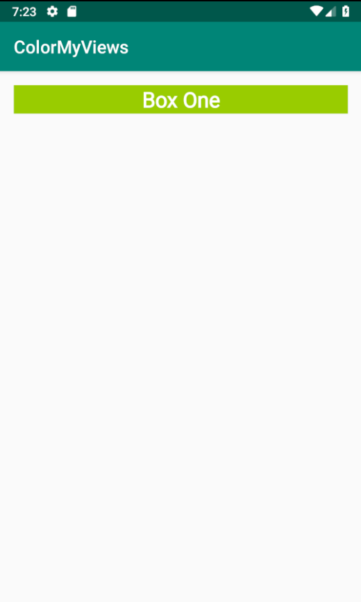
レイアウトファイルをこのように変更していきます.
activity_main.xml<TextView style="@style/whiteBox" android:layout_width="match_parent" android:layout_height="wrap_content" android:text="@string/box_one_text" app:layout_constraintBottom_toBottomOf="parent" app:layout_constraintLeft_toLeftOf="parent" app:layout_constraintRight_toRightOf="parent" app:layout_constraintTop_toTopOf="parent" app:layout_constraintVertical_bias="0.02" android:layout_margin="16dp"/>styles.xml<style name="whiteBox"> <item name="android:background">@android:color/holo_green_light</item> <item name="android:textAlignment">center</item> <item name="android:textStyle">bold</item> <item name="android:textColor">@android:color/white</item> <item name="android:textSize">24dp</item> </style>アプリを実行して,テキスト「Box One」がついたスタイル付きの緑色のTextViewが表示されます.
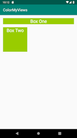
3. 2番目のTextViewを追加する
ここでは,2番目のTextViewを追加します.
制約とスタイルはこのようにします.
activity_main.xml<TextView style="@style/whiteBox" android:layout_width="130dp" android:layout_height="130dp" android:layout_margin="16dp" android:text="@string/box_two" app:layout_constraintLeft_toLeftOf="parent" app:layout_constraintTop_toBottomOf="@id/boxone_text" />※layout_width,layout_heightは可能な限り
wrap_contentを使って柔軟性があるといいこの属性が制約をつけるもので,親レイアウトのLeft側に
TextViewのLeft側と制約をつけるという意味になります.
app:layout_constraintLeft_toLeftOf=“parent"
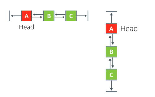
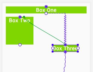
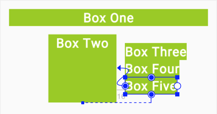
4. TextViewのチェーンを追加する
ここでは,3つの
TextViewを追加していきます.
チェーンというものを使って,ビュー同士を互いに水平に配置します.チェーンにはHeadと呼ばれるものがあります.
Headがチェーン内の全てのビューの配置を制御します.
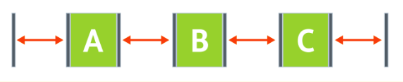
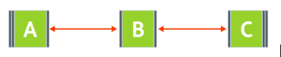
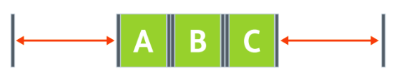
チェーンスタイル
チェーンには3つのスタイルがあるのでここで紹介します.
スプレッド: これはデフォルトのスタイルで,マージンが考慮されていて,ビューが均等に広がります.
インサイドスプレッド: これは最初と最後のビューは親の端にくっついて,残りのビューは均等に広がります.
パック: これはマージンが考慮されていて,ビューが全てパックされた状態になります.
またチェーンには
weightというものがあって,layout_constraintHorizontal_weightまたはlayout_constraintVertical_weight属性で設定された値によって,
ビューは全てのスペースを埋めるようになります.
たとえば,ビューBとCが占めるスペースはビューAの2倍に設定するとこのようになります.
まず,新しい
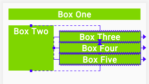
TextViewを3つ追加します.activity_main.xml<TextView android:id="@+id/bo_three_text" android:layout_width="wrap_content" android:layout_height="wrap_content" android:text="@string/box_three" style="@style/whiteBox"/> <TextView android:id="@+id/bo_four_text" android:layout_width="wrap_content" android:layout_height="wrap_content" android:text="@string/box_four" style="@style/whiteBox"/> <TextView android:id="@+id/bo_five_text" android:layout_width="wrap_content" android:layout_height="wrap_content" android:text="@string/box_five" style="@style/whiteBox"/>strings.xml<string name="box_three">Box Three</string> <string name="box_four">Box Four</string> <string name="box_five">Box Five</string>しかしこのままでは,制約が付けられていないのできっとエラーが表示されるはずです.
なので次にチェーンを作成していきます.まず,新しい3つのTextViewを全て選択して,
Chains>Create Vertical Chainを選択します.
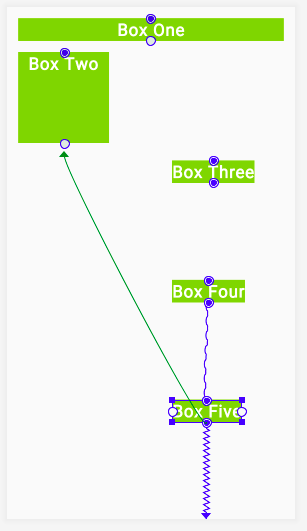
次に,「Box Three」の上部から,「Box Two」の上部に伸びる制約を追加します.
同じように「Box five」の下部もやってみます.
次に,左右の制約を追加していきます.
「Box Three」の左側を「Box Two」の右側に制約します。「Box Four」と「Box Five」についても繰り返します.
最後に,3つのテキストビューそれぞれに,
layout_weight属性を0dpにします.
0dpは,制約がMatch Constraintであることを指します.
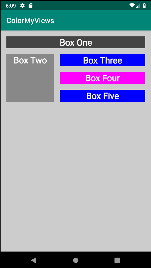
5. ユーザーがタップしたときの処理を追加する
ここでは,アプリをもう少しカラフルにしていきます.
最初に全てのテキストビューの色を,白にしていきます.その次にビューの色とレイアウトの背景色を変更する処理を追加します.まずは,
styles.xmlファイルのwhiteBoxスタイルでbackgroundcolorを白に変更します.<item name="android:background">@android:color/white</item>次に,MainActivity.ktに,
makeColor()という関数を定義します.
この関数が,タップした時に色が変わるハンドラーになります.MainActivity.ktprivate fun makeColored(view: View) { }そして関数の中に処理を書いていきます.
setBackgroundColor()メソッドで,各idのビューを呼び出し,Colorクラスで背景色を変更します.MainActivity.ktprivate fun makeColored(view: View) { when (view.id) { // Boxes using Color class colors for the background R.id.box_one_text -> view.setBackgroundColor(Color.DKGRAY) R.id.box_two_text -> view.setBackgroundColor(Color.GRAY) R.id.box_three_text -> view.setBackgroundColor(Color.BLUE) R.id.box_four_text -> view.setBackgroundColor(Color.MAGENTA) R.id.box_five_text -> view.setBackgroundColor(Color.BLUE) else -> view.setBackgroundColor(Color.LTGRAY) } }次に,ルートレイアウトのConstraintLayoutにidを追加します.
android:id="@+id/constraint_layout"
また,ビューをKotlinコードで使用するためにビューを呼び出す必要があるのでそのために,
setListeners()関数を追加します.private fun setListeners() { val boxOneText = findViewById<TextView>(R.id.box_one_text) val boxTwoText = findViewById<TextView>(R.id.box_two_text) val boxThreeText = findViewById<TextView>(R.id.box_three_text) val boxFourText = findViewById<TextView>(R.id.box_four_text) val boxFiveText = findViewById<TextView>(R.id.box_five_text) val rootConstraintLayout = findViewById<View>(R.id.constraint_layout) }次に,
setListener()関数の終わりに,Listを定義します.
全てのビューのインスタンスをここに格納します.fun setListeners() { ... val clickableViews: List<View> = listOf(boxOneText, boxTwoText, boxThreeText, boxFourText, boxFiveText, rootConstraintLayout) }次に,
setListener()関数の終わりに,各ビューのリスナーを定義します.for (item in clickableViews) { item.setOnClickListener { makeColored(it) } }最後に,Mainactivity.ktのonCreateメソッドの最後で,
setListener()関数の呼び出しを行います.override fun onCreate(savedInstanceState: Bundle?) { ... setListeners() }アプリを実行して色の変化を確認してみましょう.
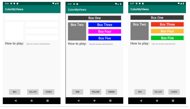
はじめは,backgroudcolorが白で,TextViewをタップすると色が変化します.
ConstraintLayoutの使い方②へ
ConstraintLayoutの使い方②では,さらに複雑なレイアウトのアプリを作ってみます.
ConstraintLayoutの使い方②はこちら
https://qiita.com/syuheifujita/items/d7625ce90cede27a1a85まとめ
・ConstraintLayoutは,レイアウトの子ビューを柔軟な方法で整列や配置を行える
・ConstraintLayoutは,必ず1つの水平と1つの垂直の制約が定義される
・ConstraintLayoutは,様々な画面サイズや解像度に対応できる
・チェーンは,互いのビューを水平や垂直に連結させる宿題
①色とテキストの代わりに画像を使用します.ユーザーがテキストビューをタップすると,アプリで画像が表示されるように実装してください
クイズ
1問目
constraintLayoutでは,ビューを所定の位置に維持するために必要な制約について正しいのは次のうちどれですか?・2つの水平制約
・1つの垂直制約
・少なくとも1つの水平および垂直の制約
・ビューを制限する必要はありません参考資料
ソースコード
Github:
https://github.com/syuheifujita/android-codeLab-fundamental-2-3言葉の定義
・ConstraintLayout
ビュー同士を,垂直や水平に制約をつけて整列させるViewGroup・ViewGroup
ビューをまとめてある規則で整列させるもののこと
(ConstraintLayoutやLinearLayoutなど)・ハンドラー
ユーザーがタップした時などに行われる,処理のことCodeLabs by Google
https://codelabs.developers.google.com/android-kotlin-fundamentals/
- 投稿日:2020-02-05T22:09:03+09:00
【Android-Codelabs】7/36 〜 ConstraintLayoutの使い方① 〜
2019年にGoogleから,Web上でAndroidを学べるコースが提供されました.(Android Kotlin Fundamentals Course)
この記事では,そのコースを実際にやってみてアウトプットしてみるといった内容です.
何かツッコミなどあれば編集リクエストかコメントかTwitterでいただければ修正いたします今回学ぶこと
・ViewGroupの一つである,ConstraintLayoutの使い方
・ConstraintLayoutのメリット目指す成果物
ここでは,,タップすると色が変わるクリック可能なテキストビューとボタンビューで構成されています.
それらのレイアウトをViewGroupである,ConstraintLayoutを使っていきます.
ConstaraintLayoutとは
ViewGroupの一つで,子ビューを柔軟な方法で配置やサイズ変更をできるようにするものです.
制約(Constaraint)をつけて,複雑なレイアウトを作ることができます.制約(Constaraint)とは
制約とは,2つのUI要素間の接続や整列を行うことです.
必ず親レイアウトか別のビューに,1つの水平方向の制約と1つの垂直方向の制約をつけなくてはいけません.
①水平方向の制約:BはAの右側に整列されるように制約されます(完成したアプリでは、Bはこの水平方向の制約に加えて少なくとも1つの垂直方向の制約を必要)
②垂直方向の制約:CはAを下に整列されるように制約されます(完成したアプリでは、Cはこの垂直方向の制約に加えて少なくとも1つの水平方向の制約を必要)ステップ
1. 新しいプロジェクトを作成する
パラメーターをこのように設定して,新しいプロジェクトを作成してください.
Template: Empty Activity
Name: ColrMyViews(ここはお好みで)
Language: Kotlin
Minimum API Level: API 29
2. TextViewに制約をつける
ここでは,スタイルと制約をつけます.
レイアウトファイルをこのように変更していきます.
activity_main.xml<TextView style="@style/whiteBox" android:layout_width="match_parent" android:layout_height="wrap_content" android:text="@string/box_one_text" app:layout_constraintBottom_toBottomOf="parent" app:layout_constraintLeft_toLeftOf="parent" app:layout_constraintRight_toRightOf="parent" app:layout_constraintTop_toTopOf="parent" app:layout_constraintVertical_bias="0.02" android:layout_margin="16dp"/>styles.xml<style name="whiteBox"> <item name="android:background">@android:color/holo_green_light</item> <item name="android:textAlignment">center</item> <item name="android:textStyle">bold</item> <item name="android:textColor">@android:color/white</item> <item name="android:textSize">24dp</item> </style>アプリを実行して,テキスト「Box One」がついたスタイル付きの緑色のTextViewが表示されます.
3. 2番目のTextViewを追加する
ここでは,2番目のTextViewを追加します.
制約とスタイルはこのようにします.
activity_main.xml<TextView style="@style/whiteBox" android:layout_width="130dp" android:layout_height="130dp" android:layout_margin="16dp" android:text="@string/box_two" app:layout_constraintLeft_toLeftOf="parent" app:layout_constraintTop_toBottomOf="@id/boxone_text" />※layout_width,layout_heightは可能な限り
wrap_contentを使って柔軟性があるといいこの属性が制約をつけるもので,親レイアウトのLeft側に
TextViewのLeft側と制約をつけるという意味になります.
app:layout_constraintLeft_toLeftOf=“parent"
4. TextViewのチェーンを追加する
ここでは,3つの
TextViewを追加していきます.
チェーンというものを使って,ビュー同士を互いに水平に配置します.チェーンにはHeadと呼ばれるものがあります.
Headがチェーン内の全てのビューの配置を制御します.
チェーンスタイル
チェーンには3つのスタイルがあるのでここで紹介します.
スプレッド: これはデフォルトのスタイルで,マージンが考慮されていて,ビューが均等に広がります.
インサイドスプレッド: これは最初と最後のビューは親の端にくっついて,残りのビューは均等に広がります.
パック: これはマージンが考慮されていて,ビューが全てパックされた状態になります.
またチェーンには
weightというものがあって,layout_constraintHorizontal_weightまたはlayout_constraintVertical_weight属性で設定された値によって,
ビューは全てのスペースを埋めるようになります.
たとえば,ビューBとCが占めるスペースはビューAの2倍に設定するとこのようになります.
まず,新しい
TextViewを3つ追加します.activity_main.xml<TextView android:id="@+id/bo_three_text" android:layout_width="wrap_content" android:layout_height="wrap_content" android:text="@string/box_three" style="@style/whiteBox"/> <TextView android:id="@+id/bo_four_text" android:layout_width="wrap_content" android:layout_height="wrap_content" android:text="@string/box_four" style="@style/whiteBox"/> <TextView android:id="@+id/bo_five_text" android:layout_width="wrap_content" android:layout_height="wrap_content" android:text="@string/box_five" style="@style/whiteBox"/>strings.xml<string name="box_three">Box Three</string> <string name="box_four">Box Four</string> <string name="box_five">Box Five</string>しかしこのままでは,制約が付けられていないのできっとエラーが表示されるはずです.
なので次にチェーンを作成していきます.まず,新しい3つのTextViewを全て選択して,
Chains>Create Vertical Chainを選択します.
次に,「Box Three」の上部から,「Box Two」の上部に伸びる制約を追加します.
同じように「Box five」の下部もやってみます.
次に,左右の制約を追加していきます.
「Box Three」の左側を「Box Two」の右側に制約します。「Box Four」と「Box Five」についても繰り返します.
最後に,3つのテキストビューそれぞれに,
layout_weight属性を0dpにします.
0dpは,制約がMatch Constraintであることを指します.
5. ユーザーがタップしたときの処理を追加する
ここでは,アプリをもう少しカラフルにしていきます.
最初に全てのテキストビューの色を,白にしていきます.その次にビューの色とレイアウトの背景色を変更する処理を追加します.まずは,
styles.xmlファイルのwhiteBoxスタイルでbackgroundcolorを白に変更します.<item name="android:background">@android:color/white</item>次に,MainActivity.ktに,
makeColor()という関数を定義します.
この関数が,タップした時に色が変わるハンドラーになります.MainActivity.ktprivate fun makeColored(view: View) { }そして関数の中に処理を書いていきます.
setBackgroundColor()メソッドで,各idのビューを呼び出し,Colorクラスで背景色を変更します.MainActivity.ktprivate fun makeColored(view: View) { when (view.id) { // Boxes using Color class colors for the background R.id.box_one_text -> view.setBackgroundColor(Color.DKGRAY) R.id.box_two_text -> view.setBackgroundColor(Color.GRAY) R.id.box_three_text -> view.setBackgroundColor(Color.BLUE) R.id.box_four_text -> view.setBackgroundColor(Color.MAGENTA) R.id.box_five_text -> view.setBackgroundColor(Color.BLUE) else -> view.setBackgroundColor(Color.LTGRAY) } }次に,ルートレイアウトのConstraintLayoutにidを追加します.
android:id="@+id/constraint_layout"
また,ビューをKotlinコードで使用するためにビューを呼び出す必要があるのでそのために,
setListeners()関数を追加します.private fun setListeners() { val boxOneText = findViewById<TextView>(R.id.box_one_text) val boxTwoText = findViewById<TextView>(R.id.box_two_text) val boxThreeText = findViewById<TextView>(R.id.box_three_text) val boxFourText = findViewById<TextView>(R.id.box_four_text) val boxFiveText = findViewById<TextView>(R.id.box_five_text) val rootConstraintLayout = findViewById<View>(R.id.constraint_layout) }次に,
setListener()関数の終わりに,Listを定義します.
全てのビューのインスタンスをここに格納します.fun setListeners() { ... val clickableViews: List<View> = listOf(boxOneText, boxTwoText, boxThreeText, boxFourText, boxFiveText, rootConstraintLayout) }次に,
setListener()関数の終わりに,各ビューのリスナーを定義します.for (item in clickableViews) { item.setOnClickListener { makeColored(it) } }最後に,Mainactivity.ktのonCreateメソッドの最後で,
setListener()関数の呼び出しを行います.override fun onCreate(savedInstanceState: Bundle?) { ... setListeners() }アプリを実行して色の変化を確認してみましょう.
はじめは,backgroudcolorが白で,TextViewをタップすると色が変化します.
ConstraintLayoutの使い方②へ
ConstraintLayoutの使い方②では,さらに複雑なレイアウトのアプリを作ってみます.
ConstraintLayoutの使い方②はこちら
https://qiita.com/syuheifujita/items/d7625ce90cede27a1a85まとめ
・ConstraintLayoutは,レイアウトの子ビューを柔軟な方法で整列や配置を行える
・ConstraintLayoutは,必ず1つの水平と1つの垂直の制約が定義される
・ConstraintLayoutは,様々な画面サイズや解像度に対応できる
・チェーンは,互いのビューを水平や垂直に連結させる宿題
①色とテキストの代わりに画像を使用します.ユーザーがテキストビューをタップすると,アプリで画像が表示されるように実装してください
クイズ
1問目
constraintLayoutでは,ビューを所定の位置に維持するために必要な制約について正しいのは次のうちどれですか?・2つの水平制約
・1つの垂直制約
・少なくとも1つの水平および垂直の制約
・ビューを制限する必要はありません参考資料
ソースコード
Github:
https://github.com/syuheifujita/android-codeLab-fundamental-2-3言葉の定義
・ConstraintLayout
ビュー同士を,垂直や水平に制約をつけて整列させるViewGroup・ViewGroup
ビューをまとめてある規則で整列させるもののこと
(ConstraintLayoutやLinearLayoutなど)・ハンドラー
ユーザーがタップした時などに行われる,処理のことCodeLabs by Google
https://codelabs.developers.google.com/android-kotlin-fundamentals/
- 投稿日:2020-02-05T17:15:31+09:00
[ AndroidStudio ] PMD解析結果の見方
少し前にPMDを導入した。
https://qiita.com/QiitaD/items/7c1e635ff0cc2115d969見方を調査してみた。
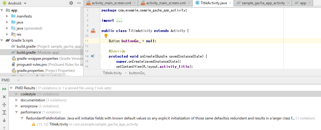
解析結果
以下が解析結果である。
例ではperformanceというところを見ている。これを開くと冗長な初期化がされていると書いてある。
その下、ビックリマークの横に発生しているクラスと行が書かれている。
試しにスクショの上半分のコードを見て頂くと、TitleActivityの11行目にボタンをnullで初期化しており、これが冗長な分だと示している。感想
pmdについて調べてみたが、参考になるサイトはほとんどなかった。どうやらbuildフォルダのoutputに解析結果出す方法がありそうなのだが、見つからず…
今回紹介したものでも役立ちそうなので、しばらくはこれで行きたい。
- 投稿日:2020-02-05T15:07:34+09:00
【Crashlytics】開発中のクラッシュログで埋もれるのを防ぐ(Android版)
Firebase Crashlytics を使うと、クラッシュログを自動的に収集でき、ユーザーの環境で起こったクラッシュの把握や原因の分析に役立つ。もはやこれなしでは不安になってしまうくらい、イマドキのアプリ開発には欠かせないツールになっていると感じる。
AndroidでCrashlyticsを使っていたところ、デフォルトだとデバッグビルド時でもお構いなしにクラッシュログを収集してしまうようだった。開発中はクラッシュはそれなりに起こるので、そのままだと本当に本番環境でクラッシュしたログが埋もれてしまう。リリースビルドでは有効にしつつ、デバッグビルドでだけCrashlyticsを無効にする方法を説明する。
方法
The Firebase Blog: Firebase Crashlytics, builds and you
↑のブログポストの末尾の「Apps that are auto initialized」の手順でできる(タイトルの通り、Crashlyticsを自動的に初期化している場合)。
ただ、記事のXMLをそのまま記載すると、実行時に
Key firebase_crashlytics_collection_enabled expected Boolean but value was a java.lang.String. The default value false was returned.という警告が出るので、少し書き換える。最終的には、以下の内容を
app/src/debug/AndroidManifest.xmlに書けばOK。<manifest xmlns:android="http://schemas.android.com/apk/res/android"> <application> <meta-data android:name="firebase_crashlytics_collection_enabled" android:value="false" /> </application> </manifest>ちなみに、
src/debugにAndroidManifest.xmlを置くと、debugビルド時にのみ、その内容がsrc/AndroidManifest.xmlにマージされる。Crashlyticsに限らず使えるテクニック。これだけで、デバッグビルド (
./gradlew assembleDebug) したときはクラッシュログを送らず、リリースビルド (./gradlew assembleRelease) のときはクラッシュログを記録するようにできる。ビルド時に追加でなんらかの設定などをする必要はない。まとめ
これで開発時はクラッシュログが送られなくなるので、本番環境で発生したクラッシュの解析に集中することができる
- 投稿日:2020-02-05T15:07:00+09:00
ProgressDialogが非推奨のため、ProgressBarで代替する
ProgressDialog が API 26 (Android 8.0) から非推奨となったため、代わりに ProgressBar などを用いて実装を行う必要があります。
Referenceには ProgressDialog クラスがありますが、DialogFragment クラスを継承しただけの独自クラスです。
シンプルに実装できるものがありましたので紹介します。
以下、Kotlinのサンプルコードです。
MainActivity.ktclass MainActivity : AppCompatActivity() { // ProgressDialog クラスはこのあと実装します private val progressDialog = ProgressDialog.newInstance("表示するメッセージ") override fun onCreate(savedInstanceState: Bundle?) { super.onCreate(savedInstanceState) setContentView(R.layout.activity_main) // ここでProgressDialogを表示させます progressDialog.show(supportFragmentManager,"TAG") } }ProgressDialog.ktclass ProgressDialog : DialogFragment() { companion object { fun newInstance(message: String): ProgressDialog { val instance = ProgressDialog() val arguments = Bundle() arguments.putString("message", message) instance.arguments = arguments return instance } } override fun onCreateDialog(savedInstanceState: Bundle?): Dialog { val mMessage = arguments!!.getString("message") val builder = AlertDialog.Builder(activity!!) val inflater = activity!!.layoutInflater val view = inflater.inflate(R.layout.dialog_progress, null) val mMessageTextView = view.findViewById(R.id.progress_message) as TextView mMessageTextView.text = mMessage builder.setView(view) return builder.create() } }dialog_progress.xml<!-- ルートタグを変更しています。 --> <!-- エラーが出ましたので、AndroidX を使うようにしました。 --> <?xml version="1.0" encoding="utf-8"?> <androidx.constraintlayout.widget.ConstraintLayout xmlns:android="http://schemas.android.com/apk/res/android" xmlns:app="http://schemas.android.com/apk/res-auto" android:layout_width="wrap_content" android:layout_height="wrap_content"> <ProgressBar android:id="@+id/progress" android:layout_width="80dp" android:layout_height="80dp" android:layout_gravity="center" android:layout_marginStart="16dp" android:layout_marginTop="16dp" app:layout_constraintLeft_toLeftOf="parent" app:layout_constraintTop_toTopOf="parent" app:layout_constraintBottom_toBottomOf="parent" android:layout_marginBottom="16dp" /> <TextView android:id="@+id/progress_message" android:layout_width="wrap_content" android:layout_height="wrap_content" android:layout_marginStart="16dp" app:layout_constraintBottom_toBottomOf="@id/progress" app:layout_constraintLeft_toRightOf="@id/progress" app:layout_constraintTop_toTopOf="@id/progress" app:layout_constraintVertical_bias="0.5" /> </androidx.constraintlayout.widget.ConstraintLayout>Reference
ProgressDialogの独自実装
https://wiki.toridge.com/index.php?android-kotlin-DialogFragment
- 投稿日:2020-02-05T13:31:34+09:00
ViewPager2とTabLayoutでページコントロール&ページ切り替えを簡単に用意
- スマートフォンアプリを使っているとよく見かけるページコントロールを簡単に作ろうという話です。
- 簡単にという事で、できればPngやJpegといった、用意するのが手間になる画像リソースも省きたいところ。
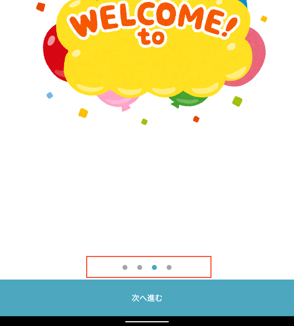
ページコントロールってなに?
- よく見かけるこれです↓
このコンポーネントって・・・
- iOSのHuman Interface Guidelines に定義されているコンポーネントなので、Androidにはありません

- チュートリアルなんかでよく見かけ、iOSと同じデザインでヨロシクと言われた人もいるんじゃないかと

用意していくよ
構成
- MainFragment (全ページを管理する親Fragment)
- Page1Fragment (1ページ目のFragment)
- Page2Fragment (2ページ目のFragment)
- Page3Fragment (3ページ目のFragment)
- Page4Fragment (4ページ目のFragment)
全ページをまとめる親ページとして
MainFragmentと、子ページとしてPage1〜4Fragmentを用意MainFragment
Layout
- 子ページを管理するための
ViewPager2と、ページコントロール用のTabLayoutを用意。
ViewPager2→androidx.viewpager2.widget.ViewPager2TabLayout→com.google.android.material.tabs.TabLayout- 必要に応じてAndroidXやMaterial Componentsを取り込みましょう
- 最下部に次のページに遷移させる為の
Buttonを用意。fragment_main.xml<?xml version="1.0" encoding="utf-8"?> <androidx.constraintlayout.widget.ConstraintLayout xmlns:android="http://schemas.android.com/apk/res/android" xmlns:app="http://schemas.android.com/apk/res-auto" xmlns:tools="http://schemas.android.com/tools" android:layout_width="match_parent" android:layout_height="match_parent" android:background="@color/color_white"> <androidx.viewpager2.widget.ViewPager2 android:id="@+id/viewPager" android:layout_width="match_parent" android:layout_height="0dp" app:layout_constraintBottom_toTopOf="@+id/frameLayout" app:layout_constraintEnd_toEndOf="parent" app:layout_constraintStart_toStartOf="parent" app:layout_constraintTop_toTopOf="parent" /> <FrameLayout android:id="@+id/frameLayout" android:layout_width="match_parent" android:layout_height="wrap_content" app:layout_constraintBottom_toTopOf="@+id/nextLayout" app:layout_constraintEnd_toEndOf="parent" app:layout_constraintStart_toStartOf="parent"> <com.google.android.material.tabs.TabLayout android:id="@+id/indicator" android:layout_height="40dp" android:layout_width="wrap_content" android:layout_gravity="center_horizontal" app:tabBackground="@drawable/indicator_selector" app:tabGravity="center" app:tabIndicatorHeight="0dp" app:tabIndicatorFullWidth="true" app:tabRippleColor="@null"/> </FrameLayout> <Button android:id="@+id/nextLayout" android:layout_width="match_parent" android:layout_height="60dp" android:background="@color/button_color" android:stateListAnimator="@null" android:text="@string/next_button_text" android:textColor="@color/color_white" android:textSize="15sp" android:textStyle="bold" app:layout_constraintBottom_toBottomOf="parent" app:layout_constraintEnd_toEndOf="parent" app:layout_constraintStart_toStartOf="parent" /> </androidx.constraintlayout.widget.ConstraintLayout>ポイント

TabLayoutのapp:tabBackground="@drawable/indicator_selector"は、選択中、非選択中を意識しておくindicator_selector.xml<?xml version="1.0" encoding="utf-8"?> <selector xmlns:android="http://schemas.android.com/apk/res/android"> <item android:state_selected="true"> <shape android:innerRadius="0dp" android:shape="ring" android:thickness="4dp" android:useLevel="false"> <solid android:color="@color/blue" /> </shape> </item> <item> <shape android:innerRadius="0dp" android:shape="ring" android:thickness="4dp" android:useLevel="false"> <solid android:color="@color/gray" /> </shape> </item> </selector>
- TabLayoutの
app:tabRippleColor="@null"は、ページコントロールの選択時のRippleEffectの設定
- 不要であれば
@nullで表示しない設定にしておくCode(必要そうな箇所を抜粋)
MainFragment.ktclass MainFragment : Fragment() { private sealed class IndexItem { abstract fun newInstance(): Fragment object FirstItem : IndexItem() { override fun newInstance() = Page1Fragment.newInstance() } object SecondItem : IndexItem() { override fun newInstance() = Page2Fragment.newInstance() } object ThirdItem : IndexItem() { override fun newInstance() = Page3Fragment.newInstance() } object FourthItem : IndexItem() { override fun newInstance() = Page4Fragment.newInstance() } } private val indexItems = listOf( IndexItem.FirstItem, IndexItem.SecondItem, IndexItem.ThirdItem, IndexItem.FourthItem) // ~~~ 省略 override fun onViewCreated(view: View, savedInstanceState: Bundle?) { super.onViewCreated(view, savedInstanceState) setupViewItem() } private fun setupViewItem() { viewPager.adapter = object : FragmentStateAdapter(this) { override fun getItemCount(): Int = indexItems.size override fun createFragment(position: Int): Fragment { return indexItems[position].newInstance() } } viewPager.orientation = ViewPager2.ORIENTATION_HORIZONTAL TabLayoutMediator(indicator, viewPager) { _, _ -> }.attach() } }ポイント
sealed classを利用し、子ページの処理を統一ViewPagerのadapterはandroidx.viewpager2.adapter.FragmentStateAdapterを利用- TabLayoutMediatorは
TabLayoutとViewPager2の動きをリンクさせるためのクラス
- タブのテキストを変更する為にも利用するが、今回は利用しないのでアタッチのみ実施
Page 1~N Fragment
- 好きなページ数でつくってください
- 内容もすきなままにどうぞ

おわり
- いかがでしたでしょうか。
ViewPager2のおかげで少ないコード数で対応可能になりました。- iOSのコンポーネントにあわせて、Androidをつくるのは
感ありますががんばっていきましょう

これからも楽しいアプリケーション開発を
- 投稿日:2020-02-05T13:05:23+09:00
Groovy2系(Gradle)はコメント中の\uもUnicodeエスケープされる
Groovy2系の文字列リテラルは
\u0000のように\uに続けて4桁の数字でUnicodeエスケープされます。
このUnicodeエスケープは文字列リテラルだけではなく困った事にコメントにも適用されます。なので例えば以下のようなコメントを書くとエラーになります。// C:\uploadこの動作は以下のバグレポートによるとバージョン2系のパーサーはunicode readerでソースコードを読み込むので発生するとコメントされていました。つまり文字列やコメントだけではなくコードすべてに対してUnicodeエスケープしているという事です。
バージョン3系ではパーサーが新しくなりコメントに
\uを含めることができます。またドキュメントから見つけられなかったのですがスラッシュ文字列とドルスラッシュ文字列も\uはUnicodeエスケープされなくなりました。とは言え、まだリリースされていないので今はどうにかしてコード中から
\uを取り除く必要があります。そもそもの発端はUnityでAndroid用にカスタム build.gradle テンプレートを利用して
DIR_UNITYPROJECTをプロジェクトフォルダの絶対パスに置換する機能を使った時にuで始まるフォルダがあった事が原因でWindowsでエラーが起きた事でした。
Unity2019.1以降ならDIR_UNITYPROJECTを置換する時にパス区切り文字をエスケープして\\で出力するのでこの変数で問題は起きないようです。
- 投稿日:2020-02-05T10:13:34+09:00
細かいことはいいから特定のAPIエンドポイントのOkHttpログをtailする
Androidの開発をしてると、特定のAPIに対するリクエストとレスポンスを確認したいことって、あると思います。
普通にlogcatを眺めるだけだと、目的外のログもぶわぁーって出てしまって涙目ですよね。
皆どうしてるんですかね?私はこうしてます。(pidcatを利用)
以下、
v1/users/registerというパスを含むリクエストとレスポンスを確認するとします。リクエストを確認
コマンド
pidcat com.sample.package -t OkHttp | awk '/-->.*v1\/users\/register, /--> END/'ログ
                 OkHttp  D  --> POST https://api.sample.com/v1/users/register http/1.1
                         D  Content-Type: application/json; charset=UTF-8
                         D  Content-Length: 170
                         D  {"user":{"app_version":"2.4.0","device_id":"5a3fe389-da50-4083-a811-24c77093e64b","device_name":"generic_x86","os_type":"Android","os_version":"9"}}
                         D  --> END POST (170-byte body)
レスポンスを確認
コマンド
pidcat com.sample.package -t OkHttp | awk '/<--.*v1\/users\/register, /<-- END/'ログ
                         D  <-- 200  https://api.sample.com/v1/users/register (8942ms)
                         D  date: Wed, 05 Feb 2020 00:24:05 GMT
                         D  content-type: application/json; charset=utf-8
                         D  server: nginx
                         D  vary: Accept-Encoding
                         D  cache-control: no-cache
                         D  x-runtime: 0.110749
                         D  x-frame-options: deny
                         D  {"status": 200}
                         D  <-- END HTTP (17-byte body)
awkして、該当のログを引っこ抜いているだけなので、特に解説はしません。
細かいツッコミはなしで。。。
- 投稿日:2020-02-05T08:46:00+09:00
[Android]XMLファイルに記述したオブジェクトを読み込む
はじめに
Android では
res/xmlフォルダ に任意の XML ファイルが作成できるようになっており、
ここに XML ファイルを作成し、格納しておけば、簡単に読み込めるようになっています。
今回は この XML ファイルに記述したオブジェクトを読み込む方法について説明します。val parser = applicationContext.resources.getXml(R.xml.user_list) parser.getAttributeBooleanValue ...永続化するオブジェクト(クラス)を作成する
永続化するオブジェクトは次の
Personクラスのオブジェクトにします。
Personクラスは 名前(String) と 年齢(Int) 、アイコン(リソースID)を持つクラスです。Person.ktdata class Person(val name: String, val age: Int, val iconRes: Int)XMLファイルにオブジェクトを記述する
次の手順で XML ファイルを作成し、オブジェクトを記述していきます。
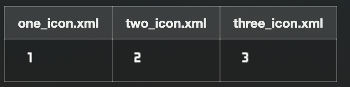
resフォルダを右クリックし、New -> Android Resource Fileを開くFileNameをuser_list、Resource TypeをXMLにしてOKを押すperson_listタグの中にpersonタグを定義し、アトリビュート name age icon を記述する。<?xml version="1.0" encoding="utf-8"?> <person_list> <person name="One" age="20" icon="@drawable/one_icon"/> <person name="Two" age="21" icon="@drawable/two_icon"/> <person name="Three" age="22" icon="@drawable/three_icon"/> </person_list>XMLファイルからオブジェクトを読み込む
res/xmlの XML ファイルはcontext.resources.getXmlで取得できるXmlResourceParserを利用して読み込みます。XmlResourceParserですがXmlPullParserを継承したクラスなのでXmlPullParserと同じ利用方法になります。val parser = applicationContext.resources.getXml(R.xml.person_list)XML ファイルを読み込みの制御には
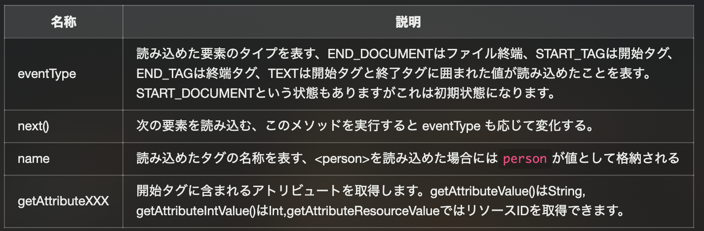
XmlPullParserのeventTypeとnext()を利用します。
またタグ名称の確認はname、アトリビュートの取得にはgetAttributeXXXを利用します。
XmlPullParserを利用して、XMLファイルの全ての要素から、
全て Person オブジェクトを取得する処理を記述すると次のようになります。private fun parsePerson(): List<Person> { // オブジェクトを格納するリストを作成する val persons = mutableListOf<Person>() // person_list.xml を解析するパーサーを取得する val parser = applicationContext.resources.getXml(R.xml.person_list) // 解析が完了し、ドキュメントの終端に到達するまで処理を続ける while (parser.eventType != END_DOCUMENT) { // 開始タグでかつ、名称がPersonならば各アトリビュートを取得する if (parser.eventType == START_TAG && parser.name == "person") { val name = parser.getAttributeValue(null, "name") val age = parser.getAttributeIntValue(null, "age", 0) val icon = parser.getAttributeResourceValue(null, "icon", 0) persons.add(Person(name, age, icon)) } // 次の要素を読み込む parser.next() } // パーサーはクローズ処理が必要なので忘れずに実行する parser.close() return persons }おわりに
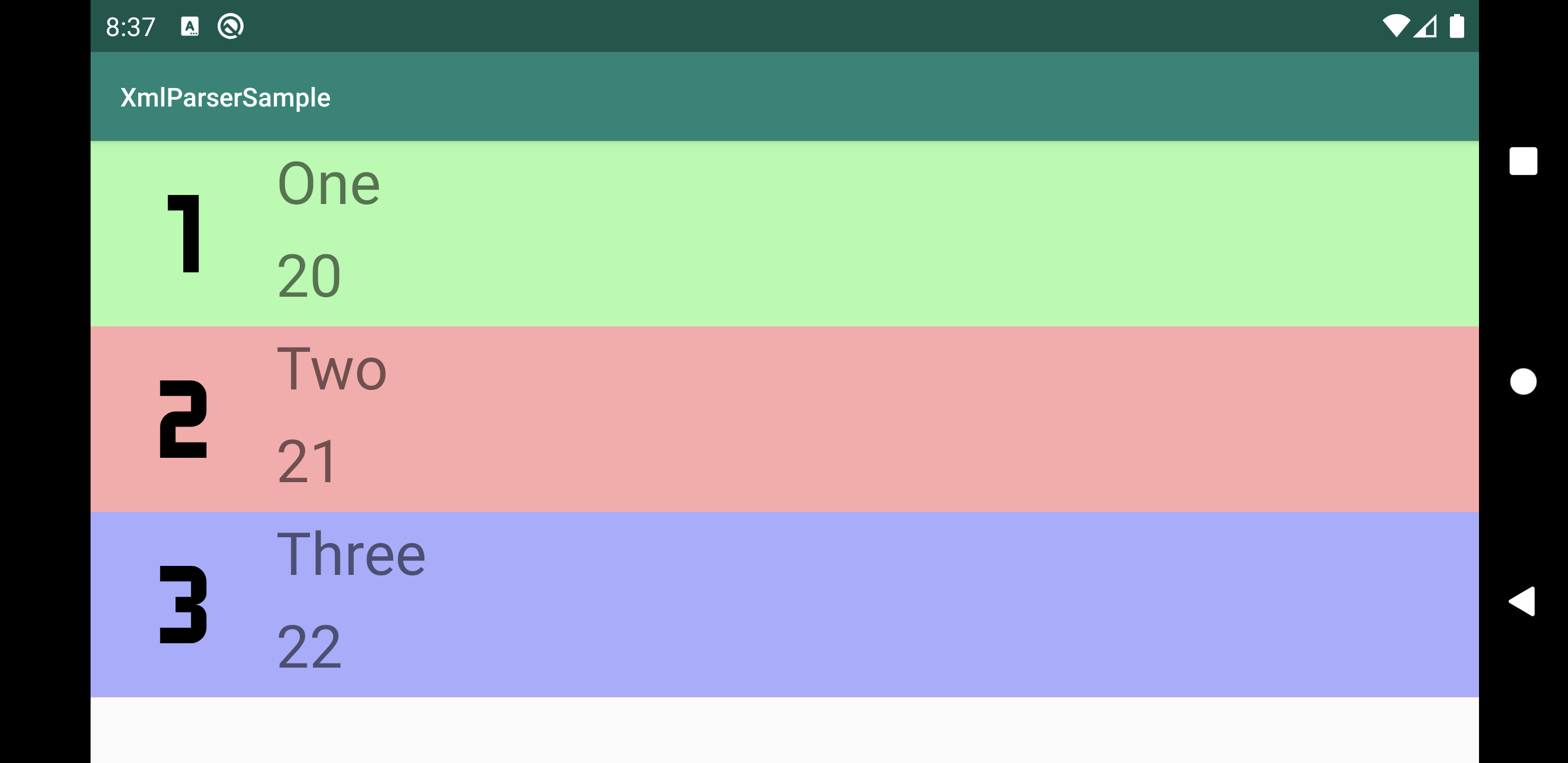
最後に実装したパース処理を利用して、アプリを作成してみました。
このように XMLファイルに記述しておいたオブジェクトを元に View を組み立てられます。
XML ファイルでリソース管理することはあまりないかもしれませんが場合によっては使えるかなと思います。
MainAcitivity.kt
    override fun onCreate(savedInstanceState: Bundle?) {
        super.onCreate(savedInstanceState)
        setContentView(R.layout.activity_main)

        val persons = parsePerson()
        val user1 = persons.getOrNull(0)
        val user2 = persons.getOrNull(1)
        val user3 = persons.getOrNull(2)

        val name1 = findViewById<TextView>(R.id.name1_text_view)
        name1.text = user1?.name
        val age1 = findViewById<TextView>(R.id.age1_text_view)
        age1.text = user1?.age.toString()
        val icon1 = findViewById<ImageView>(R.id.icon1_view)
        icon1.setImageResource(user1?.iconRes ?: 0)

        val name2 = findViewById<TextView>(R.id.name2_text_view)
        name2.text = user2?.name
        val age2 = findViewById<TextView>(R.id.age2_text_view)
        age2.text = user2?.age.toString()
        val icon2 = findViewById<ImageView>(R.id.icon2_view)
        icon2.setImageResource(user2?.iconRes ?: 0)

        val name3 = findViewById<TextView>(R.id.name3_text_view)
        name3.text = user3?.name
        val age3 = findViewById<TextView>(R.id.age3_text_view)
        age3.text = user3?.age.toString()
        val icon3 = findViewById<ImageView>(R.id.icon3_view)
        icon3.setImageResource(user3?.iconRes ?: 0)
    }
main_activity.xml
<LinearLayout xmlns:android="http://schemas.android.com/apk/res/android"
    xmlns:app="http://schemas.android.com/apk/res-auto"
    xmlns:tools="http://schemas.android.com/tools"
    android:layout_width="match_parent"
    android:layout_height="wrap_content"
    android:orientation="vertical"
    tools:context=".MainActivity">

    <androidx.constraintlayout.widget.ConstraintLayout
        android:orientation="vertical"
        android:layout_width="match_parent"
        android:layout_height="100dp"
        android:background="#aaffaa">

        <ImageView
            android:id="@+id/icon1_view"
            android:layout_width="100dp"
            android:layout_height="match_parent"
            app:layout_constraintTop_toTopOf="parent"
            app:layout_constraintLeft_toLeftOf="parent"
            app:layout_constraintBottom_toBottomOf="parent"/>

        <TextView
            android:id="@+id/name1_text_view"
            android:layout_width="0dp"
            android:layout_height="0dp"
            android:textSize="32dp"
            app:layout_constraintTop_toTopOf="parent"
            app:layout_constraintLeft_toRightOf="@id/icon1_view"
            app:layout_constraintRight_toRightOf="parent"
            app:layout_constraintBottom_toTopOf="@id/age1_text_view"/>

        <TextView
            android:id="@+id/age1_text_view"
            android:layout_width="0dp"
            android:layout_height="0dp"
            android:textSize="32dp"
            app:layout_constraintTop_toBottomOf="@id/name1_text_view"
            app:layout_constraintLeft_toRightOf="@id/icon1_view"
            app:layout_constraintRight_toRightOf="parent"
            app:layout_constraintBottom_toBottomOf="parent"/>

    </androidx.constraintlayout.widget.ConstraintLayout>

    <androidx.constraintlayout.widget.ConstraintLayout
        android:orientation="vertical"
        android:layout_width="match_parent"
        android:layout_height="100dp"
        android:background="#ffaaaa">

        <ImageView
            android:id="@+id/icon2_view"
            android:layout_width="100dp"
            android:layout_height="match_parent"
            app:layout_constraintTop_toTopOf="parent"
            app:layout_constraintLeft_toLeftOf="parent"
            app:layout_constraintBottom_toBottomOf="parent"/>

        <TextView
            android:id="@+id/name2_text_view"
            android:layout_width="0dp"
            android:layout_height="0dp"
            android:textSize="32dp"
            app:layout_constraintTop_toTopOf="parent"
            app:layout_constraintLeft_toRightOf="@id/icon2_view"
            app:layout_constraintRight_toRightOf="parent"
            app:layout_constraintBottom_toTopOf="@id/age2_text_view"/>

        <TextView
            android:id="@+id/age2_text_view"
            android:layout_width="0dp"
            android:layout_height="0dp"
            android:textSize="32dp"
            app:layout_constraintTop_toBottomOf="@id/name2_text_view"
            app:layout_constraintLeft_toRightOf="@id/icon2_view"
            app:layout_constraintRight_toRightOf="parent"
            app:layout_constraintBottom_toBottomOf="parent"/>
    </androidx.constraintlayout.widget.ConstraintLayout>

    <androidx.constraintlayout.widget.ConstraintLayout
        android:orientation="vertical"
        android:layout_width="match_parent"
        android:layout_height="100dp"
        android:background="#aaaaff">

        <ImageView
            android:id="@+id/icon3_view"
            android:layout_width="100dp"
            android:layout_height="match_parent"
            app:layout_constraintTop_toTopOf="parent"
            app:layout_constraintLeft_toLeftOf="parent"
            app:layout_constraintBottom_toBottomOf="parent"/>

        <TextView
            android:id="@+id/name3_text_view"
            android:layout_width="0dp"
            android:layout_height="0dp"
            android:textSize="32dp"
            app:layout_constraintTop_toTopOf="parent"
            app:layout_constraintLeft_toRightOf="@id/icon3_view"
            app:layout_constraintRight_toRightOf="parent"
            app:layout_constraintBottom_toTopOf="@id/age3_text_view"/>

        <TextView
            android:id="@+id/age3_text_view"
            android:layout_width="0dp"
            android:layout_height="0dp"
            android:textSize="32dp"
            app:layout_constraintTop_toBottomOf="@id/name3_text_view"
            app:layout_constraintLeft_toRightOf="@id/icon3_view"
            app:layout_constraintRight_toRightOf="parent"
            app:layout_constraintBottom_toBottomOf="parent"/>
    </androidx.constraintlayout.widget.ConstraintLayout>

</LinearLayout>
アイコンリソース
参考文献
- 投稿日:2020-02-05T03:51:47+09:00
Android-Codelabs-2.2: EditTextを使って入出力のできるアプリの作り方
2019年にGoogleから,Web上でAndroidを学べるコースが提供されました.(Android Kotlin Fundamentals Course)
この記事では,そのコースを実際にやってみてアウトプットしてみるといった内容です.
何かツッコミなどあれば編集リクエストかコメントかTwitterでいただければ修正いたします今回学ぶこと
・
EditTextのビューを使用して,ユーザー入力を取得する方法
・visibilty属性を使って,Viewの可視性(Visible)を変更する方法目指す成果物
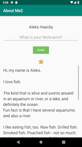
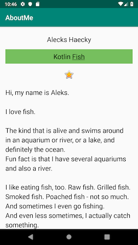
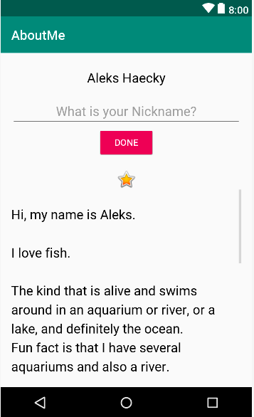
ここでは,前回使ったアプリにインタラクティブ機能を追加します.ソースコードはこちらになります.
ユーザーはニックネームを入力し,DONEボタンをタップすると,
TextViewは入力されたニックネームを表示されます.
また,TextViewをタップするとニックネームを再度更新されます.ステップ
1. テキスト入力用のEditTextを追加する
ここでは,
EditTextビューを追加して,ユーザーがニックネームを追加できるようにします.
EditTextはTextViewのサブクラスです.
このように,ユーザーはテキストを入力して,テキストの入力や編集ができます.
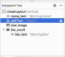
まず,レイアウトファイル
activity_main.xmlで,name_textの下にEditTextを定義しましょう.
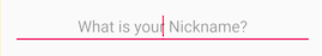
activity_main.xml<EditText android:id="@+id/nickname_edit" android:layout_width="match_parent" android:layout_height="wrap_content" android:hint="@string/what_is_your_nickname" android:layout_margin="16dp"/>hint属性は,入力する前に薄いもじが表示されているようなデザインにすることができます.(テキストはstring.xmlで設定)
そしたらアプリを実行してみましょう.
スターの画像の上に,hint属性の「Name」を含むEditTextが表示されます
2. EditTextのスタイルを設定する
ここでは,スタイルを
NameStyleに変更,inputType属性を設定することによりEditTextのビューのスタイルを設定していきます.まず,スタイルはstyle属性で指定していきます.
style="@style/NAmeStyle”を追加します.次に,
inputType属性は,ユーザーがEditTextビューに入力できる入力のタイプを指定します.たとえば,パスワードの場合,
textPasswordを使います.
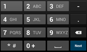
電話番号には,
phoneを使います.数字キーパッドが表示され,ユーザは数字のみを入力できます.
そして
EditTextの属性はこのようにします.activity_main.xml<EditText android:id="@+id/nickname_edit" style="@style/NameStyle" android:layout_width="match_parent" android:layout_height="wrap_content" android:layout_gravity="center" android:layout_margin="8dp" android:hint="@string/what_is_your_nickname" android:inputType="textPersonName" />3. ボタンを追加する
Buttonは,ユーザーがタップのアクションを実装できるUI要素です.
テキスト,アイコン,テキストとアイコンの両方でも実装できます.
まず,Doneボタンを追加します.
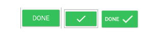
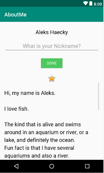
Buttonビューの属性はこのようになります.<Button android:id="@+id/done_button" android:layout_width="wrap_content" android:layout_height="wrap_content" android:text="@string/done" android:layout_gravity="center_horizontal"/>次に,ボタンの色をアクセントカラーに変更します.
アクセントカラーはres/values/colors.xmlファイルで定義されています.style属性を
Buttonビューに追加しましょうstyle="@style/Widget.AppCompat.Button.Colored"
色が変化しましたね!
color.xmlの属性を変更するとボタンの色も変更できます.<color name="colorAccent">#76bf5e</color>
4. ニックネームを表示するTextViewを追加する
ここでは,色付きの背景を持つTextViewを追加します.
まず,
TextViewをButtonビューの下に追加します.
属性はこのようにします.activity_main.xml<TextView android:layout_width="wrap_content" android:layout_height="wrap_content" android:id="@+id/nickname_text" android:layout_gravity="center" style="@style/NameStyle"/>次に,
TextViewの可視性(Visible)を変更します.
visibility属性を使って,ビューを表示か非表示にすることができます.また,visibilityには3種類の値があります
・visible:ビューが表示されます
・Invisible:ビューを非表示にしますが、ビューはまだレイアウトのスペースを占有します
・gone:ビューを非表示にし、ビューがレイアウトのスペースを占有しないようにします
nickname_textは,最初は表示させたくないので,属性はandroid:visibility="gone”を使います.
レイアウトファイルはこのようにします.activity_main.xml<TextView android:layout_width="wrap_content" android:layout_height="wrap_content" android:id="@+id/nickname_text" android:layout_gravity="center" style="@style/NameStyle" android:visibility="gone"/>5. ButtonにClickListenerを実装する
ここでは
Buttonがタップされた時に,実行される処理を実装していきます.まず,javaフォルダーから
MainActivity.ktを開いて,addNicknameという関数を追加します.
ボタンをタップすると,テキストビューを表示されるので,パラメーターにviewを指定します.MainActivity.ktpackage com.example.android_codelab_2_1 import androidx.appcompat.app.AppCompatActivity import android.os.Bundle import android.view.View import android.widget.EditText import android.widget.TextView class MainActivity : AppCompatActivity() { override fun onCreate(savedInstanceState: Bundle?) { super.onCreate(savedInstanceState) setContentView(R.layout.activity_main) } private fun addNickname(view: View) { } }次に,ボタンが押された時に
nickname_editとnickname_textのビューを参照したいので,addNickname関数内でfindViewByIdを追加します.private fun addNickname(view: View) { val editText = findViewById<EditText>(R.id.nickname_edit) val nicknameTextView = findViewById<TextView>(R.id.nickname_text) }そして,
EditTextで入力された値をTextViewのtext属性に渡したいので,nicknameTextView.text = editText.text要素を追加します.private fun addNickname(view: View) { val editText = findViewById<EditText>(R.id.nickname_edit) val nicknameTextView = findViewById<TextView>(R.id.nickname_text) nicknameTextView.text = editText.text }値を渡したら,
nickname_editは非表示にさせたいので,visibility属性を使います.
また同じく,nickname_textは表示させたいので,visibility属性を使います.private fun addNickname(view: View) { val editText = findViewById<EditText>(R.id.nickname_edit) val nicknameTextView = findViewById<TextView>(R.id.nickname_text) nicknameTextView.text = editText.text editText.visibility = View.GONE nicknameTextView.visibility = View.VISIBLE }次に,クリックリスナーを追加します.
MainActivity.ktの,onCreateメソッド内でこのように定義します.val buttonDone = findViewById<Button>(R.id.done_button) buttonDone.setOnClickListener { addNickname(it) }
Buttonビューを使いたいので,findViewByIdメソッドを呼び出します.
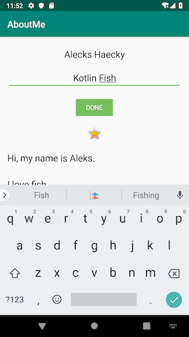
addNickname()メソッドのitは,引数として渡されるdone_buttonのButtonビューを指しています.アプリを実行して,ニックネームを入力してDONEボタンをタップしたらこのようになることを確認しましょう.
次に,ボタンをタップした後にキーボードを隠したいので,このようなコードを
addNickname関数の最後に追加します.val inputMethodManager = getSystemService(Context.INPUT_METHOD_SERVICE) as InputMethodManager inputMethodManager.hideSoftInputFromWindow(view.windowToken, 0)6. ニックネームを更新する機能を実装する
ここでは,ニックネームを更新する機能を実装します.
更新するには,nickname_textをタップすると,nickname_editとdone_buttonを再び表示させるようにします.まず,更新するために,
updateNickname関数を定義します.private fun updateNickname (view: View) { }
nickname_textをタップすると,nickname_editとdone_buttonを再び表示させたいので,関数をこのようにします.private fun updateNickname (view: View) { val editText = findViewById<EditText>(R.id.nickname_edit) val doneButton = findViewById<Button>(R.id.done_button) editText.visibility = View.VISIBLE doneButton.visibility = View.VISIBLE view.visibility = View.GONE }次に,MainActivity.ktでリスナーを定義します.
nicknameTextView.setOnClickListener() {
    updateNickname(it)
}
7. EditTextにフォーカスを設定して,ユーザビリティを高める
仮に,
nickname_textをタップして,再びnickname_editが表示されたとしても,編集可能なのかどうかはユーザーに伝わりにくい時があります.
こういった時には,requestFocus()関数を使います.まず,EditTextビューに,
requestFocus()関数をupdateNickname関数の最後の行に記述して,フォーカスを設定します.editText.requestFocus()次に,キーボードを表示させる,コードをupdateNickname関数の最後の行に記述します.
val imm = getSystemService(Context.INPUT_METHOD_SERVICE) as InputMethodManager
imm.showSoftInput(editText, 0)
以上で終わりになります.
インタラクティブなアプリを作れました!
まとめ
・EditTextは,ユーザーがテキストの入力や変更ができるUI要素
・visibilty属性で,ビューの表示や非表示を設定できるクイズ
1問目
EditTextはどのサブクラスですか?View
LinearLayout
TextView
Button2問目
visibilityビューに設定されている場合、次の属性のどれがビューを非表示にしてレイアウトのスペースを占有しないようにしますか?visible
Invisible
gone
hide3問目
次の文のうち、Buttonビューについて正しいものはどれですか?Buttonは、ViewGroupです
Button画面ごとに3つしか配置できません
Buttonはクリック可能であり、クリックすると、クリックリスナーがアクションを実行します
ImageViewはButtonの拡張です参考資料
ソースコード
Github:
https://github.com/syuheifujita/android-codeLab-fundamental-2-2言葉の定義
・可視性(Visible)
ビューの表示や非表示を設定できる属性のこと・アクセントカラー
基本の色に加えて,目立たせるための色としてcolor.xmlにデフォルトで定義されているもののこと・サブクラス
親クラスを継承した子クラスのこと・リスナー(Listener)
タップされたかを,見張っておく機能のようなもののこと
ex)onClickListenerCodeLabs by Google
https://codelabs.developers.google.com/android-kotlin-fundamentals/
- 投稿日:2020-02-05T03:51:47+09:00
【Android-Codelabs】6/36 〜 EditTextを使って入出力のできるアプリの作り方 〜
2019年にGoogleから,Web上でAndroidを学べるコースが提供されました.(Android Kotlin Fundamentals Course)
この記事では,そのコースを実際にやってみてアウトプットしてみるといった内容です.
何かツッコミなどあれば編集リクエストかコメントかTwitterでいただければ修正いたします今回学ぶこと
・
EditTextのビューを使用して,ユーザー入力を取得する方法
・visibilty属性を使って,Viewの可視性(Visible)を変更する方法目指す成果物
ここでは,前回使ったアプリにインタラクティブ機能を追加します.ソースコードはこちらになります.
ユーザーはニックネームを入力し,DONEボタンをタップすると,
TextViewは入力されたニックネームを表示されます.
また,TextViewをタップするとニックネームを再度更新されます.ステップ
1. テキスト入力用のEditTextを追加する
ここでは,
EditTextビューを追加して,ユーザーがニックネームを追加できるようにします.
EditTextはTextViewのサブクラスです.
このように,ユーザーはテキストを入力して,テキストの入力や編集ができます.
まず,レイアウトファイル
activity_main.xmlで,name_textの下にEditTextを定義しましょう.
activity_main.xml<EditText android:id="@+id/nickname_edit" android:layout_width="match_parent" android:layout_height="wrap_content" android:hint="@string/what_is_your_nickname" android:layout_margin="16dp"/>hint属性は,入力する前に薄いもじが表示されているようなデザインにすることができます.(テキストはstring.xmlで設定)
そしたらアプリを実行してみましょう.
スターの画像の上に,hint属性の「Name」を含むEditTextが表示されます
2. EditTextのスタイルを設定する
ここでは,スタイルを
NameStyleに変更,inputType属性を設定することによりEditTextのビューのスタイルを設定していきます.まず,スタイルはstyle属性で指定していきます.
style="@style/NAmeStyle”を追加します.次に,
inputType属性は,ユーザーがEditTextビューに入力できる入力のタイプを指定します.たとえば,パスワードの場合,
textPasswordを使います.
電話番号には,
phoneを使います.数字キーパッドが表示され,ユーザは数字のみを入力できます.
そして
EditTextの属性はこのようにします.activity_main.xml<EditText android:id="@+id/nickname_edit" style="@style/NameStyle" android:layout_width="match_parent" android:layout_height="wrap_content" android:layout_gravity="center" android:layout_margin="8dp" android:hint="@string/what_is_your_nickname" android:inputType="textPersonName" />3. ボタンを追加する
Buttonは,ユーザーがタップのアクションを実装できるUI要素です.
テキスト,アイコン,テキストとアイコンの両方でも実装できます.
まず,Doneボタンを追加します.
Buttonビューの属性はこのようになります.<Button android:id="@+id/done_button" android:layout_width="wrap_content" android:layout_height="wrap_content" android:text="@string/done" android:layout_gravity="center_horizontal"/>次に,ボタンの色をアクセントカラーに変更します.
アクセントカラーはres/values/colors.xmlファイルで定義されています.style属性を
Buttonビューに追加しましょうstyle="@style/Widget.AppCompat.Button.Colored"
色が変化しましたね!
color.xmlの属性を変更するとボタンの色も変更できます.<color name="colorAccent">#76bf5e</color>
4. ニックネームを表示するTextViewを追加する
ここでは,色付きの背景を持つTextViewを追加します.
まず,
TextViewをButtonビューの下に追加します.
属性はこのようにします.activity_main.xml<TextView android:layout_width="wrap_content" android:layout_height="wrap_content" android:id="@+id/nickname_text" android:layout_gravity="center" style="@style/NameStyle"/>次に,
TextViewの可視性(Visible)を変更します.
visibility属性を使って,ビューを表示か非表示にすることができます.また,visibilityには3種類の値があります
・visible:ビューが表示されます
・Invisible:ビューを非表示にしますが、ビューはまだレイアウトのスペースを占有します
・gone:ビューを非表示にし、ビューがレイアウトのスペースを占有しないようにします
nickname_textは,最初は表示させたくないので,属性はandroid:visibility="gone”を使います.
レイアウトファイルはこのようにします.activity_main.xml<TextView android:layout_width="wrap_content" android:layout_height="wrap_content" android:id="@+id/nickname_text" android:layout_gravity="center" style="@style/NameStyle" android:visibility="gone"/>5. ButtonにClickListenerを実装する
ここでは
Buttonがタップされた時に,実行される処理を実装していきます.まず,javaフォルダーから
MainActivity.ktを開いて,addNicknameという関数を追加します.
ボタンをタップすると,テキストビューを表示されるので,パラメーターにviewを指定します.MainActivity.ktpackage com.example.android_codelab_2_1 import androidx.appcompat.app.AppCompatActivity import android.os.Bundle import android.view.View import android.widget.EditText import android.widget.TextView class MainActivity : AppCompatActivity() { override fun onCreate(savedInstanceState: Bundle?) { super.onCreate(savedInstanceState) setContentView(R.layout.activity_main) } private fun addNickname(view: View) { } }次に,ボタンが押された時に
nickname_editとnickname_textのビューを参照したいので,addNickname関数内でfindViewByIdを追加します.private fun addNickname(view: View) { val editText = findViewById<EditText>(R.id.nickname_edit) val nicknameTextView = findViewById<TextView>(R.id.nickname_text) }そして,
EditTextで入力された値をTextViewのtext属性に渡したいので,nicknameTextView.text = editText.text要素を追加します.private fun addNickname(view: View) { val editText = findViewById<EditText>(R.id.nickname_edit) val nicknameTextView = findViewById<TextView>(R.id.nickname_text) nicknameTextView.text = editText.text }値を渡したら,
nickname_editは非表示にさせたいので,visibility属性を使います.
また同じく,nickname_textは表示させたいので,visibility属性を使います.private fun addNickname(view: View) { val editText = findViewById<EditText>(R.id.nickname_edit) val nicknameTextView = findViewById<TextView>(R.id.nickname_text) nicknameTextView.text = editText.text editText.visibility = View.GONE nicknameTextView.visibility = View.VISIBLE }次に,クリックリスナーを追加します.
MainActivity.ktの,onCreateメソッド内でこのように定義します.val buttonDone = findViewById<Button>(R.id.done_button) buttonDone.setOnClickListener { addNickname(it) }
Buttonビューを使いたいので,findViewByIdメソッドを呼び出します.
addNickname()メソッドのitは,引数として渡されるdone_buttonのButtonビューを指しています.アプリを実行して,ニックネームを入力してDONEボタンをタップしたらこのようになることを確認しましょう.
次に,ボタンをタップした後にキーボードを隠したいので,このようなコードを
addNickname関数の最後に追加します.val inputMethodManager = getSystemService(Context.INPUT_METHOD_SERVICE) as InputMethodManager inputMethodManager.hideSoftInputFromWindow(view.windowToken, 0)6. ニックネームを更新する機能を実装する
ここでは,ニックネームを更新する機能を実装します.
更新するには,nickname_textをタップすると,nickname_editとdone_buttonを再び表示させるようにします.まず,更新するために,
updateNickname関数を定義します.private fun updateNickname (view: View) { }
nickname_textをタップすると,nickname_editとdone_buttonを再び表示させたいので,関数をこのようにします.private fun updateNickname (view: View) { val editText = findViewById<EditText>(R.id.nickname_edit) val doneButton = findViewById<Button>(R.id.done_button) editText.visibility = View.VISIBLE doneButton.visibility = View.VISIBLE view.visibility = View.GONE }次に,MainActivity.ktでリスナーを定義します.
nicknameTextView.setOnClickListener() {
    updateNickname(it)
}
7. EditTextにフォーカスを設定して,ユーザビリティを高める
仮に,
nickname_textをタップして,再びnickname_editが表示されたとしても,編集可能なのかどうかはユーザーに伝わりにくい時があります.
こういった時には,requestFocus()関数を使います.まず,EditTextビューに,
requestFocus()関数をupdateNickname関数の最後の行に記述して,フォーカスを設定します.editText.requestFocus()次に,キーボードを表示させる,コードをupdateNickname関数の最後の行に記述します.
val imm = getSystemService(Context.INPUT_METHOD_SERVICE) as InputMethodManager
imm.showSoftInput(editText, 0)
以上で終わりになります.
インタラクティブなアプリを作れました!
まとめ
・EditTextは,ユーザーがテキストの入力や変更ができるUI要素
・visibilty属性で,ビューの表示や非表示を設定できるクイズ
1問目
EditTextはどのサブクラスですか?View
LinearLayout
TextView
Button2問目
visibilityビューに設定されている場合、次の属性のどれがビューを非表示にしてレイアウトのスペースを占有しないようにしますか?visible
Invisible
gone
hide3問目
次の文のうち、Buttonビューについて正しいものはどれですか?Buttonは、ViewGroupです
Button画面ごとに3つしか配置できません
Buttonはクリック可能であり、クリックすると、クリックリスナーがアクションを実行します
ImageViewはButtonの拡張です参考資料
ソースコード
Github:
https://github.com/syuheifujita/android-codeLab-fundamental-2-2言葉の定義
・可視性(Visible)
ビューの表示や非表示を設定できる属性のこと・アクセントカラー
基本の色に加えて,目立たせるための色としてcolor.xmlにデフォルトで定義されているもののこと・サブクラス
親クラスを継承した子クラスのこと・リスナー(Listener)
タップされたかを,見張っておく機能のようなもののこと
ex)onClickListenerCodeLabs by Google
https://codelabs.developers.google.com/android-kotlin-fundamentals/
- 投稿日:2020-02-05T00:25:55+09:00
Andorid のブラウザで加速度の値を取得してグラフ表示したりローカルなファイルにセーブしたりする
やること
タイトルそのままです。Chrome でしか動作は確認していません。多分 iOS + Safari でも動きます。下記サイトで動作を見れます。
正常に動くと上のような感じになります。加速度センサがついてない PC などでは、加速度の値やグラフは表示されません。
ソースコード
全体のコードは下記に置いてます。
要点
加速度データの取得
下記のコードで、加速度を取得するたびに arr に加速度データを記録していきます、
- https://kkblab.com/make/javascript/acc.html
上記サイトのコードほぼそのままです。acc.jsvar aX = 0, aY = 0, aZ = 0; // 加速度データの記録用 var startTime = Date.now(); // 開始時間の記録 var arr = []; // セーブする用 // 加速度データを取得する window.addEventListener("devicemotion", (dat) => { aX = dat.accelerationIncludingGravity.x; aY = dat.accelerationIncludingGravity.y; aZ = dat.accelerationIncludingGravity.z; arr.push( {"t": Date.now() - startTime, "x": aX, "y": aY, "z": aZ }); });データをローカルなファイルにセーブする
arr を json に変換して、Blob を使ってダウンロードできるようにします。
- https://qiita.com/wadahiro/items/eb50ac6bbe2e18cf8813
上記ページのコードを json でダウンロードできるように変更したものです。アンカーではなく、ボタンを押したらセーブするようにするには、少し複雑なコードを書く必要あり。
save.jsfunction handleDownload() { var blob = new Blob([ JSON.stringify(arr) ], { "type" : "application/json" }); if (window.navigator.msSaveBlob) { window.navigator.msSaveBlob(blob, "acc.json"); window.navigator.msSaveOrOpenBlob(blob, "acc.json"); } else { document.getElementById("download").href = window.URL.createObjectURL(blob); } // セーブしたらデータをリセットする。リセットしたくなければ下記2行をコメントアウトする。 arr = []; startTime = Date.now(); }グラフを表示する
arr の末尾から canvas の幅と同じ pixel 分だけデータを取りだして、頭から順に線をつないで引いていっているだけです。縦方向の座標値は適当なので、端末によっては縦幅を越えて描画されるかもしれません。
graph.jsvar canvas; var ctx; var preX = 0, preY = 0, preZ = 0; // 描画用 // 加速度データをグラフ表示する displayData function displayData() { // 加速度の値を文字で表示する var txt = document.getElementById("txt"); txt.innerHTML = "x: " + aX + "<br/>" + "y: " + aY + "<br/>" + "z: " + aZ; // canvas の背景をグレーで塗る if ( ! canvas || ! canvas.getContext ) { return false; } ctx.fillStyle = "gray"; ctx.fillRect( 0, 0, canvas.clientWidth, canvas.clientHeight ); ctx.lineWidth = 1 ; // 最新から 300px 分のデータを取りだす。 var varr = []; if ( arr.length > canvas.clientWidth){ varr = arr.slice(-canvas.clientWidth,-1); }else{ varr = arr; } for ( idx in varr ){ if ( idx > canvas.clientWidth ) break; var dat = varr[idx]; // X 軸加速度を赤の線で表示する var dy1 = canvas.clientHeight/2 + dat.x * 10.0; var dx = idx; ctx.strokeStyle = "red"; ctx.beginPath(); ctx.moveTo(dx,dy1); ctx.lineTo(dx-1,preX); ctx.stroke(); // Y 軸加速度を青の線で表示する var dy2 = 50 + dat.y * 10.0; ctx.strokeStyle = "blue"; ctx.beginPath(); ctx.moveTo(dx,dy2); ctx.lineTo(dx-1,preY); ctx.stroke(); // Z 軸加速度を緑の線で表示する var dy3 = 50 + dat.z * 10.0; ctx.strokeStyle = "green"; ctx.beginPath(); ctx.moveTo(dx,dy3); ctx.lineTo(dx-1,preZ); ctx.stroke(); // 次のデータを表示するときに前のデータから線を描く用 preX = dy1; preY = dy2; preZ = dy3; } }端末にもよりますが、それなりに高速にデータ取りつつ描画ができるので、最近のスマフォはすごいなーと思ったり。
